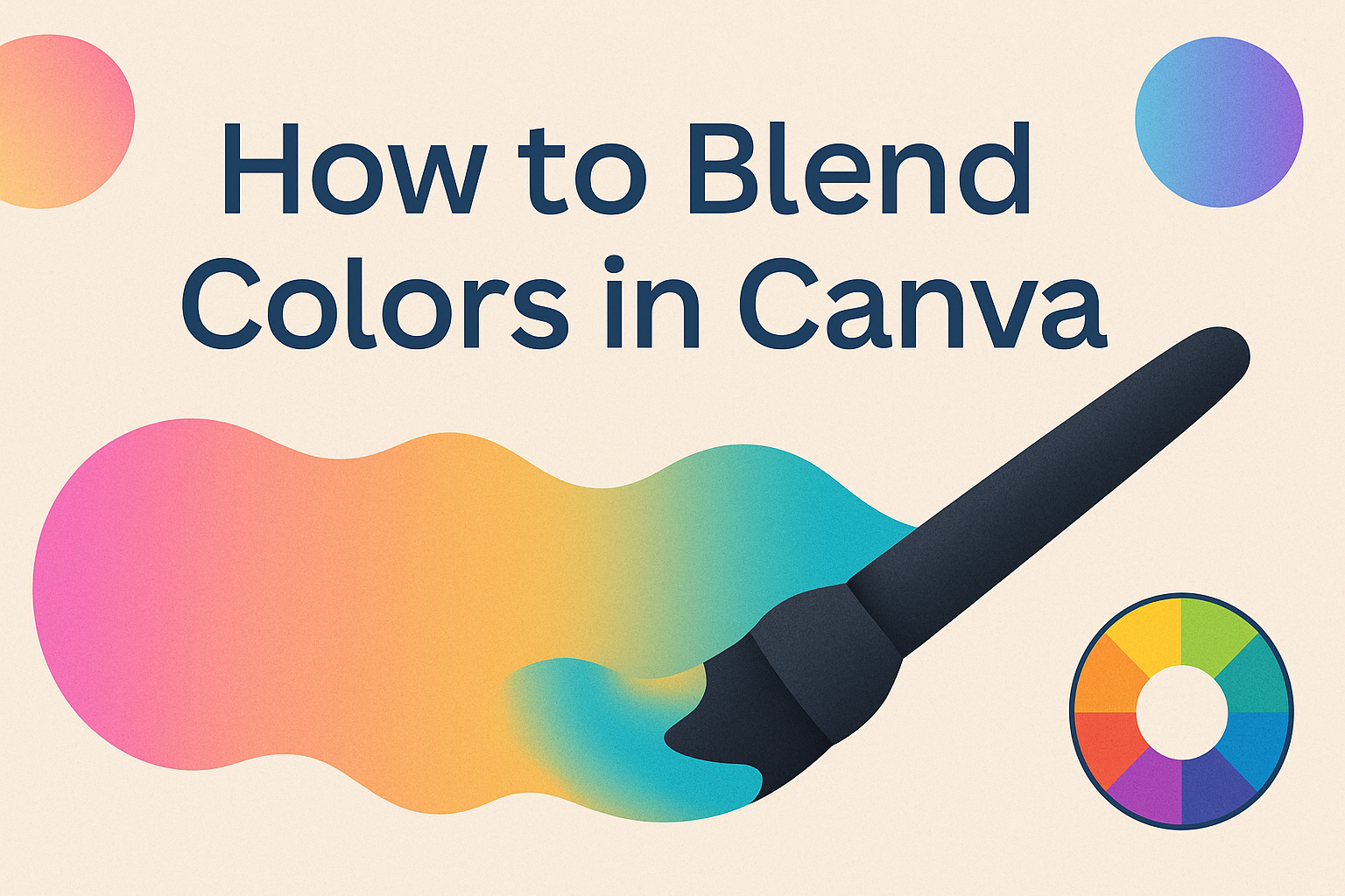
Blending colors in Canva can elevate any design project, making it more vibrant and engaging.
By learning simple techniques to blend colors, anyone can create stunning visuals that capture attention and convey the right mood.
With the right approach, even beginners can achieve professional-looking results.
Understanding the basics of color theory is essential for effective blending. It helps designers choose the right colors that work harmoniously together.
Canva offers handy tools to make this process easy, enabling users to experiment with various palettes and effects.
Whether it’s for a social media post, a presentation, or a personal project, knowing how to effectively blend colors can make a significant difference.
Readers will discover step-by-step methods and tips that will turn their creative ideas into reality.
Getting Started with Canva
Canva is a user-friendly design tool that allows anyone to create stunning visuals easily.
Understanding its interface and selecting the right canvas are important steps to begin designing effectively.
Understanding the Interface
When a user logs into Canva, they encounter a clean and simple interface. The main dashboard features a search bar, where users can find templates, elements, and more.
On the left side, there’s a sidebar that includes options like “Templates,” “Photos,” and “Elements.”
At the center, the workspace is where users drag and drop elements. It allows for easy adjustments and previews of their designs.
Users can also access settings, such as resizing or changing backgrounds, by clicking on the top toolbar. Familiarizing oneself with these features is key for efficient design.
Choosing the Right Canvas
Selecting the correct canvas size is essential for any project in Canva. Users can choose from common dimensions like A4, Instagram posts, or custom sizes.
Each option ensures that the design fits its intended use, whether it’s for social media, presentations, or prints.
To select a canvas, users simply click the “Create a design” button. A drop-down menu appears, showing various options.
It’s beneficial for users to consider their final output to make the best choice. A correctly sized canvas keeps the design visually appealing and aligned with the project goals.
Mastering Color Blends
Blending colors in Canva can enhance any design. By selecting the right colors, using the color picker, and applying gradient effects, users can create stunning visuals.
Selecting Colors
Choosing the right colors is crucial for effective blending. Users can start by thinking about the mood they wish to convey. For a calm design, blues and greens work well, while bright colors like red and yellow can energize a project.
Canva provides a color palette tool to help explore various combinations. Creating a palette of complementary colors ensures that they work well together.
Using the color wheel, designers can see how colors relate to each other. This offers a better understanding of shades, tints, and tones.
Using the Color Picker
The color picker in Canva offers a simple way to choose and adjust colors. By selecting an object, users can click on the color palette to access this tool.
Once there, it is easy to select a new color and see how it looks on the design.
Adjusting the opacity is another helpful feature. Users can blend the selected color with the existing one. This allows for interesting effects and helps in achieving the desired look.
For more custom colors, the color wheel can also be utilized to create unique shades.
Applying Gradient Effects
Gradients add depth and dimension to designs. Canva makes it easy to apply gradient effects.
Users can choose two or more colors and blend them smoothly across an object. This creates an eye-catching look.
To apply a gradient, select an object and then choose the gradient option.
Canva provides pre-made gradients or users can customize their own. Experimenting with different color combinations can lead to unique designs.
Using gradients can also help to highlight important elements in a project, drawing attention where it’s needed.
Advanced Blending Techniques
In graphic design with Canva, advanced blending techniques enhance creativity and produce stunning visuals. This section explores two key methods: working with transparency and layering with color modes.
Working with Transparency
Transparency allows designers to mix colors and images seamlessly. By adjusting the opacity of an element, he can create effects that blend smoothly into the background or other images.
To use transparency in Canva:
- Select the image or shape.
- Click on the “Transparency” option in the toolbar.
- Move the slider to adjust the level.
A lower opacity creates a softer, more subtle look, while higher transparency can add depth. This technique is beneficial for overlaying text onto images, enriching the overall design.
Layering and Color Modes
Layering involves stacking multiple elements to create interesting visual effects. Each layer can have different colors and transparency levels, offering unique combinations.
Canva also provides special blending modes. To access these, click on the image and choose the “Edit” option.
The blend modes vary from “multiply” to “screen,” each providing different outcomes.
Using these modes can enhance textures and colors, making designs stand out. Experimenting with various layers and modes allows for a more dynamic and engaging composition.
Practical Applications
Color blending in Canva can elevate designs by creating depth and harmony. It is useful in various graphic projects, including logos and social media visuals. Here are two key areas where blending colors shines.
Designing Logos and Branding
Blending colors helps in designing logos that stand out. By mixing shades, a logo can become more vibrant and visually appealing.
For example, combining a bright blue with a soft green can suggest freshness and creativity. This technique enables designers to create unique logos that represent a brand’s identity.
Using gradients and blended colors can also make the logos look modern. A well-designed logo can attract attention and foster brand recognition. Designers often test different color blends to find the best option for their clients.
Creating Social Media Graphics
Social media graphics benefit greatly from color blending.
Engaging visuals can lead to more shares and likes.
Using blended colors allows for unique posts that capture user interest.
For instance, a combination of warm oranges and cool blues can create a balanced look.
This mix can convey excitement while maintaining a calm feeling.
In addition, blending colors helps to create backgrounds that are eye-catching.
Designers can use this technique to draw attention to important information, like promotions or events.
By utilizing blended colors, posts become more appealing and engaging for audiences.