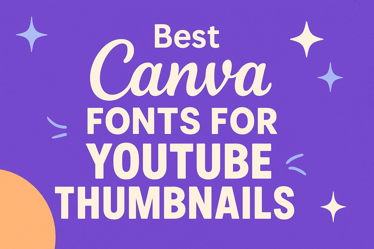
Creating eye-catching YouTube thumbnails is essential for attracting viewers.
The best Canva fonts for YouTube thumbnails can significantly enhance engagement and make content stand out. With the right font, a thumbnail can convey the video’s theme and grab attention quickly.
Many fonts can work well, but choosing ones that are bold and easy to read is crucial.
Fonts like Panton Bold and Rubik offer strong visibility, making them perfect for thumbnails. By selecting the appropriate font, creators can ensure their videos get noticed among a sea of content.
This blog post will explore some of the top Canva fonts for YouTube thumbnails, making it easier for creators to find the perfect match for their style.
Readers will discover a mix of modern, fun, and creative options to elevate their thumbnail designs.
Understanding Typography in Thumbnails
Typography plays a crucial role in how thumbnails attract viewers. The right choice of fonts can enhance readability and convey the tone of the content.
This section explores the importance of font selection and how it affects viewer engagement.
The Role of Fonts in Design
Fonts are not just decorative elements; they are vital for communication. The right font can quickly convey the mood and message of the video.
For example, a bold font like Oswald can create excitement, while a softer font like Playfair Display exudes elegance.
When designing thumbnails, contrast is essential. Utilizing a combination of font styles (like bold and regular) can emphasize key phrases.
Combining colors that stand out against the background also helps improve readability.
Including a clear hierarchy in text size is beneficial. Titles should be larger to grab attention, while subtitles can be smaller, inviting viewers to learn more.
Choosing fonts that align with the video’s theme enhances the overall design and encourages clicks.
Font Psychology and Viewer Engagement
Fonts can significantly influence viewer behavior. Each font carries its own emotional weight, impacting how viewers perceive the content.
For instance, fonts with sharp angles may evoke strong emotions, while rounded fonts often feel more approachable.
Engaging viewers requires understanding these subtle cues.
For example, using a playful font like Summer can attract a younger audience. In contrast, using a strong font like Just Believe may resonate with a more serious theme.
Experimenting with font styles is a smart way to grab attention. Viewers are drawn to unique designs that stand out in their feeds.
By combining font psychology with thoughtful design, creators can enhance viewer engagement and increase click-through rates.
Top Canva Fonts for Impactful YouTube Thumbnails
Choosing the right font is key to grabbing viewers’ attention on YouTube. Different styles can convey various emotions and messages, helping to make thumbnails engaging and memorable. Here are some great font choices to consider.
Bold and Attention-Grabbing Fonts
Bold fonts are essential for creating impactful thumbnails. They stand out easily in crowded feeds.
Examples include Bebas Neue and Panton Bold. These fonts have a strong presence, ensuring titles are noticed at first glance.
Using uppercase letters increases visibility, making a statement. Short phrases or single words in these fonts can make viewers curious, urging them to click.
Many content creators rely on bold fonts to emphasize key messages or themes in their videos.
Elegant and Sophisticated Typefaces
For a more refined look, elegant fonts work well. These typefaces can convey a sense of professionalism and style.
Fonts like Nunito and Cantora One add a touch of class to thumbnails. They are ideal for channels focusing on lifestyle, fashion, or education.
Their clean lines and balanced appearance help deliver a polished look. Using these fonts can attract a different audience looking for high-quality content.
Careful use of color can enhance these fonts, making them even more appealing. Light backgrounds with darker fonts often work best for visibility and elegance.
Fun and Casual Fonts for Informal Channels
Fun fonts bring a lively feel to thumbnails. They are perfect for casual content that aims to entertain.
Fonts such as Horizon and Rubik capture a playful vibe, engaging viewers right away. These typefaces can draw in audiences interested in gaming, vlogs, or humor.
Using bright colors with these fonts can amplify their appeal. Short, quirky phrases in these fonts can make viewers smile and feel connected.
It’s essential to balance fun with readability. Ensuring that the font is still clear, even in smaller sizes, is key to attracting clicks.
Mixing Fonts Effectively
Mixing fonts can bring a fresh look to YouTube thumbnails. By pairing fonts wisely and following some simple guidelines, anyone can create eye-catching designs that draw in viewers.
Pairing Fonts for Cohesion
Choosing complementary fonts is key to creating unity in a design. A good approach is to mix a bold font with a softer, simpler font.
For example, having a striking title in a bold style paired with a clean, readable font for subtitles can create balance.
Using a maximum of two or three fonts works best. This helps keep the design looking clean and avoids clutter. Consistency in style is also important. Fonts that share similar characteristics, like height or weight, often blend well together.
Font Combinations Rules
There are basic rules for combining fonts effectively.
First, it’s helpful to use fonts from the same family. For instance, a sans-serif font can pair nicely with a sans-serif variation.
Another rule is contrast. For instance, a tall, thin font can complement a short, heavy font.
Tips for Font Combinations:
- Use bold fonts for titles.
- Choose lighter fonts for supporting text.
- Limit combinations to two or three distinct styles.
By following these rules, anyone can enhance their YouTube thumbnails and engage their audience more effectively.
Optimizing Thumbnails for Accessibility
Creating accessible thumbnails is essential for reaching a wider audience. This involves using effective color combinations and ensuring that text is easily readable.
Color Contrast and Readability
Color contrast plays a critical role in making thumbnails readable. It is important to choose colors that stand out against each other.
For example, a dark font on a light background or vice versa helps with visibility.
Using tools like the WCAG contrast checker can assess color pairs. Aim for a contrast ratio of at least 4.5:1 for normal text. This ensures that everyone, including those with visual impairments, can easily read the text.
In addition, avoiding overly bright colors can reduce strain on the eyes. Instead, opt for softer tones that complement each other while still being legible.
Font Size and Thumbnail Scaling
Font size is another key factor in thumbnail accessibility. Text should be large enough to read at a glance, especially on smaller screens like smartphones.
A font size of at least 24px is often recommended for visibility.
It is also crucial to consider scaling when designing thumbnails. Thumbnails often appear in different sizes across various platforms.
Therefore, the design should maintain clarity and legibility even when resized.
Choosing bold fonts can enhance visibility. Additionally, keeping text short and concise helps convey the message quickly.
Avoid cluttering the thumbnail with too much information to ensure each element stands out.