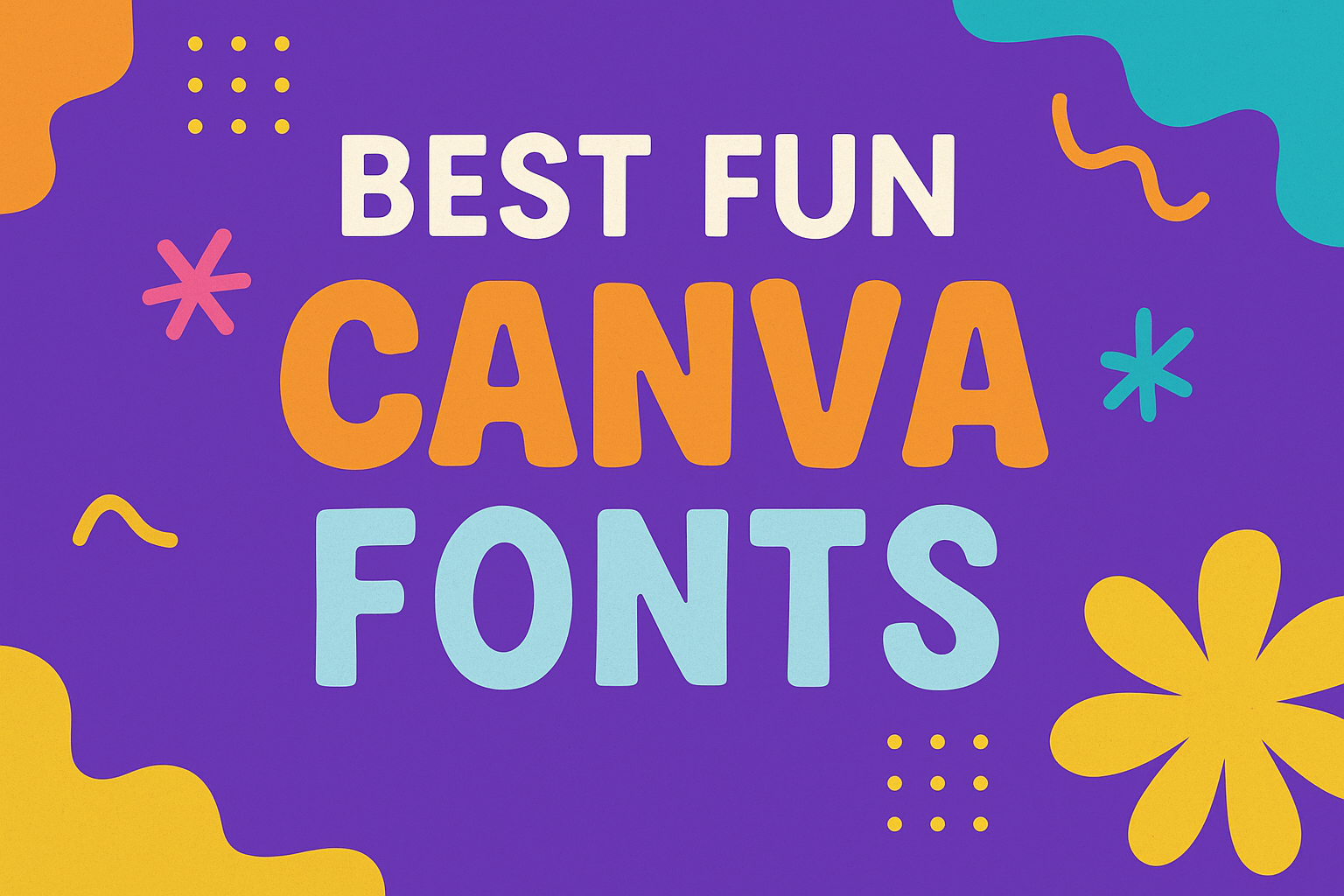
Finding the perfect font can bring a design to life, adding a sense of playfulness and charm that grabs attention.
For those using Canva, exploring fun fonts like Dreaming Outloud and Lucky Bones can transform any project into something extraordinary. These fonts are designed to add personality and flair.
Canva offers a variety of fonts that cater to different design needs.
For dynamic branding, Kooka Expanded provides modern, rounded edges ideal for bold headlines. Meanwhile, Nectarine offers an elegant yet playful vibe that fits well with creative projects.
The abundance of options ensures everyone can find something that resonates with their style.
For designers wanting to create content that stands out, getting familiar with these fonts is essential. They offer various moods and styles, allowing users to tailor their designs to specific audiences.
Whether for a playful greeting card or vibrant advertisement, the right font can make all the difference.
What Makes a Font ‘Fun’?
Fun fonts bring vibrancy and personality to any design. They appeal to emotions and enhance the mood through playful elements, engaging colors, and unique styles.
Colors and Emotions
Colors play a huge role in making a font feel fun.
Bright or unexpected color combinations can grab attention and evoke feelings like happiness or excitement. For example, neon shades or pastel hues can add modern flair to a playful text.
Different colors can suggest different emotions. While warm colors like red and orange can feel energetic, cooler colors like blue and green might give a calming or fresh vibe.
Designers often choose colors that align with the message they want to convey, enhancing how the text feels.
Choosing the right colors is essential. They should complement each other without clashing, ensuring the text is easy to read while catching the viewer’s eye.
Font Styles and Personality
The style of a font greatly influences its personality.
For instance, a fun font often features irregular shapes, bouncy letters, or whimsical elements. These characteristics can make the text look lively and engaging.
Fonts with decorative elements, like swirls or loops, add a playful touch that can make the design feel more dynamic. For example, script fonts with exaggerated curves can convey elegance with a dash of playfulness.
The size and weight also matter. Bold, chunky fonts can feel strong and confident, while thinner, more delicate fonts offer a light-hearted and cheerful vibe.
With so many options, designers can match the font style to the desired feeling or theme of the project.
Top Fun Fonts in Canva
Finding unique and playful fonts can transform ordinary designs into something truly special. Each font has its distinct character and flair, perfect for adding a touch of fun to your projects.
Comic Relief
Comic Relief is a font known for its playful and informal vibe. It’s ideal for projects requiring a lighthearted and cheerful tone.
The letters are rounded, making them easy on the eyes and inviting to readers. This font works well in children’s books, cartoons, and playful graphics where a relaxed style is key.
The font’s legibility also ensures that it remains versatile across various design elements. Its charm lies in its ability to stand out without overpowering the message.
Lobster Two
Lobster Two is loved for its bold and confident script style. It adds a touch of elegance while keeping things informal.
The font is perfect for headlines, greeting cards, and logos requiring a friendly yet sophisticated look. Each letter flows smoothly into the next, creating an eye-catching inscription.
Users appreciate its balance between expressive flair and readability. This makes Lobster Two a popular choice for designers seeking stylish, yet approachable visuals.
Pacifico
Pacifico brings a sense of casual fun with its retro-inspired design. Its flowing script gives off a carefree and relaxed vibe.
This font is ideal for projects that aim to evoke feelings of nostalgia or leisure, like summer posters or beach-themed designs.
Despite its playful nature, Pacifico maintains clear legibility, making it suitable for both headers and larger blocks of text. It captures attention without feeling too formal or serious.
Shadows Into Light
Shadows Into Light offers a warm, handwritten feel. It’s perfect for adding a personal touch to invitations, notes, or custom graphics.
The font’s unique charm comes from its slight slant and rounded edges, creating an informal yet sincere appearance.
Its versatility is key, as it pairs well with both modern and traditional designs. The friendly and approachable style of Shadows Into Light allows it to fit comfortably in many different types of projects.
Pairing Fun Fonts with Classic Fonts
Pairing fun fonts with classic ones can create engaging and balanced designs. Fun fonts bring creativity and flair, while classic fonts add stability and clarity, making them a great match for many projects.
Contrasting Font Pairings
Contrasting fonts can make a design pop by showcasing differences in style.
A playful script like Yellowtail often pairs beautifully with a reliable, simple typeface such as Open Sans. The flowing curves of Yellowtail add excitement, while the clean lines of Open Sans ensure readability.
This combination works well for projects needing a touch of whimsy paired with professionalism, like event posters or social media graphics.
Bold fonts with thin, streamlined fonts can also create contrast. Using a chunky serif typeface along with a light sans-serif font delivers a striking effect.
For instance, combining a bold, artistic font with a clean sans-serif helps draw attention to key elements while still maintaining an easy-to-read design.
Harmonizing Font Pairings
Harmonizing fonts focus on creating a cohesive and unified look. Choosing fonts with similar characteristics can enhance this harmony.
For example, pairing a bold Sans script with a delicate Serif typeface can emphasize elegance and symmetry. This choice is excellent for invitations or personal stationery, where a sophisticated touch matters.
Fonts like Margin and Marline complement each other by sharing a modern yet fluid style, perfect for branding materials. These fonts balance each other by combining modernity with a touch of elegance, ensuring a polished and professional appearance. When working on projects like logos, aiming for harmony in font pairings can create a unified brand message.
Using Fun Fonts Wisely
When selecting fun fonts for design projects, it’s crucial to consider factors like readability and the context in which they’ll be used. Understanding some basic principles can help in making choices that enhance rather than overwhelm a design. Mixing and matching fonts also requires thoughtful consideration to maintain visual harmony.
Readability and Legibility
Fun fonts are great for adding character, but readability should never be sacrificed.
It’s important to choose fonts that are easy to read at various sizes. A font that is too complex or decorative might look appealing, but it could make the text hard to read, especially from a distance.
Consider the audience and the purpose of the design. Use fonts that maintain legibility in both digital and print formats.
Test fonts by viewing them on different devices to ensure consistency. Colors can affect readability too, so choose contrasting colors between the text and background for better visibility.
Context Is Key
The context in which a font is used can greatly impact its effectiveness.
Using a playful font might be perfect for a child’s birthday invitation but not for a formal business presentation. Always align the font style with the message and tone of the content.
Designers should think about the purpose and audience before choosing a font. For energetic and vibrant designs, like those used in dynamic branding, fonts like Rague Shine are suitable.
Conversely, a sleek and simple font is more fitting for professional settings.
Mix and Match Best Practices
Combining fun fonts can create interesting designs but should be done with care.
A good rule is to mix a fun display font with a more neutral font for body text. This provides balance and ensures the message is clear.
For example, pairing a bold and playful font with a clean and simple sans-serif font often works well.
Avoid using too many different fonts, as it can make the design look cluttered. Sticking to two or three complementary fonts will keep the design cohesive.
Try a playful script font like Yellowtail alongside a reliable font such as Open Sans for a balanced effect.
Customizing Fonts for Unique Designs
Creating unique and eye-catching designs with fonts involves applying text effects and adjusting font colors and sizes. By exploring these options, designers can make ordinary text stand out.
Adding Text Effects
Text effects can transform plain words into something exciting. Effects like shadows, outlines, and glows can add depth and make text pop.
Shadows create a 3D effect, making letters appear raised from the background. Outlines emphasize the shape of letters by adding a border.
In Canva, effects are easy to apply. After selecting text, he or she can navigate to the effects menu. There, different options can be explored.
For instance, a glow effect can be adjusted for color and intensity, helping it match the design theme.
Experimenting with these effects allows for playful and engaging text. Adjusting these settings can change the feel of the text, making elements from formal to fun.
Altering Font Colors and Sizes
Changing colors and sizes is a simple way to draw attention or match branding.
Bright colors attract the eye, while muted tones provide a softer look. In Canva, designers can click on the text box to access color choices. This makes it simple to find the right color for any project.
Font size plays a key role too. Larger text can highlight important information, while smaller text fits perfectly for details.
Canva offers flexible resizing by dragging the corners of a text box for the preferred size.
Combining various colors and sizes helps guide the reader’s eye through the design. This creates a seamless reading experience and supports the overall message.
Fun Fonts for Specific Occasions
Choosing the right fun font can make special occasions more lively and memorable. Whether it’s invitations, greetings, or promotional materials, a well-suited font brings excitement and captures the mood of the event.
Birthday and Party Invitations
A birthday or party invitation sets the tone for the celebration.
Using lively fonts like Lucky Bones adds a playful vibe to any invite. This typeface is is known for being easy to read, which is essential for sharing details clearly.
Another choice is Dreaming Outloud Script, which brings elegance mixed with fun. Perfect for both adult-themed parties and kids’ celebrations, these fonts help convey a sense of joy and anticipation for the event.
For those looking to add a quirky touch, Aliens and Cow offers a whimsical flair. With its unusual characters, it brings a smile to the recipient’s face even before the party starts.
These options ensure that the excitement begins the moment the invitation is seen, making guests more eager to join in on the fun.
Holiday Greetings
Holiday greetings can be enhanced with fonts that celebrate the season.
A font like Comfortaa brings warmth and friendliness, making it an ideal choice for festive cards or messages. This sans-serif font is modern yet inviting, perfect for connecting with loved ones during special times of the year.
Rague Shine is another fantastic option, offering a dynamic and vibrant feel. Its style is suitable for those looking to send out cheerful messages that stand out.
Whether it’s Christmas, New Year’s, or any other holiday, these fonts help communicate the joy and spirit of the season.
Creating eye-catching holiday greetings with these fonts ensures that your message not only captures attention but also spreads happiness.
Event Flyers and Posters
When it comes to event flyers and posters, using the right font can make all the difference.
Kooka Expanded, with its modern and bold edges, is perfect for grabbing attention in crowded spaces. This font works great for contemporary advertising designs where being noticeable is key.
For events that require a touch of playfulness, Monfem—a calligraphic script font—adds elegance with a flowy style. Its unique design makes it well-suited for artistic events or showcases.
These fonts, tailored for posters and flyers, ensure your event promotion is both appealing and effective in drawing crowds.
Incorporating Images and Icons with Fonts
Integrating images and icons with fonts in Canva designs can create a visually appealing and effective communication tool.
The key is to create a clear visual hierarchy and ensure balance between text and imagery.
Creating Visual Hierarchy
Creating a strong visual hierarchy helps guide the viewer’s attention to the most important parts of the design.
Fonts play a crucial role in this process. A bold or larger font can be used for headings, making them stand out against other elements.
Meanwhile, body text can be more subtle, with a lighter weight or smaller size.
Icons can also support this hierarchy by emphasizing key points. For example, an arrow icon can direct the eye to important text, making sure the message is not lost.
Choosing the right color contrasts between fonts and icons enhances readability and keeps the design engaging.
Balancing Text with Imagery
Balancing text with images in a Canva design ensures that neither element overwhelms the other.
When too much text is placed over an image, it becomes difficult to read.
A good practice is to use images as a background with a slight overlay to soften them. This allows text to stand out clearly.
Icons can act as visual anchors or dividers, breaking up blocks of text. This helps maintain the viewer’s interest and prevents visual fatigue.
Careful placement of text around images or using image boundaries as guides can create a harmonious look.
Adjusting transparency and size ensures that all elements play well together, making the design attractive and functional.
The Impact of Fun Fonts on Audience Engagement
Using fun fonts effectively can significantly increase audience engagement by capturing attention and generating positive emotions.
This section will explore techniques for grabbing attention and encouraging positive responses using playful typography.
Attention-Grabbing Techniques
Fun fonts can immediately capture an audience’s attention. Bright colors, unique shapes, and bold designs are key features that draw the eye.
These fonts create a visual hierarchy, directing viewers to essential information first. For example, using a playful headline font can make the main message of a poster pop.
Incorporating contrast with sizes and styles can further enhance engagement. Pairing a large, bold fun font with a more straightforward text ensures that the audience stays focused on the important parts.
A font like Black Mango stands out because it’s versatile and adds elegance without being overpowering. Using such fonts helps in creating memorable experiences.
Encouraging Positive Responses
Fun fonts not only attract attention but also evoke emotions and responses.
Fonts combined with illustrated elements often produce a joyful and inviting atmosphere. Playful fonts convey a sense of creativity, making audiences more likely to engage and respond positively.
Certain font pairings can also impact emotions. Combining script and display fonts can add a sense of whimsy and light-heartedness.
Mixing decorative fonts with simpler text creates a balanced and inviting design. This approach can be particularly effective in creative projects, from social media graphics to event invitations, enhancing the overall appeal and prompting enthusiastic reactions.
Best Practices for Mobile and Web Fonts
When choosing fonts for mobile and web, it is crucial to ensure they are suitable for different screen sizes and load quickly. This involves considering both the adaptability of fonts in responsive designs and the impact on loading times.
Responsive Design Considerations
Responsive design is essential for ensuring that fonts look great on all devices, from desktops to smartphones.
Flexibility in font choices can help maintain readability across various screen sizes. It is important to choose fonts that retain their clarity and legibility when resized.
Using web-safe fonts is beneficial because they are designed to display correctly on different platforms, avoiding unexpected changes in appearance. Popular web-safe options include Arial, Verdana, and Georgia.
Adjusting font sizes relative to screen width can further enhance responsiveness. Implementing units like ems or percentages allows fonts to scale with the user’s preferences, ensuring a consistent experience across devices.
Loading Times and Performance
Font loading can significantly affect page performance, especially on mobile devices.
Optimizing font files by subsetting—removing unused characters—can reduce file size and improve loading speed. Smaller files mean quicker downloads and a smoother experience for users.
When embedding fonts, utilizing formats like WOFF2 is advisable, as they are highly compressed and modern, aiding faster loading times.
Leveraging font-display CSS properties to control how fonts are applied can prevent text from disappearing while waiting for fonts to load.
Caching strategies also help in maintaining effective loading times.
By using proper caching, repeated visits to a site will require less data fetching, thus preserving performance and enhancing user satisfaction.