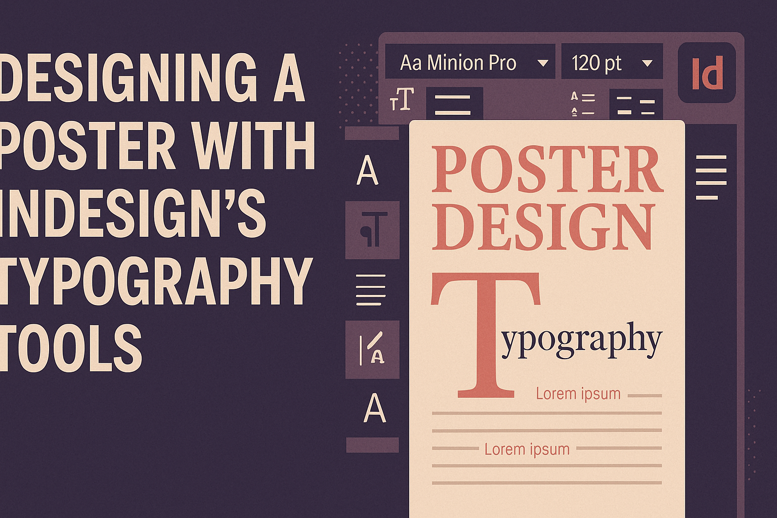
Adobe InDesign is a powerful tool for creating eye-catching posters using typography. By mastering InDesign’s typography tools, designers can transform text into art that captures attention. This process not only involves selecting the right fonts but also arranging them in a way that communicates the message effectively.
Typography can make or break a poster design. With InDesign, users can experiment with different typefaces, sizes, and alignments to create a unique look. Features like grids and guides help maintain balance and structure, allowing designers to focus on creativity.
Learning how to use InDesign’s typography features can elevate any designer’s skills. For those looking to create impactful posters, exploring the tools and techniques available in InDesign is essential. Whether it’s a bold statement or delicate details, the software offers endless possibilities to enhance the artistic appeal of a poster.
Getting Started with InDesign
Before diving into design, one must become familiar with the InDesign workspace and set up the document correctly. This includes understanding where tools are located, how to arrange the layout, and managing the panels to enhance workflow efficiency.
Understanding the Workspace
The InDesign workspace is designed to maximize efficiency. Key components include the toolbar, the control panel at the top, and panels on the right for various functions. He or she can customize these parts to fit their workflow, making it easy to access frequently used tools.
New users should note the Preferences menu under Edit. Adjust settings here to best suit personal habits, such as units, grids, and performance options. This ensures smoother operations while working on a project.
Keyboard shortcuts are also essential. They save time and make navigation quicker. Utilizing shortcuts like Ctrl+Z for undo or Ctrl+S for save can improve the working speed drastically. It’s worth spending some time learning these to enhance productivity.
Setting Up Your Document
Setting up a document correctly ensures that all design elements are organized. The first step is going to File > New > Document, which brings up the New Document window, where key settings are chosen.
Paper size, orientation, and margins should be specified first. For instance, selecting an A3 size with proper margins ensures that the content fits well on the page. Additionally, adding a Bleed of around 5mm helps when the printed document is cut to size.
The Intent can be set to Print or Web, depending on the final product’s purpose. This affects several defaults such as color modes, so it must be chosen wisely. Knowing what the end use is will guide these decisions.
Navigating Through Panels
InDesign’s panels are crucial for accessing tools and functions. They are found on the right side of the workspace. Each panel, such as Pages, Layers, or Swatches, has a specific role. These can be collapsed or expanded to create more space.
Often panels can be grouped or docked together to keep the workspace tidy. For instance, placing the Character and Paragraph panels in the same group can streamline text edits. This flexibility allows designers to create a layout that suits their process.
Basic Typography Principles
Typography is crucial when designing posters in Adobe InDesign. Selecting the appropriate font, understanding font licensing, and pairing fonts effectively are vital for creating visually appealing designs.
Choosing the Right Font
Selecting the right font can make or break a poster design. Fonts convey mood and brand identity, so understanding the qualities of different types is key. Serif fonts like Times New Roman are traditional and elegant, great for formal designs. Sans-serif fonts like Arial are clean and modern, perfect for informal projects.
InDesign offers a wide range of typefaces. Experimenting within the software allows designers to preview how fonts interact with the poster’s elements. Ensuring readability is also necessary, especially for large blocks of text.
Managing Font Licensing
Font licensing is an important, yet sometimes overlooked, part of design. Using fonts without proper licenses can lead to legal issues. Many fonts come with specific terms on how they can be used, especially in commercial projects. Free and open-source fonts are available but they often have their own guidelines too.
Adobe InDesign’s integration with Adobe Fonts simplifies the licensing process. Users can access and sync licensed fonts directly within the application, ensuring peace of mind when designing. It’s always recommended to double-check licensing to avoid potential problems.
Exploring Font Pairing
Font pairing involves choosing typefaces that complement each other. Balance is a primary factor in creating a harmonious visual experience. Effective pairings often contrast styles: a bold sans-serif with a delicate serif, for instance. This contrast can highlight important information and guide the viewer’s eye across the poster.
Practical tools, such as online font pairing generators, can also help to find successful combinations. InDesign itself can serve as a testing ground for seeing how fonts work together. Consistency across design elements should be maintained to ensure the poster is cohesive and professional.
Working with Type Tools
InDesign’s typography tools allow designers to create impressive and dynamic posters. Understanding how to use the Type Tool, Control Panel, and styles can enhance any design project.
Using the Type Tool
The Type Tool is the starting point for adding text to a poster. By clicking the Type Tool icon in the Tools panel, users can draw a text box on their document. Text can then be typed directly or pasted into this box.
After placing the text, designers can adjust the font, size, and color. For example, changing text into outlines transforms the text into a vector, allowing for creative manipulation. This feature is especially useful for customizing titles or headings.
Mastering the Type Tool provides the foundation for further customization with styles and effects. Experimenting with various settings helps in achieving the desired look for each design element.
Understanding the Control Panel
The Control Panel offers quick access to many text formatting options. It appears at the top of the workspace when the Type Tool is selected. Designers can change font styles, sizes, and alignments from this panel.
Adjustments like leading and kerning can also be made, which are important for spacing the text correctly. This ensures that the text is readable and visually pleasing.
By using the Control Panel, designers can optimize their workflow, making it easier to experiment with different typographic elements and see immediate results. This tool makes it simple to make quick changes without interrupting the creative process.
Creating Paragraph Styles
Paragraph styles in InDesign streamline the process of applying consistent formatting throughout a document. Creating a paragraph style involves setting specific text attributes—like font size, alignment, and line spacing—which can then be saved and applied to multiple paragraphs.
To create a style, designers select the text with the desired formatting and click “New Paragraph Style” in the Paragraph Styles panel. These styles ensure uniformity, making updates across the document fast and efficient.
Using paragraph styles also helps in maintaining a professional look by keeping headings, subheadings, and body text consistent. This feature is invaluable for large posters with lots of text.
Applying Character Styles
While paragraph styles control whole sections of text, character styles are used for smaller text elements. Character styles apply specific attributes, like bold or italics, to selected words or letters within a paragraph.
To set up a character style, a designer selects the formatted text and clicks “New Character Style” in the Character Styles panel. This allows for quick styling of key phrases or individual characters.
Character styles enhance the design by emphasizing crucial information, creating visual interest, and ensuring consistency. They are particularly useful for highlighting words in a headline or making callouts stand out. By using both paragraph and character styles, designers can ensure their text remains both stylish and functional.
Advanced Typography Techniques
Using Adobe InDesign for typography allows designers to add detailed enhancements to their projects. By mastering advanced features such as glyphs, kerning, tracking, baseline shift, and text wrap, designers can refine their work for a polished, professional look.
Utilizing Glyphs and Special Characters
InDesign offers a variety of glyphs and special characters that can make designs more unique and personalized. Glyphs refer to different creative characters and symbols that are not typically found on a standard keyboard. Designers can access these through the Glyphs panel in InDesign, providing a vast selection of options.
To use glyphs effectively, designers should explore different fonts, as each font offers its own set of unique characters. Searching through various font families can reveal hidden gems that enhance visual appeal. Incorporating these characters strategically can elevate the design by adding aesthetic flair and improving readability.
Being playful with special characters can also bring a creative touch. For instance, using styled quotation marks or decorative bullets adds a classy or playful element, depending on the style. Being mindful about their placement ensures that these elements integrate seamlessly into the overall design, rather than feeling out of place.
Adjusting Kerning and Tracking
Kerning and tracking are essential tools in typography design within InDesign. Kerning adjusts the spacing between individual pairs of letters to achieve a visually pleasing result. Correct kerning prevents awkward gaps or overlaps that can disrupt the flow of text.
Tracking, on the other hand, modifies spacing across a range of characters or entire blocks of text. It affects how tight or loose the text appears. Understanding when to use these tools can dramatically affect readability and aesthetics. For headings, tightening the tracking can add impact to bold titles.
In contrast, loosening tracking in body text can improve legibility, especially in smaller fonts. Balancing these adjustments ensures clarity and style, allowing the text to enhance the visual narrative of the poster creatively.
Applying Baseline Shift
Baseline shift is another valuable technique in Adobe InDesign that allows designers to move text vertically on a page. This feature can be used to create interesting text effects, such as elevated or lowered characters in a word for emphasis or creative expression.
Employing a baseline shift can result in dynamic text layouts. For instance, designers might elevate the first letter of a sentence or emphasize a brand name within a tagline. This slight alteration adds texture and depth to text, making it more engaging.
When applying a baseline shift, it’s essential to maintain consistency and rhythm. Too much variation can make the text look uneven, whereas subtle shifts can enhance focus without distracting the reader from the main message.
Exploring Text Wrap Options
Text wrap options in InDesign help in seamlessly incorporating images or other graphic elements with text. By wrapping text around a shape, designers maintain a fluid and integrated look. InDesign offers multiple wrapping styles like wrap around bounding box or contour lines.
Using the correct wrap style ensures that text complements rather than competes with images. Adjusting wrap settings, such as the offset distance, can control how close text comes to the object.
This nuanced control lets designers maintain balance and harmony in their layouts. Selecting the appropriate text wrap options allows the visual elements to coexist effectively, enhancing the overall impact of the design without compromising on readability.
Incorporating Graphics and Images
When designing a poster, adding graphics and images can make the design pop and attract more attention. It’s important to know how to place these elements effectively and use frames and shapes to enhance the visual presentation.
Placing Images in Your Layout
To insert images, InDesign provides a helpful tool called the Place command. This can be accessed through the “File” menu or by using the shortcut “Ctrl+D” for Windows and “Cmd+D” for Mac. Users can then browse their files to select the desired image.
Once the image is placed, it can be moved and resized to fit the layout. Adjusting the position and size is easy; simply click and drag the image to where it fits best. Images can also be rotated to add a dynamic touch to the design. Using high-quality images can significantly improve the visual appeal of a poster.
Working with Frames and Shapes
Frames and shapes are used to hold and position images within the layout. InDesign allows users to create rectangular, oval, or custom-shaped frames. These frames help keep images organized and aligned.
To adjust the frame’s size without affecting the image quality, users can click on the frame and drag its corners. Additionally, frames can be filled with colors or gradients to add depth and contrast to the design.
A practical trick is to use frames to create borders or emphasize key image areas, helping to guide the viewer’s eye. Custom shapes can also be used creatively to wrap text around images, making the design more engaging.
Finalizing Your Poster Design
When finalizing a poster in Adobe InDesign, it’s essential to check for errors and optimize the design for printing. Going through proofing and pre-flight checks ensures everything is in place, and exporting the file correctly guarantees a high-quality print.
Proofing and Pre-flight Checks
Before finishing up a poster design, checking everything thoroughly is key. First, they should proofread all text for spelling and grammatical errors. Even small mistakes can stand out in printed work. They should also ensure that all images and graphics are high resolution to prevent pixelation.
InDesign’s built-in pre-flight tool is very useful. It helps spot missing fonts, incorrect links, and color issues. Setting pre-flight profiles can guide the software to point out any potential problems, ensuring the document is print-ready.
Color accuracy is also important. Testing colors on different screens can highlight discrepancies, and using a color profile like CMYK provides consistency in printing. Designers can avoid unexpected results by checking all these details thoroughly.
Exporting to PDF and Printing Tips
Once the design passes the proofing stage, it’s time to export it. Exporting as a PDF is the best way to maintain quality. Choosing the “High Quality Print” preset in InDesign ensures that all elements are preserved, including colors and fonts.
Adding bleed and crop marks during export is crucial. They help ensure that the design extends to the edge of the page, so there are no unwanted borders. Bleed typically extends 0.125 inches beyond the page to guarantee perfect trimming.
Communicating with the print shop is also wise. They can provide specific settings or profiles needed for the best print results. It’s a good idea to send a test print to identify any issues before committing to a full print run.