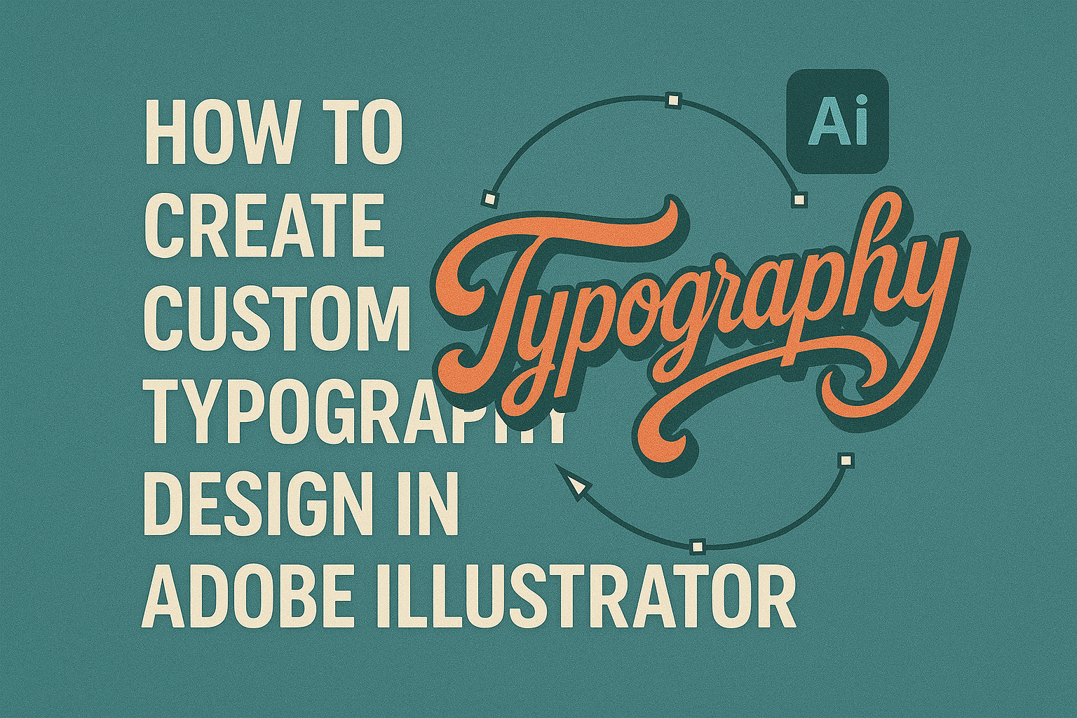
Creating custom typography design in Adobe Illustrator can open up a world of creativity. It’s the perfect way to make your words stand out, giving them unique style and flair. By using tools like the Pen tool and applying different font effects, anyone can transform plain text into eye-catching designs.
This personalized approach allows designers to express individuality and make content memorable. Whether someone is designing a logo or a poster, custom typography adds a special touch. Adobe Illustrator provides all the necessary tools to experiment and refine these artistic ideas.
Knowing how to effectively use tools such as the Type tool and drawing objects for captivating text plays a significant role in creating unique designs. With practice, even beginners can master the art of custom typography and elevate their design skills.
Understanding Typography in Graphic Design
Typography in graphic design is both an art and a science. It shapes how messages are perceived and plays a crucial role in visual communication. Important areas include the role of typography, its impact on branding, and the selection of appropriate fonts for different projects.
The Role of Typography
Typography greatly influences how a design is received. It isn’t just about making words readable—it involves setting the right mood and guiding the viewer’s emotions. Typography brings life to content by affecting how the message is interpreted. Good typography helps establish hierarchy, leading the reader through important information in the right order.
Designers often consider size, spacing, and color to make typography effective. These elements work together to ensure the text is not only legible but also engaging. In doing so, typography can either enhance or hinder communication, making it an essential part of any design project.
Typography and Branding
Typography is vital for creating a brand’s identity. The choice of fonts can tell a lot about a brand’s personality and values. For instance, a brand aiming for a traditional image might use classic serif fonts, while a tech company may opt for sleek, modern sans-serif fonts.
The consistency of typography across various brand materials helps build recognition. When a brand uses the same font style in its logos, advertisements, and packaging, it becomes easier for consumers to identify it. This consistency is important for maintaining a strong and memorable brand presence.
Choosing the Right Font
Selecting the correct font is an important task in creating engaging designs. Fonts come in various styles, such as serif, sans-serif, and display, each suited for different purposes. Serif fonts are often seen as formal or traditional, making them great for print media. Sans-serif fonts are clean and modern, suitable for digital platforms.
Designers must also consider readability. A font may look visually appealing but can become a problem if it’s hard to read. Experimenting with different font combinations can help find the perfect match that fits the mood and message of the project.
Getting Started with Adobe Illustrator
Adobe Illustrator is a powerful tool for creating custom typography designs. To start, it’s important to understand how to navigate the interface, set up your document properly, and use essential tools for creating stunning typography.
Navigating the Interface
Navigating Adobe Illustrator can feel overwhelming, but breaking it down helps. The menu bar at the top provides options like File and Edit. The Tools panel on the left holds commonly used tools such as the Pen, Type, and Shape tools.
On the right, the Properties panel adjusts your design elements. Exploring the Layers panel is crucial too, as it organizes components within your artwork. Take time to explore these panels, and use the Workspace Layout option under the Window menu to customize the layout that works best.
Setting Up Your Document
Before diving into design, setting up your document correctly is essential. When creating a new file, select the New Document option from the File menu. Here, choose your desired dimensions and units. For typography, consider starting with letter or A4 size.
Adjust the artboards depending on how many styles you plan to create. Always choose CMYK for print and RGB for digital designs to ensure color accuracy. Using the Advanced Options, set the Raster Effects to High (300ppi) for better output quality.
Essential Tools for Typography
Creating beautiful typography requires specific tools. The Type tool lets you add and edit text effortlessly. With the Character panel, you can modify font, size, and spacing. Explore different fonts and typography effects for unique designs.
The Pen tool is vital for custom paths and shapes, allowing more control over your typography layouts. Use the Align panel to ensure everything is precisely positioned. Experiment with the Gradient and Color Swatch panels to apply color fills that enhance your designs. Regularly practicing with these tools helps create more polished and creative typographic pieces.
Creating Basic Text Elements
Creating custom typography designs in Adobe Illustrator involves adding, formatting, and organizing text within your design. This process ensures that your text is not only visually appealing but also well-structured.
Adding Text to Your Design
To begin, select the Type tool from the toolbar. Click anywhere on the canvas to create a point of origin for your text. Then, type out the desired words or phrases.
Choosing the right font is crucial. Adobe Illustrator offers a wide range of fonts to fit any style. For a more personalized touch, you might explore additional fonts available through Adobe Fonts. Experimenting with different fonts will help you find one that perfectly complements your design.
Formatting Your Text
Once your text is added, you can adjust its appearance using the Character panel. This tool allows you to modify font size, style, and spacing. Adjusting these attributes helps in achieving the desired aesthetic.
To make your text stand out, consider using different styles like bold or italic. Another useful feature is the ability to adjust kerning, which can enhance readability. You can also apply colors to your text or outline it to add depth and contrast to your design.
Working with Text Boxes
Text boxes help in controlling the layout of your text. They keep your typography clean and organized. To create a text box, click and drag with the Type tool to define the area where your text will appear.
After creating a text box, adjust its size to accommodate the text without overcrowding. This practice ensures that your text remains legible and visually appealing.
Linking multiple text boxes can be useful for longer passages of text, allowing content to flow seamlessly from one box to another. This technique is handy for projects where text alignment and consistency are key, like brochures or multi-page documents.
Customizing Your Typography
Creating custom typography in Adobe Illustrator involves fine-tuning various elements to make text unique and visually appealing. Key aspects include adjusting letter spacing, utilizing typographical styles, and applying effects to enhance the text.
Adjusting Letter Spacing
Letter spacing, or kerning, is crucial for readability and aesthetics. In Adobe Illustrator, users can adjust this spacing by selecting the text with the Type tool and modifying the kerning in the Character panel.
Proper kerning ensures that letters are neither too close nor too far apart, which improves clarity. Users can also utilize the “Optical” setting for automatic adjustments or manually input values for precise control.
When customizing, it’s important to consider the text’s purpose and medium. A logo may require tighter spacing, while body text often benefits from more generous spacing to ensure legibility.
Utilizing Typographical Styles
Typographical styles in Illustrator offer a wide range of options to enhance text appearance. These styles include using various fonts, weights, and alignments. Users can choose from preset styles or create custom ones to fit specific design needs.
To apply or create a style, the Character panel is used to adjust font weight, size, and color. Illustrator allows for the easy creation of sophisticated designs by layering styles. It’s important to maintain consistency in style choices to reinforce brand identity or convey the intended message effectively.
Applying Effects to Text
Effects in Adobe Illustrator can transform simple text into eye-catching designs. The “Effect” menu offers options like 3D, warp, and shadow effects to add depth and dimension.
To apply an effect, select the text and choose the desired option from the menu. For example, the 3D Extrude & Bevel effect gives text a three-dimensional look, while shadow effects can create a sense of realism and depth.
It’s crucial to use effects sparingly, as overdoing them can make text hard to read. The goal is to highlight the text while maintaining clarity and making the design unique and engaging.
Advanced Typography Techniques
In Adobe Illustrator, mastering advanced typography can elevate designs by allowing text to seamlessly blend with graphic elements. Exploring techniques like creating outlines, using the Pathfinder tool, and integrating text with images can transform ordinary text into eye-catching visuals.
Creating Outlines from Text
Creating outlines from text is an essential skill for customizing typography. Outlining text transforms characters into editable shapes. This means designers can alter individual letters without affecting the font properties.
To create outlines, start by selecting the text with the Type Tool. Then, navigate to the Type menu and choose Create Outlines. Once converted, each letter becomes an independent vector shape, allowing for manual adjustments using the Anchor Point Tool. Designers often use this technique to create unique logos or custom fonts.
Outlining also ensures that text appears the same across different devices, as it is now a vector graphic. This process is especially useful when sharing files with clients or other designers who may not have the same fonts installed.
Using the Pathfinder Tool
The Pathfinder tool is invaluable for combining text shapes and other graphic elements. It allows designers to merge, subtract, and intersect shapes, creating complex typography effects.
To use the Pathfinder tool, first create text outlines. Then, with the shapes selected, open the Pathfinder Panel. Use options like Unite to merge different elements or Minus Front to cut out shapes. This tool is vital for creating intricate designs where text interacts seamlessly with other graphics.
It’s a favorite for those wanting to incorporate text with abstract shapes without compromising design integrity. By mastering the Pathfinder tool, designers can achieve more dynamic compositions that enhance visual appeal.
Integrating Text with Images
Integrating text with images adds depth and interest to designs. Adobe Illustrator offers several ways to achieve this effect, such as using clipping masks and opacity settings.
Begin by placing an image on the artboard and typing the desired text. Convert the text to outlines, then position it over the image. Select both the text and image, and apply a Clipping Mask through the Object menu.
This integration technique creates the illusion of text within an image, making it perfect for posters and cover designs. Adjusting layer opacity and blending modes can further enhance the interaction between text and imagery, resulting in engaging and harmonious designs.
Fine-Tuning Your Design
When creating custom typography in Adobe Illustrator, attention to detail can make your design stand out. Key aspects such as aligning text elements, establishing hierarchy and readability, and applying color theory are crucial.
Aligning Text Elements
Aligning text elements properly ensures a clean and organized design. Use Illustrator’s alignment tools to adjust text placement accurately. Both vertical and horizontal alignments help maintain a balanced look. Grids and guides can assist in aligning different text sections.
Creating symmetry or intentional asymmetry within your design enhances its visual appeal. Consistent spacing between letters, known as kerning, also impacts the overall harmony of the typography. Spending time on these details results in a polished, professional look that communicates the intended message effectively.
Hierarchy and Readability
Establishing a clear hierarchy in typography guides the viewer’s eye through the content effectively. Use different font sizes, weights, and styles to create visual interest. Headlines should be larger or bolder, making them stand out as the main focus.
Readability is another priority. Choose fonts that are easy to read at different sizes. Stay mindful of line spacing or leading, as it affects how comfortably text can be read. Avoid overcrowding elements as it can distract and overwhelm readers, detracting from your message.
Color Theory in Typography
Color plays a significant role in typography. It can evoke emotions and convey meaning. Selecting the right color palette enhances the impact of your design. Use contrasts like light text on a dark background, or vice versa, to improve text visibility.
Complementary colors can create harmony, while contrasting ones add energy and draw attention. Be sure to consider color psychology to align with the mood or theme of your design. Tools within Illustrator help in previewing how different color combinations work together, ensuring the final result is both striking and cohesive.
Preparing for Export
When preparing to export your custom typography design in Adobe Illustrator, it’s important to finalize your design, choose the right file format, and properly export your work. These steps ensure that your typography looks great and can be used in a variety of applications.
Finalizing Your Design
Before exporting, double-check your design. Make sure all elements are aligned and spaced properly. It’s helpful to zoom in and inspect details to catch small errors in shapes or text.
Ensure that each text element is correctly outlined if needed. Outlining is a process that turns your text into a graphic object, which is crucial if you’re sending the file to others who may not have the same fonts installed.
Lock or hide layers that don’t need adjustments. By doing this, you simplify the design and reduce the chance of accidental changes as you prepare for final export. It also makes the document cleaner, especially if others will use the file in the future.
Choosing the Right File Format
Selecting the right file format depends on your needs. If you’re printing, consider formats like PDF or EPS for high-quality results. These formats preserve vector data, ensuring your typography maintains crisp lines and colors.
For web use, go for SVG or PNG. SVG keeps the scalability and quality intact, ideal for online graphics that might change size. PNG is a solid choice if your design includes transparency or will be used in a digital-only format.
If exporting for video or other multimedia, you might save in formats like JPEG if a raster image is required. Yet, always keep a master file in vector format for any future edits or changes.
Exporting Your Typography Design
When you’re ready to export, the process begins with setting your artboard correctly. Ensuring that the artboard matches your design’s dimensions prevents unwanted cropping or scaling issues.
Navigate to the Export function in Illustrator. Depending on your version, you might use “Export As” or “Save As” options. Here, you can select the format chosen earlier and set additional preferences, like resolution for raster exports.
Check the advanced settings for each format. Options like compression for JPEGs or transparency for PNGs can greatly affect the final output. Adjust according to the final use case, ensuring the design looks its best.