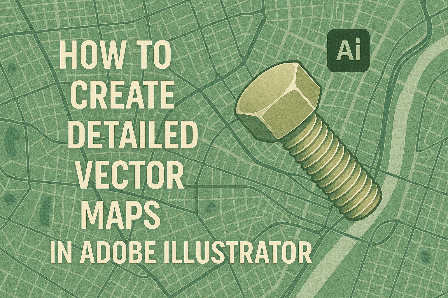
Creating vector maps in Adobe Illustrator can be a rewarding skill, especially for those interested in design and geography. Adobe Illustrator allows users to combine shapes, text, and symbols to produce detailed digital maps. These maps are versatile and can be used in various projects, from architecture to infographics.
For those new to the process, starting with a clear plan and organized layers is essential. This not only makes the creation process smoother but also ensures the map is easy to edit and update. Plus, using Illustrator’s tools effectively can result in clean and precise designs that reflect your unique style.
Engaging with resources and tutorials can significantly boost learning and creativity. Exploring tutorials that show how to add labels, adjust layers, and incorporate different elements can be particularly helpful. Understanding these basics can transform a simple map into a detailed and functional artwork.
Understanding Vector Graphics
Vector graphics are essential for creating detailed and scalable map illustrations. They offer unmatched clarity and flexibility, which is crucial for both digital and printed maps.
Benefits of Vector Graphics for Maps
Vector graphics provide several benefits when designing maps. One major advantage is their scalability. Unlike other formats, vectors can be resized without losing image quality, ensuring maps remain sharp at any size. This makes them ideal for projects that require diverse display sizes, from small brochures to large posters.
Vectors are also easy to edit. Designers can change colors, shapes, and lines quickly, making it easier to update and customize maps. This flexibility is important for projects needing regular updates or adaptations for various audiences.
Maps often require precise detailing. Vectors allow designers to focus on intricate aspects like borders, landmarks, and paths with accuracy. This precision ensures users can interpret the map details effectively.
Vector vs. Raster Graphics
Vector and raster graphics are different tools for artists and designers. Vectors use mathematical equations to create images, allowing them to scale infinitely without losing clarity. This makes them perfect for maps that need clear lines and labels.
Raster graphics, in contrast, are made up of pixels. Zooming in can show pixelation, reducing clarity. While rasters are great for detailed, high-color images, they fall short for maps requiring detail at varying sizes.
File size is another consideration. Vector files are often smaller than raster files because they only store data about points and paths, not every individual pixel. This can make vectors more efficient for sharing and storing maps.
Setting Up Your Adobe Illustrator Workspace
Creating detailed vector maps requires an efficient workspace in Adobe Illustrator. Having a well-organized setup can make your design process smoother and more enjoyable. Pay attention to document settings and familiarize yourself with the interface and helpful shortcuts.
Choosing the Right Document Settings
Starting with the right document settings is crucial. Begin by selecting the appropriate size for your map. If unsure, you can always resize later, but it’s good to have a starting point that fits your project.
Choose a color mode that suits your needs. CMYK is often used for print, while RGB is best for digital display. Be mindful of the units you are working with, such as inches or pixels, which can affect your design precision.
Proper organization of layers is also important. It allows you to manage different elements of your map easily, from roads to geographic features, making editing simpler. Remember to save your document frequently to avoid losing your work.
Navigating the Interface
Understanding the Adobe Illustrator interface can greatly enhance your workflow. Familiarize yourself with the essential panels: Layers, Tools, and Properties. Use the Home tab to access tutorials and tips.
Toolbars can be customized for quick access to commonly used tools. Arranging panels in a way that suits your working style can improve efficiency. You can dock, stack, or float panels as needed.
Consider using multiple artboards if your project involves various components. This keeps everything in one file without cluttering your view. Also, mastering zoom and pan controls helps you navigate complex designs with ease.
Useful Shortcuts and Tools
Using shortcuts can save you time and effort. Memorizing basic shortcuts like Ctrl+Z for undo, Ctrl+C for copy, and Ctrl+V for paste streamlines your workflow. Adobe Illustrator offers many more commands that can boost productivity.
The Selection Tool (V) helps in moving and adjusting items quickly. The Direct Selection Tool (A) is useful for editing anchor points and paths, which is essential in map detailing.
Explore the Pathfinder panel for complex shapes and the Pen Tool for custom paths. The Eyedropper Tool is perfect for matching colors across different elements, and the Rotate Tool helps in orienting map elements accurately.
Gathering Your Map Resources
To create a detailed vector map in Adobe Illustrator, it’s important to gather accurate materials and data. This ensures precision and quality in the final product. Here, we’ll explore how to find reliable reference maps and import geographic data effectively.
Finding Accurate Reference Material
When starting a map project, having accurate reference material is crucial. Look for authoritative and well-detailed maps. Libraries or official government sites often provide reliable geographic information.
Online resources like GIS databases also offer extensive information. Websites like OpenStreetMap allow users to access and download up-to-date maps.
Physical maps can be useful, too. Atlases or topographical maps might provide the level of detail needed. Use a variety of sources to ensure comprehensive information, which will improve accuracy and visual appeal in Illustrator.
Importing Geographic Data
After gathering reference materials, the next step is importing geographic data into Adobe Illustrator. First, ensure the data format is compatible. Essential formats include SVG, PDF, or AI files, which retain vector details.
OpenStreetMap data can be imported efficiently using specialized tools. These tools often convert map data into Adobe Illustrator-friendly formats. For step-by-step guidance, users can refer to tutorials like this one on importing OpenStreetMap data to Illustrator.
Import your chosen data by going to File > Place in Illustrator. Organize layers and elements to keep your map clear and editable. Proper data setup in Illustrator is key to a successful and detailed vector map.
Drawing the Map Base
Creating a detailed vector map in Adobe Illustrator starts with a solid base. This involves setting up layers for different elements, using tracing techniques to outline the main features, and applying brushes and symbols to enhance clarity and detail.
Creating Layers for Organization
Layers are essential for organizing complex maps. They allow the user to separate different elements, like roads and buildings. By keeping these components on separate layers, it becomes easier to manage and edit them individually.
To create layers, navigate to the Layers panel and click the “Create New Layer” icon. Name each layer according to its content for clear organization. For example, you might have layers titled “Roads”, “Parks”, and “Labels”.
This approach not only increases efficiency but also reduces the risk of errors when editing. It helps in locking layers, preventing accidental changes.
Tracing Outline Techniques
Tracing forms the backbone of a custom map. First, import a map reference image into Illustrator. Use the Pen Tool (P) to draw paths along significant structures. It’s crucial to zoom in for precision when dealing with intricate areas.
The Image Trace feature can automate parts of this process. This tool converts a raster image into paths, making it easier to edit. Adjust settings under the Tracing Options to achieve the desired balance between detail and clarity.
Through these techniques, users can create accurate outlines that serve as guides for further detailing.
Utilizing Brushes and Symbols
Brushes and symbols enhance the map’s visual appeal and functionality. They offer quick ways to apply design elements consistently across the map.
For instance, Pattern Brushes can create detailed road patterns, while Art Brushes might be used for rivers or boundaries. Users can find these under the Brushes panel, and custom brushes can also be created to fit unique needs.
Symbols simplify repetitive elements, such as icons for landmarks. Create a symbol by selecting an object and choosing New Symbol in the Symbols panel. This allows easy updates to all instances with a single edit.
Utilizing these tools helps maintain a neat and attractive map design throughout the process.
Adding Map Details
Adding details to a map in Adobe Illustrator involves illustrating roads and paths, defining regions using colors and patterns, and marking points of interest. Each of these steps brings more clarity and depth, enhancing the map’s usefulness for its intended audience. With these techniques, the map becomes more engaging and informative.
Illustrating Roads and Paths
To illustrate roads and paths effectively, it’s important to use the Pen Tool in Illustrator. By clicking and dragging, one can easily trace over imported map paths. This helps in creating accurate vector lines. Using different stroke weights can represent various road types, such as highways or local streets.
Adding dashed lines can indicate paths or trails. Group similar paths together for easy management. A layer hierarchy lets users toggle visibility, streamlining adjustments. Utilize the Eyedropper Tool to maintain color consistency, ensuring road color matches the map’s style.
Defining Regions with Colors and Patterns
Defining map regions with colors and patterns enhances differentiation. Select regions using the Polygonal Lasso Tool to isolate areas like parks or residential zones. Applying solid colors can help in identifying distinct regions effectively.
Patterns are perfect for highlighting specific locations. For example, a series of diagonal lines might indicate a forested area. To use patterns, create a new swatch and apply it to the desired region. It’s important to balance pattern use so the map remains clear and easy to read.
Marking Points of Interest
Points of interest add essential information to a map. Use simple shapes, like circles or squares, to mark these spots. This might include landmarks, restaurants, or other notable locations. Ensure each point is clearly visible by choosing contrasting colors.
Icons add visual meaning and can be selected from Illustrator’s built-in libraries or created manually. Position them accurately using layers to organize points separately. To keep the map user-friendly, add small labels next to each point. Use the Type Tool for this task, and select a readable font that fits the map’s overall design.
Styling Your Map
Giving your map a unique style in Adobe Illustrator can make it stand out. It involves adding textures, choosing the right colors, and picking suitable fonts to enhance aesthetics and readability.
Applying Textures for Visual Interest
Textures can add depth and dimension to a map. Using layer effects like grain or noise can create a tactile feel. Patterns such as hatching or stippling offer variety and can highlight specific areas.
Adobe Illustrator allows easy integration of texture files. They can be applied as overlays or within shapes to enhance different regions. Textures should be subtle enough to not distract but noticeable enough to create interest.
Experimentation is key. Trying different combinations helps in finding a style that suits the map’s theme and purpose.
Choosing Color Palettes
Color palettes influence the overall mood and legibility of a map. Choosing colors that contrast well is essential for clarity. Shades of blue and green often work well for natural features such as water bodies or forests.
Adobe Illustrator provides tools like the Color Guide for selecting harmonious colors. Using color gradients can show depth or elevation, adding more detail to the map.
Avoid using too many colors. A limited palette can create a more professional and cohesive look while ensuring important information stands out.
Working with Typography
Typography plays a crucial role in conveying information clearly. Font choice should reflect the map’s tone and serve its functionality. Sans serif fonts are often clearer for labels and small text.
Text placement is also important. Labels should be placed where they don’t obstruct map details but are still easy to spot. Using hierarchy, such as larger font sizes for important areas, helps readers navigate the map efficiently.
Illustrator’s text tools allow customization of font size, style, and formatting to fit different map elements. Ensuring text is legible at different sizes ensures versatility across various display mediums.
Finalizing and Exporting the Map
When creating detailed vector maps in Adobe Illustrator, it is important to ensure the map is error-free before exporting. Understanding various export formats helps maintain design quality.
Checking for Errors
Before exporting, designers should check their maps for any errors. This involves verifying that all paths are aligned and labels are correct. Using Illustrator’s Outline Mode can help identify misplaced objects or overlaps.
Ensuring that all layers are labeled appropriately makes future edits easier. Labels should be clear and consistent throughout the map to maintain readability. It’s also wise to double-check that any custom styles applied are consistent. This prevents parts of the map from looking out of place.
Review the use of colors in the design and ensure that they match the intended output. Often, colors may appear differently on screen compared to print, so performing a test print can be beneficial.
Export Formats and Best Practices
There are several export formats suitable for vector maps. The Adobe Illustrator (AI) format retains all editing capabilities and is ideal for further modifications. Vector-based PDFs are efficient for sharing and easy to print without losing quality.
SVG files offer versatility for web use, ensuring sharpness across all devices. When exporting, checking the settings like resolution and compression ensures high-quality results. Using multiple formats allows designers to cater to different platforms, whether digital or print.
For presentation, high-resolution JPG or PNG files are relevant, though they lose some scalability. Balancing file size with detail level is crucial, especially for web usage, to maintain performance while preserving clarity.