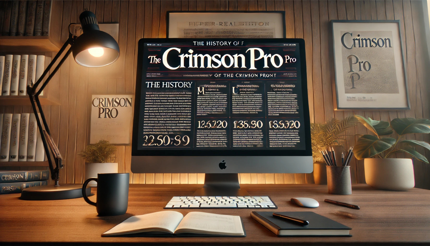
Crimson Pro is more than just a font; it’s a modern take on classic typography. Designed by Jacques Le Bailly, Crimson Pro brings a contemporary twist to old-style typefaces. The font combines elegance with readability, making it perfect for books and long-form texts. Originating as a redesign of the original Crimson Text, Crimson Pro continues …
Font Tutorials
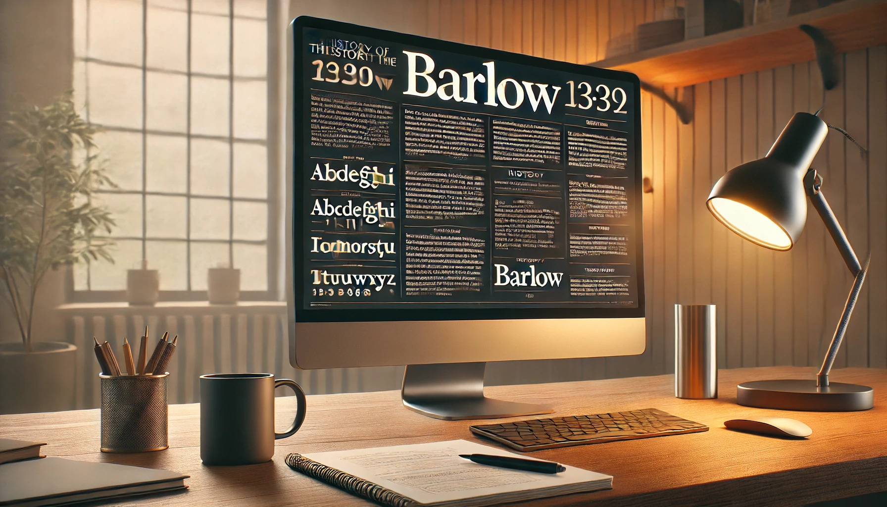
Barlow is a unique typeface that draws inspiration from the visual elements found in California’s public design. From the simple elegance of highway signs to the structured look of car plates, Barlow brings a touch of California’s style into the digital world. Designed by Jeremy Tribby, this font captures the spirit of the Golden State …
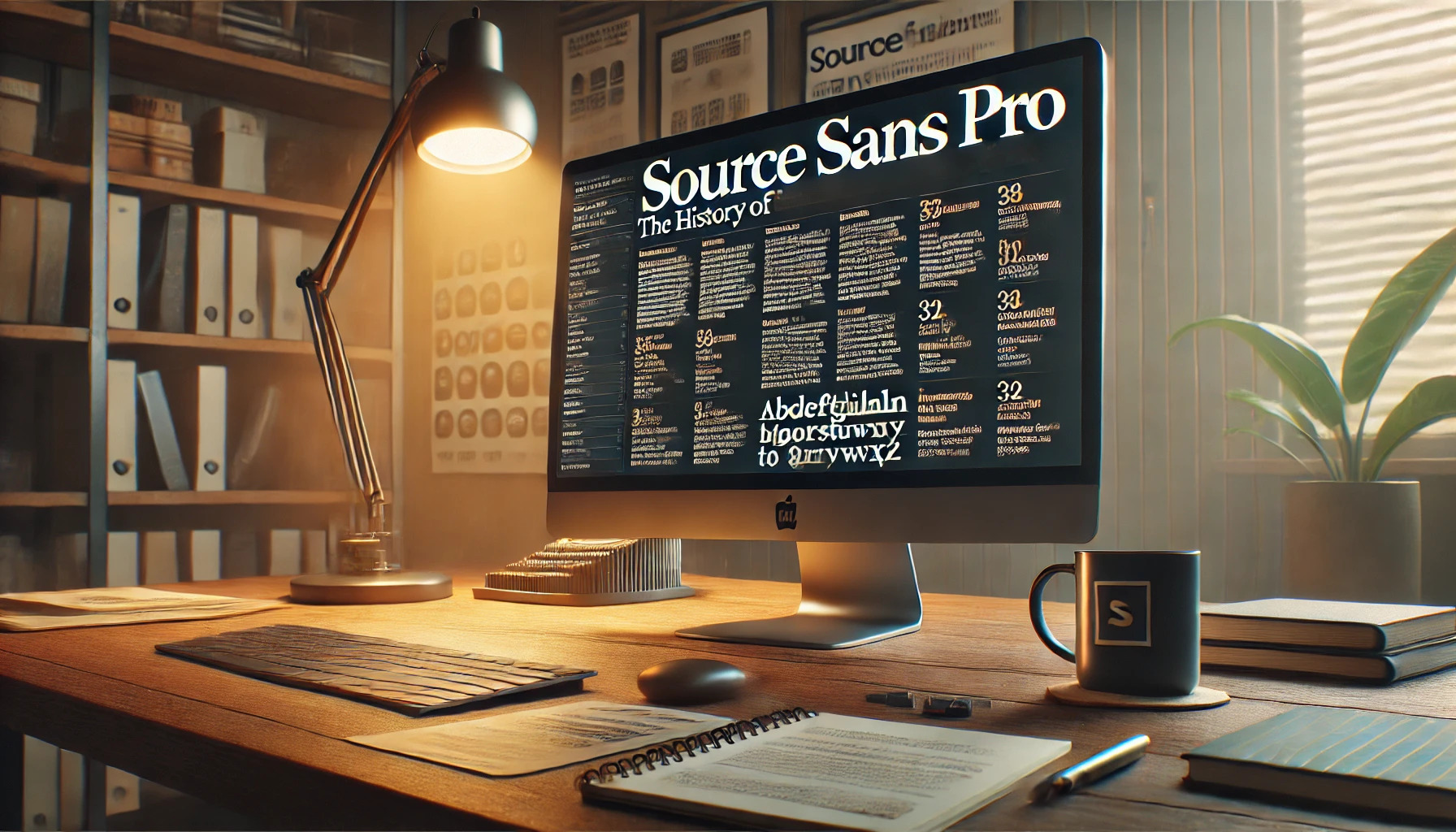
Source Sans Pro is a font with an interesting story. Created by Paul D. Hunt, this sans serif typeface was the first open-source project from Adobe. Its design takes inspiration from classic American type styles, making it both modern and versatile. This font is especially prized for its clarity and readability in user interfaces. It …

Carter One is a playful and vibrant font that brings a touch of nostalgia to modern design. It’s inspired by the casual typeforms of the mid-20th century, often seen on advertising or pulp fiction book covers. This gives the font its retro charm and unique appeal. Created by designer Vernon Adams, Carter One is a …
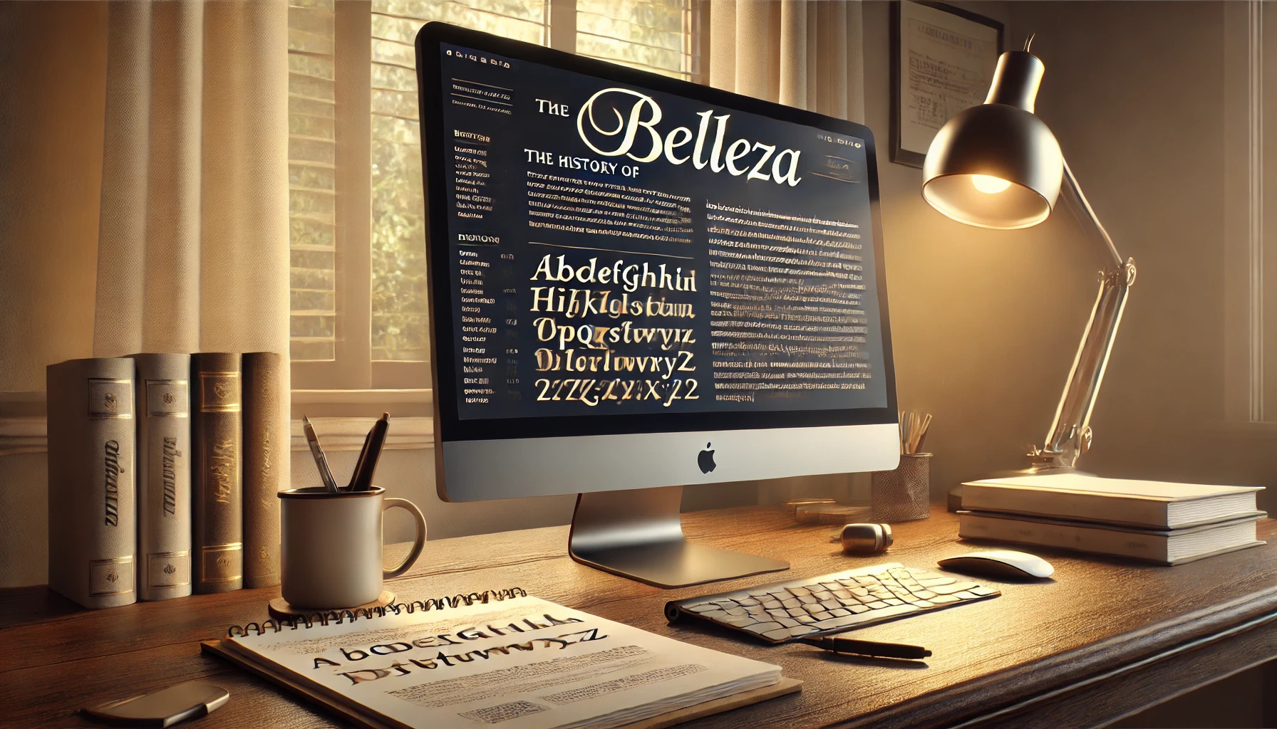
Belleza is a font that brings elegance and sophistication to its design. Created by Eduardo Tunni, it is inspired by fashion and a desire to capture beauty and grace in type form. Belleza’s classic proportions and high contrast make it a favorite for those looking to add a touch of elegance to their projects. This …
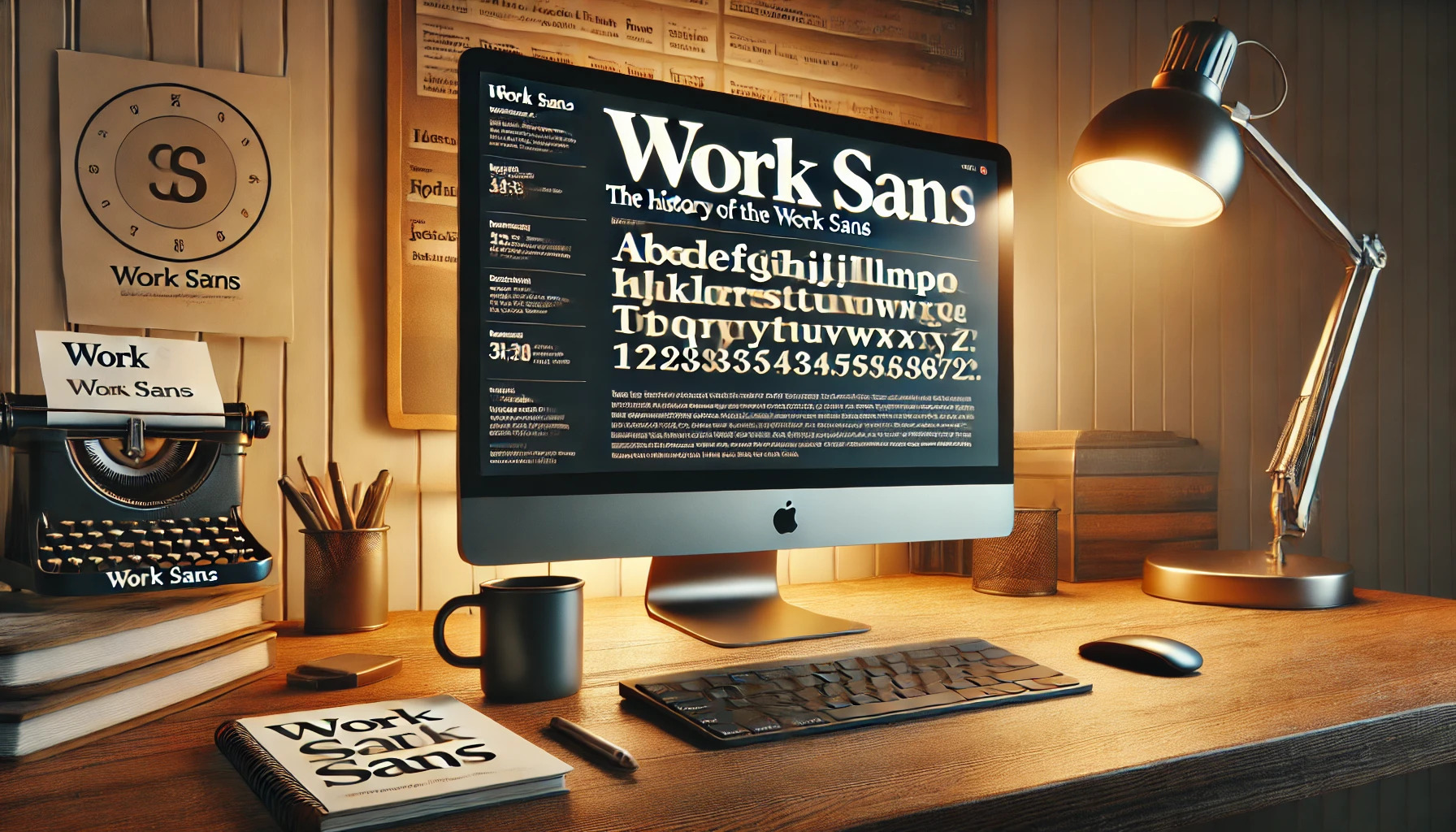
Work Sans is a modern sans-serif typeface that has captured the interest of designers around the world. It is inspired by early grotesque typefaces, giving it a unique mix of geometric and humanist elements. These qualities make Work Sans suitable for both digital and print applications, offering versatility in design projects. Initially released in 2015, …
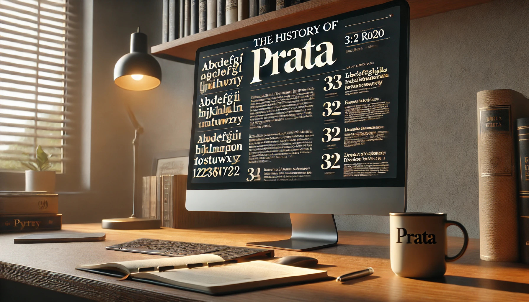
Prata is a typeface that stands out with its elegance and timeless charm. Designed by Ivan Petrov, Prata combines sharp features with organic teardrops to create a unique and sophisticated look. This font is inspired by Didone typefaces, known for their high contrast between thick and thin strokes. The triangular serifs and teardrop-shaped terminals give …
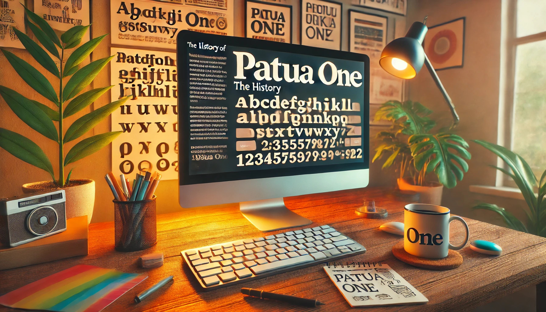
Patua One is a distinctive slab serif font with a rich history that began with its release in 2012. Inspired by early 20th-century advertising typography, it stands out with its low contrast and bold, blocky serifs. What makes Patua One unique is its ability to create visual impact even at small sizes, thanks to its …
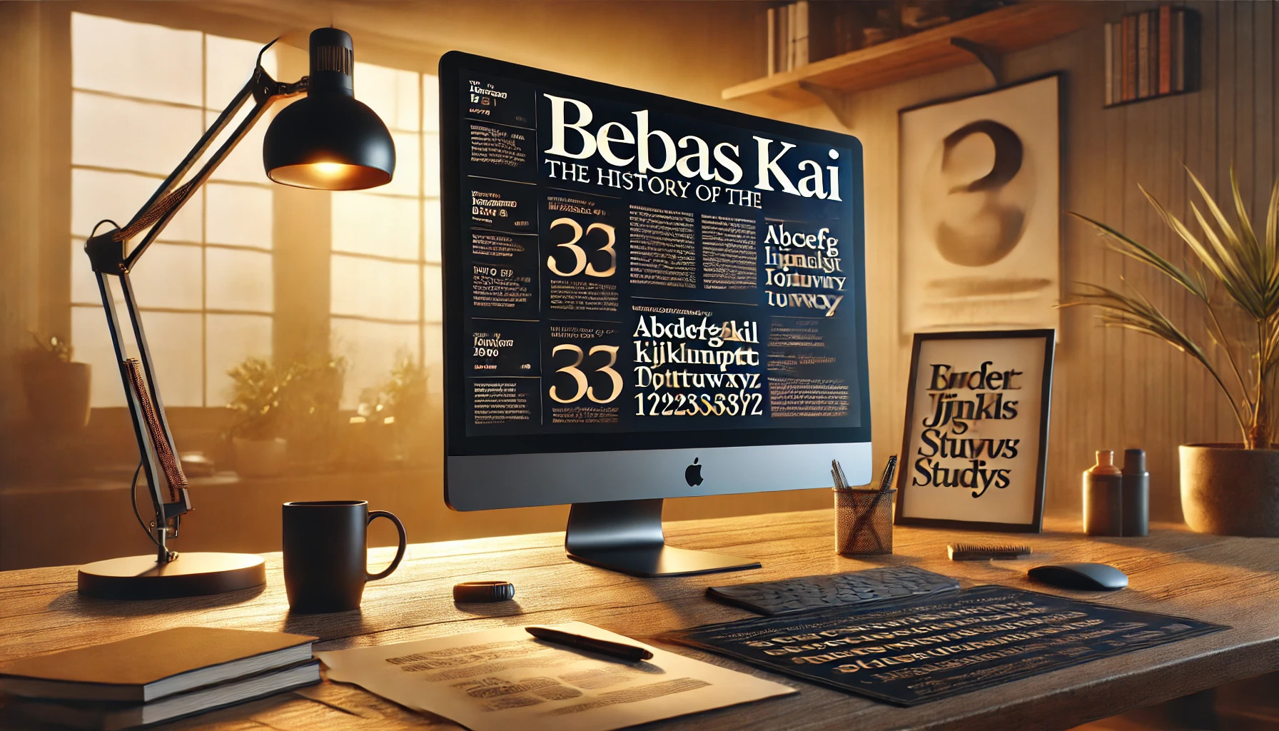
Bebas Kai, known for its clean and modern look, is a widely used font designed by Ryoichi Tsunekawa. This sans serif font offers versatility for both personal and commercial projects, making it a valuable resource for designers worldwide. It’s available through platforms like Adobe Fonts and Dafont, allowing users to access it easily. The history …
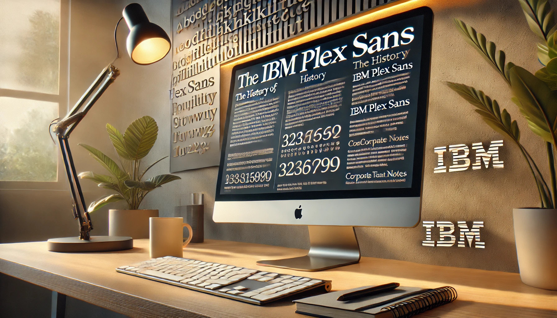
For a company as iconic as IBM, creating a typeface that reflects its values is no small task. IBM Plex Sans serves as a key part of this vision, embodying both history and modernity. The development of IBM Plex Sans was driven by a desire to capture IBM’s unique identity. This typeface is not just …