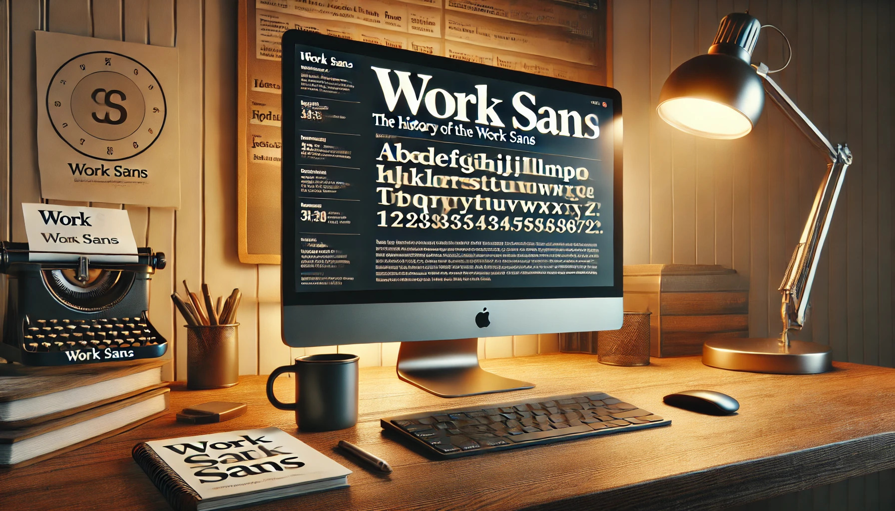
Work Sans is a modern sans-serif typeface that has captured the interest of designers around the world. It is inspired by early grotesque typefaces, giving it a unique mix of geometric and humanist elements. These qualities make Work Sans suitable for both digital and print applications, offering versatility in design projects.
Initially released in 2015, Work Sans has gained popularity for its clean and slightly playful design. The font’s adaptability is evident in its variety of styles and weights, which cater to different design needs. Designers appreciate how this font brings a fresh, contemporary feel to their projects.
Work Sans is available through platforms like Google Fonts and Adobe Fonts. This accessibility makes it easier for designers to incorporate the font into their work, enhancing their creative process. Whether for web design or printed materials, Work Sans offers a reliable choice with a modern twist.
Origins of Work Sans
Work Sans is a modern typeface inspired by early Grotesque designs. It offers versatility for both digital and print media. This section covers its design inspiration and the work of designer Wei Huang.
Inspiration Behind the Design
Work Sans draws inspiration from early Grotesque typefaces, notably those crafted by Stephenson Blake and Bauerschen Giesserei. These early fonts were known for their functional and straightforward design.
The early Grotesques provided a foundation for on-screen text optimization, essential for modern use. The design ensures clarity at multiple sizes and diverse weights, making it fitting for a variety of applications, such as web and desktop.
These inspirations help Work Sans maintain a clean, neutral appearance that doesn’t overshadow the content it supports. Perfect for projects demanding clarity and readability.
Designer Wei Huang
Wei Huang, an Australian-based designer, developed Work Sans. His goal was to create a typeface that worked effortlessly across digital platforms. Huang wanted to ensure that the typeface would be both practical and appealing, contributing to a seamless reader experience.
Huang’s awareness of digital design needs guided his choices in adapting traditional Grotesque elements for modern use. The result is a typeface that captures the essence of classic design while addressing current digital demands. Huang’s work showcases his ability to blend history with innovation, crafting Work Sans for today’s needs.
Design Philosophy
Work Sans is designed to offer a balance between modern style and practical usability. It stands out with its simplicity and focus on readability, making it a popular choice for both digital and print media.
Typeface Characteristics
Work Sans features simple and clear shapes. It draws inspiration from early 20th-century typefaces but updates these designs for today’s screens. The font includes a variety of weights, which allows designers to achieve different levels of emphasis and hierarchy in their work.
The typeface is further tailored for digital environments. It includes some modern tweaks, like larger diacritic marks, to ensure clarity on screens. This small but important detail enhances its usability in web design. The Google Fonts page notes that heavier weights are more suited for display use.
Readability and Legibility
Work Sans maintains high readability with its clean, uniform strokes. The design avoids ornate features, making it easy to read at various sizes. This characteristic suits it well for body text in web articles and print media.
Legibility is enhanced by thoughtful spacing and balancing of characters. The font ensures each letter is distinct, reducing eye strain during prolonged reading. The layout optimizes for both digital screens and print, adding to its versatility in different formats.
Development and Expansion
Work Sans is a versatile typeface that has grown significantly since its inception. Its development focused on creating a flexible font family with a comprehensive character set, making it highly adaptable for both print and digital use.
Font Family and Weights
The Work Sans family offers a range of weights, providing options from thin to bold. This flexibility makes it suitable for various design needs. Users can choose different styles to enhance readability and visual interest in projects.
Work Sans is rooted in early Grotesques, a style known for its clean lines. This connection to historical typefaces gives it a blend of tradition and modernity. This makes it a preferred choice for projects that require a crisp and professional look.
Character Set and Glyphs
This typeface includes an extensive character set, allowing for use in a wide range of languages and applications. It supports Latin scripts and has a substantial collection of glyphs. This is beneficial for designers working on international projects.
The attention to detail in its design ensures each glyph is optimized for clarity on screens. The bold variants retain their integrity even at smaller sizes, maintaining legibility. This adaptiveness makes Work Sans a reliable choice for digital applications where clarity is crucial.
Usage of Work Sans
Work Sans has gained popularity for its versatility and ability to adapt to different needs. It is often used in web design and corporate branding due to its clean appearance and readability.
Popularity in Digital Media
In digital media, Work Sans is widely favored for its on-screen readability. This typeface family is designed to work well in various sizes, especially from 14px to 48px, making it suitable for both body text and headings. Its origins from early Grotesque typefaces contribute to its unique style, making it a popular choice for creating modern and engaging digital content. Many designers use this font for websites and apps due to its flexibility.
Work Sans is also available for free under the Open Font License, encouraging widespread use in different projects. This accessibility further bolsters its presence in the digital space, allowing designers to easily integrate it into their projects. The font’s optimization for medium-sized text enhances its role in providing a seamless user experience.
Branding and Visual Identity
For branding, Work Sans is particularly effective in conveying a clean and modern image. Brands often choose this typeface for its ability to maintain clarity and personality across various print and digital media. It offers a range of weights that can be used to create strong visual hierarchies, critical for effective branding and messaging.
The font family’s slightly playful feel in heavier weights adds character to brand identities without losing professionalism. When combined with its strong readability, this makes Work Sans a reliable choice for companies aiming to create a memorable visual identity. Its broad range of styles and open license allow brands to experiment and adapt the font to their unique requirements, enhancing their overall image.
Technical Aspects
Work Sans is a versatile font designed for both screen and print. It offers various file formats for wide compatibility and boasts efficient webfont performance.
File Formats and Compatibility
Work Sans is available in multiple file formats to ensure it works across different platforms and devices. Popular formats include TrueType (TTF) and OpenType (OTF), which are widely supported in most software applications. These formats allow for scalable designs, maintaining clarity and detail at any size.
For web usage, Web Open Font Format (WOFF and WOFF2) versions are commonly used. These formats are optimized for fast loading on web pages, providing efficient performance while maintaining quality. The range of formats ensures that designers can use Work Sans in both digital and print media without compatibility issues.
Webfont Performance
Efficiency and speed are critical for webfonts, and Work Sans performs well in this area. The font’s design minimizes file size, which helps in faster loading times on websites. This is achieved by optimizing the weight and size of characters used on the site, so only necessary elements are loaded.
The typeface is meant for medium-size text (14px-48px), which is ideal for various screen sizes and resolutions. As a result, Work Sans adapts to different devices without sacrificing readability, making it a great choice for web designers. The focus on performance means users can enjoy smooth and responsive text on any platform.
Access and Licensing
Work Sans is a widely-used sans serif typeface that’s easy to access. It is available through several platforms like Adobe Fonts for both web and desktop use. This accessibility allows designers and businesses to easily integrate it into their projects.
The font is licensed under the Open Font License (OFL), which provides flexibility. It allows users to use, modify, and distribute the font without needing to pay fees. This makes it a popular choice for both personal and commercial projects.
Key features of the Open Font License (OFL):
- Free to use for personal and commercial purposes
- Permission to modify and customize the font
- Allows users to embed the font in documents or software
- Users must share the font with the same license if they distribute it
For designers interested in embedding this font into websites, the Open Font License permits this functionality. Users can also find multiple styles of Work Sans available, enhancing its versatility in different design contexts.
The clear guidelines and open nature of the license make Work Sans an approachable option for those seeking both creativity and simplicity.
Updates and Version History
Work Sans has seen a series of updates since its initial release in 2015. Designed for both display and print usage, its updates often enhance readability and versatility.
2015: The first version of Work Sans was introduced. It was inspired by early grotesque typefaces, blending geometric forms with humanist touches.
2018: Updates were made to improve screen readability. Diacritic marks were enlarged for better legibility at digital resolutions.
2021: Adjustments were made for broader compatibility in digital and print formats. This made it easier to use across various platforms.
Work Sans offers several variations optimized for different uses. A desktop-optimized version is available on the Work Sans GitHub project page.
There’s also a focus on simplifying the font features while keeping them effective for both digital and print environments.
Feedback from users has driven many updates. This feedback loop has helped refine its look and feel, ensuring that the font stays relevant and user-friendly.
With each update, Work Sans continues to evolve, balancing aesthetic appeal with practicality. This makes it a reliable choice for designers and typographers.
Comparisons and Alternatives
Work Sans is a popular sans-serif typeface loved for its versatility. It’s often compared to other sans-serif fonts due to its clean and modern look.
A common alternative to Work Sans is Elaine Sans. It shares a similar geometric design, making it a good choice for designers seeking a comparable feel.
In terms of lighter weights, Work Sans Light mimics Work Sans with a slightly softer appearance. It works well for subtle, understated designs.
For those interested in more robust alternatives, POE Vetica New Light offers a similar weight and style. It fits well in projects where a professional yet approachable design is needed.
Here’s a quick list of alternatives:
- Elaine Sans
- Work Sans Light
- POE Vetica New Light
These fonts provide different nuances while keeping the core qualities that make Work Sans appealing.
Designers often select alternatives based on specific project needs. Some prefer the boldness and clarity of certain weights, while others might lean towards a more minimalist approach.
For anyone looking for inspiration, Typewolf offers great examples of Work Sans used in real-world designs. Additionally, Beautiful Web Type provides insight into the playful nature of Work Sans, especially at heavier weights.
Choosing the right font can transform the tone of a piece, so exploring these alternatives is key for anyone seeking the perfect fit for their design projects.
User Reviews and Feedback
Work Sans has found a warm reception among designers and typographers. It is praised for its versatility across both digital and print media. Many users appreciate its variety of weights, which provides flexibility in different projects.
In online discussions, users frequently mention its clean and modern aesthetic. Some note the slightly playful touch, particularly at heavier weights. This aspect makes it a popular choice for brands wanting a contemporary, friendly look.
Feedback often highlights its readability at medium sizes, making it suitable for web content. Users enjoy its design for its pleasant balance between geometric and humanist elements. This makes it a neat option for all sorts of creative and professional projects.
User Favorite Elements:
- Versatile Weights
- Modern Aesthetic
- Readable Sizes
In community discussions, such as on forums like Reddit, Work Sans is affectionately called “the bomb” by fans. They value its ability to fit various themes and styles, providing the right balance of formality and playfulness.