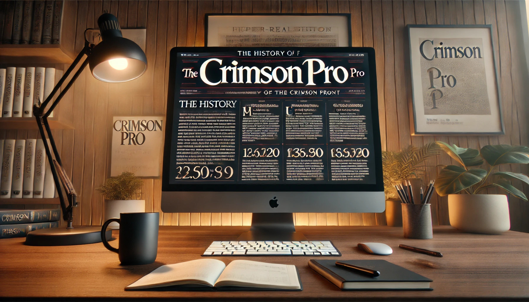
Crimson Pro is more than just a font; it’s a modern take on classic typography. Designed by Jacques Le Bailly, Crimson Pro brings a contemporary twist to old-style typefaces. The font combines elegance with readability, making it perfect for books and long-form texts.
Originating as a redesign of the original Crimson Text, Crimson Pro continues to serve the tradition of beautiful, classic typefaces. This font family, which includes multiple styles and weights, is inspired by the Garamond typeface. This makes it suitable for various editorial needs and online publications.
With its rounded and clear design, Crimson Pro has become a favorite among designers looking for a serif typeface. People can access it freely, as it is available under the SIL Open Font License. This accessible design choice ensures its popularity in digital and print formats.
Origins of Crimson Pro
Crimson Pro is a serif typeface that builds on traditional Garamond-inspired designs. It combines a classic look with modern functionality, allowing for usability in various media. The font first appeared as an open-source option, becoming popular for book publishing and academic texts due to its readability.
Design Philosophy
Crimson Pro was designed to offer a contemporary take on traditional serif fonts. Its main goal is to provide a clear and classic reading experience, making it suitable for long text formats like books and articles. The design maintains a balance between old-style charm and modern needs.
This typeface features rounded and open letters, improving the readability of texts significantly.
The font includes a range of weights, allowing for flexibility in design applications. It can be used in both Roman and Italic styles, providing designers with more options. The designers ensured that large counters and apertures make the characters easy to distinguish, even at smaller sizes. These attributes contribute to its effectiveness in various settings.
Creator Background
Sebastian Kosch is the mind behind Crimson Pro. He first developed the original Crimson Text in 2010. Kosch aimed to create a modern Garalde-style typeface. His work targets a balance between aesthetic beauty and practical functionality.
Kosch developed Crimson Pro, an update of his initial design. The decision to make it open-source supported widespread usage and adaptability. His passion for typographic excellence is evident through his thorough approach to font creation. This dedication to detail and accessibility has helped Crimson Pro gain popularity in numerous design and academic contexts.
Evolution of the Typeface
Crimson Pro is a serif typeface with a rich history. It has evolved from an initial release to become a popular choice for book publishing and academic texts due to its readability and classic design.
Initial Release
Crimson Pro emerged in 2010, crafted by designer Jacques Le Bailly. The font belongs to the old-style serif category, often called “Garalde” or “Old Style.” It was inspired by Garamond, a classic typeface known for its elegance and legibility. The aim was to create a typeface that was both free and open-source, allowing for widespread use without restrictions. At its inception, Crimson Pro focused on providing high-quality libre text fonts, filling a gap in the market for easily accessible, versatile typefaces.
Major Updates
Since its initial release, Crimson Pro has undergone significant updates to enhance its functionality and appeal. One major development was the introduction of variable fonts, which allows for more flexibility in design. Crimson Pro now includes a variable weight axis, enabling users to adjust the font’s weight dynamically to suit different design needs. This adaptability helps in maintaining visual consistency across various formats and sizes. Additionally, the typeface offers a range of weights and italics, expanding its versatility and usability.
Adoption and Use Cases
The adoption of Crimson Pro has been widespread, particularly in academic and editorial settings. Its clear and classic appearance makes it suitable for lengthy texts, such as books and research papers. Many designers also use it for websites that require a traditional yet fresh look. Crimson Pro’s readability and aesthetic qualities have made it a favored choice for projects that demand a sophisticated appearance. It remains a popular option within the design community, standing out for its blend of tradition and modernity.
Characteristics of Crimson Pro
Crimson Pro stands out with its rich font family, unique features, and high readability. This font is ideal for various uses, from textbooks to web content, offering flexibility and style.
Font Family
Crimson Pro is a versatile serif typeface, providing a wide range of styles. It includes eight weights, such as Light, Regular, and Bold. Each weight comes in both Roman and Italic forms. This versatility makes it suitable for different design needs, whether for headings or body text. As an open-source font, it offers flexibility for both personal and professional projects. Its design is inspired by classic typefaces, contributing to a timeless appeal. This feature ensures it remains popular in both print and digital media. More on this topic can be found on Google Fonts.
Distinctive Features
Several features make Crimson Pro unique. Inspired by the classic Garamond style, it aligns with the Garalde tradition, known for elegance. It exhibits a balance in weight distribution, which ensures visual harmony on the page. Large counters and apertures enhance character recognition. This detail aids designers in customizing titles and paragraphs, achieving a distinct look. Users can control the font appearance with variable font settings, adjusting axes like weight and width. These options allow for creating a personalized style, fitting various branding needs. This distinctive aspect of Crimson Pro is highlighted by FontForge.
Legibility and Readability
Crimson Pro’s design is crafted to maximize readability. Its cap height, along with large apertures, reduces visual clutter. This makes it easier to read even at smaller sizes, a crucial factor for lengthy texts such as books or articles. The design ensures characters are distinguishable, helping readers follow content smoothly. This quality makes it suitable for academic materials and editorial pieces. Its legibility remains consistent across different devices, supporting both digital and printed formats. This factor enhances its usability in various environments. Readers interested in this aspect can explore more through GitHub Pages.
Technical Specifications
Crimson Pro is a versatile serif typeface known for its readability and classic design. This section explores its available formats, licensing options, and language support to give users an understanding of its extensive features.
Font Formats
Crimson Pro is widely appreciated for its adaptability across different digital and print platforms. It is available as a variable font, which allows for adjustments in weight. This means designers can achieve a range of looks using a single font file, enhancing creative flexibility. The font also supports traditional styles like Roman and Italic, providing eight named weights. This variation also makes it suitable for various uses, from books to websites. For more info about its development and features, visit its GitHub Page.
Licensing
Crimson Pro is available as a free, open-source font under the SIL Open Font License. This licensing model encourages use in personal and commercial projects without worry about cost. Designers and developers alike benefit since it allows for modifications and redistribution. This freedom fosters innovation, enabling its use in a wide array of projects—from self-published eBooks to major editorial sites. Read more about free usage and modifications on FontForge.
Language Support
One of Crimson Pro’s advantages is its comprehensive language support. It covers a wide range of languages, making it useful for multilingual content. Its design includes full support for basic Latin and extended Latin character sets. This ensures clear communication in diverse languages, helping authors connect with a global audience seamlessly. These features make Crimson Pro particularly attractive for international publications. Find more details on its language capabilities at Google Fonts.
Cultural Impact and Reception
Crimson Pro has made a significant impression on the design world and users alike. It is praised for its readability, classic style, and versatility in various media.
In the Design Community
Designers have embraced Crimson Pro for its blend of traditional and contemporary features. As a serif typeface family inspired by Garamond, it is seen as a modern take on a classic style. Designers often use it for projects that require elegance and readability. Its adaptability to web and print environments is highly valued. This quality makes it suitable for a variety of projects, from editorial websites to book publications. Its open-source nature allows designers to customize and use it freely, boosting its popularity in creative fields. For more details on its design elements, Crimson Pro is featured on GitHub Pages.
User Feedback
Users appreciate Crimson Pro for its clear and aesthetically pleasing appearance. Its cap height and large counters contribute to its readability at smaller sizes, making it ideal for lengthy texts. Many users find it comforting to read, which enhances engagement, especially in academic and professional settings. The positive reception is reflected in its ongoing use in diverse settings, from educational materials to corporate documents. The typeface’s ability to maintain legibility and beauty ensures it remains a favored choice among both designers and readers, reflecting its enduring cultural impact.
Comparisons with Other Typefaces
Crimson Pro is a popular serif typeface known for its classic and readable style. When compared to other fonts, it stands out for its versatility and historical inspiration. This section explores typefaces with similar characteristics and some ideas for pairing Crimson Pro with other fonts for added effect.
Similar Fonts
Crimson Pro is often aligned with Garalde or Old Style typefaces like Garamond. These fonts share a classic look and feel, making them suitable for book texts and academic publications. Crimson Text was the starting point for this font, aiming to capture and modernize these historical styles. Other similar fonts include Minion and Palatino, which emphasize strong readability and elegance. These fonts often feature smooth transitions and flowing lines. Their clean design makes them excellent choices for various print and digital media.
Font Pairing Ideas
When pairing Crimson Pro with other fonts, consider using it alongside sans-serif options for contrast. Fonts like Roboto and Archivo pair well, offering a clear and modern touch next to the classic serifs of Crimson Pro. Roboto is especially popular due to its versatility and readability on screens. Another potential pairing is using a bolder sans-serif for headings alongside Crimson Pro for body text. This creates a balanced design that allows each section of text to stand out. Combining these fonts can enhance the readability and style of both digital and print projects.
Usage Guidelines
When using Crimson Pro, it’s important to maintain its classic feel while ensuring readability. Paying attention to best practices and avoiding common mistakes can enhance the overall effectiveness of your text.
Best Practices
Crimson Pro is ideal for long-form reading materials, such as books and academic papers. Its design, inspired by old-style typefaces like Garamond, offers a timeless look perfect for maintaining a professional and classic aesthetic.
For digital use, opt for larger font sizes to ensure readability on screens. This maximizes its open and clear design characteristics, making the text easier to read. Employing ample line spacing can add to the overall visual clarity.
In print, Crimson Pro works well for headings and body text. Using bold or italic styles for emphasis can enhance readability while keeping the document engaging. Always check the document’s alignment and margins for a polished finish.
Common Pitfalls
Avoid using Crimson Pro in environments that require sans-serif fonts. Its detailed and classic look might not fit modern or minimalist design contexts. Choosing serif fonts for such projects could result in a mismatch in style and readability.
At very small sizes, Crimson Pro can be difficult to read, especially on screens. This can detract from its clean aesthetic. Be cautious about using it in small print or on websites where users will view content from mobile devices.
Another common mistake is overloading text with too many styles like bold or italics. This can make the document look cluttered and tiring to read. Keeping style changes minimal helps maintain its elegant appearance.
Accessibility Considerations
Crimson Pro is a serif typeface known for its readability. This makes it a great choice for accessible designs. When considering accessibility, it’s important to ensure text is clear and easy to read for everyone.
Font Size: Accessible designs use a minimum font size of 12-14 pts for body text. This helps people with low vision read without straining.
Contrast and Color: High contrast between text and background improves visibility. It’s essential to avoid complex patterns or colors that can hurt readability for users with vision impairments.
Line Spacing and Letter Spacing: Proper line and letter spacing make text easier to scan. Crimson Pro, with its classic style, maintains readability in different sizes.
When choosing a typeface for accessibility, it helps to use ones known for their clear designs. Crimson Pro’s inspiration from traditional Garamond typefaces contributes to its legibility, making it suitable for various digital platforms.
Accessible typography can make a significant difference in creating inclusive content. Following basic guidelines ensures that digital materials cater to the needs of diverse audiences.
Technological Advancements
Crimson Pro has taken advantage of modern digital font technology to enhance its features. Variable fonts have become increasingly important. These allow users to adjust the weight and style of the typeface seamlessly, providing flexibility for various projects.
The font is available as a free, open-source option under the SIL Open Font License. This means anyone can use, study, or modify it. Designers and developers find this very useful for various digital projects. The ability to find and download Crimson Pro on platforms like Google Fonts adds convenience.
The design of Crimson Pro reflects a careful balance. Jacques Le Bailly, the designer, focused on improving color, glyph balance, and legibility. These features make it suitable for long texts, like books and academic papers, ensuring that the reading experience is pleasant on both paper and screen.
Crimson Pro’s blend of tradition and modern technology highlights its ongoing relevance. Many appreciate its inspiration from old-style typefaces like Garamond. This connection to the past gives Crimson Pro a classic, timeless appearance. Meanwhile, modern adjustments ensure it fits the needs of today’s digital environments.
Future Directions for Crimson Pro
Crimson Pro has gained attention as a classic yet versatile font with a rich history. Designers are exploring how this font can be adapted to meet modern needs while preserving its timeless appeal. They are focusing on improving its legibility for digital screens, as more reading shifts online.
One exciting direction is the creation of variable fonts. These allow users to adjust weight, width, and slant, offering more flexibility for projects. This capability makes it easier for web designers to implement responsive typography that looks good on any device.
There’s also potential for expanding language support. Currently, Crimson Pro serves many Western languages. By adding characters for other languages, the font can reach a wider audience and support more global communication needs.
Collaboration is another promising avenue. Designers can work with developers to integrate Crimson Pro into popular design tools and platforms. This can simplify its use across various media and encourage its adoption in both print and digital projects.
Crimson Pro may also find increased use in educational materials. Its readability and classic style suit textbooks and academic articles. As educational content moves online, engaging typography like Crimson Pro can make learning materials more appealing and accessible.
Adapting to modern design trends while staying true to its roots could secure Crimson Pro’s place in both traditional publishing and innovative digital media. The font’s evolution offers exciting possibilities for designers and developers alike.