Choosing the right font can make a big difference in design projects.
For those looking for the best paragraph fonts in Canva, options like ABeeZee and Panton stand out for their readability and style. These fonts are not only visually appealing but also enhance the clarity of text, making them ideal for various uses.
Canva offers a wide range of fonts that suit different themes and styles.
Readers can explore user-friendly typefaces like Sukar and Radley, which add a fun and modern touch to their designs. These fonts are perfect for creative projects where personality and legibility are essential.
As Canva continues to be a popular choice for designers of all levels, understanding which fonts work best can lead to better and more effective designs. With so many options available, knowing these standout choices can help elevate any project.
Understanding Font Psychology
Font choices do not just add style; they also carry meaning. Different fonts evoke various feelings and can impact how the text is perceived. By understanding font psychology, designers can make better decisions about which fonts to use in their projects.
The Impact of Fonts on Readability
Readability is key in any design.
Some fonts, like sans-serif options, are often easier to read in digital formats. Fonts with clean lines and clear shapes help reduce eye strain.
Choosing fonts with proper spacing and size also matters. For example, fonts like ABeeZee and Panton are designed to be clear and inviting.
Important tips for font readability:
- Use ample line spacing: This makes the text feel less cramped.
- Select appropriate sizes: Ensure that text is large enough for all readers.
- Stick to simple styles: Less is often more when it comes to readability.
Conveying the Right Message
Fonts can change the tone of the content. For instance, a playful font may evoke joy, while a bold serif font feels more serious. Understanding this can greatly influence a viewer’s perception.
When designers select a font, they must consider the message they want to convey.
For a fun campaign, a font like Sukar might be fitting. On the other hand, for professional reports, choosing a classic font like Radley works better.
Key points to consider:
- Match the font to the content’s tone: Serious content needs serious fonts.
- Think about the audience: Different age groups may react differently to certain styles.
- Use fonts strategically: A well-chosen font strengthens the message.
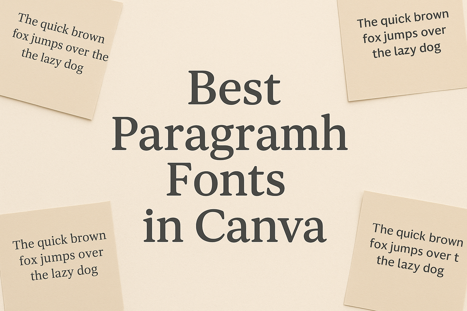
Top Fonts for Paragraphs in Canva
Canva offers a variety of fonts suitable for paragraphs. Choosing the right type can greatly enhance the readability and overall appeal of designs. Here are two popular categories: serif and sans serif.
Serif Fonts for Professionalism
Serif fonts are timeless and often used in professional settings. They have small lines or strokes at the ends of letters. This feature gives them an elegant and formal appearance.
- Merriweather: Known for its readability, Merriweather is great for longer texts. It balances style with clarity.
- Lora: This font pairs well with many other styles. Its classic look makes it a favorite for business documents.
Using serif fonts can help create an air of trust. They are perfect for reports, resumes, or any formal content.
Sans Serif Fonts for Modernity
Sans serif fonts provide a clean and modern feel. They lack the small decorative lines found in serif fonts, making them appear more straightforward.
- Open Sans: This font is versatile and easy to read, making it suitable for digital and print formats.
- Roboto: With its friendly and approachable style, Roboto works well for web content.
Many designers prefer sans serif fonts for their minimalist look. They are perfect for websites, presentations, and marketing materials.
Pairing Fonts Effectively
Pairing fonts well is key to creating designs that are both attractive and easy to read. Finding the right combinations enhances visual appeal and communicates ideas effectively.
Complementary Font Pairings
Complementary font pairings create a balanced and harmonious look. Pairing a bold heading font with a clean body font can achieve this effect. For example, Bebas Neue as a heading font pairs nicely with Montserrat for body text.
Another great option is to combine Montserrat with Open Sans. Montserrat’s modern style contrasts with Open Sans’s versatility, making it ideal for various designs.
Using a script font for headings, like Pacifico, can add a personal touch. It works well with a simple sans-serif body font, ensuring readability without overwhelming the viewer.
Font Pairing Tips
To pair fonts effectively, consider these tips.
First, limit yourself to two or three fonts in a single design. This keeps the design uncluttered and focused.
Next, check for contrast. Combining a serif font with a sans-serif can create a striking difference. For example, Playfair Display (serif) alongside Lato (sans-serif) offers a nice balance.
Always ensure readability—this is crucial, especially for body text. A complex font may look nice but can be hard to read.
Lastly, stay true to your brand’s personality. The fonts should reflect the tone and feel of the message being conveyed.
Customizing Fonts for Brand Identity
Customizing fonts is key for creating a strong brand identity. A unique font can make a brand easily recognizable and memorable.
Canva allows users to upload custom fonts. This feature helps brands maintain a consistent look across all designs.
Users can also mix and match fonts from Canva’s library to find the perfect pair.
Here are some important points to consider:
- Font Style: Choose a font that reflects the brand’s personality.
- For instance, a playful brand might use rounded, fun fonts.
- Readability: Ensure that the font is easy to read.
- This is important for both online and print materials.
- Brand Colors: Match the font choice with the brand’s color scheme.
- This creates a more cohesive appearance.
Users can easily edit fonts through the Brand Kit in Canva. They can set preferred fonts for headings, body text, and more. This helps keep everything aligned with the brand’s style.
Experimenting with different font sizes and weights is also beneficial.
- A bold font can highlight key messages, while a lighter font can soften the overall look.