Choosing the right fonts in Canva can be tricky, especially when aiming for designs that work well in multiple languages and are easy for everyone to read. The best multilingual and accessible Canva fonts are those that combine clear letter shapes, good spacing, and support for various scripts, making content readable for all audiences. These fonts help communicate messages clearly, whether on social media posts, websites, or printed materials.
Many popular Canva fonts are designed with accessibility in mind, offering clean lines and stable baselines that make reading easier for people with visual challenges or dyslexia. At the same time, the right fonts support special characters and accents needed for different languages without losing style or clarity. This balance helps designs stand out while staying inclusive and user-friendly.
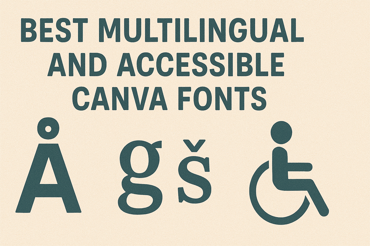
What Makes Canva Fonts Multilingual And Accessible?
Fonts that support many languages and are easy to read help designers reach more people. These fonts must handle different scripts and include features that improve clarity and ease of use. Good readability and clear design make the fonts more useful in a range of projects.
Defining Multilingual Font Support
Multilingual font support means a font includes characters from multiple writing systems. For Canva fonts, this often covers Latin, Cyrillic, Arabic, and other scripts. Such fonts have a wide variety of letters, accents, and special marks.
This support allows designers to create content in many languages without switching fonts. It also helps maintain a consistent look across languages, which is important for brand identity.
Fonts with multilingual support often include clear letter shapes for different alphabets. They must be tested to ensure all characters display correctly and look balanced. This is essential in graphic design for user comprehension and cultural sensitivity.
Characteristics of Accessible Fonts
Accessible fonts are designed to be easy to read by people with varying vision abilities. Canva fonts that focus on accessibility often use sans-serif styles because these fonts have simple, clean lines. Examples include Arial and Open Sans.
Key features include:
- Larger x-height for better letter recognition
- Clear spacing between letters and words
- Avoidance of decorative elements that might confuse readers
Using bold or heavier weights can help people with low vision distinguish text easily. Accessibility also means fonts work well across devices and screen sizes, keeping readability consistent.
The Importance of Readability in Design
Readability is crucial in graphic design to make sure the message reaches everyone. Canva promotes fonts that maintain clarity even at small sizes or on different backgrounds.
Good typography means choosing fonts that avoid overcrowded spacing and have consistent letter shapes. Designers should also ensure the text contrasts well with its background, which helps all readers, including those with color vision issues.
Testing fonts in various contexts—like presentations, reports, or social media posts—helps confirm their legibility. For tips on choosing accessible fonts in Canva, you can check this accessible fonts guide.
Top Multilingual Canva Fonts You Should Try
Choosing fonts that work well in many languages is important for clear communication. Some fonts also make reading easier on screens and devices. These options in Canva bring both style and strong language support.
Inter: Optimized For Screen And Language Support
Inter is designed to work well on all screen sizes. It has clear letter shapes and good spacing, which helps readability. Inter supports many languages, including special characters and accents, making it very versatile.
Its simple, modern style fits both professional and casual designs. Because of its legibility, it is often used in websites and apps. Inter is a solid choice for anyone needing a font that looks great and reads well in multiple languages.
Nunito: Friendly and Highly Legible
Nunito offers a rounded, warm look that feels welcoming. It’s easy on the eyes due to its balanced letterforms, which helps readers focus without strain. Nunito supports many languages with a broad set of characters.
Its friendly style works in educational materials or casual branding. The smooth curves make it a good pick for projects aimed at wide audiences. Nunito’s accessibility makes it one of the best Canva fonts for clear multilingual use.
Varela Round: Universal And Approachable
Varela Round combines smooth edges with simplicity. This makes it approachable and easy to read for lots of users. It supports multiple languages, including accented letters needed for many European and Latin scripts.
Its style fits well for websites, user interfaces, and social media posts. The font balances a modern look with a welcoming feel, which helps create trust in your message. Varela Round is both accessible and stylish in Canva designs.
Josefin Sans: Stylish Multilingual Option
Josefin Sans stands out with a geometric, minimalist style. It works well for headlines and creative projects because of its unique letter shapes. It supports many languages, making it a flexible choice.
Though it’s stylish, Josefin Sans stays clear and readable. This balances creativity with function, useful for brands that want to show personality without losing clarity. It fits well in Canva fonts where style and multilingual support matter.
Highly Accessible Fonts For Inclusive Design
Choosing the right fonts makes text easier to read and helps people with different needs access content better. Accessible fonts have clear letter shapes, good spacing, and simple design. These traits boost readability for everyone on digital platforms like Canva.
Popular Sans-Serif Choices
Sans-serif fonts are usually the best pick for digital reading. They have clean lines and no extra strokes, which keeps letters simple and clear. Fonts like Roboto, Inter, and DM Sans stand out because they balance style with high readability.
These fonts work well on screens of all sizes. They avoid confusion between similar letters by having clear shapes and even spacing. For example, Inter is known for its contemporary look and strong accessibility features. This makes it easier for users, including those with dyslexia or low vision, to read.
Because Canva offers many sans-serif fonts, it’s smart to pick ones that maintain clarity at smaller sizes and across devices. Roboto and DM Sans are also great for making content look modern while supporting readability.
Serif Fonts for Distinct Readability
Serif fonts have small “feet” or lines at the ends of letters. These details guide the reader’s eyes and enhance reading flow, especially in printed materials like brochures or letters.
Fonts like Georgia and Times New Roman are classic serif choices because their design keeps text comfortable for longer reading. Serifs help separate words visually and support smooth eye movement across paragraphs.
However, on digital screens, serif fonts may lose some clarity at smaller sizes due to their decorative strokes. That’s why they are often best used in print or large, clear headers in Canva designs. When used carefully, serif fonts add a professional and readable touch.
Fonts Optimized for Visual Clarity
Fonts designed with accessibility in mind focus on letter distinctiveness and spacing. Key features include open counters (the spaces inside letters like ‘e’ and ‘o’), consistent stroke widths, and stable baselines.
For example, fonts like Open Sans and Lexend prioritize making every character easy to tell apart. This reduces confusion and helps readers who struggle with letter blending or motion.
Good visual clarity also means balanced letter spacing (kerning) and line height (leading). Proper spacing prevents text from feeling crowded, which is a common issue for digital content. Accessible fonts on Canva often come with built-in features to adjust these settings easily, ensuring clear and inclusive design.
Best Canva Font Combinations For Multilingual Projects
Choosing fonts for multilingual projects requires careful thought to ensure readability and style across different languages. It’s important to balance fonts that support various scripts while keeping a clear visual hierarchy. Pairings should work well for both Latin and non-Latin characters without losing legibility or style.
Pairing Strategies for Contrast
Contrast is key in creating effective font combinations, especially for multilingual work. Combining a bold sans-serif with a light script or serif can help separate headings from body text clearly. This contrast guides the reader’s eye and improves overall readability.
For languages with complex characters, such as Arabic or Chinese, pairing a clean geometric font for body text with a decorative font for headings adds visual interest while preserving clarity. Contrast in weight, style, and size creates a balanced design that works across scripts.
It’s helpful to test font combinations in each language to ensure each script looks natural together. Also, use fonts with wide language support like Montserrat, Oswald, or Poppins. They pair well in font combinations and handle many alphabets reliably.
Best Canva Font Combinations
Some of the best Canva font combinations for multilingual projects blend readability with style. For example:
- Ahsing + Montserrat: Combines unique decorative letters with a clean sans-serif, great for branding in different languages.
- Oswald + Brittany: Works well for sleek designs mixing modern sans-serif with a flowing script.
- Impact + Dream Avenue: Bold for headlines, gentle for body text, great for eye-catching multilingual social posts.
These combinations support various scripts while maintaining strong visual contrast. Many of these fonts are available for free on Canva, making them easy to access for diverse projects.
Mistakes to Avoid With Font Pairings
One common mistake is choosing fonts that don’t support all the required language characters. This leads to broken text or fallback fonts that clash visually. Always confirm language support before finalizing any font pairing.
Avoid pairing fonts with similar shapes and weights, as they can blur the distinction between headings and body text. This hurts readability and reduces the design’s impact.
Another error is using overly decorative or script fonts for long paragraphs, which can confuse readers in any language. Save those fonts for headings or accents. Stick with simple, legible fonts for the main text to keep messages clear across languages.
Being mindful of these common errors improves the success of multilingual Canva font combinations. For more font pairing ideas and tips, explore examples of the best Canva font combinations.
Creative Categories: Handwriting, Script, and Retro Fonts
Fonts in handwriting, script, and retro styles add character and personality to designs. Each category offers unique qualities like personal flair, elegance, or nostalgia, while some cater to multilingual needs and ensure clear reading across languages.
Handwriting Fonts for Personal Touch
Handwriting fonts create a warm and friendly feel in projects. They mimic natural writing styles, making designs look personal and approachable. These fonts work well for invitations, social media posts, and branding that seeks to feel human and relatable.
Many handwriting fonts in Canva are designed to remain easy to read, which is important for accessibility and audience understanding. Whether it’s casual or brush-style handwriting, these fonts give a unique identity. Examples like “Canva Student” or “Signature” balance style with clarity, supporting multiple scripts when needed to serve diverse audiences.
Script Fonts with Multilingual Support
Script fonts give a flowing, elegant look that suits formal invitations or branding. The best script fonts support a wide range of alphabets, helping messages reach international audiences without losing appeal.
Fonts like “Pinyon Script” combine beauty and legibility, making them solid choices for multilingual content. These fonts often include accented letters and special characters, allowing use in languages beyond basic Latin script. Their connected letterforms give a stylish touch without sacrificing readability.
Retro Fonts That Stay Readable
Retro fonts bring a sense of nostalgia and vintage style to designs. They can evoke different eras, like the bold 70s or art deco 20s, while fitting modern projects. Readability is key with retro fonts, especially when used in branding or advertising.
Canva offers retro fonts that mix charm with clear letter shapes, avoiding overly ornate forms that confuse readers. These fonts are perfect for logos, posters, or any visual content needing a historic look without losing communication power. They often include multilingual characters to serve wider audiences.
Cursive Styles for International Appeal
Cursive fonts combine the elegance of script fonts with a handwritten feel, often used in creative or formal designs. Their smooth, flowing strokes enhance the appeal of wedding signs, certificates, and branding elements.
Top cursive fonts also support multiple languages by including extended character sets. This ensures that accents, tildes, and umlauts appear correctly across versions. Popular options focus on legibility alongside aesthetic grace, making them practical for international use while keeping design flair.
Leveraging Canva Pro And Premium Fonts For Accessibility
Using premium fonts in Canva offers more than just style. These fonts often include features that improve readability and support multiple languages, making designs easier to access. Choosing the right font can also strengthen a brand’s identity and give projects a professional edge.
Premium Fonts and Their Unique Features
Premium fonts in Canva Pro come with benefits like better character spacing and clear letter shapes, which help with legibility. Many of these fonts support a wide range of languages, including accents and special characters. This makes them great for multilingual projects or audiences.
Some premium fonts are designed to be highly readable at different sizes, which is important for accessibility. For example, fonts with open letterforms and consistent stroke widths reduce strain for readers.
Brand Identity with Professional Fonts
Professional fonts available through Canva Pro can help create a strong brand identity. Companies often use consistent fonts to show personality and values. These fonts give designs a polished, unified look that supports trust and recognition.
Picking the right font can express different moods, from friendly and casual to formal and serious. Premium fonts also offer unique styles that might not be available in free font collections. This variety helps brands stand out while still being accessible to diverse audiences.
How to Download Canva Fonts
Downloading Canva fonts can be simple but requires a few steps. Users with a Canva Pro subscription usually have instant access to premium fonts without extra downloads. They just select the font inside Canva’s editor when designing.
For those who want to use Canva fonts outside the platform, some fonts can be downloaded from their original font foundries if Canva allows it. It’s important to check the font’s license, as not all Canva fonts are for external use. Users can also upload custom fonts to Canva Pro for full control over their font choices.
For more details on premium font options in Canva Pro, visit best premium fonts in Canva.
Popular Picks: Community Favorites and Trendy Fonts
Many designers look for fonts that combine style with wide usability. Some fonts are loved for their unique look, while others are chosen because they work well in different languages.
Most Loved Canva Fonts
Among the favorites is The Artist Script, known for its elegant, hand-drawn feel. It works well on invitations, branding, and social media posts, adding a personal touch without losing readability. Another popular choice is La Luxes Script, which offers a modern, flowing style perfect for fashion and beauty projects.
Julius Sans One stands out for those who want a clean, simple look. Its thin sans-serif style is often used in headlines and logos. These fonts are praised not only for their beauty but also for their ease of use across many Canva designs.
Fonts That Always Work Across Languages
For projects needing strong multilingual support, fonts like Julius Sans One play a big role because of their clear letterforms that stay readable in various alphabets. Its wide character set includes many accents and special marks.
Many designers also turn to fonts specifically designed for broad language coverage. These fonts handle extended scripts without missing characters.
More details on multilingual-friendly fonts can be found at the page about best multilingual fonts.