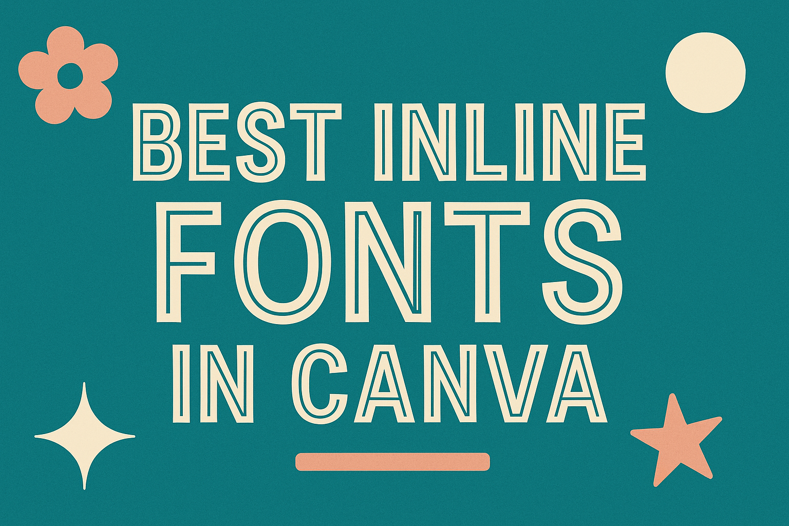
Finding the right font can transform any design project from ordinary to extraordinary.
Canva, a popular design tool, offers a rich selection of inline fonts that add a unique touch to your work.
Choosing the best inline fonts in Canva helps create eye-catching and professional designs.
Many designers appreciate the elegance that inline fonts bring. For example, Ravenholm Inline features a striking gothic style, adding refinement to posters and invitations.
Similarly, whimsical fonts like Oregano offer playful options perfect for casual or retro-themed designs.
Exploring Canva’s font library reveals many options for different styles and moods. Whether it’s a bold and attention-grabbing design or something subtle and refined, there’s an inline font that fits the bill.
For those interested in more diverse font choices, check out some of the best fonts available in Canva to elevate your creative projects.
Understanding Inline Fonts
Inline fonts are unique and versatile, often adding a decorative touch to designs. They consist of a patterned or open line through the letters, creating a distinct aesthetic different from other font styles.
Defining Inline Fonts
Inline fonts feature a hollow or patterned interior. The open lines within the letters give them a unique appearance suitable for creative projects. These fonts blend artistic style with readability, and are popular in designs that need to stand out.
Many designers use inline fonts for headlines, logos, or posters. They provide both a focal point and an element of personalization. This makes them a favorite in graphic and web design projects where visual appeal is key.
Characteristics of Inline Fonts
Inline fonts have distinctive features. Hollow interiors or internal patterns are their primary traits. These characteristics make them ideal for playful or artistic themes.
They are typically bold and striking, which enhances their legibility at larger sizes.
In designs with layered text, these fonts can add depth and complexity without overwhelming the viewer.
Additionally, inline fonts can be paired with solid fonts for contrast, enhancing the overall design by drawing attention to specific text elements.
Inline Fonts Vs. Other Font Styles
Inline fonts are different from other styles like serif or sans-serif fonts. While serif fonts have small lines at the end of characters and sans-serif fonts are more straightforward, inline fonts provide a textural element with their open lines.
The uniqueness of inline fonts lies in their artistic approach. This makes them suitable for designs needing emphasis or visual flair.
In contrast to script fonts, which mimic handwriting, inline fonts excel in bold and modern designs. They combine functionality with aesthetics, making them a valuable tool for any designer looking to enhance their work.
How Inline Fonts Enhance Your Canva Designs
Inline fonts in Canva add unique style and depth, making designs more eye-catching and effective. These fonts can boost visual appeal and improve the clarity of text.
Visual Impact of Inline Fonts
Inline fonts stand out because of their unique design features. They often have outlines or inner lines that give each character a distinct look.
This makes them perfect for creating attention-grabbing headings and titles.
Using inline fonts can add personality to a project, making it memorable and visually compelling. In a design landscape filled with regular fonts, inline fonts provide an exciting alternative that can make any text pop.
Their distinctive appearance makes them great for getting a viewer’s attention and conveying the style of the content.
Typographic Hierarchy with Inline Fonts
Creating a clear typographic hierarchy improves readability and guides the viewer through the content.
Inline fonts can be used to establish levels of emphasis. Designers can use these fonts for headings while using simpler fonts for body text. This contrast creates a visual guide that helps viewers understand what to focus on first.
Inline fonts naturally draw the eye, helping to set apart sections or key information. This technique is especially useful for presentations and posters, where hierarchy is crucial for communication.
Matching Inline Fonts with Images and Graphics
Pairing inline fonts with suitable images and graphics enhances the overall design. The decorative nature of inline fonts harmonizes well with certain visual styles, especially those that are bold or playful.
Choosing elements that share a similar tone or theme creates a cohesive look.
For instance, a playful image can pair well with a fun inline font like Bubblebody Inline. This approach ensures that all parts of a design work together to communicate the message effectively. Such combinations can create a more engaging and pleasing design.
Selecting the Best Inline Fonts in Canva
Choosing the right inline font in Canva can add style and distinction to your design projects. Inline fonts are perfect for creating eye-catching headlines, enhancing body text, and pairing well with other typefaces.
Top Inline Fonts for Headlines
For bold and striking headlines, fonts like Ravenholm Inline stand out with their unique gothic style. These fonts have a decorative touch that grabs attention.
Inline details in such fonts provide a sense of elegance and sophistication.
These characteristics make them excellent choices for magazine covers or event posters. Another great option is Bree Serif, known for its assertive curves and robust strokes, making it a powerful choice for commanding attention.
Popular Inline Fonts for Body Text
For body text, readability is key. Inline fonts offering a clean yet stylish look are ideal.
Source Sans Pro is a good example, as it balances between modern and easy-to-read text. This font offers a minimalist look suited for long passages where legibility is important.
Espoir Serif provides another option that combines style with clarity. It maintains readability even in smaller sizes. The subtle inline touches add a modern twist to traditional serif fonts, making text engaging without being overwhelming.
Pairing Inline Fonts with Other Typeface
Successfully pairing inline fonts with other typefaces can enhance the overall design.
Combining bold inline fonts with simpler sans serif fonts creates contrast and focus. For instance, pairing Ravenholm Inline with a subtle sans serif font can highlight titles while ensuring the body text remains clear and easy to read.
Mixing inline fonts with traditional serif fonts is another effective strategy. This combination can provide a warm and inviting look for your design.
It’s essential to consider the mood and tone of the project to create visual harmony, using varied styles to avoid a cluttered appearance.
Applying Inline Fonts to Various Design Projects
Inline fonts offer unique styling that stands out in different design projects. They add a creative flair, making each project visually captivating and engaging. Whether for branding, invitations or marketing materials, inline fonts can enhance the overall look and feel of a design.
Brand Identity and Inline Fonts
Using inline fonts for brand identity can make a logo or tagline memorable. They provide an opportunity to express the personality and values of a brand.
For instance, a business targeting a youthful audience might choose a playful inline font for its logo, which captures energy and fun.
Brands can also use inline fonts in their visual content across social media, brochures, and websites. A font like Boldesqo Serif Inline is ideal for strong statements and ensures the brand voice remains consistent.
Event Invitations and Inline Fonts
Inline fonts bring a touch of elegance and creativity to event invitations. They work well for both formal gatherings such as weddings and casual events like birthday parties.
A font like Bubblebody Inline offers a fun and playful appearance perfect for creative designs.
Event planners often look for fonts that match the theme of the event. Inline fonts with decorative elements can elevate the look of an invitation. Using these fonts, guests get a glimpse of the event’s atmosphere before they even arrive.
Marketing Materials and Inline Fonts
In marketing, capturing attention quickly is crucial. Inline fonts can help achieve this by making headings and taglines pop.
Whether it’s a poster, flyer, or digital ad, these fonts bring an eye-catching element to the design.
Creative teams often choose inline fonts like Oregano for their charming and retro features. These fonts are effective in setting the tone for a campaign, ensuring that the message is not only seen but remembered.
Tips for Using Inline Fonts Effectively
Using inline fonts can add a unique touch to any design project. They enhance style with color, spacing, and layering. Here’s how to make the most of them.
Color and Contrast
Choosing the right colors is key to making inline fonts stand out. It’s important to use bold colors that create a contrast with the background. This helps the text be visible and easy to read.
A bright font on a dark background or vice versa works well.
Another idea is to use colors that match the theme of the project. If the design is playful, cheerful colors like pink and yellow could work. For more formal projects, sticking with whites and greys might be better.
Using gradients or color shades within the letters can add depth. This makes the text appear more lively and engaging.
Spacing and Alignment
Proper spacing is crucial for readability. Inline fonts often have unique or unusual shapes, so adjusting the spacing between letters can make a big difference. Using enough space ensures the text doesn’t look cramped.
Alignment plays a big role too. Inline fonts can be aligned to the left, right, or centered, depending on what suits the design best. The key is to keep the text balanced with other elements on the page.
Lists or bullet points can help break up text, which also aids readability. This way, the message is conveyed clearly.
Layering with Other Design Elements
Inline fonts can be paired with images and graphics to create interesting layers. This helps make the design more dynamic. Placing text over a subtle image can add texture to the design.
Using shadows or outlines can make inline fonts pop. This adds an extra layer of style and makes sure the text doesn’t blend into busy backgrounds.
Combining different font styles can also be effective. Pairing an inline font with a simpler font creates contrast and highlights the key parts of the text. This draws attention where it’s needed without overwhelming the reader.
Customizing Inline Fonts in Canva
When using inline fonts in Canva, designers can personalize their projects by adjusting the color and size of the text, applying various effects, and even creating unique styles. Each customization option adds flair and personality to design work in Canva.
Adjusting Inline Font Color and Size
In Canva, it’s easy to change the color and size of inline fonts. To do this, start by selecting the text you want to customize. A toolbar will appear, giving options to edit the font.
Click on the color button to choose from a palette or create a custom color. Use sliders or input a specific hex code for exact hues.
Adjusting the font size is just as simple. Drag the slider or type a number in the size box to increase or decrease the text. This allows for precise control over how the font fits and looks in the design.
Experimenting with different colors and sizes can turn a simple design into something eye-catching.
Adding Effects to Inline Fonts
Adding effects to inline fonts can greatly enhance the design. Canva offers various effects like shadows, outlines, and glows. To use these, click on the “Effects” button in the toolbar.
Shadows add depth by making the text look 3D or like it’s lifted off the page. Outlines help to emphasize text without making it bold.
Glows can make text look illuminated, adding a special touch to designs.
These effects can be adjusted for transparency, blur, and color. Tinkering with these settings can produce striking text that stands out while maintaining readability.
Creating Custom Inline Font Styles
Designers can create custom inline font styles in Canva to ensure a unique look. Begin by selecting a basic inline font and experimenting with various attributes.
Try combining different effects such as layering a shadow with an outline for a distinctive appearance. Additionally, mix fonts by pairing an inline style with another type.
Use letter spacing and line height adjustments to achieve the desired look. Once a custom style is perfected, save the project as a template for future use.
Canva’s flexibility allows for designing truly one-of-a-kind typography that matches the vision of any creative project.
Navigating Canva’s Font Library
Canva offers a wide range of fonts, perfect for any creative project. From bold display fonts to subtle scripts, users can explore various styles to find just the right fit for their designs. Knowing where to find and how to test these inline fonts can enhance any creation.
Finding Inline Fonts in Canva
To locate inline fonts in Canva, the user should start by logging into their account and opening a new design project.
On the left side of the screen, there is a “Text” tab that users can click to add a text box. Once added, the top toolbar reveals a wide array of font choices.
In the font dropdown menu, users can browse through Canva’s extensive font library.
For inline fonts specifically, typing keywords like “inline” in the font search bar can help filter the results. Another option is to use category tags like “playful” or “bold” for styles that may include inline characteristics.
Previewing and Testing Inline Fonts
Previewing fonts before finalizing a design is crucial. This can be done by selecting a font from the dropdown and observing how it appears in the design space.
Users will see their text instantly transform, giving a quick glimpse of the font’s impact.
Testing fonts involves applying them in different contexts within the project. Users can adjust font size, color, and alignment to see which combinations work best for their design goals.
Users might find it helpful to test inline fonts for titles or headlines, as many suitable options are available for free. This experimentation ensures that the final product aligns with the creative vision.
Best Practices for Licensing and Copyright
When using fonts in Canva, it’s important to understand how licensing works.
Users should check if a font is free or requires a license. Fonts marked as “Free” can be used without legal concerns, but those without this label might need a license, especially for commercial projects.
Always review the Canva Content License Agreement before using any design elements.
This document outlines the terms for use and ensures that users remain compliant with copyright laws. Staying informed helps prevent legal issues in creative projects.
Here are some key best practices:
-
Check Font Labels: Make sure to use fonts labeled as free for personal projects. For commercial use, verify if additional permissions or licenses are needed.
-
Use Content Legally: If a font isn’t labeled as free, consider purchasing a license or using an alternative to stay within legal boundaries.
-
Keep Updated on Policies: Regularly visit Canva’s licensing page to stay updated on any changes that might affect how fonts and other elements can be used.
Following these practices helps ensure that creative projects remain both beautiful and legally secure.
By being mindful of copyright and licensing rules, designers can enjoy using Canva‘s extensive font library with peace of mind.