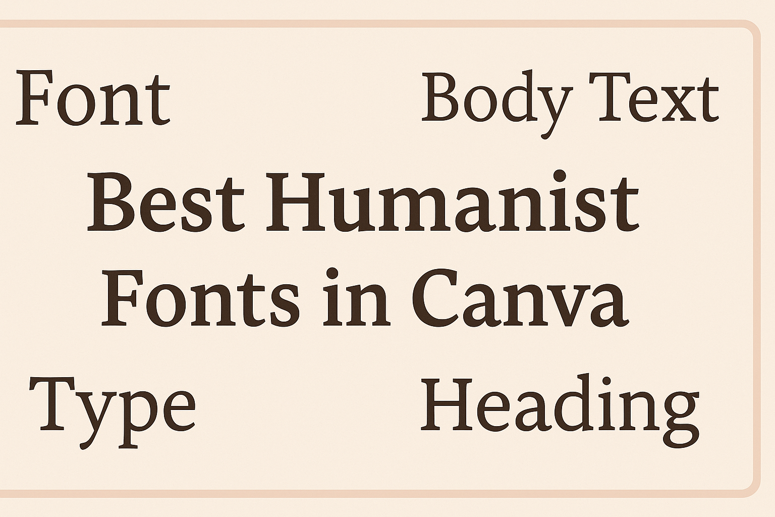
When creating designs in Canva, choosing the right font can truly enhance the message and style. Humanist fonts stand out for their elegance and readability, making them perfect for both personal and professional projects.
This blog post will explore some of the best humanist fonts available in Canva, showcasing their unique features and how they can elevate any design.
Whether it’s for a presentation, a social media post, or a website, the right font can make all the difference. Humanist fonts like Garamond and Centaur bring a touch of sophistication while remaining easy to read.
Designers looking to create eye-catching visuals will find valuable insights in the selections that follow.
As users navigate through the diverse world of fonts in Canva, knowing which humanist options to choose can save time and improve overall aesthetics. This guide is intended to assist anyone looking to enrich their design projects with fonts that are both stylish and functional.
Exploring Canva’s User Interface
Canva’s user interface is designed to be user-friendly and intuitive, making it easy to navigate for all users.
Understanding how to access the font library and use the text tool effectively is key to creating beautiful designs.
Accessing the Font Library
To access the font library in Canva, users need to log into their Canva account. Once they open a new design, they can find the Text option in the left toolbar.
Clicking on this option reveals various font choices.
Users can browse through the font library by clicking on the font dropdown menu at the top of the screen. This menu displays both free and premium fonts.
By typing in specific font names or styles, users can quickly locate their desired fonts.
It’s helpful for users to explore different font categories, such as Serif, Sans-serif, and Handwritten fonts. This allows for better font selection that matches the design theme.
Using the Text Tool
The Text tool is essential for adding text to a design.
Users can add a text box by selecting the Text option and choosing among headings, subheadings, or body text. This flexibility allows users to apply various text styles easily.
After adding text, users can format it using options in the toolbar. They can adjust font size, color, spacing, and alignment. This customization helps in making the text more visually appealing.
For those looking to pair fonts, Canva offers suggestions for compatible font pairs. Experimenting with different text placements and styles can transform ordinary designs into eye-catching graphics.
Top Humanist Fonts in Canva
Humanist fonts combine legibility with a personal touch. They have a warm, inviting feel, making them great for various design projects. Here are three popular choices available in Canva.
Open Sans
Open Sans is a friendly and approachable font designed by Steve Matteson. Its clean lines and simple forms make it easy to read on screens.
This font has a wide range of sizes and styles, allowing for versatility in designs. It works well for both body text and headings.
Many users appreciate how Open Sans looks in different contexts, from professional presentations to casual websites. Its modern appearance makes it suitable for many audiences.
Roboto
Roboto is a widely used font created by Christian Robertson. Its geometric shapes and open curves give it a unique look, making it both stylish and readable.
This font has multiple weights, ranging from thin to bold, giving designers flexibility in their projects. It is especially popular in tech and app design.
Roboto is often favored for its contemporary feel, making it suitable for various styles, from sleek corporate branding to vibrant, colorful graphics.
Lato
Lato, designed by Łukasz Dziedzic, is another excellent humanist font. It features semi-rounded details that make it warm and inviting.
Lato also offers numerous weights, which lets designers create a dynamic visual hierarchy in their work.
Its versatility allows it to fit a variety of contexts, from friendly blogs to professional reports. Many appreciate how Lato maintains clarity, even in longer texts.
Each of these fonts brings a unique character to designs, helping to communicate messages effectively while remaining visually appealing.
Design Tips for Humanist Fonts
Choosing the right design elements to complement humanist fonts can enhance the overall look and feel of any project. Key factors include effective font pairing, creating a strong visual hierarchy, and paying attention to color and contrast.
Font Pairing
When it comes to font pairing, it is important to select complementary typefaces that enhance the readability of humanist fonts. For headings, a bold sans-serif can add contrast, while a clean serif pairs well for body text.
Examples of great pairs include:
- Garamond for body text with Bebas Neue for headings.
- Centaur used in tandem with Montserrat can create a professional touch.
Mixing weights and styles can also add interest while maintaining harmony across the designs.
Visual Hierarchy
Establishing visual hierarchy is key when using humanist fonts. This involves organizing text size, weight, and style to guide the reader’s eye effectively.
Start by using larger, bolder fonts for titles or headings. This makes them stand out.
For subheadings, a slightly smaller size helps maintain a distinct look while remaining readable.
Body text should be comfortable to read, typically around 10-12 points in size. Implementing varied font styles can highlight important information and improve comprehension.
Color and Contrast
Color and contrast play a significant role in typography. High contrast ensures that text is legible against the background. For example, dark text on a light background works well.
Choosing a color palette that aligns with the brand is essential. Soft, muted colors can complement humanist fonts without overpowering them.
Using accent colors for headings or important text can draw attention and create emphasis. Remember to keep accessibility in mind, ensuring that color choices offer enough contrast for all viewers.
Application Examples
Humanist fonts can enhance the clarity and appeal of various design projects. They work well in different contexts, making them a popular choice for social media, presentations, and marketing materials.
Social Media Graphics
For social media graphics, humanist fonts like Garamond or Nunito offer a clean and inviting look. Their excellent readability makes them a great choice for posts, captions, and headlines.
Using these fonts can help grab attention while still being easy to read. They suit images with text overlay, ensuring that the message is clear.
Designers often pair humanist fonts with bold colors or illustrations. This combination makes the graphics more engaging.
For example, a striking post could feature a quote in Garamond over a colorful background. This creates an eye-catching design that encourages sharing.
Presentations
In presentations, clarity is essential, and humanist fonts rise to the occasion. Fonts like Centaur work well for both titles and body text. Their balanced design helps maintain audience interest.
Using a size hierarchy—large for titles and smaller for bullet points—can enhance readability. It helps the audience easily follow along, especially in a busy room.
Bullet points formatted with Nunito can simplify complex information into digestible pieces. This approach keeps the audience engaged without overwhelming them with text.
Marketing Materials
Marketing materials benefit greatly from humanist fonts. They convey professionalism while remaining approachable.
Fonts like Adobe Garamond are often used in brochures and flyers.
In a brochure, headlines might use a larger weight of the font to stand out. Important details can utilize a lighter weight to create contrast.
This setup helps guide the reader’s eye through the content.
When creating a poster for an event, a humanist font can make the information pop. Clear, readable text combined with vibrant visuals helps capture attention.