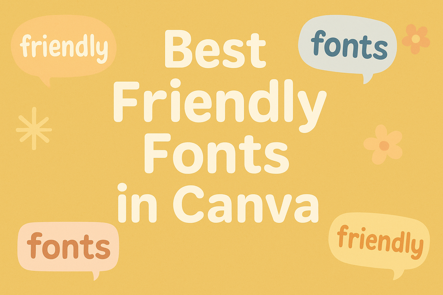
When it comes to adding a touch of warmth and approachability to design projects, choosing the right font is essential.
Canva, a popular online design tool, offers a variety of friendly fonts that make your creations stand out without overwhelming the viewer. These fonts are perfect for both personal and professional projects, helping users convey warmth and welcome in their designs.
In Canva, users can find a range of friendly fonts suitable for different styles and purposes.
For those seeking playful and vibrant designs, fonts like Tropika offer a bold and tropical vibe, influenced by vintage travel themes.
For a more relaxed and handwritten look, options like Amatic SC bring a hand-drawn charm that feels casual yet thoughtful.
Designs featuring the best friendly fonts can enhance anything from greeting cards to business presentations.
Playful fonts, such as Marykate or Candice, bring an approachable feel to any project.
By incorporating these fonts, designers can easily create materials that engage and appeal to their audience.
Explore the possibilities with these friendly fonts in Canva, perfect for adding a personal touch to any creative work.
What Are Friendly Fonts?
Friendly fonts are those that evoke warmth and approachability. These fonts are often used in designs that aim to be engaging and welcoming to the audience. They can play a crucial role in creating a positive first impression.
Defining Friendly Fonts
Friendly fonts typically feature round shapes, soft edges, and a casual style. These characteristics make them look less formal and more inviting.
Fonts like Amatic SC, with its hand-drawn appearance, and Candice, known for its playful style, are great examples.
These fonts are often less structured and more free-flowing, making them feel personable.
The visual appeal of friendly fonts lies in their ability to convey a sense of comfort and creativity. They often mimic handwriting or playful script, adding character to the text.
Importance in Design
In design, the choice of font can greatly affect the tone and effectiveness of a project.
Using friendly fonts helps set a welcoming mood, drawing in viewers and keeping their attention. This can be crucial for branding, advertisements, or any content aimed at being user-friendly and approachable.
They play a significant role in enhancing readability and creating an emotional connection with the audience.
For instance, in educational materials or family-oriented products, these fonts can make the content feel more relatable and engaging. Their appeal is in making the viewer feel a part of the message, rather than just an observer.
How to Access Fonts in Canva
Accessing fonts in Canva is simple and user-friendly. Users can explore a vast library of fonts and even add their own to make designs unique. Here’s how to navigate these options.
Navigating the Canva Interface
Finding fonts in Canva begins on the main design page. At the top, there’s a “Text” button. Clicking this will open a sidebar where various font styles appear.
Users can experiment with options like headings, subheadings, and body text.
Within this menu, users will see a wide array of fonts. Clicking a font applies it to the selected text box. It’s helpful to preview different styles to find the perfect fit.
For specific themes, Canva organizes fonts by categories, making searches easier.
Adding New Fonts to Your Library
Canva’s versatility includes the ability to upload new fonts, enhancing creative projects. This is reserved for Canva Pro users.
To add a font, navigate to the Brand Kit section. Here, users can find an “Upload a font” link. Clicking it allows them to choose a font file from their device.
It’s important to check that the font is licensed for web use before uploading.
Once added, the new font appears in the user’s library alongside pre-existing choices. This feature is great for maintaining brand consistency by using custom fonts in all visual materials.
Top Friendly Fonts in Canva
Choosing the right font in Canva can make a huge difference in any design project. This section explores some of the best friendly fonts available in Canva, focusing on sans serif, serif, fun and quirky, as well as script and handwritten options.
Sans Serif Favorites
Sans serif fonts are known for their clean, modern look. They are popular because of their simplicity and readability.
Fonts like Open Sans and Lato are often used in professional settings, offering a sleek design that stands out without being overwhelming. Montserrat is another popular choice, inspired by urban typography from Buenos Aires, offering a distinctive touch.
Proxima Nova is appreciated for its versatility, often featuring in digital and print projects. It combines geometric precision with humanistic elements, making it suitable for a friendly and approachable look.
These fonts are ideal for tech startups, contemporary brands, and any project that needs a modern and clean appearance.
Serif Selections
Serif fonts bring a traditional feel to designs, with small lines or strokes at the ends of letters enhancing readability in print.
Times New Roman and Georgia are classic choices that convey elegance and authority. If you’re looking for something with more character, consider Libre Baskerville, which provides a vintage touch without sacrificing clarity.
For designs that need to appear both friendly and classic, Playfair Display works well.
It is influenced by the typeface styles of the late 18th century and can add a historical feel to your work. These fonts work wonderfully for longer articles, books, or any project that aims for traditional sophistication with a modern twist.
Fun and Quirky Options
When aiming for a playful vibe, Canva offers a range of fun and quirky fonts.
Comic Neue brings a fun and lighthearted feel, shaking the outdated reputation of Comic Sans with improved design aspects. Fredoka One is another choice that boasts rounded shapes and a bouncy appearance, making it excellent for kid-friendly projects.
Indie Flower adds a casual touch, capturing a handwritten charm that feels personal and approachable.
These fonts are perfect for invitations, social media graphics, or projects needing a dose of cheerfulness. Their charm lies in their ability to convey playfulness and energy effectively, making designs stand out in a crowded online world.
Script and Handwritten Choices
Script and handwritten fonts add a personal touch to designs, often used for elegant or creative projects.
Great Vibes is a popular choice with its flowing lines and classic charm, ideal for wedding invitations and elegant branding. Another option, Pacifico, offers a more relaxed feel, inspired by surf culture.
Dancing Script is well-loved for its informal feel, reflecting joyful movement and creating an inviting atmosphere.
The cursive nature of these fonts can enhance greeting cards, creative logos, or anything aiming to express personality through writing. They bring warmth and elegance to projects, creating a connection that feels both personal and genuine.
Using Friendly Fonts Effectively
When using friendly fonts, it’s important to think about how they work together with other fonts, how big they are, and the colors around them. These factors will make sure the fonts look good and are easy to read.
Pairing Fonts
Pairing fonts in a design can be challenging. The goal is to make them look good together without clashing.
Friendly fonts often have a playful or relaxed feel, so they can be paired with more neutral or simple fonts for balance. For example, a bold friendly font like Tropika can go well with a clean sans-serif font. This combination creates a pleasant contrast.
Picking fonts that complement each other is key. One font might be eye-catching, while the other remains simple to support it.
Consistency across headings and body text enhances readability, so maintaining style consistency helps keep the design unified and pleasing.
Font Size and Spacing
The right font size and spacing can greatly affect how legible and approachable your text appears.
Friendly fonts can be used in headlines as they often attract attention. It’s essential to use a larger size for headings and a smaller font for the body text.
Spacing, including letter spacing and line height, should be adjusted to ensure that the text is easy to read.
Too little space can make the design feel cramped, while too much space can make it appear disjointed.
Experimenting with these settings can help achieve the desired look and feel, ensuring information is conveyed clearly.
Color and Contrast
Color and contrast play an important role in making friendly fonts pop.
When choosing colors, consider a palette that aligns with the font’s style. Bright and cheerful colors can enhance a font’s playful nature.
Contrast is also crucial. Light colors on dark backgrounds, or vice versa, can make text easier to read.
It’s essential to ensure enough contrast between text and background to maintain legibility.
Utilizing tools or plugins in design software can help test color pairings for readability.
Staying mindful of accessibility standards benefits all users, ensuring your design is both stylish and functional.
Customizing Fonts in Canva
Customizing fonts in Canva enhances the visual impact of any design. By adjusting font style and weight, modifying letter spacing and line height, and creating text effects, users can transform a simple text into a standout feature.
Adjusting Font Style and Weight
In Canva, users can easily change the style and weight of fonts to fit the design’s mood. Bold, italic, or underlined styles add emphasis and variety.
Users can select different font weights, ranging from light to extra bold. This flexibility helps convey different tones, such as making titles bolder for prominence or using a lighter style for subtlety.
Canva offers a palette of styles within many fonts. This feature allows designers to diversify text elements without changing font families, maintaining consistency and harmony throughout the design.
Lightweight styles often suit formal or minimalistic designs, while heavier styles are great for headings or to highlight key points.
Modifying Letter Spacing and Line Height
Changing letter spacing and line height in Canva is essential for readability and aesthetic appeal.
Letter spacing, also known as tracking, is adjusted to create a less crowded or more cohesive look. More space between letters can give a modern, airy feel, while tighter spacing can make text compact and bold.
Line height adjustments help with readability, especially in blocks of text. Increasing line height creates more breathing space, making the text easier on the eyes.
Canva’s built-in tools allow precise control over these elements, so users can fine-tune their designs to meet their needs.
Creating Text Effects
Text effects in Canva add visual interest and depth. Effects like shadows, outlines, or glows make text pop, ensuring it captures attention.
Creating a shadow effect can add dimension, while outlines highlight text without overpowering other elements.
Gradient fills add color transitions to text, providing a unique visual appeal.
These effects can be applied with just a few clicks, allowing even beginners to produce professional-looking text designs. Canva’s user-friendly interface ensures that adding these effects is easy and intuitive, making any text stand out effectively.
Licensing and Usage Rights
When using fonts on Canva, it’s crucial to understand the licensing terms associated with their usage. This ensures that designs meet legal standards and creators work within Canva’s guidelines. Highlighting key points on font licenses and when a commercial license is necessary can help users make informed decisions.
Understanding Canva’s Font License
Canva offers both free and Pro content licenses for their font offerings.
Free fonts are available at no cost and can be used in personal or commercial projects, making them accessible for everyone. Pro fonts, on the other hand, require a Canva Pro subscription.
Pro licenses allow for broader usage of fonts, including on products for sale, though it’s important to check the specific terms that might apply.
Users are advised to read the Content License Agreement thoroughly, as it outlines permissible actions such as alterations and sharing limitations.
While accessing fonts, users should ensure they’re compliant with the intended use to prevent any issues. Misuse could lead to restrictions or additional costs, so understanding these guidelines protects both the user and their creations.
When You Need a Commercial License
A commercial license is essential when using fonts in projects that generate revenue. This includes printing designs on merchandise or using them in advertisements.
Canva’s Pro Users have broader rights under the Pro Content License, allowing them to capitalize on their designs without legal concerns.
For those working with clients, a commercial license provides the flexibility to create custom projects while respecting Canva’s terms.
It’s important to verify whether a design falls under commercial use and secure the appropriate licenses accordingly. This protects the user from potential legal issues and ensures compliance with Canva’s rules, safeguarding their project and reputation.