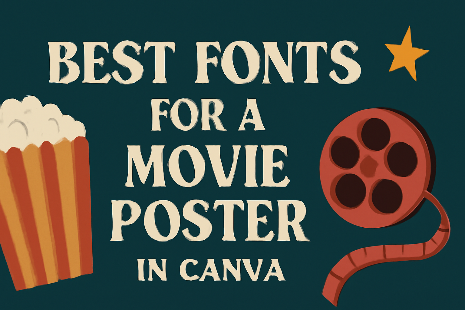
Creating a standout movie poster requires more than just striking imagery; the right font plays a crucial role in capturing attention.
The best fonts for a movie poster in Canva can elevate the design by enhancing the theme and conveying the film’s mood effectively.
Selecting a font that matches the essence of the movie makes a significant difference in how potential viewers perceive it.
In Canva, a variety of fonts are available that can cater to different genres, from whimsical to dramatic. This flexibility allows designers to experiment and find a style that resonates with their vision.
Whether one is designing an indie film poster or a blockbuster release, the right font choice can make a lasting impression.
With so many options to choose from, it can be overwhelming to find the perfect font. This post will explore some of the top fonts ideal for movie posters, providing insights that can help anyone craft an eye-catching design.
Understanding Font Categories
Fonts come in different styles, each suited for specific purposes. Knowing about the main categories can help designers choose the right font for their movie poster. Here are the key font categories to consider.
Serif Fonts
Serif fonts have small lines or strokes at the ends of their letters. These fonts often bring a classic and elegant touch to designs. Common examples include Times New Roman and Georgia.
Serif fonts work well for movie posters that aim for a traditional or sophisticated look. They can enhance the theme of drama, romance, or period films. Their readability can also make them a great choice for titles and credits.
When using serif fonts, it’s essential to ensure they match the film’s tone. Subtle differences in style can influence how the audience perceives the movie. Choosing the right serif font can create a strong visual impact.
Sans Serif Fonts
Sans serif fonts lack the extra strokes found in serif fonts. This gives them a clean, modern appearance. Popular sans serif fonts include Arial, Helvetica, and Futura.
These fonts are often used for contemporary movie posters. They are perfect for action, sci-fi, or comedy films, where a more casual and straightforward look is desired. Their simplicity can help convey urgency or energy.
When selecting a sans serif font, designers should consider the overall design layout. This category provides versatility and clarity, making it an excellent choice for both titles and taglines. Keeping the message clear is key.
Display Fonts
Display fonts are unique and creative. They often have unusual shapes or decorative elements. These fonts are intended for attention-grabbing headlines and titles, making them ideal for movie posters.
Examples of display fonts include Broadway and Lobster. They can help convey specific themes or evoke emotions. For instance, a quirky font might be used for a kids’ movie, while a bold, dramatic font may suit an action film.
When choosing a display font, it’s vital to ensure that it reflects the film’s personality. These fonts should be legible even from a distance, especially on posters. Their distinctive styles can make a memorable first impression.
Handwriting Fonts
Handwriting fonts mimic the look of handwritten text. They add a personal and informal touch, making designs feel more approachable. Examples include Pacifico and Dancing Script.
These fonts are perfect for creative projects, such as romantic or indie films. They can help establish a warm and inviting atmosphere. Using a handwriting font can make the poster feel more relatable to the audience.
When applying handwriting fonts, it’s crucial to strike a balance. They should not overwhelm other design elements. Ensuring clarity in messaging is important, especially for movie titles and key information. This category can add a unique flavor to a poster.
Top Fonts for Movie Posters in Canva
Choosing the right font is essential for capturing the spirit of a movie. Different genres require different styles to resonate with the audience. Here are some recommended fonts for various movie poster types.
Blockbuster-Style Fonts
Blockbuster films often feature bold and eye-catching fonts. These fonts are designed to draw attention and convey excitement.
- Bebas Neue: This font is clean and bold, making it great for action-packed titles. It ensures legibility from a distance.
- Impact: A classic choice for dramatic titles, Impact is thick and strong. It’s perfect for conveying a sense of urgency.
- Rockwell: This slab-serif font has a robust and sturdy appearance. It works well for modern action or sci-fi movies.
These fonts help set the tone for the excitement viewers can expect from a blockbuster.
Indie Film Fonts
Indie films often embrace uniqueness and creativity. Selecting a font that reflects the film’s character can make a big difference.
- Gagalin: This retro comic font adds a vintage touch to any design. It works well for quirky stories that need a playful vibe.
- Nectarine: A playful and quirky font that adds charm and creativity. It’s ideal for light-hearted indie films.
- Kare: Available with Canva Premium, Kare adds a contemporary look. Its bold design can capture attention without overpowering the style.
These fonts give indie films a personal touch that connects with audiences.
Romantic Comedy Fonts
Fonts in romantic comedies should evoke warmth and charm. They often have a softer, more approachable appearance.
- Cinzel: This decorative serif font offers a timeless, elegant look. It is great for romantic themes that need a touch of sophistication.
- Playfair Display: With its classic and chic style, this font adds romance to any poster. Its graceful curves are perfect for love stories.
- Dancing Script: This playful cursive font brings a fun, informal feel. It resonates well with light-hearted romantic comedies.
These fonts help create a friendly yet captivating atmosphere for romance enthusiasts.
Horror Movie Fonts
For horror movies, fonts should instill fear and suspense. Dark, jagged edges or eerie styles are common choices.
- Creepster: This creepy font has a unique, spooky vibe. It’s perfect for capturing the essence of horror without being overly complex.
- Zofi: With a jagged style, Zofi conveys a sense of chaos. It’s an excellent choice for intense thrillers or slasher films.
- Fjalla One: Though simple, it can be used effectively in horror settings. Its bold nature adds intensity and urgency to any title.
These fonts enhance the chilling nature of horror films, allowing for an instant reaction.
Documentary Fonts
Documentaries often require fonts that are straightforward and professional. The choice of font should reflect the seriousness of the content.
- Open Sans: A clean sans-serif font that maintains readability across all media types. It’s perfect for presenting information clearly.
- Roboto: This font balances modernity and professionalism. Its versatility suits various documentary styles and topics.
- Merriweather: A serif font known for its legibility. It’s a great choice for text-heavy film posters, providing an intellectual feel.
These fonts assist in delivering the message without drawing attention away from the content.
The Impact of Typography on Viewer Perception
Typography plays a significant role in shaping how viewers perceive a movie poster. The choice of font can evoke emotions, suggest themes, and even influence audience expectations. Two main aspects of typography are font psychology and cultural font associations, both of which are key to understanding how text impacts visual communication in film marketing.
Font Psychology
Font psychology explores how different typefaces can create emotional responses. For example, bold, sans-serif fonts often convey strength and modernity, making them ideal for action films. In contrast, serif fonts tend to feel more traditional and trustworthy, which can suit historical dramas.
Playful or quirky fonts may attract a younger audience and suggest fun, while elegant scripts often imply romance or sophistication. Selecting the right font can set the tone and attract the intended audience, making it vital for designers to consider the psychological impact of their typography choices.
Cultural Font Associations
Cultural font associations significantly influence viewer perceptions as well. Certain fonts carry meanings based on cultural contexts. For example, typefaces inspired by vintage styles might evoke nostalgia, appealing to those who appreciate retro aesthetics.
On the other hand, modern, geometric fonts can reflect innovation and forward-thinking, appealing to sci-fi fans. Understanding these associations allows designers to align their choices with the themes of the movie and the preferences of their targeted demographic, enhancing the overall effectiveness of the poster.
How to Pair Fonts in Canva
Pairing fonts in Canva can make a big difference in design. It helps create a clear message and adds style to any project.
1. Choose Contrasting Fonts:
Mix a serif font with a sans-serif font. For example, a bold serif for titles and a clean sans-serif for body text create a nice contrast.
2. Limit the Number of Fonts:
Using two to three fonts is best. Too many fonts can make the design look cluttered. Stick to a simple combination for clarity.
3. Consider Weight and Size:
Play with font weight and size. A bold title stands out against a lighter body font. This creates a visual hierarchy that guides the viewer’s eye.
4. Use Canva’s Font Combinations:
Canva offers suggested font pairings. They provide good starting points. Popular choices include Margin + Marline for modern designs.
5. Stay on Brand:
Choose fonts that match the theme of the project. For movie posters, dramatic fonts work well. Use bold impact fonts for attention-grabbing titles.
6. Test Before Finalizing:
Always preview the paired fonts together. Adjust them until they look just right. It’s okay to try different styles until it feels perfect.
Customizing Fonts for Brand Consistency
Customizing fonts is key for any brand. It helps create a unique identity that people remember.
When designing a movie poster, choosing the right font affects how the message feels. Different fonts can convey various emotions. For example:
- Bold fonts like Rockwell grab attention.
- Playful fonts such as Nectarine add a fun vibe.
- Elegant fonts like Cinzel offer a classic touch.
Using consistent fonts across all materials strengthens a brand’s character. It creates a cohesive look.
When selecting fonts, consider these tips:
- Match Brand Personality: Choose fonts that reflect the brand’s values and style.
- Limit Font Choices: Use 2-3 fonts to avoid a cluttered look. This maintains clarity.
- Ensure Readability: Fonts should be easy to read from a distance, especially on posters.
Canva provides tools to customize fonts easily. Users can upload personal fonts that align with their brand. This feature allows for even more consistency across designs.
By focusing on these aspects, brands can enhance their visuals and impact. Consistent font usage not only improves brand recognition but also communicates professionalism. This approach leads to stronger connections with the audience.
Licensing and Font Usage Rights
When designing a movie poster in Canva, understanding licensing and font usage rights is essential. Each font comes with specific rules about how it can be used.
Many fonts in Canva are free to use for personal projects. However, commercial use might have different regulations.
It is important to check the licensing terms for each font.
Some fonts are available under creative commons licenses, allowing for broader uses. Others may need a one-time purchase or subscription for commercial projects.
Here are key points to remember:
- Free Fonts: Often have fewer restrictions for personal use.
- Commercial Fonts: May require a license for business projects.
- Attribution Requirements: Some fonts can require credit to the creator.
Using fonts without understanding their licensing can lead to legal issues. Always verify the terms before including a font in a project.
Canva makes it easier by providing licensing information for each font directly in the platform. This ensures users can make informed decisions while designing.
Keeping bold designs in line with legal guidelines helps protect creators. They can confidently showcase their work without worrying about infringement.
Tips for Legibility and Readability
When creating a movie poster in Canva, it is important to make sure the text is easy to read. Here are some tips to improve legibility.
1. Choose the Right Font Size
Text should be large enough to read from a distance. A font size of at least 30 points is recommended for titles and headings.
2. Use High Contrast
Ensure there is a clear difference between the text color and the background. Dark text on a light background or vice versa works well.
3. Limit Font Styles
Using too many different fonts can confuse viewers. Stick to two or three fonts for a clean look.
4. Keep It Simple
Avoid overly decorative fonts for important information. Simple, bold fonts usually convey messages better.
5. Use Spacing Wisely
Proper spacing between letters and lines enhances readability. Use line spacing of 1.5 to 2 times the font size.
6. Test Readability
View the poster from a distance or reduce its size to mimic real-life viewing conditions. This helps ensure the text remains clear.
Utilizing Canva’s Design Features
Canva offers a range of design features that can enhance movie poster creations. These tools allow users to choose from a variety of fonts, apply text effects, and even add custom fonts to their designs, giving each poster a unique touch.
Canva’s Font Library
Canva’s font library is extensive and user-friendly.
Users can select from hundreds of fonts that cater to different styles and themes. This library includes options like Lato, known for its modern look, and Gagalin, which offers a retro vibe.
To access the font library, click on the text box, then browse or search for specific fonts. This makes it easy to find the perfect match for any movie poster’s theme.
Additionally, Canva allows for font pairings. By combining fonts, like a bold title with a cleaner subtitle, designers can create a striking effect. This enhances readability and visual appeal.
Using Text Effects
Text effects can greatly enhance the appearance of titles on movie posters.
Canva provides options like drop shadows, highlights, and outlines.
To apply an effect, select the text box and choose the “Effects” option. From there, a variety of effects can be added to draw attention.
For example, a drop shadow can create depth, making the text pop against the background.
Moreover, adjusting the transparency and positioning of these effects allows for customization. This means the text can stand out while still matching the overall design of the poster.
Adding Custom Fonts
For users who want even more uniqueness, Canva allows the addition of custom fonts.
This option is particularly useful for branding or niche projects.
To add a custom font, users need a Canva Pro account. Once upgraded, they can upload their font files directly to Canva.
After uploading, these fonts become part of their personal library.
Using custom fonts adds an extra layer of personality to designs. Whether it’s a quirky font for a comedy film or an elegant script for a romantic movie, this feature helps to align the typography with the film’s essence.
Incorporating Visual Hierarchy with Fonts
Visual hierarchy is important in design. It helps guide a viewer’s attention to what matters most.
Using different fonts can create this effect.
1. Font Size:
Using larger fonts for titles catches the eye. Smaller fonts can be used for details.
This size difference clearly shows the importance of each text element.
2. Font Weight:
Bold fonts can emphasize key information. Regular or light weights can be used for less important details.
Mixing weights can create a clear distinction between sections.
3. Font Style:
Different styles such as italic or caps lock can add interest. For instance, using an italic font for quotes or important phrases can make them stand out.
Choosing the right style is key.
4. Color Contrast:
High contrast between the text and background attracts attention. Dark text on a light background is easy to read.
Bright or unique colors can highlight headlines or key points.
In movie posters, the title usually has the most visual weight. Fonts like Lato Bold are great for impactful titles. They have a clean look which fits many styles.
Fonts like Gagalin can add a vintage touch. It draws attention and fits themes well.
Choosing the right fonts helps convey the movie’s mood.