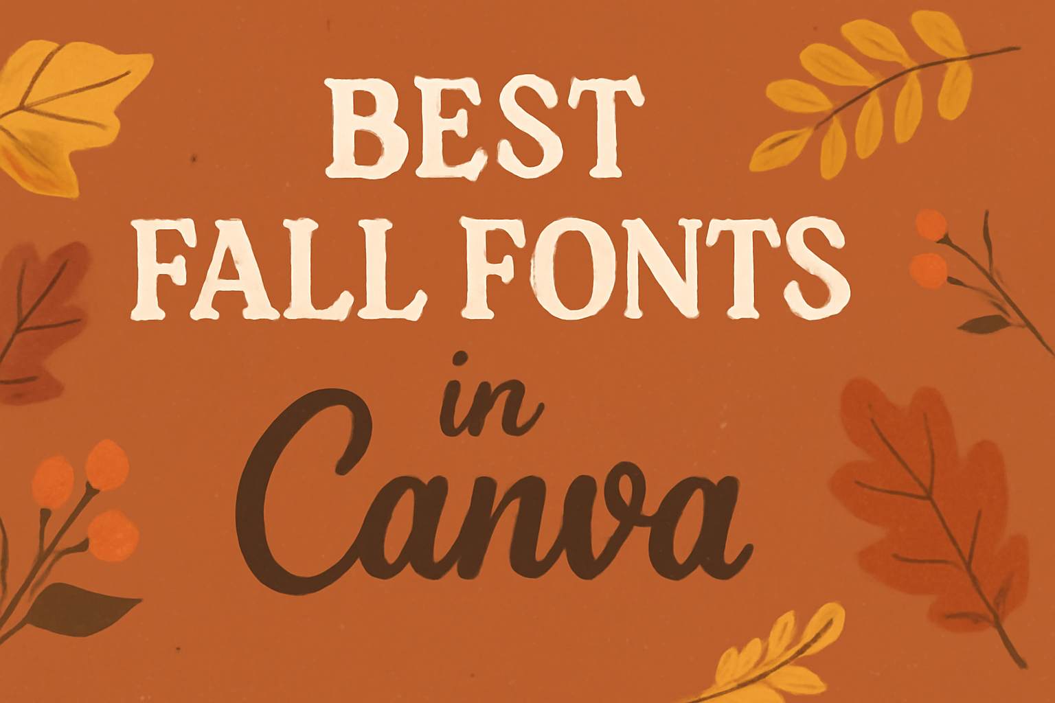
As the leaves change color and the air turns crisp, many designers seek to capture the essence of fall in their creations.
Canva offers a variety of fonts that can help bring that autumn charm to life. Whether designing greeting cards, posters, or social media posts, the right font can make all the difference.
Fonts like Angella White and Rasputin offer unique styles that embody the spirit of autumn.
Angella White is known for its elegant, signature-like appearance, while Rasputin provides a vintage touch with ornate details. These fonts are perfect for crafting designs with a cozy, seasonal feel.
Using well-chosen fonts can transform a project, giving it warmth and character.
Fonts such as Bree Serif add friendliness, making it ideal for engaging audiences. Additionally, Apricots font pairs easily with others, offering versatility in design.
Explore these popular choices and let your creativity flow this fall.
Understanding Font Aesthetics for Autumn
When choosing fonts for autumn, the right style can evoke the cozy, warm feeling of the season.
Think of colors like rich oranges, deep reds, and golden yellows, which naturally complement fall-inspired fonts.
Key characteristics of fall fonts often include:
- Warmth: Fonts can feel more welcoming with smooth, flowing lines.
- Elegance: A touch of sophistication through intricate details.
- Nostalgia: Vintage-inspired fonts that remind of past seasons.
Decorative fonts like Rasputin are perfect for adding a touch of antique charm. Their filigree-like details make them unique for autumn projects. These fonts work well for invitations, greeting cards, or any design where a refined feel is desired.
Signature-style fonts like Angella White offer an elegant, personal touch. The gentle curves and flowing strokes create a soothing aesthetic that pairs beautifully with autumn themes.
When designing with these fonts, it’s useful to combine them creatively:
- Pair bold fonts with minimalist ones for contrast.
- Mix ornate details with simpler styles for balance.
| Font Feature | Description |
|---|---|
| Warmth | Uses smooth lines to feel inviting |
| Elegance | Intricate details add sophistication |
| Nostalgia | Vintage styles with a classic feel |
These elements come together to create designs that beautifully capture the essence of fall.
By thoughtfully selecting and combining fonts, designers can create visuals that warm the heart just like a cozy fall day.
Top Elegant Serif Fonts in Canva
Serif fonts are known for their classic and timeless appeal. They bring an air of sophistication to any design. On Canva, users can explore a variety of elegant serif fonts that elevate their projects.
The Seasons by MyCreativeLand is a favorite among designers. Known for its classy and fresh serif style, this font is perfect for display work. It’s elegant and thin, which makes it stand out. Users who love stylish fonts often choose The Seasons for their projects. More about this font is available here.
Another popular choice is Quattrocento. This Roman typeface combines strength and elegance, offering widely spaced letters that make small text easy to read.
It’s versatile for both digital and print, providing a sober yet classic feel. Designers looking to convey a sense of grandeur and clarity might prefer using Quattrocento in their layouts.
For a modern twist, Merriweather offers a robust design with a touch of elegance. It’s crafted to be easy on the eyes, which makes it great for longer text passages. Designers appreciate Merriweather for balancing modernity with tradition, making it suitable for a wide range of projects.
Playfair Display also deserves a mention. With its high contrast and bold style, it evokes a sense of high fashion and editorial design. Playfair Display is an ideal choice if the goal is to grab attention while maintaining a polished look.
Cozy Handwritten Fonts for Fall
Fall brings a sense of warmth and comfort, and one of the best ways to capture that in design is through cozy handwritten fonts. These fonts add a personal, inviting touch to projects, making them perfect for autumn-themed designs.
Sweet Apricot is a charming option that strikes a balance between stylish and simple. It’s not overwhelmingly decorative, which gives it flexibility in various projects. Sweet Apricot tends to capture the essence of fall beautifully.
Apricots is another lovely choice. Known for its easy-to-read handwriting style, Apricots is suitable not just for fall but also for various other seasons.
It’s versatile and pairs well with standard typefaces, providing a gentle, welcoming look.
Another font to consider is Bree Serif, which has a soft and structured appeal. With its rounded forms, Bree Serif offers a warm, approachable feel that connects with the cozy vibes of fall, much like a comfy sweater. This makes it ideal for designs aiming to engage audiences effectively.
Designers might also enjoy using Rasputin. This decorative display font has a vintage appeal with intricate details. Its ornate style brings a touch of old-world charm, making it a special addition to fall projects.
These fonts not only look good on their own but can also be enhanced with colors like deep reds and burnt oranges. Such combinations help deliver the warmth and coziness associated with the autumn season.
Each font brings something unique to the table, ensuring that every fall project can stand out with its own special touch.
Rustic Display Fonts for Harvest Themes
When creating designs for harvest themes, rustic display fonts can add a touch of charm and warmth. These fonts perfectly capture the essence of autumn with their cozy and inviting look.
Bowl Font: This is a minimalist sans-serif font. It has rounded edges that make it feel friendly. The distressed surface gives it a rustic vibe, making it great for fall projects. More about it can be found at Best Rustic Fonts in Canva.
Albany Font: Designed by Jen Wagner, this warm script font brings out the feelings of a fall harvest. It includes 74 ligatures, helping texts look realistic and full of character. Check out more about this font at 20 Fall Fonts That Evoke Autumn, Foliage & Harvests.
Using these fonts can create a balance of rustic aesthetics with modern design. They work well on posters, invitations, or any autumn-themed projects.
Tips for Usage:
- Pair these fonts with deep red and burnt orange colors.
- Apply them on textured backgrounds for a natural feel.
- Experiment with sizes for headers and subheaders.
Modern Sans Serifs for a Crisp Fall Look
Modern sans serif fonts bring a fresh, clean look to any fall design. They are known for their simple lines and sleek appearance, making them perfect for a crisp seasonal theme.
Anahaw is a great example of a geometric sans serif font. It offers a minimalist design, with structured letterforms that work well for logos and headings. The clean look of Anahaw adds a contemporary edge to any autumn project. This font provides a modern feel that contrasts beautifully with the rustic tones of fall.
Ovo is another strong choice. With its bold and clean lines, Ovo delivers a friendly yet modern feel. This font has slightly rounded edges, making it approachable and easy to read. It’s particularly effective for creating eye-catching designs that need a touch of warmth.
Roboto is a popular sans serif that brings versatility to fall designs. Known for its clarity and readability, it suits both digital and print projects.
Its sleek design is perfect for maintaining a professional look while still embracing the seasonal theme. Roboto’s flexibility makes it a favorite for many designers.
How to Select the Perfect Fall Font
Choosing the right font for fall projects can set the mood perfectly. It’s all about finding a style that reflects the warm and cozy feelings of the season. Here are a few tips to guide the selection process.
First, consider theme and tone. Will it be playful, elegant, or rustic? Fonts can convey different emotions, so it’s important to match the font to the project’s vibe.
Next, think about readability. While some fonts may look beautiful, they should still be easy to read. This is especially important for longer text.
A mix of fonts can add variety. Pairing a fancy font with a simple one often works well.
For instance, a script font might be paired with a sans-serif for contrast. The Rasputin font is a decorative style that pairs nicely with more understated fonts.
Color plays a role, too. Warm tones like deep orange or maroon complement fall fonts beautifully.
For a professional touch, consider using fonts like The Seasons, which is a classy serif option perfect for the season.
Finally, it’s great to experiment. Testing different fonts with your design can reveal which one feels the best. Don’t be afraid to try something new and see how it transforms the look.
Pairing Fonts for Fall Designs
Picking the right font pairings can set the mood for any fall design. Using a combination of fonts adds depth and keeps the design interesting.
Contrast is Key
When pairing, contrast is important. Bold, decorative fonts like Rasputin can be matched with simpler ones to highlight headlines. Mixing styles creates a balance that’s visually appealing.
Experiment with Styles
Different styles like serif and sans-serif work well together.
For example, a decorative style like Bree Serif can go with a plain sans-serif to give a cozy feel. This blend is perfect for autumn themes.
Keep Readability in Mind
While being creative, make sure the text is easy to read. A popular choice like Sweet Apricot is both readable and stylish. It’s great for making text stand out without being overwhelming.
Short Font Pairing Tips:
- Choose contrasting styles: This creates interest.
- Mix serif with sans-serif: This adds a classic touch.
- Prioritize readability: Especially for longer texts.
Creating engaging fall designs with font pairings can capture the essence of the season. A thoughtful mix of fonts makes designs lively and memorable, perfect for an autumn look and feel.
Utilizing Font Colors and Textures
When designing with fall fonts in Canva, playing with font colors and textures can make a huge difference.
Warm Colors: Think of deep oranges, rustic reds, and golden yellows. These shades mirror autumn leaves and create a cozy feel.
They can add warmth and richness to your designs.
Textures: Applying textures to fonts can give them a unique touch. Textures like wood grain or worn paper can enhance the autumn vibe, making your project stand out.
Using these textures conveys a sense of nostalgia that fits with the season. It can help engage the audience more effectively.
Here’s a simple guideline:
| Element | Suggestion |
|---|---|
| Color | Rusty Reds, Golden Yellows |
| Texture | Wood Grain, Worn Paper |
Mix and Match: Experiment by mixing different fonts with varied colors and textures.
This blends the elements perfectly to create a visually appealing and balanced design.
He or she can tweak colors and textures to find the right look for their project. This can help capture the essence of autumn in their design.
Tips for Creating Seasonal Content in Canva
Creating seasonal content in Canva can be both fun and effective. Here are some tips to help you get started:
Choose the Right Color Palette
He should select warm colors that suit the season, like oranges, browns, and deep reds. These colors evoke the cozy, inviting feeling of fall.
Use Autumn-Themed Fonts
Selecting the perfect font can set the mood for any fall project. Consider using fonts like Rasputin, which has a vintage charm, or Bree Serif for a cozy touch.
Include Seasonal Graphics
Adding icons and illustrations like leaves, pumpkins, or acorns can enhance the seasonal vibe. She can find a variety of these elements in Canva’s library.
Balance Text and Imagery
It’s important to strike a balance between visuals and text. They should make sure the content is eye-catching, yet easy to read.
Larger fonts can help the text stand out against detailed images.
Experiment with Layouts
Trying different layouts can keep the content fresh and interesting. He can use templates or create his own design to find what works best for his project.
Mixing up the alignment and spacing can create unique visuals.
Keep it Simple
While it’s tempting to include numerous elements, simplicity often brings the best results. She should focus on clear, impactful designs for a stronger seasonal message.