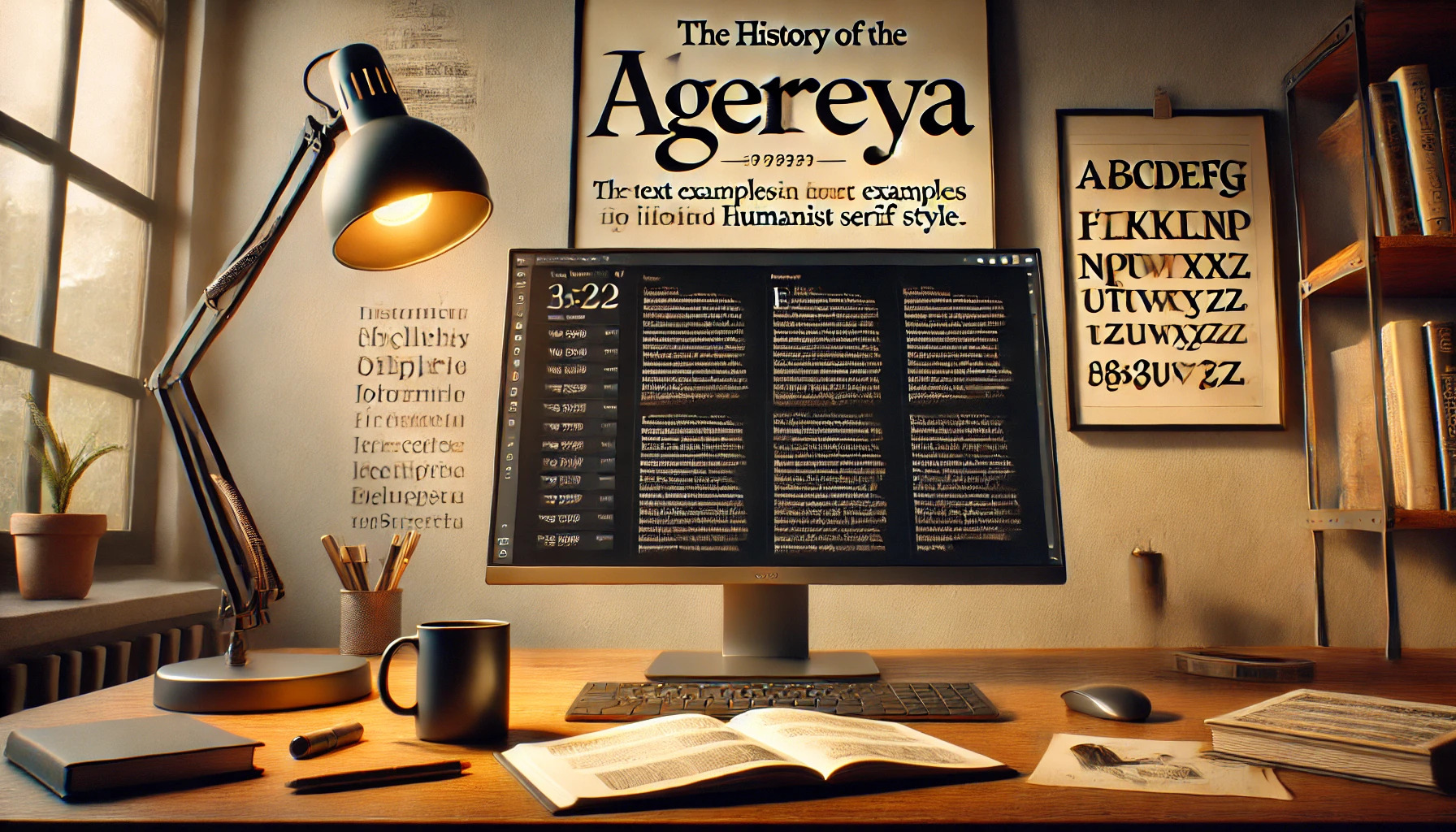
Alegreya is a font that has captured the attention of both designers and readers alike. Created by Juan Pablo del Peral, it was originally designed for literature. Its dynamic and varied rhythm makes it perfect for lengthy texts, offering readers a smooth reading experience.
Alegreya has a unique charm, striking a balance between classical and contemporary styles. It is recognized for its calligraphic influences which add a touch of elegance to the page. The font offers a range of styles, which makes it a versatile choice for different projects.
A notable feature of Alegreya is its open licensing. Under the SIL Open Font License, Alegreya can be used freely for personal, educational, and commercial projects. This accessibility further extends its appeal to designers who are looking for beautiful and functional typefaces.
Origin of Alegreya
Alegreya, a typeface with calligraphic roots, was created by designer Juan Pablo del Peral and is known for its readability and dynamic rhythm. The font was developed by Huerta Tipográfica, a foundry that supports innovative type design.
Designer Juan Pablo del Peral
Juan Pablo del Peral is the innovative designer behind Alegreya. His vision was to create a typeface that blends the elegance of calligraphic styles with modern design elements. Del Peral focused on readability, aiming for a typeface suitable for both digital and print media. His work results in a typeface that combines traditional aspects with a contemporary flair. This balance of old and new helps make Alegreya both classic and current.
Huerta Tipográfica Foundry
Alegreya was developed by Huerta Tipográfica, a respected Argentine type foundry. This foundry is known for pushing boundaries in type design and supporting designers in their creative processes. Huerta Tipográfica ensures high-quality standards and innovative approaches. By fostering a collaborative environment, the foundry played a crucial role in bringing Alegreya to life, allowing it to gain popularity in the design world.
Design Philosophy
Alegreya’s design reveals unique characteristics. It merges humanistic serif features with a focus on enhancing readability. The typeface flows seamlessly, making it ideal for both print and digital content.
Humanistic Serif Qualities
Alegreya showcases humanistic serif qualities that imitate the fluidity of handwritten text. This style brings a personal and approachable feel to the font. Designed by Juan Pablo del Peral, the typeface captures a sense of warmth and clarity. The curved strokes and slight angle in the letters help mimic a calligraphic approach.
This touch of the handwritten form makes Alegreya stand out. It’s not only elegant but also versatile, working well in various settings. The font conveys both tradition and modernity, striking a balance that appeals to many designers.
Reader-Friendly Ambiance
The main goal of Alegreya’s design is to create a reader-friendly ambiance. Its structure supports easy reading, which is particularly evident in long texts. With its dynamic rhythm and variation, the typeface keeps readers engaged without overwhelming them.
These qualities suit literary and digital works alike, affording texts a smooth flow. The blend of styles available ensures content creators can find the perfect fit for their needs. This approach to design prioritizes comfort and accessibility for the reader, maintaining attention without sacrificing elegance.
Characteristics of Alegreya
Alegreya is known for its special design, dynamic rhythm, and flexibility. Its glyphs offer a modern take on calligraphy, while its italic style is both unique and functional. With multiple weights and variations, Alegreya suits various design needs.
Glyph Design
Alegreya features a contemporary interpretation of calligraphy. Designed for literature, it balances classic and modern elements. Its glyphs have a dynamic rhythm, which helps readers focus on long texts. This makes it suitable for academic and literary works. The font is especially admired for its legibility and adaptability.
The typeface’s design ensures that it supports different languages and characters. It includes small caps and appropriate spacing, which contribute to its readability. This depth of design makes Alegreya a favorite in many typographic settings.
Unique Italic Style
The italic style of Alegreya is carefully crafted to complement its regular glyphs. It isn’t just a simple slant of the regular style but a full design on its own. This makes the italic version both expressive and unique. It maintains readability while adding emphasis to text.
The italic variation fits seamlessly with its regular counterpart, providing a cohesive reading experience. Its balanced strokes and detailed design help in distinguishing italic text from regular text, making it stand out.
Weight and Variations
Alegreya offers multiple weights and styles. This includes a range from regular to bold, providing versatility in design choices. These variations make it suitable for different uses, from headlines to body text.
The font’s various weights allow designers to build a complex typographic system without needing other fonts. This makes Alegreya ideal for projects that require a unified look, like ebooks or marketing materials. The variety in styles, such as serif and sans serif, adds to its versatility in use.
Alegreya in Use
Alegreya is a versatile font that shines in both print and digital media. It’s celebrated for its unique design and has been featured in several award-winning projects.
Print Media Applications
The Alegreya font family is often chosen for print projects due to its classic feel and readability. Its serif design, with calligraphic influences, makes it perfect for literary works, giving a touch of elegance to book pages and magazines.
Alegreya’s range of weights and styles allows designers to establish a clear hierarchy, which is crucial in creating effective layouts. It is popular in editorial design, enhancing text clarity and aesthetics, particularly in lengthy reading materials.
Digital Media Presence
In the digital world, Alegreya offers flexibility with its various styles. It’s available on platforms like Google Fonts, making it easily accessible for web designers. The typeface adapts well to screen displays, thanks to its dynamic rhythm and clear letterforms.
Its use spans from websites to mobile apps, where readability and visual appeal are key. Alegreya pairs well with sans-serif fonts, offering creative possibilities in digital design, from marketing graphics to presentations.
Award-winning Projects
Alegreya has been recognized for its excellence in type design. It received the Certificate of Excellence in Type Design from the Type Directors Club. Its innovative, calligraphy-inspired design won praise for bridging traditional aesthetics with modern needs.
This font has been part of projects that captured audiences’ attention due to its distinctive style, making it a favorite tool among designers pushing the boundaries of typographic art. Its successful integration into high-profile works highlights its influential role in elevating design projects.
Technical Details
Alegreya is a versatile serif typeface that supports a variety of font formats and provides flexible licensing options for different usage needs. It is designed to perform well in both print and digital environments, offering a wide range of styles and typographic features.
Font Formats
Alegreya is available in several font formats that make it compatible with different applications. The most common formats include OTF (OpenType Font) and TTF (TrueType Font). These formats ensure high-quality rendering and support various typographic features. The Alegreya font family on Google Fonts includes styles like regular, italic, and bold, each contributing to its dynamic and versatile nature. Support for multiple weights broadens its usage, making it suitable for body text and headings.
Licensing and Usage
The licensing for Alegreya is flexible, allowing use in both personal and commercial projects. On platforms like Adobe Fonts, users can easily sync and use the font on websites and in design software without additional cost, provided they have a subscription. For more custom uses or large-scale projects, it’s important to review specific licensing details to ensure compliance. The font’s open-source versions can be downloaded from suitable repositories, allowing designers to use and modify them to fit specific project needs. These options make Alegreya accessible for various digital and print projects alike.
Updates and Expansions
Alegreya has seen several developments since its creation, including the introduction of a sans serif version and various updates that improve its versatility and usability. These changes have helped Alegreya to maintain its popularity among designers worldwide.
Alegreya Sans
Alegreya Sans is a significant addition to the Alegreya family. It offers a different look while maintaining the same friendly and approachable style. Created to provide more variety, Alegreya Sans complements the original serif version perfectly. It consists of 12 styles, ranging from light to bold, and includes both italic and regular options.
This sans serif version is praised for its readability and is often used in digital and print media. The introduction of Alegreya Sans allows designers more flexibility, expanding the potential uses for the Alegreya type system. It is ideal for projects where a modern, minimalistic touch is needed.
Version Releases
Over the years, Alegreya has undergone several version releases to enhance its features and support. These updates include more styles and character sets, greatly expanding its use. For instance, the 2012 release of Alegreya Pro included an expanded commercial version, increasing its appeal for professional use.
The updates also ensured that the typeface supported a wide range of languages, making it accessible to a global audience. These releases show a commitment to maintaining Alegreya as a versatile and comprehensive typeface. The releases improve its usage for both casual readers and professional designers, ensuring it stays relevant in a fast-changing design environment.
Impact on Typography
Alegreya stands out for its unique blend of classic and contemporary elements. It has been well received in the typography industry and has influenced the design of other typefaces.
Industry Reception
Alegreya has made a significant mark in the world of typography. The typeface has been celebrated for balancing elegance with readability, making it ideal for literature. This recognition was reflected when it was named one of the “Fonts of the Decade” in the ATypI Letter2 competition in 2011. Its design emphasizes dynamic rhythm, which enhances the reading experience for long texts.
Its versatility, with both serif and sans-serif versions, has also been praised. This adaptability makes it a preferred choice for various design needs, from websites to print.
Influence on Other Typeface Designs
Alegreya’s innovative approach has inspired other typeface designers. Its mix of traditional calligraphic elements with modern styling sets a trend followed by many new fonts. Alegreya’s serif and sans-serif versions have shown how combining styles can create harmonious type systems.
As a result, the typeface has paved the way for new designs that push creative boundaries. By influencing the creation of more playful and expressive fonts, Alegreya has contributed to the evolution of type design, encouraging a mix of classic and playful elements.