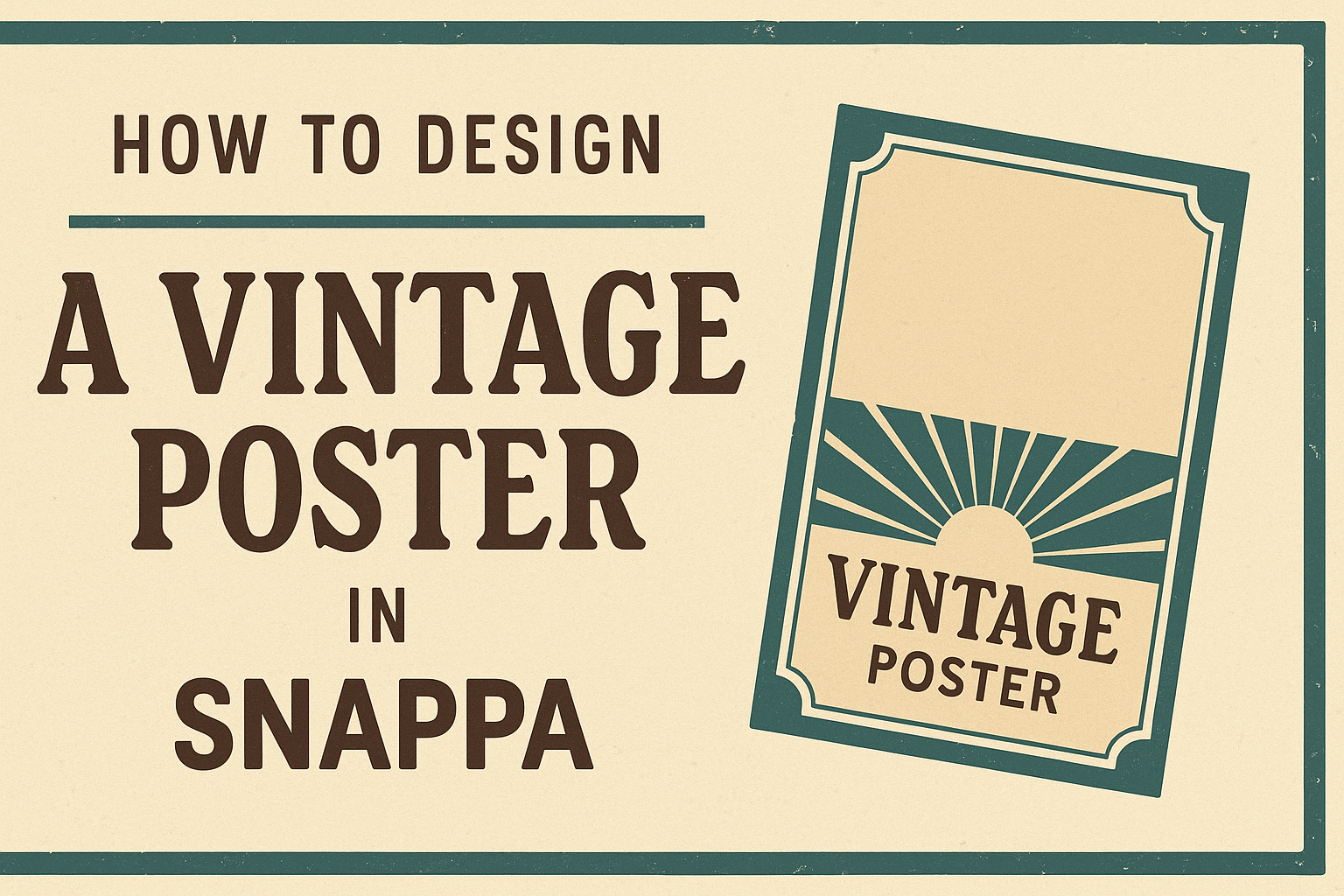
Creating a vintage poster can be a fun and rewarding project. With the right tools and guidance, anyone can achieve a classic look that captures the charm of yesteryear.
Using Snappa makes the design process straightforward and enjoyable, allowing users to craft stunning vintage-style posters with ease.
By leveraging Snappa’s user-friendly features, designers can access a range of templates, graphics, and fonts that evoke the nostalgic feel of vintage designs.
It provides everything needed to create eye-catching posters, from retro color palettes to unique typography.
With just a few clicks, it is possible to bring a timeless aesthetic to life.
Whether for personal use or promotional purposes, mastering vintage design can set any project apart. This blog post will walk through the essential steps to create stunning vintage posters in Snappa, making it easy for anyone to start their design journey.
Understanding Vintage Aesthetics
Vintage design incorporates elements from the past, often evoking nostalgia through specific styles. Key aspects include color palettes, fonts, and patterns that capture the essence of different eras.
These elements work together to create unique, eye-catching posters.
Exploring Color Palettes
Color palettes play a crucial role in vintage design. They often feature muted, earthy tones or vibrant shades popular in past decades.
For example, colors like faded reds, soft yellows, and olive greens evoke a retro feel.
Using palettes such as teal and orange can connect a design to the 1950s or 60s.
It’s beneficial to reference vintage posters for inspiration and to see how color limited the options from that time.
When selecting colors, aiming for a harmonious combination enhances the vintage vibe. Tools like online color palette generators can help designers pick complementary colors.
Selecting Classic Fonts
Fonts are another vital part of vintage aesthetics. Classic fonts have distinct characteristics that evoke specific time periods.
Serif fonts, like Baskerville or Caslon, can give a formal feel, while sans-serif fonts, such as Futura, can create a more casual, modern look.
Handwritten or script fonts add a personal touch, making designs feel friendly and inviting.
It’s wise to limit the number of font styles to two or three to maintain clarity and professionalism. Mixing fonts can add interest, but they should be easy to read.
Incorporating Retro Patterns
Patterns add depth and personality to vintage posters. Geometric shapes, florals, and even polka dots were widely popular in past designs.
Mixing these elements can create dynamic visuals that reflect the era.
When choosing patterns, it’s important to consider their compatibility with other design elements.
For example, a bold pattern might work well with a simpler background to avoid overwhelming viewers.
Faded or distressed effects on patterns can enhance that vintage feel, making the design appear more authentic.
Utilizing layers can add complexity while keeping the overall look polished and engaging.
Setting Up Your Snappa Workspace
Setting up a workspace in Snappa is crucial for creating a vintage poster. It involves navigating the interface, choosing the right template, and customizing the canvas size for the best results.
Navigating the Interface
When first using Snappa, taking time to explore the interface is key.
The dashboard features different sections like templates, graphics, and your saved designs. At the top, there is a menu bar for quick access to multiple tools.
On the left, users find the design menu, where they can select images, text, and shapes.
It’s also easy to switch between different projects. Knowing where everything is makes the design process smoother and quicker.
A little practice with the interface will allow for a more enjoyable experience. Familiarity with the tools helps users find what they need faster, making the design process less stressful.
Choosing the Right Template
Snappa offers a variety of templates perfect for vintage posters. Users can start from scratch or select one that fits their vision.
On the templates page, Snappa provides a range designed specifically for posters.
To choose a template, click on the “Create a Graphic” button. A grid displays various styles. Users should look for vintage themes or retro designs that resonate with their goal.
After selecting a template, it can be customized. This is where personal creativity can shine through.
Users can adjust colors, fonts, and images to make the poster unique while still maintaining that vintage vibe.
Customizing the Canvas Size
Adjusting the canvas size is important for any design.
Snappa allows users to set the dimensions based on where they plan to use the poster. Whether for print or online, choosing the right size ensures the design looks great.
To customize the size, navigate to the canvas settings after selecting a template. Users can enter specific width and height values.
Common sizes for posters, like 18×24 inches or A3, can also be selected.
Having the correct dimensions prevents pixelation or awkward cropping in the final product. This step sets the foundation for a well-designed vintage poster.
Creating Your Poster
Designing a vintage poster in Snappa involves careful attention to background elements, layering visual components, and applying textures and filters. Each aspect plays a crucial role in achieving that authentic vintage feel.
Adding Background Elements
To start, choosing the right background is essential. They can set the tone for the entire poster.
Snappa provides various templates and images that work well as backgrounds. Users should look for muted colors or faded textures that imply age.
Using a solid color can also be effective. A soft or muted shade provides a good base.
It’s important to remember that the background should enhance, not overpower, the other elements.
Place images or patterns behind text to add depth. Make sure they complement the overall design. A well-thought-out background can make a significant difference in how the poster looks.
Layering Visual Components
Layering adds richness and dimension to the poster. In Snappa, users can stack images, shapes, and text in a way that creates a sense of depth.
It helps to start with a focal point, like an image or a bold title, and build around it.
Adjusting transparency levels is a great technique. By making some elements semi-transparent, users can create intriguing visual effects.
Using overlapping shapes can also draw the viewer’s eye to specific areas. Snappa allows easy repositioning of layers, so don’t hesitate to experiment until it feels just right.
Applying Textures and Filters
Textures and filters are key to achieving that authentic vintage look. Snappa offers a variety of textures that can add character.
Overlaying a texture can make the design feel more tactile and interesting.
Filters can also help tweak colors and enhance saturation or contrast. A sepia or black-and-white filter can evoke a classic feel.
When applying any effects, moderation is crucial. Too many textures or filters can make the design cluttered.
Subtle adjustments often yield the best results, allowing the poster to maintain its vintage charm while still looking polished.
Final Touches and Exporting
As the design process comes to a close, final adjustments and proper exporting are essential for achieving the best results. This section addresses reviewing the design for any necessary edits, saving the project effectively, and exporting it for various platforms.
Review and Edit
Before wrapping up, he should take a moment to review the poster carefully.
Checking for any spelling mistakes or alignment issues is crucial.
It’s helpful to zoom in on details and view the project at different magnifications.
Using Snappa’s tools, he can adjust colors or fonts to ensure everything looks perfect. If he has multiple elements, double-checking their layering can help avoid any overlap or clutter.
A fresh set of eyes can make a difference, so getting feedback from someone else can provide valuable insights.
Saving Your Design
Once satisfied with the design, it’s time to save the work.
He can click the “Save” button in the toolbar within Snappa. For the first save, selecting the correct folder helps keep everything organized. If no folder is chosen, the graphic will save to the default “All your graphics” folder.
Make it a habit to save frequently to avoid losing changes. When he saves again, the new version will replace the previous one.
Keeping backups is also wise, as it allows for recovery if necessary.
Exporting for Print and Web
Exporting the finished design is the last step. Snappa offers options for both print and web formats.
For print, he should choose a high-resolution format, like PDF or PNG. This ensures the poster maintains its quality when printed.
For web use, he can opt for lower-res formats, such as JPEG or GIF, which help in faster loading times.
It’s essential to choose the right dimensions to suit the platform where the poster will be displayed. By ensuring proper export settings, he can achieve the best visual experience for viewers.