Creating eye-catching designs in Canva doesn’t have to be a daunting task. By focusing on color harmony, layout balance, and the power of simplicity, anyone can elevate their designs to a more professional level.
With just a few easy tips, it’s possible to enhance visual appeal and convey messages more effectively.
Many users overlook basic design principles, yet these can significantly impact how a design is perceived.
It’s important to choose a limited color palette and ensure elements are aligned properly for better visual flow.
Exploring tools within Canva, like grids and frames, can make it simpler to create stunning layouts.
No matter the project, a few thoughtful changes can take a design from ordinary to exceptional. Taking the time to refine designs not only helps in grabbing attention but also in sharing ideas clearly.
Readers will find that even small adjustments can yield impressive results in their Canva projects.
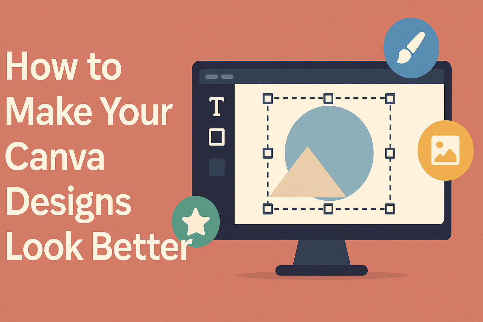
Understanding Canva’s Toolkit
Canva offers various tools to help users create eye-catching designs. By mastering these essential features, anyone can enhance their projects and achieve a professional look.
Work With Templates
Templates are a great starting point for design projects. Canva provides a wide selection of templates for different needs, such as presentations, social media posts, and flyers.
Users can browse through categories or use the search bar to find specific styles.
When choosing a template, it’s important to pick one that fits the project’s theme. After selecting a template, users can customize elements like colors and images to match their brand.
This way, it becomes easier to create a cohesive design that stands out.
Explore Design Elements
Canva includes numerous design elements such as shapes, icons, and images. These elements help enhance designs and make them more engaging.
To access these tools, users can navigate to the “Elements” tab on the sidebar.
In addition to pre-designed elements, Canva allows users to upload their own images. This feature ensures that designs can be personalized further.
Users should consider the context of their project when selecting elements, ensuring each piece contributes meaningfully to the overall design.
Utilize Text and Fonts
Text plays a crucial role in conveying messages. Canva offers a variety of fonts and text styles to help users communicate effectively.
When adding text, it’s important to choose fonts that align with the design’s tone.
Canva also provides options for adjusting text size, color, and spacing. Limiting the font palette to two or three fonts helps maintain consistency and professionalism.
Users should make sure the text is legible against the background for maximum impact.
Design Principles for Visual Impact
To create visually appealing designs in Canva, it helps to understand important design principles. Focusing on color, balance, contrast, and hierarchy can greatly enhance a design’s effectiveness.
Apply Color Theory
Color theory is crucial for setting the mood and message of a design. Designers can use complementary colors to create harmony or contrasting colors to grab attention. For example, a color wheel can guide the choice of colors that work well together.
Incorporating a limited color palette can produce a cohesive look. Limiting to three to five colors helps maintain focus and avoids overwhelming the viewer. Using shades and tints of the same color can create depth while keeping the design unified.
Balance Your Composition
Balance ensures that no part of the design feels heavier than another. There are two types of balance: symmetrical and asymmetrical.
Symmetrical balance means that elements are arranged evenly on both sides, while asymmetrical balance creates interest by using different elements that still feel balanced.
Ways to achieve balance include aligning elements with grids or using negative space effectively.
Negative space allows the design to breathe and directs the viewer’s attention. A well-balanced design guides the viewer’s eye smoothly across the entire composition.
Employ Contrast and Hierarchy
Contrast helps highlight key elements within a design. It can be achieved through differences in color, size, or font styles. For instance, using a bold headline against a light background makes it stand out.
Establishing hierarchy is important for guiding the viewer’s journey through the design. Utilizing different font sizes and weights helps to prioritize information.
A clear hierarchy ensures that the most important information captures attention first, leading to better understanding and engagement.
Enhancing Images and Graphics
Images and graphics play a vital role in making Canva designs stand out. By using the right editing tools and elements, anyone can enhance their visual content effectively.
Edit Images Like a Pro
Canva offers various tools to edit images easily. Users can start by adjusting brightness and contrast to make photos clearer.
The brightness slider helps lighten dull images, while contrast adjustments highlight different tones.
Other useful features include sharpening images to reduce blur and using the saturation slider to make colors pop. For those who want to correct color issues, the tint slider comes in handy.
With these tools, anyone can create vibrant and eye-catching images that capture attention.
Incorporating Icons and Shapes
Adding icons and shapes can give designs a professional touch. Canva has a vast library of icons that can enhance any project.
Users can search for specific icons related to their theme, making it easy to find relevant graphics.
Shapes also play a crucial role. They can frame images or provide backgrounds for text. Using contrasting colors helps to create visual interest.
Layering icons and shapes strategically adds depth. By combining these elements, designs can achieve a polished and cohesive look.
Final Touches before Sharing
Before sharing any design, it’s crucial to make final adjustments. This ensures that the layout looks polished and the presentation is professional.
Two key areas to focus on are the layout and the export process.
Review and Adjust Layouts
Checking the layout is the first step. It’s important to ensure that all elements are well aligned and spaced. Canva offers grid lines and guides to help with this task.
He or she should zoom in and examine each section closely. Making sure that text isn’t too close to images can enhance clarity.
Then, consider the hierarchy of information. Bold the main points and limit the use of colors to three or four for a cohesive look. This makes the design easy to read and visually appealing.
Preview and Export
Once the layout is adjusted, the next step is previewing the design. This feature allows users to see how their work will appear in its final form.
He or she can check for any typos or misplaced elements.
After the preview, it’s time to export. Choosing the right format is essential.
For online sharing, PNG or JPG formats work well. For printed materials, PDF is often preferred.
Additional settings can include adjusting quality and size. A good practice is to ensure that the design maintains high resolution to avoid blurring.