Designing an effective mobile app settings page can seem daunting, but it doesn’t have to be.
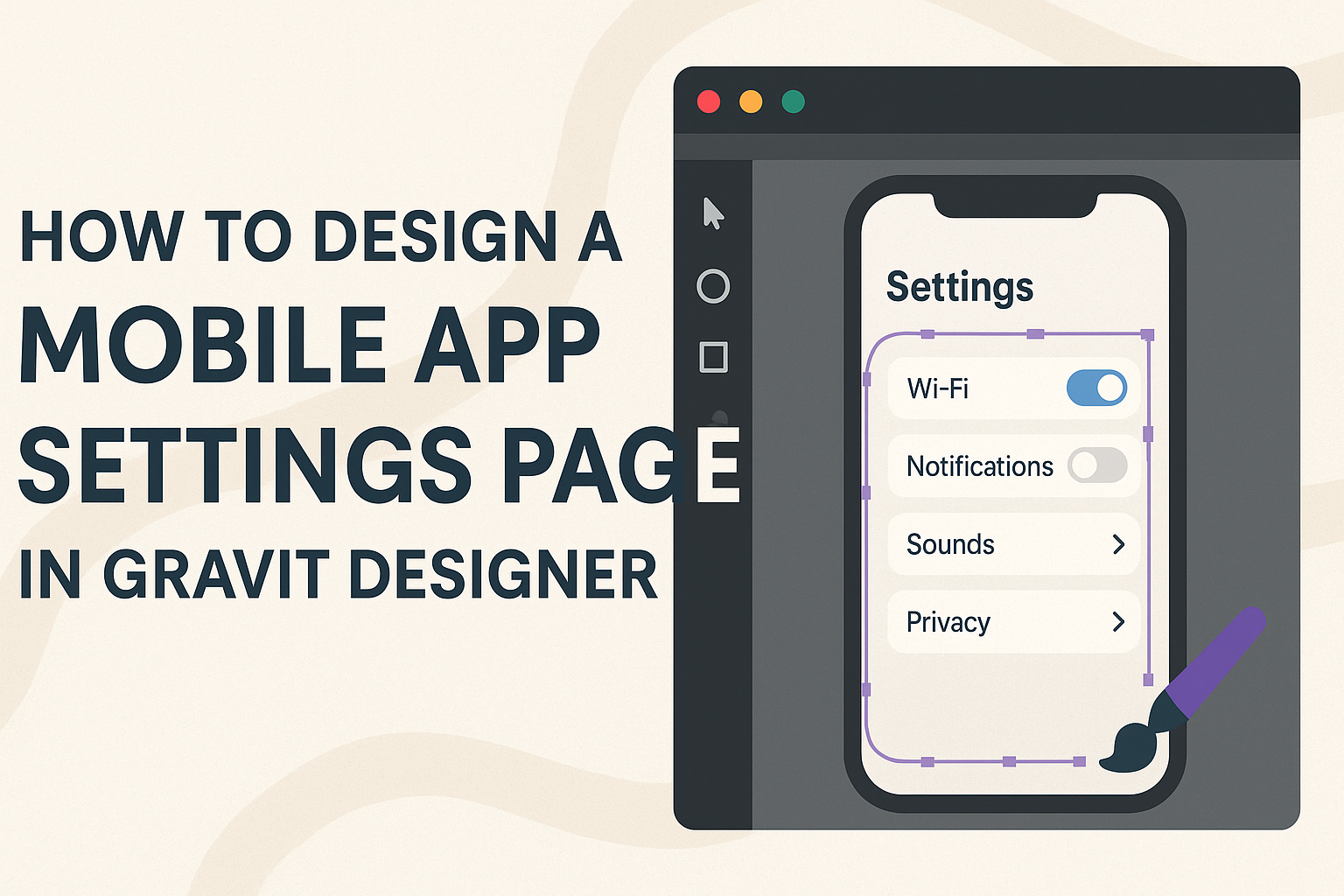
Using Gravit Designer, anyone can create a clean and user-friendly settings page that enhances user experience and accessibility.
By focusing on organization and simplicity, designers can make it easier for users to manage their preferences.
Gravit Designer provides a versatile platform where creativity meets functionality. It allows designers to experiment with layouts and features that cater to user needs.
When designing a settings page, considering how to group categories can significantly improve navigation and usability.
Focusing on clarity and minimalism is key. Users appreciate straightforward designs that help them find what they need quickly.
With the right approach in Gravit Designer, creating a top-notch settings page is definitely achievable.
Getting Started with Gravit Designer
Gravit Designer is a powerful tool for creating designs, including mobile app interfaces. Understanding its workspace and setting up a new project is essential for efficient design creation.
Understanding the Workspace
When first opening Gravit Designer, the workspace is organized into several key areas.
The toolbar on the left contains essential tools for drawing and editing shapes.
The properties panel on the right shows options to customize selected objects.
At the top, the menu bar provides access to file options, settings, and various features.
Users can adjust their layout by dragging these panels to suit their workflow. Familiarity with these areas allows for quick access to tools, making the design process smoother and more enjoyable.
Setting Up a New Project
To begin a new project in Gravit Designer, users start by clicking on Create New Design.
A window will pop up to let them choose the canvas size. Selecting a mobile size like 375×667 pixels is ideal for app design.
Once the size is chosen, users can set the background color to match the app theme.
The project will open with a blank canvas, ready for design. Users can then save their design using File > Save, ensuring their work is preserved as they progress. This sets the stage for effective and efficient app design creation.
Designing the App Settings Page
Creating a mobile app settings page requires careful thought about layout, color schemes, and interactive elements. Each aspect plays a crucial role in ensuring a smooth user experience.
Layout Considerations
When designing the layout, clarity is key. Organizing settings into categories can help users find what they need quickly.
They can group similar options together, like Account Settings, Notifications, and Privacy.
Using a grid system helps maintain balance. Each section should be easy to access and visually distinct.
Designers can utilize spacing to avoid clutter. Adequate spacing between items improves readability.
Responsive design is essential for various screen sizes. It’s important to ensure that elements adjust seamlessly from small to large displays. A well-structured layout enhances usability and guides users through the settings easily.
Choosing Color Schemes and Fonts
Color schemes should align with the overall app aesthetics. Using consistent colors for background, text, and buttons maintains a cohesive look.
Choose colors that create enough contrast. This ensures text is easy to read.
Fonts are equally important. The selection should be legible and friendly. Avoid overly decorative fonts; instead, opt for something simple and modern.
Using different font weights can help emphasize important settings.
Also, consider accessibility. The color choice should be friendly to those with visual impairments. Tools like color contrast checkers can guide designers to make suitable choices.
Creating Interactive Elements
Interactive elements significantly enhance user engagement. This includes sliders, toggles, and dropdown menus. These components should be intuitive and responsive.
For toggles, use clear labels. A user should instantly understand what a toggle does.
Similarly, dropdowns should display a limited number of options, making decisions easier.
Interactive elements must also provide feedback. For example, a button should change color when pressed, confirming the action. This feedback reassures users that their settings are updated successfully.
Best Practices for User Experience
Creating a user-friendly settings page is essential for a smooth app experience. Key practices include grouping related options effectively and ensuring accessibility for all users.
Grouping Related Options
Grouping related options helps users find settings quickly. This can be done by categorizing settings into clear sections such as “Account,” “Notifications,” and “Privacy.”
A well-organized layout allows users to focus on their needs without feeling overwhelmed. For example, a dropdown menu with limited options (5-7 choices) can simplify decision-making.
Using visual elements like icons can also enhance clarity. Adding brief descriptions for each category helps users understand their functions. This is a good practice, especially for new users who may not be familiar with every setting.
Ensuring Accessibility
Making a settings page accessible is vital for all users. This includes using clear fonts and sufficient color contrast to aid readability.
Implementing larger buttons can help those with motor difficulties navigate easily. Additionally, text labels should be concise and descriptive to support screen readers for visually impaired users.
It’s important to provide options for customizing the interface. For instance, allowing users to change text size or color themes can enhance their experience.
Regular testing with diverse user groups can uncover any barriers and improve usability. This approach ensures that everyone can configure their settings without frustration.
Exporting and Integration
When designing a mobile app settings page, proper exporting and integration are crucial for a smooth development process. This section will cover key steps for exporting assets and collaborating effectively with developers to ensure the design comes to life as intended.
Exporting Assets for Development
Exporting assets in Gravit Designer involves several straightforward steps.
First, designers should select the elements they want to export, such as icons or images. They can do this by clicking on the item, then navigating to the Export option in the sidebar.
It’s important to choose the right file format based on usage. For instance, PNG or SVG formats are great for graphics, while JPG may work better for photos.
Designers should also set the appropriate resolution to ensure quality on various devices. Once selected, clicking Export will package the assets, ready for developers.
To organize exports, it helps to create a naming convention for files. This practice can save time and prevent confusion during the development phase.
Collaborating with Developers
Effective collaboration with developers is key to bringing a design to life.
Clear communication is essential. Designers can start by sharing exported assets in a well-organized folder, making it easy for developers to find what they need.
Additionally, using tools such as Slack or project management software can streamline communication. This allows for quick feedback and adjustments based on technical limitations or new ideas.
Regular check-ins can prevent misunderstandings and keep the project on track.
Designers should also provide a style guide outlining fonts, colors, and spacing to ensure consistency. This guide serves as a reference for developers, making it easier to implement the design accurately.