Creating a flat-style map for a website can enhance its visual appeal and functionality. Gravit Designer offers the tools needed to design eye-catching maps that are both stylish and user-friendly.
This blog post will guide readers through the steps and best practices to achieve a polished and modern map design.
Flat design is popular for its clean and simple aesthetics. Designers can leverage the capabilities of Gravit Designer to create maps that are not only attractive but also intuitive for users. By the end of this article, they will have a clear understanding of the design process and tips to make their maps stand out.
Whether for a personal project or a professional website, a well-designed map adds value to the user experience. Readers will discover techniques to optimize their designs and learn how to implement their unique style. This approach ensures that the final product is both functional and visually appealing.
Getting Started with Gravit Designer
Gravit Designer is an intuitive design tool for creating stunning visuals, including flat-style maps for websites. With its user-friendly interface and powerful features, users can easily navigate and set up their projects.
Overview of Gravit Designer Interface
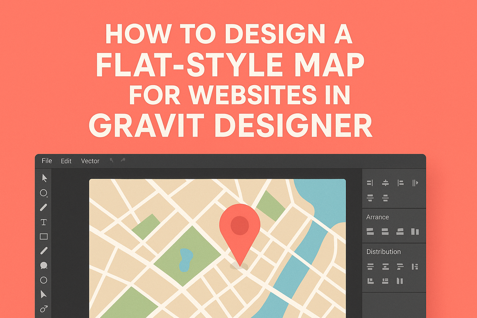
When users first open Gravit Designer, they are greeted by a clean and organized interface. The main area is the canvas, where all design work takes place.
On the left side, there is a Tools Panel that contains various tools for selection, shape creation, and text. The right side features Properties Panel, which allows users to customize their selected elements, including colors, strokes, and effects.
A Menu Bar at the top offers access to file options, editing, and additional features like exporting artwork. Understanding this layout helps users find tools and features quickly.
Setting Up Your Project Canvas
To start a new project in Gravit Designer, users should click on File and select New. A dialog box appears that allows users to choose the canvas size and orientation.
For designing flat-style maps, it’s recommended to select a landscape orientation. This gives more space for map details. Users can also set custom dimensions if needed.
Once the canvas is created, users can use grids and guides for better alignment of elements. To enable these, go to the View menu and select Show Grid.
Navigating the Tools Panel
The Tools Panel is essential for creating designs in Gravit Designer. It contains a variety of tools, including shapes, the pen tool, and text options.
Users can easily select the Rectangle Tool to create simple shapes that can represent map features. Selecting the Pen Tool allows them to draw custom paths and shapes for more intricate designs.
Using the Text Tool, users can add labels to their maps, helping to clarify information. It’s important to explore the Tools Panel fully, as it offers shortcuts to many useful functions, promoting a smoother design process.
Designing the Map Elements
Creating effective map elements is crucial for a flat-style map. This includes designing the background, roads, paths, icons for landmarks, and text labels. Each element plays a vital role in user understanding and overall aesthetics.
Creating the Map Background
A good background sets the stage for the entire map. You should choose a color palette that reflects the map’s purpose. Soft pastels are popular for whimsical maps, while darker tones can suggest a more serious tone.
Using a gradient effect can add depth to the background. Alternatively, a solid color can create a clean, minimalist look. It’s important that the background does not overpower other elements, allowing roads and landmarks to stand out clearly.
Adding Roads and Paths
When adding roads and paths, clarity is vital. Use simple lines for major roads and dashed lines for minor pathways. This helps users quickly differentiate between different types of routes.
Color choices also matter. Bright colors for major roads, such as yellow or blue, can attract attention. More muted colors like gray can be used for less important paths. Consistent line thickness enhances readability across the entire map.
Designing Icons for Landmarks
Icons serve as visual cues for important locations on the map. They should be simple and easy to understand. Common shapes include circles for parks, squares for buildings, and stars for attractions.
Using a consistent design style helps achieve a cohesive look. Each icon should be easily distinguishable, utilizing colors that contrast with the background. Adding subtle shadow effects can make the icons pop.
Incorporating Text Labels
Text labels provide essential information for users. It’s important to choose a readable font that matches the map’s style. Sans-serif fonts are often preferred for their clean appearance.
Labels should be color-coordinated with the rest of the map. Use bold text for city names and italic for smaller locations. Proper placement is essential; ensure labels do not overlap with icons or roads, making them hard to read.
Styling and Theming
When designing a flat-style map, attention to styling and themes is crucial. The right color scheme, design principles, and organization can make a map visually appealing and user-friendly.
Choosing a Color Scheme
Selecting an effective color scheme is key to a successful map design. A flat-style map often uses bold, vibrant colors that offer good contrast. Limit the palette to 3-5 colors to avoid overwhelming users.
Consider the purpose of the map. For a travel map, warm colors can create an inviting feel. A more subdued palette may suit a professional or corporate environment. Tools like color wheel calculators can help find complementary colors.
Additionally, ensuring that colors are accessible is important. Using high contrast between text and background enhances readability. You can check color contrast ratios to meet accessibility standards.
Applying Flat Design Principles
Flat design emphasizes simplicity and functionality. The absence of gradients, shadows, and textures creates a clean look. This principle allows users to focus on the map’s information without distractions.
Prioritize clear icons and labels for easy navigation. Using uniform shapes for elements makes the map cohesive. It’s helpful to create a visual hierarchy by sizing icons based on importance.
Utilizing white space effectively can enhance clarity. Ample space around text and symbols improves readability. It helps avoid a cluttered appearance.
Working with Layers and Groups
Organizing elements through layers and groups streamlines the design process. By grouping related components, it becomes easier to manipulate them as a single unit. This can make editing more efficient and intuitive.
In Gravit Designer, you can manage visibility by toggling layers on and off. This allows for a clearer view of specific elements during editing. Naming layers meaningfully aids in quick identification.
It’s beneficial to separate background, features, and labels into distinct layers. This organization enhances the map’s maintainability and flexibility. When changes are needed, you can easily find and adjust specific elements without confusion.
Exporting and Integration
This section covers important steps for exporting a flat-style map created in Gravit Designer and how to effectively integrate it into a website. Both exporting and embedding are crucial for anyone looking to showcase their maps online.
Exporting the Map as an SVG or PNG
To export a map from Gravit Designer, the user should first select the map design. They can go to the File menu and choose Export. Here, they will have options to save the map as either an SVG or PNG.
- SVG is ideal for scalability without losing quality, perfect for responsive design.
- PNG is great for web images due to its wide support but may lose quality when resized.
Once the desired format is selected, clicking on Export will prompt the user to choose a file name and location. This simple process makes it easy to have a high-quality image ready for use on any web platform.
Embedding Your Map into a Website
To integrate the map into a website, users have a couple of options.
If the map is saved as an SVG or PNG, they can upload the image to their web server. After uploading, users can use HTML to embed it.
A basic example of HTML for embedding might look like this:
<img src="path/to/your/map.svg" alt="Flat Style Map">
Alternatively, if the user employed an interactive format, they can embed it directly using an iframe.
The iframe allows the map to remain interactive on their site, enhancing user engagement. Integration can thus be accomplished effectively with a few simple steps.