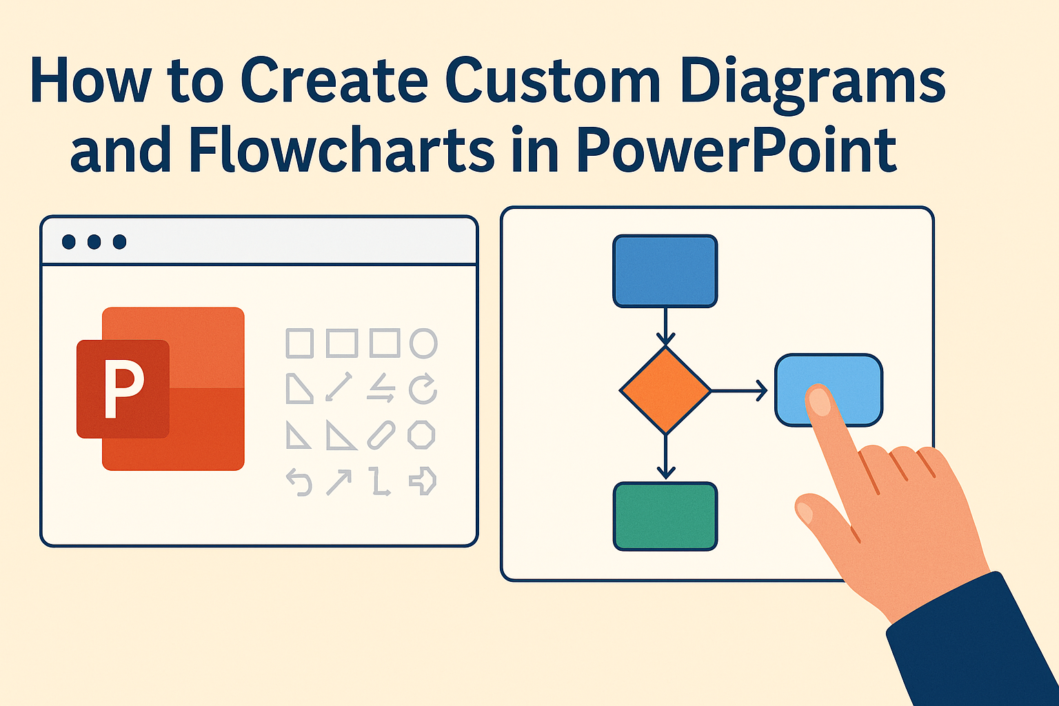
Creating custom diagrams and flowcharts in PowerPoint can enhance any presentation. These visual tools help to simplify complex ideas, making them easier for the audience to understand and remember.
With just a few easy steps, anyone can transform their slides into engaging visual narratives.
PowerPoint offers various built-in tools that allow users to design diagrams that fit their unique needs. From SmartArt to shapes, the program provides options that can cater to different formatting preferences.
This accessibility means that even those with minimal design experience can produce professional-looking graphics.
Whether drafting a project plan, illustrating a process, or showcasing data, custom diagrams can make a significant impact. Learning how to effectively create these visuals not only improves communication but also keeps the audience interested.
With the right techniques, anyone can master the art of diagramming in PowerPoint.
Getting Started with PowerPoint
PowerPoint provides a user-friendly platform for creating diagrams and flowcharts. Understanding its workspace and accessing drawing tools is essential for any user looking to make custom designs.
Understanding the Workspace
PowerPoint’s workspace is organized into several sections. The Ribbon at the top contains tabs, such as Home, Insert, and Design, which provide various tools.
On the left, the Slides Pane shows thumbnails of slides in the current presentation. Users can click to select a slide for editing.
The main area is the Slide Workspace. Here, users can view and alter the selected slide. The Notes Pane below the slide allows for adding notes that are visible only during presentations.
By keeping these sections in mind, users can navigate PowerPoint more effectively, ensuring they find and use the tools they need for creating flowcharts.
Accessing Drawing Tools
To create flowcharts, users need access to specific drawing tools. These tools are mostly found in the Insert tab on the Ribbon.
Clicking on Shapes reveals a list of various options. Users can find flowchart shapes like process boxes, decision diamonds, and more. These shapes simplify the process of building diagrams.
Another useful tool is SmartArt. This option also appears under the Insert tab. Using SmartArt, users can add pre-designed layouts, making diagram creation quicker and easier.
Familiarizing oneself with these tools will enhance the flowchart-making experience in PowerPoint, allowing for a smooth design process.
Designing Basic Diagrams
Creating basic diagrams in PowerPoint involves practical steps using shapes and colors to effectively communicate ideas. This part focuses on how to utilize shapes and lines creatively, as well as applying colors and effects to enhance the visual appeal.
Using Shapes and Lines
PowerPoint provides a wide range of shapes that can help in designing diagrams. Users can find these shapes in the “Insert” tab. Selecting the “Shapes” option allows them to choose various geometric forms.
For diagrams, common choices include rectangles for processes, diamonds for decisions, and ovals for starting or ending points. Once a shape is selected, it can be inserted with a click and drag motion.
Lines can be used to connect these shapes, showing the flow of information. To add lines, return to the “Shapes” menu and choose straight lines or arrows to indicate direction. Properly connected shapes create a clear path for viewers to follow.
Applying Color and Effects
Colors and effects play a significant role in making diagrams more engaging. Applying color helps to differentiate elements and categorize information.
Users can select a shape, click on the “Format” tab, and then choose “Shape Fill” to pick a color. Choosing contrasting colors ensures that important information stands out.
Additionally, using effects like shadows or 3D styles can give depth to the shapes. These options can be found under the “Format Shape” menu.
It’s essential not to overuse effects, as too many can distract from the message. A balanced approach helps maintain clarity while making diagrams visually appealing.
Creating Flowcharts
Creating a flowchart in PowerPoint involves choosing the right layout and effectively connecting elements. These steps help in making diagrams clear and easy to follow.
Choosing a Layout
Selecting a proper layout is important for clarity. PowerPoint offers various flowchart layouts through the SmartArt feature. Users can find the SmartArt option in the Insert tab.
They can click on “SmartArt” and choose from several types under the Process category. Some layouts include basic flowcharts, organizational charts, and cycle diagrams.
It is critical to select a layout that matches the flow of information. For complex processes, a more detailed layout may be necessary, while simpler tasks might require a basic one. Keep in mind the audience and the message when making this choice.
Connecting Elements
Connecting elements correctly ensures the flowchart is easy to understand. After choosing shapes for the flowchart, users need to link them together. PowerPoint allows users to draw lines or arrows to connect shapes.
To do this, they can go to the Insert tab and select Shapes. From there, they can choose lines or connectors. Proper labels on arrows can clarify the process being represented.
Using color or line styles can help distinguish different types of connections. This is especially helpful in complex charts. Ensuring proper alignment and spacing between elements also improves readability.
Enhancing Diagrams
To make diagrams in PowerPoint more effective, adding text and utilizing SmartArt graphics are two important steps. Clear labels and graphics can significantly improve understanding and engagement.
Adding Text and Labels
Text and labels are critical for clarifying the purpose of each element in a diagram. When adding text, it is vital to keep it concise. Each label should describe the function or step represented.
Tips for Adding Text:
- Use bold for headings or important points.
- Choose a readable font size. Aim for at least 18pt for visibility.
- Keep your text aligned to maintain a clean look.
To add labels, click the shape where the text should go. Simply start typing to insert text. Users can also utilize text boxes for additional information, ensuring everything is easy to understand.
Utilizing SmartArt Graphics
SmartArt graphics provide ready-made designs that can enhance the visual appeal of diagrams. This feature makes it easy to create professional-looking diagrams with minimal effort.
To use SmartArt, follow these steps:
- Go to the Insert tab.
- Click on SmartArt.
- Select a style that fits the diagram’s purpose.
SmartArt allows for customization. Users can change colors, shapes, and layouts to match their presentation style. It’s a great tool for visually summarizing complex information, allowing viewers to grasp the main ideas quickly.
Customization Techniques
Customizing diagrams and flowcharts in PowerPoint allows for a more personalized and engaging presentation. Various techniques enable users to enhance their visuals. This includes using shapes, adjusting line styles, and adding images.
Working with Custom Shapes
PowerPoint offers a wide range of shapes to create unique diagrams. Users can start with basic shapes like rectangles, circles, and arrows from the Shapes menu. To create custom shapes, hold the Shift key while drawing to maintain proportions or combine multiple shapes using the Merge Shapes feature.
Once the basic shapes are in place, they can be formatted. Adjust the fill color, outline, and effects to achieve a desired look. Right-clicking the shape brings up formatting options. Users should consider using the “Format Shape” pane for more precise adjustments.
Manipulating Line Styles and Arrowheads
Lines and arrows are crucial in flowcharts to show relationships. PowerPoint provides options to customize these elements. Users can change the thickness, color, and dash style of lines by selecting Format Shape and navigating to the Line options.
Adding arrowheads is also important for clarity. There are options to select different arrow styles in the same menu. Consistent line styles help keep diagrams looking professional. This level of detail enhances readability and guides viewers through the flow of information.
Incorporating Images and Icons
Images and icons add visual appeal to flowcharts and diagrams. Users can easily insert images by going to the Insert tab and selecting Pictures. Using icons, which can be found in the Insert menu, is another fantastic option. These are often more fitting than photos for illustrating concepts.
When images and icons are added, they should complement the overall design. Ensure they are properly aligned and sized to maintain balance within the diagram. Users should also consider transparency and layering to avoid overcrowding the design, allowing key elements to stand out.
Arranging and Aligning Elements
Arranging and aligning elements in PowerPoint is essential for creating clear and professional diagrams. Using tools like grids, guides, and alignment features helps ensure that each element fits well and looks organized.
Using Grids and Guides
Grids and guides are helpful tools in PowerPoint for positioning elements accurately. Grids are invisible lines that can help users align shapes and text boxes. To enable grids, go to the “View” tab and check the “Gridlines” option.
Guides function similarly and can be positioned anywhere on the slide. They can be moved by clicking and dragging them. To add a guide, right-click on the slide, then select “Add Vertical/Horizontal Guide.”
Utilizing these tools helps maintain consistent spacing between objects, making the diagram visually appealing. Adjusting grid and guide settings allows for flexibility, helping users create unique layouts that suit their specific needs.
Applying Alignment Tools
Alignment tools simplify the process of arranging elements. They ensure that shapes and text are evenly positioned. To access these tools, select the elements that need alignment and navigate to the “Format” tab.
In the “Arrange” group, options such as “Align Left,” “Align Center,” and “Align Right” help to quickly line up objects. Users can also distribute elements evenly using “Distribute Horizontally” or “Distribute Vertically.”
These alignment tools boost the professional look of a presentation. By keeping elements aligned and evenly spaced, the overall diagram becomes clearer for the audience to understand, enhancing communication.
Advanced PowerPoint Features
PowerPoint offers some advanced features that can greatly enhance diagrams and flowcharts. Two notable tools are the Merge Shapes feature, which allows users to create unique shapes, and the option to link diagrams to Excel data, making information dynamic and interactive.
Exploring the Merge Shapes Feature
The Merge Shapes feature enables the combination of multiple shapes into one. Users can access this tool through the “Format” tab after selecting the desired shapes.
Here are the options available:
- Union: Combines selected shapes into one.
- Combine: Merges shapes while removing overlapping areas.
- Fragment: Breaks shapes into separate pieces based on overlaps.
- Intersect: Creates a new shape from the overlapping parts only.
By experimenting with these options, users can create custom forms that fit their design vision.
Linking Diagrams to Excel Data
Linking diagrams to Excel data allows for interactive presentations. Users can embed Excel charts into PowerPoint slides. This can be done through the “Insert” tab by selecting “Object” and then choosing “Create from file.”
Once linked, changes made in the Excel file reflect in the PowerPoint diagram. This keeps presentations updated with the latest data.
For better clarity, users can format the connected charts within PowerPoint. They can adjust colors, styles, and labels to match their theme. This feature is especially helpful for business presentations that rely on data accuracy.
Maintaining Uniform Style
A uniform style helps viewers quickly understand the information presented. To achieve this, she should use the same color palette throughout the design.
Choose 3-5 colors that complement each other and stick with them.
It is also essential to use the same font types and sizes. Selecting one or two fonts for titles and text will make the entire diagram cohesive.
For instance, headings can be bold and slightly larger than body text to create a clear hierarchy.
Aligning shapes and text consistently improves the overall look. Tools like PowerPoint’s gridlines and smart guides can help maintain alignment.
This attention to detail makes the diagram more professional and easier to read.
Achieving Visual Clarity
Visual clarity lets viewers grasp the content quickly. Using simple shapes and avoiding clutter is vital.
Each shape should represent one idea, ensuring that the viewer can follow the flow of the diagram.
Incorporating whitespace is another effective strategy. Adequate spacing between elements prevents overcrowding and allows viewers to focus on each part of the diagram.
This balance of space and content makes the diagram more inviting and easier to interpret.
Labels should be clear and concise. Instead of lengthy descriptions, she can use keywords or short phrases.
This keeps the diagram neat and ensures that viewers can quickly identify key concepts without getting lost in text.
Saving and Exporting Diagrams
After creating a diagram or flowchart in PowerPoint, it is essential to save and export it correctly. This ensures that the diagrams are easily accessible and properly formatted for various uses.
Choosing the Right File Format
PowerPoint offers multiple file formats for saving diagrams. The most common formats include:
- PPTX: Best for keeping all features intact for future edits.
- PDF: Useful for sharing without allowing edits; maintains layout.
- PNG/JPEG: Ideal for images; great for use in web pages or presentations.
When saving a diagram, the format chosen should depend on the intended use. For edits, stick with PPTX. For sharing, consider PDF or image formats.
Exporting for Print and Web Use
When exporting diagrams for printing or online use, quality is crucial.
For print, save the diagram as a PDF or a high-resolution PNG. This ensures clarity and quality on paper.
For web use, PNG or JPEG formats are often preferred. They are compatible with most web platforms and maintain quality while reducing file size.
Adjust the dimensions before exporting to ensure it fits well on screens or printed pages.
Remember, clear and crisp visuals enhance communication.