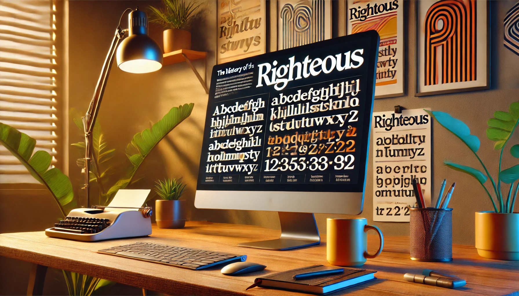
The Righteous font has a captivating backstory that blends art and typography with a touch of history. Originating from inspiration drawn from the art deco posters of Hungarian artist Robert Berény, this font stands out with its geometric style and retro-futuristic vibe. Its design features both uppercase and lowercase letters, making it versatile and flexible for various uses.
Readers interested in typography may find Righteous intriguing due to its unique blend of past and modern design elements. The font’s sharp angles and clean lines were influenced by 1950s and 1960s advertising trends. Its designer, the Astigmatic One Eye Typographic Institute, tapped into these eras to create something both familiar and fresh.
Moreover, the Righteous font is accessible and widely available for use, partly due to its release under the Open Font License. This license encourages collaboration and sharing, inviting designers to explore its potential. With its distinctive appearance and rich history, Righteous truly stands out as a font worth exploring.
Origin and Designer
Righteous is a font known for its unique style, inspired by art deco designs. It draws from historical influences and boasts a modern touch. The font has become popular for its versatility and readability.
Conceptual Genesis
The design of Righteous is rooted in the art deco movement, particularly the work of Hungarian artist Robert Berény. His distinct style, characterized by bold, geometric letterforms, influenced the creation of Righteous. This font captures the elegance and sophistication of the art deco era with its clean lines and strong presence.
Its all-caps letterforms make it particularly striking. With influences from early 20th-century posters, the font pays homage to an era of significant artistic expression.
Typeface Creation and Iterations
Righteous was developed to offer both uppercase and lowercase characters, enhancing its utility in various applications. The design process focused on ensuring that the font remained highly readable at multiple sizes, making it suitable for a wide range of uses.
The font has undergone updates to refine its style, balancing its art deco roots with modern needs. The iterations aimed to enhance its legibility while preserving the historical elements that make it special. Different versions have been released to cater to varying design requirements while maintaining its distinctive flair.
Technical Specifications
Righteous is an eye-catching, sans-serif typeface known for its geometric shapes and readability. This section delves into its family variants and examines its typographic features and readability.
Typeface Family and Variants
Righteous belongs to the sans-serif typeface family, created with a retro-futuristic vibe. It was originally inspired by deco posters, reflecting a vintage yet modern style. This typeface stands out because of its bold and dynamic look, making it suitable for various design projects.
The primary version of Righteous includes a complete set of uppercase and lowercase letters, which increases its versatility. There are also alternative styles available, such as Righteous Alt, known for its handwritten character design. These options allow designers more freedom to match the right style to their creative needs.
Typography and Readability
Designed by the Astigmatic One Eye Typographic Institute, Righteous draws strong influence from the advertising world of the 1950s and 1960s. It features clean lines and sharp angles, making each character easy to distinguish. This enhances readability even at different sizes.
The font’s geometric shapes and uniform spacing contribute to its clarity. While it retains the elegance of its inspiration, it includes modern touches that enhance its functionality across digital and print media. Righteous also supports a wide range of languages, which adds to its appeal for international projects. Such typography elements ensure it remains a versatile choice for many designers, adding impact without compromising on legibility.
Usage and Applications
The Righteous font is known for its unique style and usefulness in various projects. With its bold look and full lowercase set, it is ideal for creative works. Below, the focus is on font licensing rights and the places where Righteous makes its mark.
Font Licensing and Rights
Righteous comes with the Open Font License (OFL). This allows users to freely use, share, and modify the font. It promotes collaboration, making it a popular choice for designers who can adapt it according to their needs.
The OFL ensures that Righteous remains accessible to anyone interested in using it. Designers can leverage this licensing to include the font in commercial projects without incurring additional costs. This opens doors for more creative freedom and innovation across various platforms.
Popular Implementations
Righteous shines in branding projects, logos, and digital media. Its roots trace back to the art deco style, offering a modern twist on classic designs. This makes it an excellent choice for bold and eye-catching styles.
Brands often use Righteous to grab attention in advertisements and social media posts. The font’s geometric and readable design adapts well to different sizes, enhancing its versatility. Whether on a billboard or a business card, its presence is hard to miss, cementing its place in various design applications.
Aesthetic Aspects
Righteous is a typeface known for its geometric style and clean lines. It balances modern simplicity with a touch of vintage charm, making it visually striking.
Visual Style and Characteristics
Righteous is known for its grid-based design, drawing inspiration from art deco style. It features a balance of thick and thin lines, which gives it a bold and distinctive look. The font’s geometry creates an engaging visual rhythm, making it stand out.
The design is highly readable across different sizes, ensuring clarity whether in a title or body text. The absence of serifs gives Righteous a sleek and minimalistic appearance. This contributes to its adaptability across various design projects, enhancing its visual appeal.
Comparison with Other Typefaces
When comparing Righteous with other typefaces, it stands apart due to its geometric and deco-inspired design. Unlike serif fonts, it doesn’t have projecting features at the ends, which makes it more streamlined.
Fonts like Futura also share a geometric foundation, but Righteous has a unique balance of stroke weights. Its design is more playful and suited for creative projects. The inclusion of a full lowercase set in Righteous adds flexibility similar to typefaces like Righteous on Google Fonts, making it versatile for various uses.
Cultural Impact
Righteous font has made a recognizable mark, both as a visual element in cultural media and as a trendsetter in design. Its bold style captures attention, making it a go-to choice for many creative projects.
Representation in Media
Righteous font frequently appears in various media forms. Its bold, clean lines make it perfect for headlines and titles in web designs and advertising. It captures the viewer’s attention right away. This typeface often finds a place in movie posters and television promos.
Cartoon-style video games also like to use Righteous because it elevates the playful elements. Its strong presence enhances visual storytelling. Even social media graphics benefit from its impact, quickly attracting the viewer’s eye in a crowded feed.
Influence on Design Trends
Righteous has influenced numerous design trends with its unique character. Its retro, yet modern look has inspired other typefaces, pushing designers to explore bold and playful font styles. Often part of trendy minimalist designs, it balances simplicity with flair.
Designers across various sectors appreciate its versatility. In fashion, it may appear on clothing brands targeting younger audiences. In tech, Righteous fits well in apps aimed at a user-friendly experience. Through its use in logos, posters, and digital art, it continues to inspire creativity and innovation across the design landscape.
Modern Adaptations
Righteous has seen a surge in popularity with the rise of digital media. Its unique style makes it a favorite for creating memorable digital content and brand identities.
Digital Revival and Reinterpretations
Righteous has been revitalized in the digital age. Its roots trace back to art deco, but now it shines in modern designs. Many designers use it for its bold and stylish look.
The font is featured on platforms like Google Fonts, respected for its versatility. It supports various characters, making it useful for web and graphic design. Designers often tweak Righteous to fit specific projects, adding a unique twist while maintaining its original charm.
Usage in Brand Identities
Brands are turning to Righteous for its attention-grabbing features. It’s particularly popular in branding for its ability to stand out and draw attention. Its strong visual impact makes it ideal for logos, headlines, and advertisements.
Companies appreciate how Righteous can convey a modern and dynamic feel. It’s often seen in industries like fashion and tech, where a sleek and contemporary look is essential. This font is effective in helping brands create distinct and memorable identities.
Preservation and Legacy
Preserving the history of fonts like Righteous is important. This font, inspired by Art Deco designs from Robert Berény, combines classic and modern elements. By understanding its roots, designers can appreciate the blend of styles and ensure its continued use in creative projects.
Brian Willson is a notable figure in preserving font history. His work highlights the importance of maintaining the stories behind typefaces. Many people value his efforts in keeping the heritage of fonts alive through careful documentation and sharing knowledge.
Righteous is not just a tool for graphic design. It connects past and present design practices. As designers continue to use it, they contribute to its legacy, ensuring it remains part of typography’s evolving story.