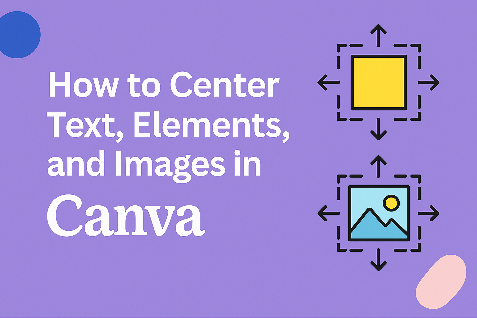
Creating designs in Canva is an exciting journey for many.
Getting those elements and text perfectly aligned, though, can sometimes be tricky.
In Canva, you can center text and elements by selecting them, clicking on the “Position” tab, and choosing the “Center” option. This ensures a neat and balanced look for your projects.
For those wanting a more polished and symmetrical design, mastering alignment in Canva is key.
Grouping elements can help manage them more easily.
You can group items by selecting them and using the “Group” option. Once grouped, you can use the “Align” dropdown to position everything harmoniously within the design.
By understanding these quick steps, anyone can improve their design’s visual appeal.
Aligning text, images, and elements not only looks good but also adds a professional touch to the presentation.
With a bit of practice, aligning various pieces will become second nature, and your projects will look even more visually cohesive.
Understanding Canva’s Text Formatting Options
Canva offers many ways to make text look great.
Users can change the font size and style easily. They can also choose from a variety of fonts to match the design theme.
Colors make text pop. Canva allows text color changes with a simple click. Adding background colors is easy too. This helps in making the text stand out.
Text effects like shadows or curves add flair. Although gradients on text are not supported yet, users can still create interesting text designs without them.
Spacing is important for readability. Canva allows adjustments to letter spacing and line height. This helps in keeping text easy to read and visually pleasing.
For organized design, Canva’s alignment tools are essential.
Users can align text left, right, or center. These options ensure everything looks neat. Learn more about aligning text in Canva by watching this tutorial on how to align text.
Formatting Tools in Canva:
| Feature | Description |
|---|---|
| Font Options | Choose from various fonts and sizes. |
| Color Settings | Change text and background colors. |
| Text Effects | Apply shadows and curves easily. |
| Spacing Controls | Adjust letter and line spacing. |
| Alignment Tools | Align text left, right, or center. |
Canva’s text formatting options are user-friendly. Whether designing for fun or work, these tools help make any project visually appealing.
Centering Text in Canva
When working with Canva, centering text can make your designs more balanced.
You can use tools like the Position tool and align your text with other elements for a neat and organized look.
Using the Position Tool
The Position tool in Canva is a simple way to center text. It helps to align text quickly without much effort.
First, click on the text box that you want to center. Once selected, go to the top corner of Canva, and find the Position button.
Clicking on this will show different alignment options. To center the text, choose the “Center” alignment. This will place the text box right in the middle of your design.
If you need the text aligned both vertically and horizontally, you can use the “Middle” option for vertical centering.
If you have multiple elements to align, the Position tool can also distribute them equally across the canvas.
Aligning Text with Other Elements
Aligning text with other elements in Canva adds polish.
To do this, select the text and any other objects you want aligned. At the top menu, you’ll find various align tools.
Choose “Align to Center” to make sure your text lines up perfectly with selected elements.
If elements are part of a group, make sure the text is within the group for alignment. Grouping elements ensures that all parts move together and maintain their spacing when centered.
Another tip is to use guidelines that appear when dragging text. These are helpful to visually confirm alignment and add a professional touch to designs. Taking advantage of these features can improve the overall look and feel of your project.
Centering Elements in Canva
Centering elements in Canva involves using smart guides and alignment buttons for precise positioning. Mastering these features can enhance the visual appeal of any design.
Utilizing Smart Guides
Smart guides in Canva are incredibly helpful for centering elements. When moving an item, these guides appear automatically to help align objects with others on the page.
This feature is particularly handy when dealing with multiple items that need to be consistently placed.
The smart guides can also assist users in maintaining symmetry and proportional spacing. They provide instant feedback, ensuring that elements are perfectly centered without extensive adjustments.
Users can make quick changes and see the effects immediately, streamlining the design process and improving accuracy.
Applying the Alignment Buttons
The alignment buttons in Canva are another essential tool for centering. Found in the toolbar, these buttons offer options like center, top, and bottom alignments.
To use them, select the elements you want to adjust and click the desired alignment button.
Another step involves grouping items first. Once grouped, use the alignment buttons to center the grouped elements. This method ensures all selected items move as a single unit, maintaining their relative spacing while achieving a centered alignment.
Using these buttons is a straightforward way to organize and align elements efficiently.
Centering Images in Canva
Centering images in Canva is easy with the position tools and background settings. These features help you create a balanced and professional look in your designs.
Adjusting Image Positioning
To position images precisely in Canva, the Position feature is your best friend. After selecting the image, navigate to the top toolbar and click on “Position.”
Here, choose the “Center” option to align your image perfectly in the middle of the design.
If multiple elements need alignment, group them first using the Group tool, accessible with “Ctrl + G” on Windows or “Cmd + G” on Mac.
By making sure everything is grouped correctly, you ensure consistent alignment.
This method works well when working with layered designs, as you can quickly center everything in one step. Keeping everything centered helps create a clean and organized look.
Setting Images as Backgrounds
Setting an image as a background in Canva allows for creative freedom while keeping designs neat.
To set an image as a background, drag it to the main design area until it fills the entire space, or right-click the image and select “Set Image as Background.”
This feature automatically centers the image, simplifying the process.
When an image acts as a background, it’s locked in place, so you can freely move other elements on top without disturbing the background.
Remember, adjusting the image’s transparency can also create interesting effects and ensure text or other elements remain readable. This technique is great for consistent designs where the image enhances but doesn’t overpower other elements.
Advanced Centering Techniques
Centering elements in Canva can be more precise with advanced methods. Using grids and frames helps arrange components neatly, while grouping and layering can streamline design adjustments.
Working with Grids and Frames
Grids and frames help designers keep layouts tidy.
Grids create orderly columns and rows, making alignment seamless. To use grids, drop your elements into a pre-defined grid space. This snaps items into place, ensuring everything is lined up.
Frames are versatile, as they hold images or texts and align them to the center easily.
By dragging items into frames, they automatically fit within the borders, centered neatly. Adjust the spacing between elements to keep the design balanced. This can be done by adding margins or padding.
Using grids and frames is beneficial for designing presentations, where consistent spacing allows for a cohesive look.
By placing text or images within these structures, designers ensure a precise and clean appearance. Testing different grid layouts can help find the perfect balance for any project.
Key Tips:
- Use grids for structured designs.
- Employ frames to contain and center elements efficiently.
- Adjust spacing for a balanced layout.
Leveraging Grouping and Layering
Grouping helps manage multiple elements. By selecting items and clicking “Group”, elements can be adjusted or moved as a single unit.
This makes centering them together much easier.
When elements are grouped, alignment becomes unified, and resizing retains the relative position.
Layering involves stacking items in different orders. To center a layer, position it between others as needed. Click on the “Position” tab in the toolbar and choose “Center” for perfect alignment.
Layers can be rearranged by dragging, making depth adjustments simpler.
For more complex designs, using both grouping and layering allows designers to create depth and hierarchy. This method is particularly useful for intricate designs where precision is key. Quick commands like “Cmd/Ctrl + G” expedite the process.
Tips for Success:
- Group items to simplify movement and alignment.
- Layer to adjust depth and order.
- Use positioning tools for precise centering.
These techniques make design work more efficient and visually appealing, enhancing the final product with ease.
Design Tips for Balanced Layouts
Creating a balanced layout in graphic design is essential for a visually pleasing look. It helps guide the viewer’s eye and keeps the focus on the right elements.
Here are some simple tips to achieve balance in your designs.
Use White Space Wisely
White space, or negative space, is your friend. It gives elements room to breathe and prevents overcrowding. This space can make the design feel clean and organized.
Align Your Elements
Proper alignment is key to balance. Ensuring text and images are neatly aligned creates an orderly feel.
Learn more about aligning elements in graphic design with this guide on creating alignment in graphic design.
Mix Different Sizes
Varying the size of elements, like text and images, can create a sense of hierarchy. Larger elements draw attention first, while smaller ones offer additional details.
Using scale can help achieve good visual balance.
Maintain Consistent Margins
Consistent margins around your design help frame the content. This creates symmetry and ensures nothing feels cramped. Equal padding around the edges can make a big difference.
Group Related Items
Grouping similar elements can help organize the content. This makes the design easier to navigate and directs attention. It also prevents the layout from feeling chaotic.