When it comes to design, choosing the right font can make a big difference.
Slab serif fonts offer a sturdy and bold look that can enhance both print and digital projects.
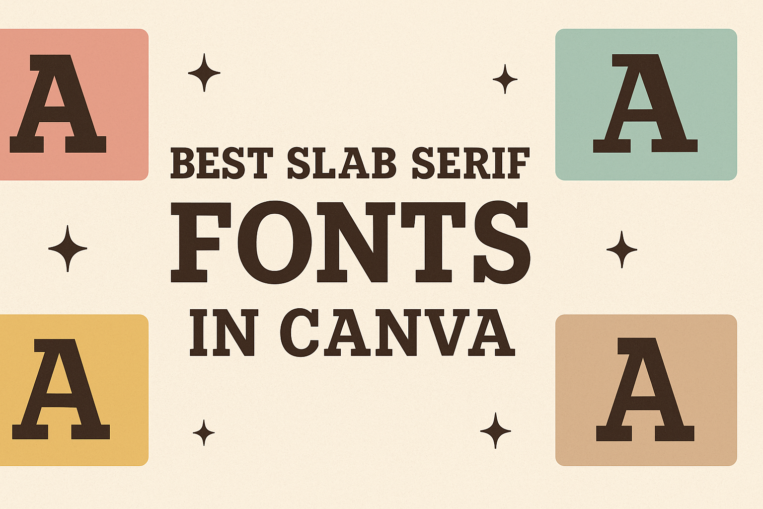
For users of Canva, there is a wide variety of slab serif fonts available that can elevate design work to the next level.
Among these, Aleo and Rockwell stand out as popular choices for their blend of readability and style.
Aleo, with its semi-rounded details, brings a modern feel to the traditional slab serif style. It’s noted for maintaining readability while giving designs a bit of personality.
Another excellent option is Rockwell, which is known for its bold and rugged appearance. It’s especially popular in headlines and posters. These fonts can transform a simple project into something that grabs attention.
For those aiming to make a strong visual impact, slab serif fonts in Canva are a fantastic tool. From creating striking headers to memorable logos, they offer both versatility and appeal.
Exploring these fonts gives designers new ways to express their creativity while keeping clarity and impact in mind.
Exploring Slab Serif Fonts
Slab serif fonts bring a distinctive style to design through their bold, block-like serifs. Their unique characteristics make them popular for conveying strength and clarity.
These fonts have a rich history and are known for their versatility in various design projects.
What Is a Slab Serif?
A slab serif font is characterized by thick, blocky serifs. Unlike other serif fonts, these have large, strong serifs that appear more geometric.
This type of font gained popularity during the Industrial Revolution when bold type was needed for advertisements and posters.
Slab serif fonts are also called Egyptian or square serif fonts. They are known for their durability in print materials and digital formats.
This font style includes typefaces like Rockwell and Clarendon, which are celebrated for their strong presence. Their robust nature makes them suitable for headlines and titles, providing a balance of style and readability.
The Appeal of Slab Serifs in Design
Designers are drawn to slab serifs because of their impact and versatility. These fonts can add a touch of retro style or modern boldness, depending on their use.
With thick serifs, they help emphasize text, making it noticeable and memorable.
Slab serifs work well in both digital and print media, fitting naturally in posters, logos, and branding materials. Their ability to convey strength while maintaining readability makes them a popular choice.
Designers appreciate how slab serifs balance classic appeal with contemporary trends, offering an excellent tool for creative expression in various projects.
Popular Slab Serif Fonts in Canva
Canva offers a variety of appealing slab serif fonts that are great for making designs bold and eye-catching. Each font has unique features that make it suitable for different design purposes, including titles, posters, or logos.
Robusto
Robusto is a strong and bold slab serif font that stands out in any design. Its thick and heavy serifs give it a commanding presence, making it perfect for headings and titles.
The font is not only eye-catching but also legible, ensuring clarity in communication.
Designers often choose Robusto for creating impactful visual elements. Its robust structure makes it an excellent fit for making statements, whether it’s on a digital platform or in print media.
In Canva, Robusto adds a sense of importance and authority to any project. This font is frequently used for branding or promotional materials, highlighting its versatility and effectiveness in conveying messages with power and strength.
ChunkFive
ChunkFive is a popular choice for those who love vintage appeal. With its chunky and bold design, this font brings a touch of nostalgia while still looking fresh and relevant.
The thick strokes and clear serifs make it highly readable, even from a distance, which is why it’s often used in posters and signage.
ChunkFive’s versatility makes it suitable for both professional and casual designs, bridging the gap between modern and classic aesthetics.
Designers appreciate ChunkFive for its ability to create a strong visual impact. This font works especially well when you want to draw attention and add a bit of old-school charm to your projects.
Zilla Slab
Zilla Slab is known for its noticeable and sturdy design. It offers a balanced contrast between thick serifs and thinner strokes, providing a more modern take on the slab serif style.
This font is an excellent choice for logos and branding, where readability and style are crucial.
Often seen in tech or innovative designs, Zilla Slab provides a professional look without being boring. Its fine details and clear lines make it suitable for formal and informal projects alike.
In Canva, Zilla Slab is loved for its ability to convey both professionalism and creativity, making it a favorite among designers looking to make a statement.
How To Choose the Right Font
Choosing the right font can transform a design by aligning with its message and enhancing the overall visual appeal. It’s essential to balance the tone, theme, and clarity of the text.
Considering Your Message
The message of the content plays a crucial role in font selection. Fonts convey feelings and tones, so this step requires thoughtful consideration.
For instance, a bold slab serif font like Klose Slab sends a strong, confident message suitable for headlines or call-to-action phrases. Meanwhile, a more delicate font might be better for softer themes.
Think about how the font will reflect the personality of the brand or message. A playful font could work well for youthful and fun materials, while a more traditional serif might suit formal or historical content. The font chosen should support the intended message clearly.
Matching Fonts with Visual Themes
The visual theme of a project greatly influences font choice. Fonts should complement the overall design, whether it’s modern, classic, playful, or corporate.
For contemporary designs, fonts like Aleo or TT Slab Condensed Thin bring a sleek, polished look with their clean lines.
Consider the color scheme and the other visual elements in the design. The right font can bring harmony and balance, ensuring elements don’t clash.
Consistency across all design aspects, including font choice, helps in creating a cohesive, visually appealing result that resonates with viewers.
Legibility and Readability
Legibility and readability are vital when choosing a font. If the text is difficult to read, the message won’t get across effectively.
Slab serif fonts are known for their readability because of their bold strokes and clear shapes.
When selecting a font, it’s important to consider its size and how it will appear in different contexts. Large displays or digital formats might require different font weights or styles to maintain clarity.
Ensuring that the text remains easy to read regardless of its format is key to successful communication.
Using Slab Serif Fonts in Layouts
Slab serif fonts add a distinct charm to any design. Their bold, block-like features make them perfect for drawing attention and providing structure. Understanding how to use these fonts can enhance the visual appeal of layouts.
Hierarchy and Emphasis
Creating a clear hierarchy is crucial in any design, and slab serif fonts excel in this area.
Using different weights and sizes of a slab serif font can help establish a visual order. Bold styles can be used for headlines, making them more pronounced, while lighter styles work well for subheadings or body text. This helps guide the reader through the information.
Consider blending slab serif fonts with sans-serif options to maintain readability, especially in digital formats. This combination helps the content feel balanced while allowing key points to stand out.
Combining Fonts
Pairing fonts can bring harmony and variety to a layout. Slab serif fonts often pair well with sans-serif fonts like Open Sans or Montserrat.
This contrast provides a modern touch, making the layout dynamic.
It’s important to ensure the styles complement one another without clashing. When combining fonts, keep the overall design theme in mind. Test different pairings to see which aligns best with the project’s tone and purpose.
Color and Contrast
Color plays a significant role in how slab serif fonts are perceived. Using contrasting colors enhances readability and focus.
For instance, a dark slab serif on a light background makes the text pop. Conversely, a light-colored font on a dark background can create a dramatic effect.
Testing different color schemes can help find the best match for your design needs. Be mindful of the readability when selecting colors, especially for smaller text sizes.
Using bold colors sparingly keeps the layout clean and professional.
Creative Tips for Slab Serifs
Slab serif fonts are versatile and can be used to create memorable logos and engaging web designs. These fonts’ bold lines and distinct serifs make them ideal for grabbing attention and conveying a strong visual identity.
Implementing Slab Serifs in Logos
When creating logos, slab serif fonts offer a bold and professional look. They can convey a sense of reliability and authority, making them suitable for businesses like law firms, financial institutions, and educational entities.
For a memorable logo, designers often combine slab serifs with minimalistic design elements. This approach helps maintain the font’s striking impact without overwhelming the viewer.
Brands that use slab serifs can achieve a modern yet classic aesthetic by choosing a font style that reflects their core values.
A good practice is to pair slab serifs with contrasting fonts, such as a sans serif, to add variety and visual interest. This pairing can make a logo not only stand out but also remain versatile across different media.
Designers should consider the font’s scalability and visibility at various sizes, ensuring that the logo remains clear and recognizable.
Slab Serifs for Web Design
Slab serif fonts can be a powerful tool in web design, providing a sleek and sophisticated appearance. They are excellent for headlines and subheadings, where attention-grabbing features are needed.
Implementing slab serifs in web pages adds depth and character while maintaining readability.
When used wisely, slab serifs enhance the user experience.
Designers often use them to create a visual hierarchy, emphasizing key messages or sections on a page.
It’s crucial to balance the strong characteristics of slab serifs with lighter fonts for body text, ensuring that the content remains easy to read.
Designers must consider web fonts’ load times and accessibility.
Selecting a digital-friendly slab serif ensures that the site performs well on various devices and screen sizes.
Thoughtful use of slab serifs enhances both the aesthetics and functionality of a website, making a lasting impression on visitors.
Font Customization in Canva
Font customization is a fun and easy way to bring creative ideas to life in Canva. Users can start by choosing from a vast selection of fonts, including various slab serif options ideal for bold and impactful designs.
Steps to Customize Fonts:
- Select Text: Click on any text box to begin.
- Font Style: Choose a font from Canva’s library.
- Size & Color: Adjust the font size and pick a color.
Styling Options:
- Bold or Italics: To add emphasis, use bold or italics.
- Spacing: Modify letter and line spacing for a balanced look.
Each customization setting helps create a unique piece.
Canva’s interface is user-friendly, making it accessible for all skill levels.
Using features like adding shadows and effects can enhance text even more.
Here is a simple feature advantage table that can be helpful:
| Feature | Benefit |
|---|---|
| Bold/Italics | Adds emphasis |
| Spacing | Improves text readability |
| Shadows | Creates depth and focus |
Exploring and experimenting with these features can lead to stunning results.
Whether it’s a poster, flyer, or social media post, users can effortlessly personalize their typography to fit any style. The creativity doesn’t stop here; experimenting is key to discovering fun and exciting customizations.
Licensing and Usage Rights
When using Canva’s font library, it’s essential to understand the licensing and usage rights associated with each font.
This ensures that designs comply with Canva’s terms and conditions.
Fonts available on Canva may have different usage rights depending on the user’s plan.
Free and Pro accounts offer varying levels of access and (https://www.biztemplateforyou.com/post/are-canva-fonts-free-for-commercial-use-a-comprehensive-guide-for-small-business-owners) commercial usage rights.
For personal projects, most fonts can be used freely and creatively. This means users can explore and experiment without worrying about licensing issues in non-commercial settings.
For commercial projects, the situation is a bit different.
Users must verify if a specific font is available for commercial use. It is important to follow the licensing terms to avoid any legal issues.
- Full Access to maximum fonts
- Commercial Usage allowed with specified fonts
- Limited Access to font library
- Restrictions may apply for commercial use
Always double-check Canva’s guidelines before using fonts in projects that might go public.
Users can find this information within Canva’s resource and help sections for peace of mind and compliance.