Creating custom UI kits in Adobe XD can greatly enhance a designer’s workflow. Instead of starting from scratch every time, designers can save commonly used components. This allows them to maintain consistency across projects while speeding up the design process.
Designers can easily access and modify these kits to fit the needs of specific projects. This flexibility ensures that their designs are not only consistent but also tailored to each unique project. Adobe XD makes it straightforward to integrate these kits seamlessly into projects.
Designers benefit from having all necessary components at their fingertips. The ability to modify and expand on custom UI kits ensures that every design is both unique and efficient. As a result, their creative focus can remain sharp and innovative, highlighting the true potential of Adobe XD.
Getting Started with Adobe XD
Adobe XD is a powerful tool for designing and prototyping user interfaces. Users can install the program, explore its interface, and set up their first project to create stunning designs.
Installing Adobe XD
To begin using Adobe XD, the installation process is straightforward. Users can download it from the Adobe website or from the Creative Cloud app. Make sure the system meets the necessary requirements, including a compatible operating system and enough storage space.
Adobe offers both a free starter plan and subscription options for more features. After installation, sign in with an Adobe ID or create one if necessary. This allows access to Adobe’s vast library of resources and updates.
Exploring the Interface
Once installed, it’s important to familiarize oneself with XD’s interface. The program opens with a clean workspace, featuring tools on the left, properties on the right, and a center area for artboards.
Tools like the selection, rectangle, and pen tools are essential for designing. Look at the top bar for options like prototype and share. Users can find helpful tutorials and guides embedded in the program to ease the learning curve.
Setting Up Your First Project
To start a new project, users can choose from various artboard presets or set custom dimensions. Presets are available for designing specifically for platforms like iOS, Android, or web.
A blank canvas greets users, but Adobe XD provides a wealth of assets and UI kits. For example, users can access UI kits for Apple iOS or Google Material directly within the app. This helps in quickly adding components like buttons and icons to the first design.
Understanding UI Kits
UI kits are powerful tools for designers. They streamline the design process and ensure consistency across projects. By offering pre-made components, UI kits save time and effort while maintaining a coherent visual style.
The Role of UI Kits in Design
UI kits play a crucial role in the design workflow. They provide designers with a set of ready-to-use components such as buttons, icons, and forms. These elements help maintain uniformity in design, which is essential for branding and user experience.
Using UI kits can significantly reduce design time. Designers no longer have to create elements from scratch, allowing them to focus more on the creative aspects of the project. This efficiency is especially beneficial when working on tight deadlines or large projects with multiple pages or screens.
Designers also benefit from the inspirations UI kits offer. With pre-made elements, they can kickstart their projects and explore different styles, ultimately enhancing creativity.
Elements of a UI Kit
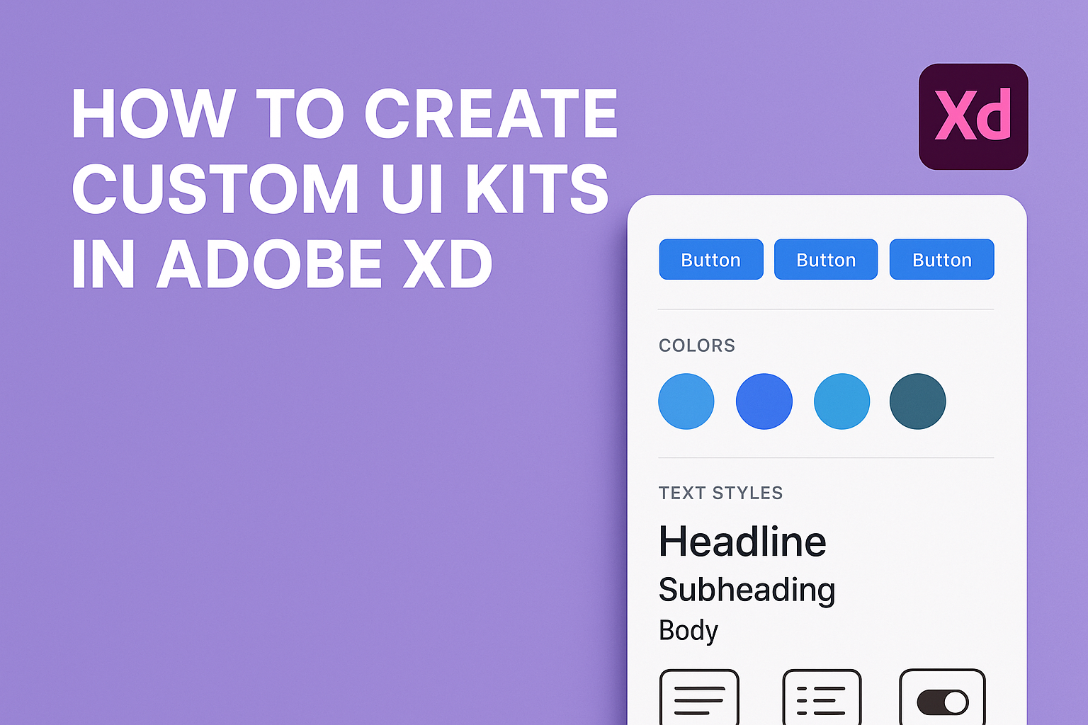
A typical UI kit contains various graphical elements that are essential for creating user interfaces. Common elements include navigation bars, sliders, buttons, and form fields. These components cater to different design needs, whether for web, mobile, or desktop applications.
UI kits often include typography guides and color palettes. This helps ensure that textual elements and color schemes are consistent across the entire design. Consistency is vital for user experience, as it creates a seamless and engaging interaction for users.
Some UI kits are specifically made for certain platforms. For example, there are UI kits that align with Google’s Material Design or Apple’s iOS guidelines. These tailored kits ensure that designs adhere to platform-specific standards, providing a more intuitive experience for users.
Creating Your UI Kit
Creating a custom UI kit in Adobe XD involves setting up a consistent design system, designing individual components, styling controls, and applying layout principles. These steps help ensure your design is effective and cohesive.
Defining Your Design System
A design system is the foundation of any UI kit. It includes standards for colors, typography, and component layouts. Adobe XD users can start by defining a color palette that aligns with their brand’s identity. Colors should be applied consistently across all UI elements to maintain uniformity.
Typography plays a crucial role too. Choosing the right font style and size can impact readability and user experience. Establishing clear rules for headers, paragraphs, and buttons helps maintain a consistent look.
Organizing these elements into a design system makes future projects easier. It saves time and allows for quick adjustments without compromising the overall aesthetic.
Designing UI Components
UI components are the building blocks of your design. They include buttons, input fields, sliders, and more. Adobe XD offers tools to make component creation straightforward.
Each component should be designed with functionality and aesthetics in mind. Consider how users will interact with buttons or forms. Making them visually appealing while ensuring they’re intuitive is key.
Components should be reusable. Once designed, they can be saved as assets in Adobe XD. This feature allows for easy access and can speed up the design process when creating new screens.
Styling Controls and Typography
Styling controls and typography involves defining visual properties for UI elements. These include borders, shadows, and gradients for controls, as well as font styles and sizes for text elements.
Consistency is important when styling controls. Borders should match across similar elements, and shadows should be used sparingly to enhance rather than distract. Typography should remain legible across all device sizes.
Using character and style themes can help ensure uniformity. Adobe XD allows designers to save text and style settings so they can be reused throughout the project. This ensures a consistent look and feel.
Using Grids and Layout Principles
Grids and layout principles ensure that design elements are aligned and proportionate. They provide a structure that helps maintain balance and harmony throughout the design.
Adobe XD has grid and alignment tools to aid in this process. Using a baseline grid can help align text precisely, while column grids can organize content in a clean and accessible way.
Layout principles, such as the rule of thirds, guide designers in placing content. These principles ensure that the design is both functional and visually pleasing. Grids and layouts are essential for responsive design, ensuring that the UI adapts well to different screen sizes.
Organizing Your UI Kit
When creating a custom UI kit in Adobe XD, keeping it organized ensures efficiency and consistency. Well-structured kits save time and make collaboration smoother. Focus on naming conventions and leveraging symbols to streamline the design process.
Naming and Layering Conventions
Choosing clear and consistent naming conventions is crucial. Each element should have a descriptive and concise name, making it easy to find and understand. Use a hierarchy that reflects the design structure, such as naming buttons by their function (e.g., “Primary Button” or “Secondary Button”).
Proper layering further enhances organization. Group similar items logically, like aligning header elements in one layer. This practice not only keeps the workspace tidy but also makes updates and changes easier. The consistent use of names and layers helps team members quickly navigate design files.
Grouping and Symbols
Grouping elements in Adobe XD not only aids organization but also boosts efficiency. Grouping related components, like navigation items, allows quick modifications across the board. This is especially useful in projects where similar elements need consistent styling.
Symbols in XD function like reusable components. Designers create a symbol once and use it throughout the project, maintaining consistency. Updates to a symbol reflect wherever it’s used in the design. This ensures uniformity across the UI and reduces repetitive work. Leveraging symbols can significantly streamline the design process, making adjustments seamless.
Sharing Your UI Kit
To share a UI Kit in Adobe XD, it’s essential to prepare assets, use collaboration features wisely, and understand the exporting process. These steps ensure that your designs maintain their integrity and are accessible to everyone involved.
Preparing Assets for Sharing
When preparing assets for sharing, it’s crucial to organize all components meticulously. Group related items such as buttons, icons, and text boxes. Create a naming system that is clear and consistent, so users can easily find what they need.
It’s also helpful to ensure that all design elements have consistent spacing, color schemes, and typography. Doing so makes it straightforward for collaborators to incorporate and adapt design elements into their projects. Consistency is key.
In Adobe XD, users can use the Assets Panel to manage colors, character styles, and components. Make sure to update this panel regularly to reflect any changes or additions to the UI Kit.
Collaboration Features in Adobe XD
Adobe XD offers robust collaboration features that simplify working in a team. One of the main features is the ability to share design specifications and prototypes using pre-defined presets. Designers can create links that give others access to design specs or prototypes.
Another useful feature is the “Coediting” function, which allows multiple users to work on a document simultaneously. This real-time collaboration can significantly speed up the design process and help in gathering instant feedback from peers.
Utilizing the comment feature is also beneficial. Teammates can leave feedback directly on the design, making it easier to make necessary changes and improvements.
Exporting and Distribution
When it’s time to export and distribute your UI Kit, Adobe XD makes the process simple. Users can export assets in various formats such as PNG, SVG, PDF, or JPG. Choose formats based on how the assets will be used or what the collaborators prefer.
To distribute the kit, you can share a link or export components into a downloadable file. Using cloud storage services like Adobe Creative Cloud can also be helpful for easy access and management.
When a UI Kit is distributed thoughtfully, it ensures that all team members can access and use the assets effectively, which keeps the project running smoothly.
Integrating Your UI Kit with Projects
Integrating your custom UI kit with projects in Adobe XD helps maintain consistency across designs. This section explores how to use components and assets to streamline design implementation and how to handle updates to your UI kit.
Using Components and Assets
Components are reusable design elements in Adobe XD, like buttons or icons, that maintain consistency across a project. When a custom UI kit is integrated, designers can easily drag and drop these components directly into their projects.
Assets in Adobe XD include colors, character styles, and symbols. By saving these elements in a UI kit, designers ensure visual consistency. Assets can be quickly accessed and applied to various design parts, reducing design time.
Designers should regularly update their project files with the latest components and assets from the UI kit. This practice ensures projects always align with the latest design guidelines. It’s a simple process of importing elements into the Assets Panel and applying them to the canvas. Designers can also link components to keep them updated automatically.
Adopting UI Kit Updates
Updating a UI kit is crucial for maintaining a fresh and consistent design language. In Adobe XD, this involves making changes to the master document from which the UI kit is distributed. Once updates are made, designers should relink components in their projects to reflect these changes immediately.
When a master document updates, Adobe XD provides notifications for linked components. Designers simply need to review these changes and decide how to apply them across projects. This option helps maintain a consistent design experience without having to manually update each element.
Having a central document for the UI kit simplifies the update process. By regularly revisiting and adjusting the master document, teams ensure all project files stay current with brand guidelines and design trends.
Best Practices
Creating a custom UI kit in Adobe XD requires careful attention to details like consistency, scalability, and updates. Each aspect plays a crucial role in ensuring your design stays relevant and functional over time.
Maintaining Consistency
Consistency is the backbone of any successful UI kit. It helps users navigate the interface with ease. Designers should establish a set style guide, including color palettes, typography, and component sizes.
Using master components in Adobe XD can streamline this process. By doing so, any changes to a master component automatically apply to all instances. This method ensures that all elements are uniform. Additionally, consistency across different views and states, such as hover effects and button states, is essential.
Elements should be tested on different screen sizes to maintain their appearance and usability.
Scalability of Your UI Kit
Scalability allows a UI kit to grow with the project. Designers should create flexible components that adapt to various layouts. It’s helpful to build components with responsive resizing, ensuring they look good on all device sizes.
Using symbols and repeat grids in Adobe XD can facilitate scalability. They allow for rapid duplication and modification across the design. Having a scalable system is crucial for collaborative projects, as different team members might work on different parts of the interface.
Breaking down complex components into smaller parts or modules allows for easy expansion and customization.
Updating Your UI Kit
Keeping a UI kit up-to-date ensures it remains effective and current. Regular updates are necessary to incorporate the latest design trends and technological advancements. This can be achieved by consistently reviewing and refreshing the styles, components, and guidelines.
When updating, documentation is crucial. Clear documentation helps team members understand changes and how to implement them. Adobe XD’s version history feature can be a powerful tool for tracking changes over time.
Designers should encourage feedback from the team using the UI kit. Collecting insights from users can guide useful updates and enhancements.
Advanced Techniques
In Adobe XD, mastering advanced techniques can enhance the functionality and visual appeal of your UI kits. These techniques involve creating interactive elements, smooth animations, and ensuring your design adapts seamlessly across different screen sizes using responsive tools.
Creating Interactive Elements
Interactive elements are essential for user engagement. In Adobe XD, designers can use components and states to build interactive UI elements. These features allow users to simulate real-world interactions, like button presses or form submissions, without leaving the desktop environment.
To start, convert UI elements into components. From there, create multiple states, such as hover or active. Using the Prototype mode, connect these states to simulate interactions. Linking interactions to components saves time and ensures consistency across designs. Users can even test the interactivity in XD’s Live Preview mode, helping refine the user experience effectively.
Animations and Transitions
Animations and transitions make a UI design dynamic and engaging. Adobe XD supports multiple types of animations like auto-animation and timed transitions between artboards.
Auto-animation allows designers to animate objects between artboards based on position changes. This feature is controlled via the Prototype tab, where designers set triggers and timing. By carefully planning animations, elements can smoothly transform, fade, or move, enhancing user interaction.
Designers can add variety with timed transitions, controlling the delay and duration, adding depth to user flows and storytelling. These dynamic elements keep users engaged and focused.
Harnessing Responsive Resize and Repeat Grid
Creating responsive designs is crucial for applications across different devices. Adobe XD offers tools like Responsive Resize and Repeat Grid to streamline this process. Responsive Resize ensures objects maintain relative positioning and size when artboard dimensions change, adapting to various screen sizes.
Designers activate Responsive Resize from the Property Inspector. It automatically adjusts groups and layers, maintaining the layout’s integrity while resizing. Repeat Grid, on the other hand, allows users to create multiple copies of elements efficiently while maintaining their spacing and alignment.
These features reduce redundant tasks, allowing designers to focus on creativity rather than manual resizing. This efficiency translates to more cohesive, adaptable designs suitable for any device or platform.