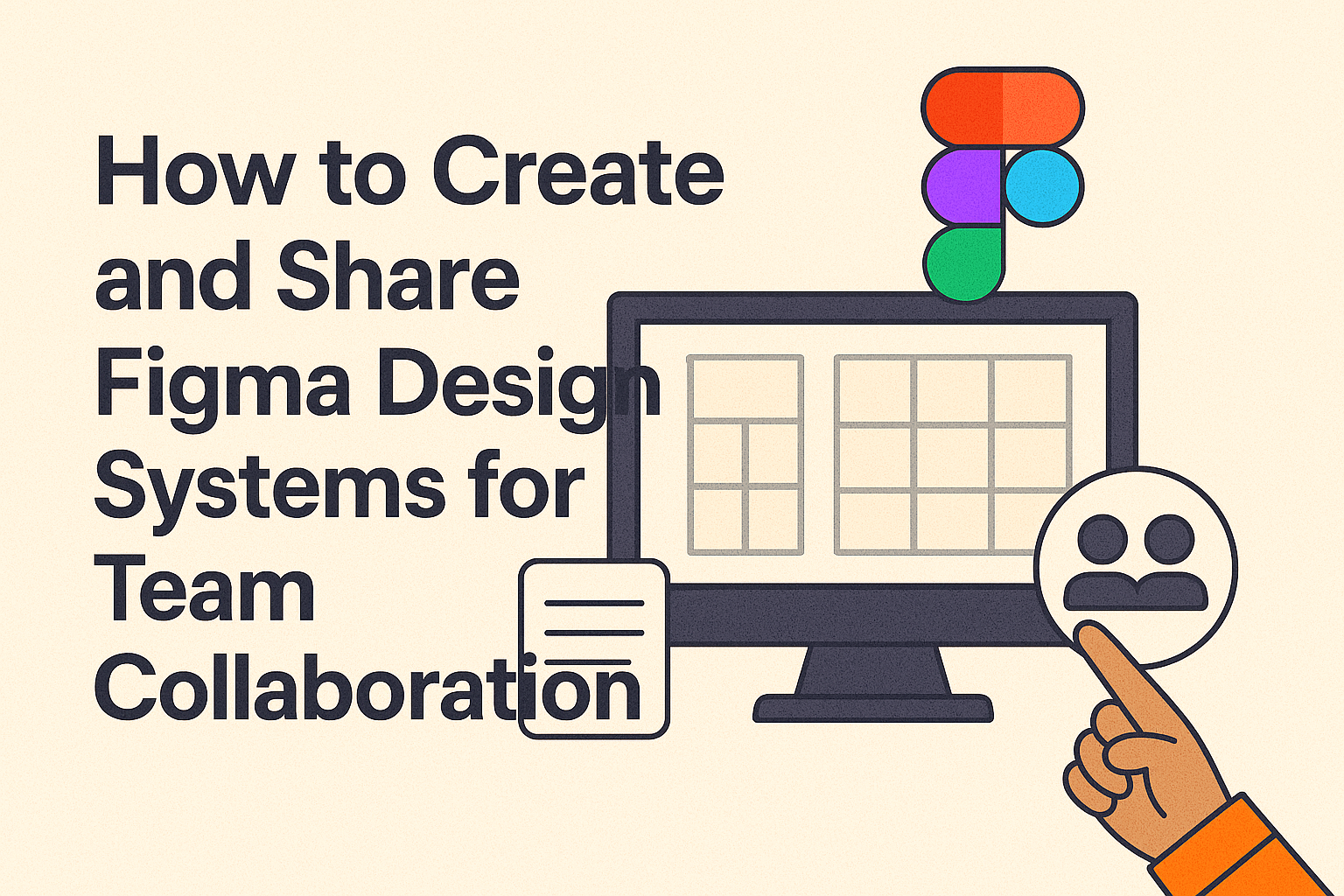
Creating and sharing design systems in Figma can significantly boost team collaboration. Figma provides a platform where design visibility across teams is enhanced, allowing for effective communication and collaboration.
To maximize the potential of Figma, it’s crucial to understand its powerful features, like team file organization and collaboration hubs. These tools help teams manage access and organize their design systems, as explained in Figma’s guidelines on team and file organization. By setting up custom templates and collaboration boards, teams can efficiently share and manage their design resources.
Figma’s sharing capabilities further enhance its collaborative nature. By sharing links to files and prototypes, team members can interact based on the permissions set, making it easy for everyone to access the necessary resources and contribute effectively to projects. Quick sharing guidelines can be found in Figma’s guide to sharing and permissions, ensuring that all team members can participate seamlessly.
Understanding Figma and Design Systems
Design systems in Figma help teams work together efficiently. They create a set of rules and reusable components that guide the design process. This creates a consistent look across apps and websites.
A design system typically includes styles, components, and guidelines. Styles control colors and fonts. Components are reusable design elements, like buttons. Guidelines provide instructions for using these styles and components.
Figma is a popular tool for building design systems. It offers features like libraries to store components. This makes it easy for team members to find and use them. With Figma, teams can update designs quickly and ensure everyone is on the same page.
Design systems also promote better collaboration. When everyone uses the same design elements, there are fewer errors. This makes it easier for everyone, from designers to developers, to work together seamlessly.
Creating a design system requires careful planning and organization. Teams must consider things like component architecture and naming conventions. Figma provides resources to help with this. For example, team Habitz offers lessons on setting up a library and structuring components.
Setting Up Your Figma Workspace
A well-organized Figma workspace is essential for successful team collaboration. This section will guide users on how to create new projects and become comfortable with the Figma interface for an efficient workflow.
Creating a New Project
Setting up a new project in Figma is straightforward. Users start by selecting Workspaces in the Figma menu bar. Here, the New Workspace option lets you add a fresh project. Next, enter a project name that clearly identifies the purpose or client, ensuring easy recognition.
In the Workspace admin field, be sure to add at least one other team member. You can do this by typing the member’s name and then selecting it. This setup helps team members easily access and manage the project.
Once everything is set, click Create Workspace. This simple process initiates the workspace where your team’s design efforts can take shape.
Familiarizing with Figma Interface
The Figma interface is user-friendly, but getting to know it well can greatly enhance productivity. The top of the file browser features a search bar to help users find files quickly. Typing in keywords will show the most relevant files, which is handy in a busy workspace.
On the left, you’ll find a panel where layers and assets are organized. This is crucial for maintaining order within your design files. Learning to navigate this panel allows users to manage components wisely and seamlessly.
In the top-right corner, the Share button allows collaborators to access projects. Sharing files via direct links keeps all team members on the same page, improving collaboration drastically. Unexpected discoveries can also be made by exploring this aspect of the interface, fueling creativity even further.
Building the Foundations of Your Design System
Creating a strong foundation for a design system involves defining visual elements like color palettes, typography, icons, and components. These elements ensure consistency and help teams collaborate effectively.
Defining Color Palettes
A color palette is the backbone of any design system. It’s important to choose colors that align with the brand identity and evoke the desired emotions. Colors should be versatile for various uses.
Include primary, secondary, and accent colors. Each category serves a different purpose, such as primary for main branding and accent for highlighting. Make sure to test color combinations to ensure readability and accessibility. Accessibility is key, so colors should have the right contrast for users with visual impairments.
Establishing Typography
Typography is more than just font choice; it’s about selecting styles that convey the brand’s voice. It’s crucial to choose a hierarchical structure that defines headings, body text, and any other type needs.
Fonts should be easy to read and compatible across devices. A good practice is to limit typefaces to maintain simplicity. Consider using web-safe fonts or well-supported typefaces to ensure consistency across different platforms.
Designing Icons and Logos
Icons and logos communicate messages and enhance usability. Design icons that are simple and recognizable. They should remain clear at various sizes and be visually consistent.
Creating a cohesive icon set involves maintaining a uniform style, such as line weight and proportion. Logos require attention to detail, ensuring they look good across different mediums. They should be scalable without losing quality, meeting both digital and print needs.
Creating Basic Components and Styles
Components are reusable elements like buttons and input fields that streamline the design process. Start with basic components, creating a library that includes styles for different states like hover and active.
Defining styles for these components ensures they match the overall look and feel of the system. Use Figma’s features to integrate shared styles, which allow for easy updates and ensure that all team members use the same elements. This approach promotes efficiency and keeps designs consistent.
Collaboration in Figma
Figma is a versatile tool that enhances team collaboration through its intuitive design systems. It allows teams to set up libraries, manage versions, invite members, and control permissions efficiently.
Setting Up Team Libraries
Setting up team libraries in Figma is like building a shared toolbox. These libraries store components like buttons, icons, and styles that everyone can access. This ensures consistency across projects because everyone is using the same elements.
Creating a library starts by gathering components and styles into one file. Then, share this file with the team. Once shared, anyone in the team can use these elements in their designs. Regular updates to the library keep everyone aligned as design needs evolve, making teamwork smoother.
Version Control and Iterations
Figma’s version control features help teams manage changes and track iterations effectively. With version history, designers can see previous changes, what was updated, and who made the changes. This feature allows teams to revisit earlier versions if needed.
Teams can also label and describe versions for clarity. When a design reaches a key milestone, they can save it as a version with notes explaining the updates. These features reduce confusion and prevent loss of work. Iteration becomes a natural part of the design process, supporting creativity and precision.
Inviting Team Members
Bringing team members onboard is crucial for seamless collaboration. In Figma, inviting members is simple. An existing team member sends invitations via email or directly within the platform. Once invited, new members gain access to the team’s projects and files.
Figma’s real-time collaboration capabilities mean that once members are added, they can start contributing immediately. With live updates, everyone stays informed about changes as they happen, fostering a dynamic and inclusive work environment.
Managing Roles and Permissions
Managing roles and permissions in Figma is essential for organizing team dynamics. Figma allows teams to assign specific roles such as editor, viewer, or admin. These roles define what each member can do within the team’s projects.
Admins have full control, enabling them to manage member access, while editors can modify designs. Viewers have limited permissions, ensuring they can only view the work without altering it. Adjusting permissions helps maintain security and efficiency, ensuring the right people have the appropriate level of access.
Sharing and Documentation
When working in Figma, sharing design systems and documenting them effectively ensures smooth team collaboration. This involves creating comprehensive documentation for clarity and using the platform’s sharing tools to facilitate seamless access among team members.
Creating Documentation for Your Design System
Clear documentation is key for any design system. It helps team members understand the purpose and use of components and styles. Each component should have a detailed description outlining its function, appearance, and usage scenarios. Adding visuals like diagrams or example use cases can be beneficial.
Another effective strategy is to organize the documentation in sections. This makes it easier for team members to find relevant information quickly. For example, separate sections for buttons, typography, and color palettes aid navigation. Regularly updating the documentation ensures it stays relevant and useful.
Interactive elements within Figma can also enhance understanding. Annotations or comments directly on design components allow for real-time feedback and discussion, encouraging collaborative problem-solving.
Using Figma’s Sharing Features
Figma provides several features that make sharing design systems with team members simple. Teams can use the Team Library to share components and styles across all projects. This tool allows designers to maintain consistency in their designs and offers real-time updates to shared components.
For direct collaboration, designers can use shareable links. This provides access to files and allows team members to view or edit based on their permissions. To ensure privacy, Figma’s sharing settings let users control who can access or edit the design systems.
Integrating commenting features within shared files encourages collaboration. Team members can leave feedback or suggestions, which helps in refining the design system further.
Maintaining the Design System
To keep a design system effective, gathering feedback is crucial. Regular updates ensure it remains relevant, and educating the team on changes fosters smooth collaboration.
Gathering Feedback and Suggestions
Feedback from team members can greatly improve a design system. Designers and developers often have firsthand insights that can highlight areas for improvement. Regular meetings or surveys are useful for collecting their thoughts.
Encouraging team members to contribute suggestions promotes a sense of ownership. It’s helpful to use collaboration tools like Figma’s comments feature. They enable members to discuss components directly within the design platform, ensuring suggestions are recorded and addressed effectively.
Updating the System
Keeping the design system current is vital for consistency and efficiency. Updates can include refining design components or adding new ones to meet evolving project needs.
It’s important to schedule regular review sessions to assess the system’s relevance. Using a checklist can help ensure no detail is overlooked. Updating documentation alongside design components ensures that everyone is on the same page when changes occur.
Educating the Team on Updates
Communication is key when new updates are implemented. Educating team members about changes helps them adapt quickly. This can be done through workshops or simple, clear documentation.
Visual aids like diagrams or step-by-step guides are particularly helpful for understanding changes. Making these resources available in a shared space, such as a team drive, ensures everyone can access them when needed.
Advanced Tips for Design System Efficiency
Design systems in Figma streamline team collaboration by organizing reusable components and maintaining consistency. Efficiency can be further enhanced by automating tasks, leveraging plugins, and optimizing performance.
Automating Repetitive Tasks
Automating tasks in Figma saves time and reduces errors. Styles, components, and layouts can be standardized through automation using tools within Figma. For example, setting default styles for text and layers ensures uniformity.
Macros can automate sequence steps, helping to manage updates across a project with a single action. Consistent naming conventions also help teams quickly identify and organize design assets, speeding up the workflow. By reducing manual effort, automation frees up more time for creativity and problem-solving.
Using Figma Plugins
Figma’s rich library of plugins extends its functionality, providing more tools to boost design efficiency. Plugins like Auto Layout automate the alignment and spacing of elements, streamlining the design process. This makes it easy to maintain consistency without manually adjusting each element.
Another useful plugin is Stark, which checks designs for accessibility and color contrast, ensuring compliance with accessibility standards. By integrating plugins that fit specific needs, teams can tailor Figma to their processes. This customization improves efficiency and helps designers focus on creativity rather than manual tasks.
Performance Optimization
Ensuring smooth performance in Figma is essential, especially when working with large design files. Keeping libraries well-organized reduces load times. Designers should also use vector graphics judiciously, as too many can slow down the system.
Adjusting image resolution to the necessary level without sacrificing quality helps maintain file efficiency. Maintaining a clean file structure, with components and assets stored logically, prevents clutter. This organization boosts performance, allowing teams to work faster without facing technical hindrances, ensuring a seamless design experience.
Implementation of Design Systems
Design systems help teams maintain consistency and bring efficiency to their workflows. Proper implementation involves smooth handoffs to developers and ensuring consistency across multiple projects.
Handoff to Developers
One crucial step in implementing design systems is seamless handoff to developers. Figma offers features that facilitate this process. Developers can easily access component details like size, spacing, and color right within Figma. These design tokens ensure that everyone on the team, regardless of their role, works with accurate and up-to-date information.
For effective handoffs, it’s essential to use Figma’s capabilities to create detailed design specifications. Linking to shared libraries also helps. These libraries allow developers to directly pull components into their workflow, reducing errors and misunderstandings. Sharing links where developers can view and inspect the design in real-time supports continuous collaboration and feedback.
Ensuring Consistency Across Projects
Consistency is key when implementing design systems across different projects. Figma makes it easier by allowing teams to set up a single source of truth. This source includes styles, components, and guidelines that teams can apply across various projects.
Using Figma’s shared libraries, teams can maintain and update design elements centrally. These updates automatically reflect across all linked projects, ensuring uniformity.
It’s essential for teams to regularly review and audit these elements. This practice helps in identifying discrepancies and ensuring alignment with the original design intentions.
Regular communication among team members also plays a significant role in maintaining consistency. By keeping everyone on the same page, teams can ensure that the design system evolves with their needs and remains an effective tool for collaboration.