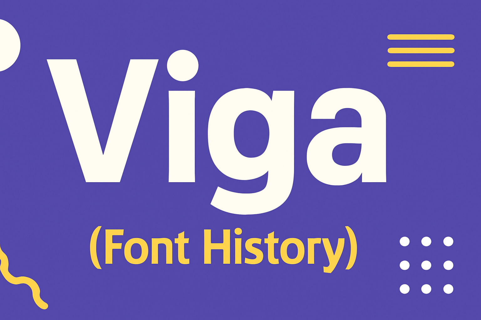
Viga is a sans serif font known for its remarkable performance on screens. Its design provides a distinct personality that makes it stand out, while ensuring readability in digital formats. The Viga font is ideal for anyone looking to enhance digital content with a clean and modern look.
Originally designed under the SIL Open Font License, Viga is free for both personal and commercial use. Whether used in web projects or print materials, it’s versatile enough to fit various design needs. This accessibility has contributed to its popularity among designers.
As digital typography keeps evolving, fonts like Viga play a critical role in enhancing visual communication. Its unique anatomy caters to a wide range of applications, making it a valuable choice for creative projects. Learn more about the features and potential use cases of Viga to see how it can enhance your design work.
Origins of Viga Font
The Viga font is a modern sans-serif typeface known for its clean and geometric style. Created by FontFuror, it serves both digital and print media with ease. This font was designed to meet the demand for simple yet unique typography.
Viga’s design stands out due to its straightforward lines and lack of serifs. This gives it a fresh and modern look, making it appealing for various applications. It’s especially suited for on-screen use because of its good readability.
Originally, Viga emerged to fill the need for a versatile font that could handle different styles and situations. This made it a popular choice among designers who wanted a font that was both practical and stylish.
For more information on Viga, you can visit the FontForge guide that explores its characteristics and use cases. Alternatively, the font is available for viewing and download on Google Fonts.
These characteristics make Viga a compelling choice for many creative projects, providing both functionality and elegance in various designs.
Design Philosophy and Characteristics
Viga is designed with simplicity and readability in mind, featuring unique elements that enhance its usability. It’s crafted to perform well on digital platforms while maintaining a distinct personality.
Legibility and Usage
Viga’s design focuses strongly on readability. Features like rounded edges and uniform stroke widths make it easy to read on screens of all sizes. Its balanced x-height and open counters improve its legibility, making it suitable for both headlines and body text.
This font works well in digital contexts where clarity is needed. Viga’s design ensures that text remains clear at different resolutions and screen sizes. Whether for websites, apps, or digital publications, Viga offers consistent performance and aesthetics.
Typeface Aesthetics
Aesthetically, Viga combines simplicity with a touch of uniqueness. Its sans serif style offers a clean look, while its rounded edges add warmth and approachability. The font’s anatomy gives it a personality that stands out in both informal and professional settings.
Viga’s clear and friendly appearance makes it versatile in many design projects. It can be used in branding, advertising, and editorial design, where a modern but distinct typeface is needed. This balance of form and function makes Viga an excellent choice for diverse creative needs.
Notable Typeface Designers and Contributors
Several designers have made significant impacts on typography. One standout figure is Claude Garamond, a 16th-century French designer who created the elegant typeface Garamond, known for its readability.
Adrian Frutiger, from Switzerland, is another influential designer. His works, like the Univers and Frutiger fonts, have become staples in both print and digital media.
Another key contributor is Colin Brignall, noted for his playful and impactful ’70s font designs. His Octopuss typeface, created for larger headlines, is particularly famous.
Below is a list highlighting some of these designers and their notable works:
-
Garamond: Claude Garamond
- Famous for: Garamond typeface
-
Univers & Frutiger: Adrian Frutiger
- Contributions: Universal clarity and modern style
-
Octopuss: Colin Brignall
- Impact: Popular ’70s font for energetic visual elements
These designers have enriched the world of typography, influencing both aesthetics and functionality. They have left a lasting legacy through their unique styles and innovative approaches. Their contributions continue to inspire new generations of designers.
Typography is a blend of art and technique. These designers show the deep creativity involved in shaping the way we read and interpret text. They have elevated typography to an essential part of visual communication.
Evolution Over Time
The Viga font has evolved significantly since its inception. By tracing its development, one can see changes both from its initial design era and through digital transformations in recent years.
Early Adaptations
The original Viga font reflected the design trends of its time. It was created with readability in mind, making it a popular choice in print media. Designers appreciated its clean and straightforward style, which allowed for clarity in different sizes.
During its early years, Viga underwent subtle changes as designers tweaked its lines and spacing. These adjustments helped it maintain relevance as print media evolved. Viga’s adaptability to these changes helped cement its position as a reliable choice for various print applications.
Digital Revival and Modifications
As technology advanced, Viga found new life in the digital world. It’s been updated to meet the requirements of modern screen displays. These updates include better clarity on various devices, making it suitable for both web and mobile platforms.
Digital modifications focused on enhancing readability without losing its signature simplicity. With these changes, Viga not only survived but thrived in the digital age. Its journey from print to pixel shows its enduring appeal and flexibility, reflecting the needs of current users.
Viga Font in Popular Media
Viga is a modern and clean sans-serif typeface. Its sharp look and readability make it a popular choice for various media.
In film posters, Viga’s bold appearance stands out, attracting audience attention. The font’s simple yet striking design complements movie titles and credits well.
In the world of television, Viga is often used for show titles and onscreen graphics. Its versatility makes it easy to read on different screens and sizes.
Video games also feature Viga in their design elements. Game menus and in-game texts benefit from Viga’s sleek, modern style, contributing to an immersive gaming experience.
Online platforms use Viga for its clean and approachable look. Social media graphics, blog titles, and website headers come alive with this font’s personality, making content more engaging.
Below is a simple list of popular media using Viga:
- Movie Posters
- Television Shows
- Video Games
- Websites
For those wanting to experiment, the font can be easily accessed through the Google Fonts website.
Whether it’s a high-budget film or an indie game, Viga adds a touch of elegance and clarity, making it a favorite in many projects.
Typography Influence and Legacy
Typography has played a vital role in communication for centuries. Its influence extends from ancient scribes to modern digital designers. Each typeface carries its own personality, impacting how messages are perceived by readers.
During the Enlightenment era, typography evolved to reflect themes of reason and progress. This period saw the creation of transitional typefaces that balanced traditional and modern styles.
In the 20th century, typefaces like Helvetica became iconic symbols of simplicity and functionality. Designers used Helvetica for everything from corporate logos to street signs, showcasing its versatility and appeal.
The shift from analog to digital typography marked a new era. With the advent of computers, designers could create and experiment with fonts easily. This led to a flourishing of diverse typefaces that shaped digital communication.
Key Milestones in Typography:
- Gutenberg’s Press: Revolutionized printing and made texts widely accessible.
- 20th Century Design: Saw a focus on clean lines and modern aesthetics.
- Digital Age: Enabled unprecedented creativity and access to typography.
Typography not only conveys information but also evokes emotions. The right choice of typeface can make a design more engaging and impactful. Its legacy is evident in everyday life, from books to websites, leaving a lasting imprint on culture and communication.
Technical Aspects
The Viga font, a sans serif characterized by its strong presence on screens, offers various features that make it suitable for both digital and print projects. Let’s explore its font family and weights, as well as how it performs in web and print usage.
Font Family and Weights
Viga belongs to the sans serif category, known for its clean and modern look. Sans serifs typically lack the small projecting features called “serifs” at the end of strokes. Viga is designed to perform well on digital screens, ensuring readability with its bold and clear strokes.
This font provides flexibility with its range of weights, accommodating different design needs. Whether used for headlines or body text, Viga maintains its strength and legibility. Its strong visual appearance contributes to a noticeable presence in any design project, making it a versatile choice for designers.
Usage in Web and Print
For web applications, Viga is a practical choice due to its solid screen performance. Its sleek, adaptable design ensures that it looks sharp on different devices, regardless of size. This makes it ideal for online platforms where readability on screens is crucial.
In print, Viga contrasts nicely with serif fonts, often used for headings and standout elements. Its compatibility with diverse design styles adds to its appeal, allowing designers to experiment with various compositions. Whether in marketing materials or editorial layouts, Viga’s versatility shines, supporting a wide array of visual narratives.
Acquiring Viga Font
Viga is a popular sans-serif font known for its readability and screen performance. This section will cover how to obtain the Viga font, focusing on licensing, rights, and download locations.
Licensing and Rights
The Viga font is available under the SIL Open Font License (OFL), which is a free, open-source license. This license allows users to use, study, modify, and share the font freely.
Projects aiming to redistribute Viga, whether personal or commercial, can do so without cost. Viga’s flexibility makes it usable in a wide range of applications, including web design and publishing. Its inclusion in software bundles is also permitted under the OFL.
Where to Download
Viga can be easily downloaded from several trusted websites. One reliable place to get it is Google Fonts, which offers a simple and straightforward downloading process.
Another option is 1001 Fonts, where Viga is also available for free. Website developers might consider downloading it from Fontsource, as they offer an NPM package for easier integration.
Each of these platforms provides the font in various formats suitable for different uses.
Comparisons With Other Sans Serif Fonts
Viga is known for its modern and clean style. It belongs to the sans-serif category, which is often used for its readability in both print and digital formats.
Helvetica is one of the most famous sans-serif fonts. While Helvetica is more traditional and neutral, Viga offers a geometric look that feels more contemporary.
Another popular option is Arial. Like Viga, Arial is easy to read, but Viga has a more distinctive style due to its unique curves and angles. Arial tends to have more standardized shapes.
Futura brings a strong geometric vibe similar to Viga. Both focus on clean lines, but Futura has more of an art-deco influence. Viga, on the other hand, gives a fresh twist to modern design expectations.
Here’s a quick comparison table:
| Font | Style | Special Feature |
|---|---|---|
| Viga | Geometric | Unique curves |
| Helvetica | Traditional | Neutral appearance |
| Arial | Standardized | Easy readability |
| Futura | Geometric | Art-deco influence |
Each of these fonts offers something unique. Viga stands out with its clean and geometric vibe, making it ideal for diverse uses. The font’s versatility can be an asset in both professional and creative projects.
Usage Tips and Best Practices
Viga is a versatile sans serif font that works well for both digital and print projects. Its clear design makes it great for on-screen reading, as noted by Google Fonts.
When using Viga in headings, keep the text short for maximum impact. Pair it with other sans serif fonts for a modern look. Using it in bold can draw attention without overwhelming the layout.
For body text, Viga maintains readability at smaller sizes. Ensure there is enough spacing between lines to avoid clutter. The font’s clean appearance makes it suitable for various subjects, from tech articles to lifestyle blogs.
Designers should consider contrast. If the background is light, using Viga in a darker shade can enhance readability. Conversely, a light shade on a dark background can provide a striking effect.
Viga can be a good choice for creating engaging banners. Its bold form can capture the viewer’s attention instantly. This makes it ideal for advertising and promotional content.