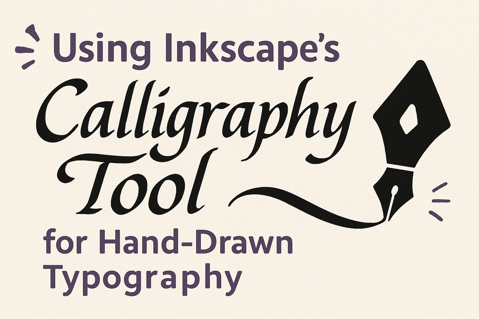
Creating stunning hand-drawn typography can be a rewarding experience, especially with the right tools. One such tool is Inkscape’s Calligraphy tool, which is perfect for digital calligraphy and artistic lettering. This versatile tool allows artists to replicate the fluid and expressive qualities of traditional calligraphy using a digital platform.
The Calligraphy tool in Inkscape offers various settings that mimic the behavior of a traditional brush or pen. Artists can adjust variables like mass, speed, and friction to get the perfect stroke effect for their project. Using a graphics tablet with this tool enhances precision and creativity, making it easier to produce detailed and nuanced designs.
Inkscape not only provides a platform for digital artists but also offers various tutorials for beginners and experienced users alike. These guides can help users learn the ins and outs of the software, making it easier to master hand-drawn typography techniques. With practice, anyone can create beautiful lettering that stands out.
Getting Started with Inkscape
Inkscape is a powerful tool for creating digital art, including calligraphy. New users need to know how to download and install the software, understand its interface, and explore the calligraphy tool.
Downloading and Installing Inkscape
To start using Inkscape, one must first download it. Visit the Inkscape website and navigate to the downloads section. Choose the version that matches the operating system—Windows, Mac, or Linux. Clicking the appropriate button will start the download process.
After downloading, open the installer and follow the prompts. This process involves choosing a destination folder and confirming installation preferences. The steps are straightforward, making it accessible for beginners.
Once installed, launch the application. A brief welcome screen introduces some key features. This step marks the beginning of your creative journey with Inkscape.
Familiarizing Yourself with the Inkscape Interface
The Inkscape interface might seem a bit overwhelming at first. It features various toolbars, menus, and a canvas area. The top of the screen displays the menu bar with essential functions like File and Edit. Below, users find the command bar with quick access icons for common tasks like saving and printing.
The left side houses the toolbox, which includes drawing tools like shapes and calligraphy. The right side may display various dialogs and docked tools. Exploring these options reveals their functions and helps users customize their workspace.
The status bar at the bottom shows helpful information about selected objects, aiding navigation. Familiarity with this layout enhances productivity and creativity in Inkscape.
Overview of the Calligraphy Tool
The Calligraphy Tool in Inkscape mimics a real pen, offering various customization options. It can be activated by clicking its icon in the toolbox or pressing C on the keyboard. The tool’s options appear in the control bar under the menu, allowing for adjustments in width, angle, and fixation.
An ideal accessory when using the calligraphy tool is a graphics tablet, which provides greater precision. Users can experiment with different angles to create unique styles, much like traditional calligraphy.
Every calligraphic style has its own characteristics, and Inkscape’s tool allows users to explore these digitally. The flexibility of the calligraphy tool can help in producing impressive hand-drawn typography designs.
Understanding the Calligraphy Tool
Inkscape’s Calligraphy Tool is perfect for those interested in digital lettering and creating hand-drawn typography. Users can explore different brushes, adjust stroke styles, and set the width to achieve their desired effect.
Tool Options and Settings
The Calligraphy Tool in Inkscape offers various settings to customize your writing experience. Access it by using the shortcut Ctrl + F6 or by selecting it from the tool menu.
Users can adjust parameters such as angle and wiggle to control how the tool responds. The angle setting lets users change the slant of the brush, which impacts the overall flow of the text.
A wiggle option adds a slight irregularity, giving a more natural look. These options provide flexibility, making it easier to replicate traditional calligraphy styles.
The Different Brushes Available
Inkscape provides several brush types that mimic traditional calligraphy tools. Users can select different pen styles that affect the brush’s stroke.
For instance, a flat brush gives sharp, clear lines similar to a quill pen. A wide-tip brush is useful for bold lettering, while a narrow brush is ideal for delicate scripts.
Experimenting with these brushes can help users find the style that best fits their project. Each brush type can be further customized with other settings, allowing a range of effects from sharp to smooth lines.
Adjusting Stroke Style and Width
Adjusting the stroke style and width is crucial for achieving various lettering styles in Inkscape. Width control changes how thick or thin the strokes appear.
In the Calligraphy Tool settings, users can modify the cap and join styles. Cap styles change the shape of the stroke ends, like round or square, while join styles affect how the angles of the letters connect.
Using the width and other settings, users can switch between styles, from thick block letters to sleek cursive scripts. These adjustments ensure the lettering aligns perfectly with their creative vision.
Techniques for Creating Hand-Drawn Typography
Hand-drawn typography with Inkscape can bring a personal and artistic touch to digital designs. Mastering basic strokes, understanding letter formation, and creatively connecting letters are essential steps in developing this skill.
Basic Strokes Practice
Learning basic strokes is the foundation of hand-drawn typography. These strokes include straight lines, curves, and loops, which are crucial for building any letter. Start with simple lines and gradually practice more complex shapes.
One way to practice is by drawing horizontal and vertical lines. This helps in gaining control over the calligraphy tool. Regular practice ensures smoother and more confident strokes. Using Inkscape’s calligraphy tool can simulate the real pen experience, making digital practice effective. Adjusting the pen angle and width can also provide different styles.
Letter Formation Techniques
Once basic strokes are mastered, focus shifts to forming letters. Each letter goes beyond just strokes; it’s about proportion and style. Inkscape allows users to experiment with various letterforms and styles like serif and sans-serif.
Take, for instance, the letter “A.” Start with the foundational strokes and adjust for symmetry and balance. Practicing lettering in different styles using varied angles, as seen in resources like the Cambridge tutorial on calligraphy, can enhance skills greatly.
Connecting Letters Creatively
Connecting letters smoothly and creatively is what sets beautiful typography apart. It requires understanding how each letter joins with the next while keeping a natural flow. Focus on spacing and adjust as needed.
Inkscape’s tools can help in experimenting with connections. Practice combining letters like “o” and “l” where the round part meets the straight line. This will add an aesthetic flow to words. Various styles, such as cursive or script, require different connection methods, which can be adjusted using tools available in FLOSS Manuals.
Enhancing Your Typography
Inkscape’s calligraphy tool is a versatile feature that can elevate hand-drawn typography. By using layers, colors, and textures, any project can be transformed into a professional-looking piece of art.
Using Layers for Complex Designs
Layers are essential for creating intricate designs in Inkscape. They allow artists to organize and manage different elements separately. By keeping text, backgrounds, and decorative elements on their own layers, users can easily modify parts without affecting other elements.
To add more depth, users can duplicate layers and adjust their opacity. This method can create a shadow effect or give letters a more three-dimensional appearance. Additionally, if any mistakes are made, they can be isolated and corrected quickly, ensuring the creative process remains smooth and efficient.
Incorporating Color and Gradients
Color is a powerful tool in typography, and using gradients can further enhance letters. Gradients add a dynamic feel and can draw attention to specific parts of the text. Inkscape provides a gradient tool that allows users to apply smooth color transitions to the calligraphy strokes.
To use it effectively, selecting harmonious colors will ensure that the text remains readable and visually appealing. Artists can experiment with different gradient directions and intensities to find what complements their design best. Mixing solid colors with gradients can also create a pleasing contrast that captivates viewers.
Applying Textures and Patterns
Textures and patterns can add richness to any typography project. Inkscape users can apply them to letters to create an interesting and unique surface. This is especially effective in designs meant to stand out, like posters or invitations.
Users can access a library of built-in patterns or import custom ones. To apply these, select the text and use the fill and stroke settings to place the pattern. Playing with opacity and blend modes can further enhance the textured effect. Aligning patterns carefully ensures consistency, resulting in a polished final product.
Project Ideas and Inspiration
Using Inkscape’s calligraphy tool offers endless creative possibilities for crafting custom designs with a personal touch. Here are some inspiring project ideas that highlight the versatility of this tool, from designing logos to making unique greeting cards and posters.
Designing Logos with Hand-Drawn Elements
Creating logos with hand-drawn elements can add a unique, personal touch to a brand. The calligraphy tool in Inkscape is perfect for this task. It allows users to experiment with different stroke widths and styles to achieve the desired effect. By blending hand-drawn letters with other design elements, logos become distinctive and memorable.
Different techniques can be used to make the logo stand out. Experimenting with brush effects or combining typography with simple graphics can enhance the logo’s impact. Using layers can help organize and explore different styles. This approach ensures the logo captures the brand’s essence while maintaining a handcrafted feel that sets it apart from generic designs.
Creating Unique Greeting Cards
Inkscape’s calligraphy tool is perfect for making greeting cards that feel special and unique. Adding hand-drawn elements can make the card stand out, whether it’s a holiday greeting, birthday wish, or thank you note. Users can incorporate charming motifs, stylish fonts, and thoughtful messages to bring their ideas to life.
Experimenting with different brush settings allows the creation of intricate designs and captivating text layouts. Utilizing features like shapes or patterns can enhance the card further, making it visually interesting. Customizing the card’s color palette can also add a personal touch, ensuring each card is one of a kind and truly heartfelt.
Crafting Personalized Posters
For those looking to create eye-catching and personalized posters, Inkscape offers a wealth of tools. The calligraphy tool helps achieve beautiful typographic effects, turning ordinary text into dynamic visual statements. Poster designers can play with bold colors, varied strokes, and different font styles to craft an engaging narrative.
Mixing hand-drawn typography with digital illustrations can result in visually striking compositions. Users can also add depth and texture to their posters by experimenting with gradient fills and layer effects. Such features enable the creation of posters that not only convey the intended message but also serve as artistic pieces that can decorate any space.
Best Practices and Tips
Using Inkscape’s Calligraphy Tool effectively for hand-drawn typography involves maintaining consistent design, optimizing tool settings, and leveraging community resources. By mastering these practices, users can create beautiful and uniform lettering with a personal touch.
Maintaining Consistency in Hand-Drawn Type
Consistency is key in hand-drawn typography. One way to achieve this is by setting up a grid or guidelines in Inkscape. This helps in maintaining even letter height and spacing.
Another tip is to use the Duplicate function to replicate elements across your design. This ensures that similar letters or shapes remain uniform.
Additionally, it can be useful to create a custom pattern or texture that matches the style of your text. This adds a cohesive look to your design. Users often find consistency challenges with mouse usage, so using a graphics tablet for smoother strokes is recommended.
Mastering the Pressure and Tilt Controls
Inkscape offers pressure and tilt settings that mimic the nuances of a real pen. Pressure sensitivity affects line thickness, while tilt can adjust line direction and angle.
When using a graphics tablet, it’s important to practice with different pressure levels. This helps in achieving variances in thickness similar to traditional calligraphy.
The Thinning setting is especially useful. It allows users to control how much the line tapers with changes in speed and pressure, enabling personalized stroke styles. For those using a mouse, adjusting these settings to zero can help in achieving smoother results.
Exploring Community Resources for Learning
Many tutorials and community forums provide valuable tips for using Inkscape’s Calligraphy Tool. Websites like FLOSS Manuals offer step-by-step guides on maximizing the tool’s potential.
Online platforms like the Inkscape community on Reddit or dedicated Discord servers can also be great places to ask for advice and see others’ work. Users can get feedback, learn new techniques, and stay updated on the latest updates or plugins.
Finally, joining online courses or workshops that focus on digital typography can enhance one’s skills further by providing structured and in-depth learning experiences.