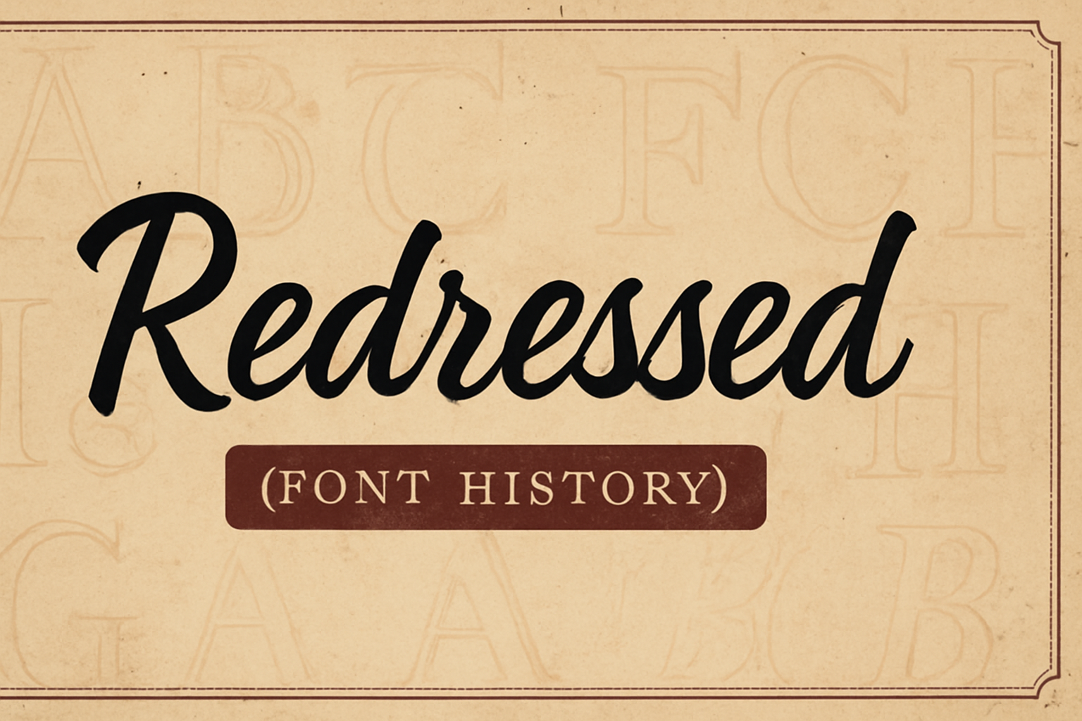
The Redressed font is a unique medium-weight typeface that brings together script and italic letterforms in an upright non-connecting style. Designed for both titling and body text, Redressed offers open spacing and stylish letterforms that ensure easy readability. This font is loved for its casual and friendly appeal, making it a versatile choice for various design projects.
Originally created by Astigmatic One Eye Typographic Institute, Redressed has gained popularity among designers and is often used for its charming handwritten look. Since its release, it has caught the eyes of many, being downloaded countless times and added to numerous design collections. This intriguing blend of styles presents a perfect balance of elegance and informality.
Whether for a personal blog title or a professional presentation, Redressed captures attention with its artistic flair. By blending elements of script and italic, it manages to stand out while maintaining clarity and legibility at various sizes. Dive into the fascinating history and evolution of the Redressed font to discover why it has become a favorite for many.
Origins of Redressed
Redressed is a distinctive font that draws inspiration from both script and italic styles. Its unique design philosophy and history contribute to its friendly and approachable appearance. This font was carefully crafted to deliver both style and functionality, making it a popular choice for various purposes.
Design Philosophy
The design of Redressed centers on the fusion of script and italic letterforms. It emphasizes a non-connecting style, which means the letters do not join together, unlike traditional cursive fonts. This results in a typeface that feels both casual and approachable, suitable for titles and body text alike.
Its medium weight gives it a balanced look, neither too light nor too heavy, which enhances readability. Open spacing between the characters ensures that the text remains clear even at smaller sizes. The combination of these elements reflects a thoughtful approach to making typography both stylish and functional.
Initial Release
The initial release of the Redressed font marked an important step in typeface innovation. Designers aimed to fill a niche for a casual yet elegant font that could work across different media. The medium weight and open spacing allowed it to adapt to various uses, including digital and print formats.
This adaptability made it quickly gain attention in design communities and become accessible through platforms like Google Fonts. The blend of classic elements with modern needs explains why it remains a versatile choice today, offering both aesthetic beauty and practical utility.
Design Characteristics
The Redressed font stands out for its unique blend of script and italic styles. It offers both a stylish look and easy readability, making it a versatile choice for different applications in print and digital media.
Typography and Style
Redressed features smooth, flowing letterforms with a slight slant to the right. This design gives the font an elegant and friendly appearance. The letters are crafted with uniform weight, providing consistency across the typeface.
Open spacing between letters enhances readability. It allows the font to be used effectively in both titles and smaller body text. Redressed combines non-connecting italic and script elements, creating an upright and sophisticated style. These characteristics make it ideal for informal and creative designs.
Font Weights and Variations
Redressed is primarily recognized as a medium weight typeface. This weight blends well with the other design characteristics, such as the smooth, rounded edges. It emphasizes the font’s ease of reading and visually appealing style.
Although Redressed does not come in multiple weights, its existing medium weight is versatile enough for various uses. It adapts well to both headline and body text applications. The clean and inviting look of Redressed ensures consistent visual impact across different sizes and formats.
Technological Development
The evolution of typography is deeply connected to technological advancements. This journey has transformed fonts from metal type to digital files, impacting design and accessibility.
Evolution over Time
Typography’s journey began with Gutenberg’s invention of the printing press in the 15th century. This era saw the use of metal type, a labor-intensive process that laid the groundwork for modern typography. As printing technology improved, new styles emerged. Serif fonts gained popularity for their readability, while sans serif fonts offered a modern touch. The invention of the Linotype machine in the late 19th century marked a significant shift, allowing faster typesetting and paving the way for large-scale, efficient production.
Digitalization Process
The transition from physical type to digital fonts marked a major shift. By the 20th century, typography began its digital revolution. Font files replaced metal sorts, drastically reducing production time and cost. The introduction of OpenType-SVG format expanded design possibilities by allowing multiple colors in a single glyph. The digital era democratized typography, making a wide variety of fonts accessible to designers worldwide. Software tools revolutionized how fonts were created and used, enabling intricate designs and widespread innovation in typography.
Usage and Applications
Redressed is a versatile font known for its unique blend of script and italic styles. Its clear and stylish look makes it popular in different applications, offering both warmth and readability.
Common Use Cases
Redressed is often used in greeting cards and invitations, providing a friendly and personal touch. The font’s style, which combines elegance with simplicity, makes it ideal for these items. Its open spacing ensures legibility on printed materials.
For digital content, Redressed is frequently chosen for blog graphics and small-sized text, where its clarity shines. It’s not only appealing but also practical, maintaining readability in various contexts. Additionally, its application in user interfaces adds a touch of friendliness, enhancing user experience.
Branding and Identity
In branding, Redressed conveys approachability and warmth. Companies aiming for a friendly image often choose this font for logos and packaging. Its non-connecting style helps in creating unique brand identities that feel welcoming.
Products that target a broad audience or wish to appear less formal can benefit from Redressed. The font supports diverse design elements, making it flexible for cohesive branding strategies. It translates well across different mediums, ensuring consistent brand communication whether in print or online.
For more on its use in branding, consider checking its application in different branding examples.
Cultural Impact
The font Redressed has carved its niche in the world of typography with its unique style. It blends script and italic letterforms, contributing to its versatility across various design contexts and media platforms.
Influences on Design
Redressed’s design is distinguished by its mix of script and italic elements. This combination makes it suitable for diverse design projects. The font’s open spacing enhances readability, drawing attention to details without overpowering the main message.
The influence of historical and cultural elements is visible in its elegant curves and non-connecting style. These features allow it to be used effectively for both titles and body text. Redressed stands out in modern designs due to its distinct, yet approachable aesthetics.
Popularity and Trends
Redressed remains popular in design circles due to its versatility and stylish feel. Its ability to present elegance without sacrificing legibility makes it ideal for various applications, from websites to print media.
Trends in typography often cycle back to tried-and-true fonts like Redressed for their reliability in maintaining engagement. This timeless appeal supports its use in diverse contexts, particularly where a blend of tradition and modernity is desired. As digital content grows, fonts like Redressed continue to dominate visual media spaces.
Historical Significance
The font Redressed has played a role in modern typography, influencing design approaches and studies. Its blend of script and italic styles offers a unique aesthetic. Below, the focus is on how Redressed is recognized in design circles and its presence in academic discussions.
Inclusion in Design Archives
Redressed has found its place in various design archives. These archives showcase its unique characteristics that make it suitable for both headlines and small text. The open spacing and stylish letterforms highlight its versatility.
It stands out for mixing script and italic forms, and its legibility has made it a candidate for inclusion in collections that emphasize design variety. Designers appreciate its flexibility, and it is often referenced when discussing modern typefaces that balance style with readability.
Studies and Publications
The font’s distinct style has been the subject of several studies. Researchers have examined how its non-connecting style can improve readability. In publications focusing on typography, Redressed is often cited when discussing fonts that effectively combine traditional and modern elements.
Academic articles have discussed its impact on legibility, especially in digital formats. Studies highlight how Redressed maintains elegance while being practical for various applications. Its presence in scholarly discussions underscores its significance in the evolution of modern typefaces.
Redressed in Education
Redressed is used in educational settings to explore both typography design principles and creation in the classroom. It encourages students to understand aesthetic and practical aspects of font creation.
Typography Curricula
In typography courses, Redressed is often highlighted for its unique blend of script and italic forms. Its medium weight and open spacing make it an interesting study example, enabling students to learn about diverse font styles. This font’s mix of styles gives students a chance to dive into how font characteristics can impact readability and design.
Teachers may include Redressed in lessons about font anatomy. They can guide students through recognizing its non-connecting style, which makes it suitable for both headlines and body text. This fosters an understanding of design choices in real-world applications.
Educational Resources
Educators have access to various resources when teaching about Redressed. Online platforms often offer materials focusing on its characteristics, usage, and design origins. These resources aid instructors in explaining how a versatile font like Redressed can be used effectively in different contexts.
Handwriting and digital design classes might use tools to manipulate and experiment with Redressed. This hands-on experience can be facilitated by downloadable kits from websites like Font Squirrel, which provide easy access and integration into classroom activities. Access to these resources supports educators in demonstrating practical font applications.
Challenges and Controversies
The Redressed font family faces challenges related to copyright issues and the proliferation of imitations. These elements have sparked debate and caution around its use in design projects.
Copyright Issues
Copyright is a significant concern in the world of fonts. Redressed, like many typefaces, can be subject to copyright restrictions. These legal protections ensure that the original creator holds rights over its distribution and use. When someone wants to use Redressed in commercial projects, they might need to purchase a license. This process guarantees that designers are paid fairly for their work, and it keeps the integrity of the font intact.
Understanding the specific terms of the font license is important. Some licenses permit use on websites, while others are more restrictive. Violating license terms can lead to legal consequences, making it crucial for designers to read and comply with the agreements. This helps avoid disputes and ensures that the font remains a valuable resource for creative projects.
Redressed Imitations
Imitations of popular fonts are common, and Redressed is no exception. Some designers may attempt to replicate its aesthetic traits, creating copies that are similar but often of lower quality. These imitations can dilute the impact of the original font and confuse audiences who encounter them in different designs.
Such imitations sometimes infringe on the original font’s design and lead to legal disputes. They can also affect the reputation of designers who unknowingly use them in projects. It is essential for designers to verify the authenticity of fonts before incorporating them into their work. Ensuring that a font is genuine contributes to maintaining a high standard of design and respecting the font creator’s artistic contribution.