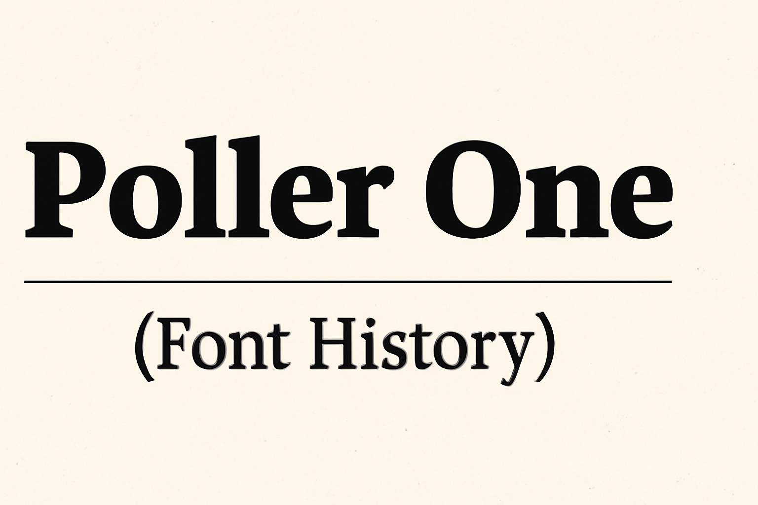
Poller One is a unique font that stands out for its high contrast and semi-extended style. This sans serif font exudes personality while maintaining clarity, making it a favorite among designers and typographers. Poller One’s inspiration comes from hand lettering on early 20th century German posters.
Because of its design, Poller One is best used for medium to large display settings. Its clear letterforms offer great readability, even from a distance. It’s an excellent choice for projects where both impact and readability are essential.
Designers often turn to Poller One for its versatility in digital displays and print media. Whether used for logos, banners, or headlines, this font helps capture attention with its distinct style while ensuring the text is easy to read.
Origins of Poller One Font
Poller One Font is a unique, high-contrast typeface that blends past and present design elements. This section explores its creative roots and details its maker.
Inspiration Behind Poller One
Poller One was inspired by hand lettering found on early 20th-century German posters. These posters often showcased bold and dynamic lettering, capturing the imagination of many with their eye-catching style. This font carries the same energy, aiming to bring vintage flair to modern typography.
The use of strong contrasts in Poller One enhances its unique character, making it suitable for various display settings. Its design draws on both historical influences and contemporary aesthetics, creating a bridge between different eras of design. It’s this blend that gives Poller One its distinctive personality and appeal.
Creator of Poller One
The creator of Poller One is Denis Jacquerye, a type designer known for his work on various fonts. His expertise in type design is evident in the way he crafted Poller One, balancing readability with style.
Denis Jacquerye’s goal was to design a font that could stand out while remaining functional. His background in type design and passion for vintage advertising styles play a significant role in shaping Poller One. This font is a testament to his skill and dedication to preserving historical design influences while adapting them for modern usage.
Design Characteristics
Poller One is a unique typeface, known for its high contrast and playful design. The font combines strong typography elements with distinctive visual aesthetics, making it ideal for headlines and branding.
Typography Elements
Poller One is a semi-extended sans serif typeface. Its design is inspired by hand lettering found on early 20th-century German posters. The letters feature high contrast, making them readable at medium and larger display sizes. The uppercase letters are bold and robust, creating a strong visual impact when used in headings. The lower-case characters maintain a balanced look, adding versatility to the font. This mix of features contributes to Poller One’s distinct personality, suitable for various design projects.
Visual Aesthetics
The design of Poller One includes playful curves and a pronounced vertical emphasis. These characteristics make it stand out, especially in posters and branding materials. The font’s exaggerated curves add a lively touch, drawing the viewer’s attention. Its semi-extended style allows it to fill space effectively without feeling cramped. These visual elements make Poller One a favorite for creative projects that require a bold and energetic look. The typeface is open source and free to use, offering designers flexibility in their work.
Poller One Usage
Poller One is a versatile font known for its high contrast and semi-extended style, making it both eye-catching and readable. These qualities make it a favorite for various design projects, from headlines in print to digital media.
Common Applications
Poller One is frequently used in design elements that need to grab attention. Its unique style is well-suited for headline and title designs due to its visual impact. Designers often choose it for creating eye-catching posters and banners. The high contrast of the font works great for medium to large display settings, making text stand out vividly.
Poller One can also be found in digital applications, like websites and apps. Developers appreciate its readability and adaptability to different sizes, which is beneficial for various screen layouts. In educational settings, the font is popular for teaching materials where both style and clarity are important. This combination of boldness and clarity helps engage viewers effectively.
Branding and Marketing
For branding and marketing, Poller One offers a striking option for logos and marketing materials. Brands that want to convey a bold and energetic personality often choose this font for its strong impression. Its inspiration from early 20th-century German posters gives it a timeless and distinctive look that can add character to any branding project.
In marketing campaigns, Poller One helps texts stand out, ensuring that key messages are easily noticed. The font’s personality complements creative advertising, from digital graphics to printed flyers, enhancing visual appeal and reinforcing brand identity. Its versatility makes it a reliable choice for brands aiming for a memorable impact in their promotional activities.
Evolution Over Time
Poller One has evolved significantly from its early designs, adjusting to changing design trends and technological advancements. It has undergone updates and variations, adapting well to digital media formats.
Updates and Variations
Poller One, inspired by early 20th-century German posters, has seen various updates to stay relevant. Designers have modified its features to enhance readability and appeal. These adjustments include tweaking its semi-extended style and high contrast for better visibility. As a result, Poller One remains both distinctive and functional.
The font has been used in different design contexts, from advertisements to modern digital interfaces. Its adaptability makes it suitable for medium to large display settings. Designers appreciate its unique personality, allowing them to create eye-catching and memorable visuals.
Adaptation to Digital Media
As digital media became more prevalent, Poller One seamlessly transitioned into the digital landscape. The font’s clear letterforms and readable design fit well on screens, ensuring legibility across various platforms. This adaptability has made it popular in web design and digital displays.
The Poller One font’s evolution reflects its success in digital applications. It has been optimized to maintain quality across different devices and resolutions. This focus on digital compatibility allows Poller One to be a dependable choice for both print and screen-based projects.
Technical Specifications
Poller One is a distinct sans serif font known for its high contrast and readability. It is available in various file formats, making it versatile and accessible for many users. The font’s licensing options cater to both personal and commercial needs, ensuring it’s widely usable.
File Formats and Compatibility
Poller One supports multiple file formats, which makes it easy to use across different platforms and software. The most common formats include TTF (TrueType Font) and OTF (OpenType Font). These formats are compatible with popular design software like Adobe Photoshop and Illustrator, as well as word processing programs such as Microsoft Word. This flexibility makes Poller One a favorable choice for web and print designers alike.
When it comes to web development, Poller One can be easily embedded using @font-face rules in CSS. This feature allows seamless integration into website projects. Sites like Google Fonts offer Poller One for web use, providing easy access and implementation options for developers.
Licensing and Distribution
Poller One is available under a licensing model that supports a wide range of projects. For personal projects, it can often be downloaded for free from various typography websites such as 1001 Fonts. This accessibility allows hobbyists and small businesses to experiment with the font without cost concerns.
For commercial use, a proper license is usually required. This can be purchased through font distributors or directly from sellers like Fonts Ninja. The commercial license permits use in advertising, marketing materials, and more. This flexibility ensures that designers can use Poller One without legal issues, providing peace of mind for professional applications.
Impact on Typography
Poller One has played a significant role in the world of typography by shaping modern typeface designs and reflecting cultural trends. Its influence can be seen in various ways, from its design elements adopted by other typefaces to its presence in cultural contexts.
Influence on Other Typeface Designs
Poller One, with its bold, sans-serif design, has inspired many contemporary typefaces. Designers often draw from its dynamic and energetic style when creating new fonts. This typeface combines vintage advertising charm with a modern aesthetic, serving as a reference point for other typefaces aiming for a similar blend.
The high contrast and semi-extended design of Poller One make it a favorite for headings and larger text, pushing other typefaces to explore similar styles. Its readability combined with personality has led designers to incorporate these features into new font creations, ensuring that typography remains fresh and relevant in digital design.
Cultural Significance
Poller One carries cultural significance by bridging the gap between historical and modern design. It draws inspiration from early 20th-century German posters and vintage signage, which adds a layer of nostalgia to contemporary settings. This historical link reminds users of design’s deep roots in advertising and communication trends.
Culturally, Poller One represents a shift toward valuing aesthetic appeal in public text, beyond just readability. In contexts like fashion and branding, Poller One is used to convey a sense of style and sophistication. Its ability to reflect both past influences and modern flair ensures it maintains a strong presence in today’s typography landscape.
Accessibility and Readability
Poller One is a high contrast sans serif font. Its design makes it stand out while remaining easy to read. Because of this, it’s great for medium to large display settings where clear communication is key.
The font has a moderate x-height, making lowercase letters easy to distinguish. This characteristic enhances its readability, especially in longer text passages and captions.
Using Poller One for digital displays ensures clear visibility. According to Google Fonts, the font’s contrast makes it suitable for screens, which often require distinct lettering.
Creating accessible content means choosing the right font. Poller One’s design supports this goal. For instance, sans serif fonts and sizes of at least 3/16 inch are recommended for digital content, as discussed in typography guidelines.
Importance of accessibility in font design is crucial, and Poller One meets many of these needs. Ensuring that text is easy to read helps all users, including those with visual impairments. For more on this topic, accessible fonts analysis offers insights into design elements that increase readability.
Critiques and Reviews
Poller One is noted for its unique blend of readability and personality. With its high contrast and semi-extended style, it stands out among various sans serif fonts.
Some reviewers appreciate how Poller One draws inspiration from hand lettering on early 20th-century German posters. This gives it a nostalgic yet modern touch. It’s suitable for digital display settings and print media alike.
Poller One’s versatility allows it to be used in different contexts, from medium-sized text to larger display formats. Many graphic designers enjoy using this font because of its clear letterforms and balanced proportions, making it both functional and visually appealing.
The x-height of the font, which refers to the height of lowercase letters, is moderately sized. This enhances the font’s legibility, making it easier to read in various contexts such as long text passages. It’s a practical choice for both print and digital use.
Here’s a simple list summarizing some critiques:
- Strengths: Readable, visually appealing, versatile
- Weaknesses: Limited to certain context sizes
For those interested, Poller One is available for free under the SIL Open Font License. This means users can modify and distribute it freely, making it a favorite among designers for both personal and commercial projects. More information can be found on the Fonts4Free website.