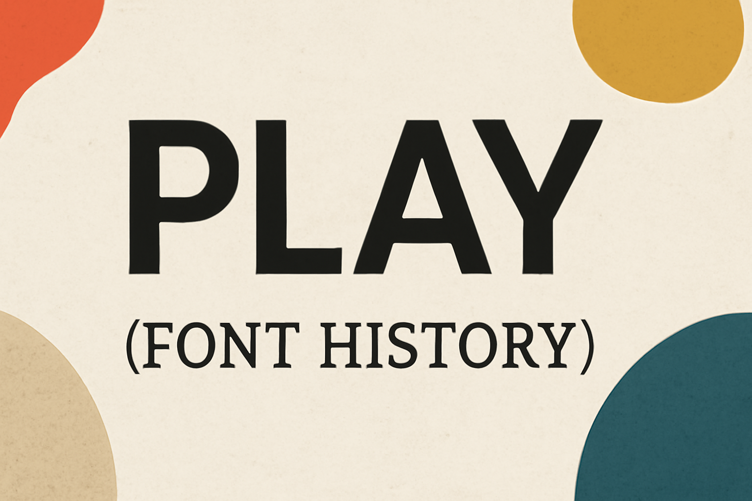
Play is a typeface known for its minimalistic and modern design. Created by Jonas Hecksher while he was the Type Director of Playtype Type Foundry, it features letters based on a squared and circular ‘O’. This design provides a corporate yet friendly look, making it versatile for various uses.
The unique elements of Play lie in its large, open counters and ample lowercase x-heights. These characteristics give it a distinctive and readable appearance, suitable for both professional and casual applications. Play is a sans serif font that stands out due to its balance of style and functionality.
Typography enthusiasts and designers often choose Play for projects that require clear and engaging text. Those interested in font design are likely to appreciate the subtle artistry in Play’s straightforward aesthetics. The font bridges the gap between formal and informal styles, making it a popular choice for diverse design needs.
Origins of Font Play
The history of typography began with early forms of written communication. This led to the development of various styles and techniques, each contributing to what we recognize as fonts today. Key milestones include significant advancements in early calligraphy and typography, plus the transformative invention of movable type.
Early Typography and Calligraphy
Back in ancient times, calligraphy served as one of the earliest forms of expressive writing. Different cultures developed unique styles. In China, beautiful brushwork was highly prized. Meanwhile, in Europe, monks dedicated their lives to crafting elaborate script by hand.
The progression from simple symbols to more complex letters paved the way for typography. Artists and scribes began experimenting with different styles and weights to convey meaning through the appearance of words. This exploration helped lay the foundation for what would later become playable fonts.
Invention of Movable Type
A significant leap in typography came with the invention of movable type. Johannes Gutenberg’s development in the 15th century revolutionized printing. For the first time, text could be mass-produced, making books and written material more accessible.
This breakthrough influenced fonts by enabling the creation of standardized typefaces. Type designers like Frederic Goudy, who designed Goudy Old Style, built upon this innovation, creating fonts that are still popular today.
Movable type also launched the exploration of new typefaces, such as the iconic Helvetica in the 20th century. Each new development expanded the possibilities for designers and users to experiment with font play, making text not just readable but also appealing.
Evolution of Font Styles
Fonts have shaped how humans have communicated in written form. Their styles have transformed from intricate and ornate to sleek and modern, adapting to cultural and technological changes.
Blackletter Fonts
Blackletter fonts, also known as Gothic scripts, were favored in Western Europe from the 12th to the 17th century. These fonts are characterized by their dense, dark appearance, with elaborate and sharp characters. Each letter often had complex, angular lines, making the text ornate but hard to read quickly.
Popular in medieval manuscripts and early printed books, blackletter offered a sense of formality and tradition. Despite their decline with the advent of more readable fonts, blackletter fonts like Textura and Fraktur are still used today in specific contexts, such as diplomas or newspaper mastheads.
Roman and Italic Types
Roman fonts were developed during the Renaissance, drawing inspiration from classical Roman inscriptions. Featuring clear, balanced lines with contrasting thick and thin strokes, these fonts became the standard for printed text due to their readability.
Italic types appeared in the early 16th century, known for their slanted and slightly cursive design. Created for saving space in printed works, they added elegance and differentiation to the typography landscape. Many modern fonts combine these two styles, offering both upright and italic versions, ensuring versatility in typesetting tasks.
Transitional and Modern Serifs
Transitional serif fonts emerged in the 18th century, bridging the gap between old-style and modern serif fonts. They introduced sharper horizontal stress and greater contrast between thick and thin strokes. This evolution led to more refined and elegant typefaces.
Modern serif fonts appeared in the late 18th to early 19th centuries with very high contrast in stroke widths. Notable examples include Bodoni and Didot, known for their strong vertical lines and thin horizontal serifs. They provided sophistication and clarity, becoming a favorite for headlines and high-end branding. Today, these fonts are celebrated for their elegance and timeless appeal in various designs.
Influence of Technology
Technology has shaped the world of typography in significant ways. From the invention of the printing press to the development of digital typesetting, each technological advance has influenced how typefaces are created and used.
Impact of the Printing Press
The printing press, invented by Johannes Gutenberg in the 15th century, was a groundbreaking achievement. This innovation made it possible to produce books quickly and more affordably than handwritten manuscripts. As a result, literacy began to spread, and demand for printed materials increased.
Before the printing press, typefaces were either handwritten or carved into woodblocks, which was time-consuming. The press allowed for the mass production of texts, prompting the development of new fonts that were easier to read in bulk print. The first fonts resembled the handwriting styles of scribes, but soon evolved into more distinct styles.
Digital Typesetting Milestones
The transition from physical type to digital typesetting brought major changes to typography. One milestone was the introduction of PostScript in the 1980s, a technology that allowed printers to produce high-quality text and graphics. It enabled designers to see their fonts rendered on screen just as they would appear on paper.
Another key development was the creation of variable fonts. These allow a single font file to contain multiple styles and weights, offering flexibility and reducing the need for multiple font files. This innovation simplifies font usage and is widely used in web design today.
Digital typesetting continues to evolve, with new software and tools making it easier for designers to experiment and create unique typography.
Iconic Fonts and Their Stories
Iconic fonts have shaped our visual world across different eras. From Gutenberg’s revolutionary moveable type to the widespread use of Helvetica, each font tells a unique story and has played a significant role in design history. Here, their stories are explored.
Gutenberg’s Type
Gutenberg’s invention of moveable type in the 15th century marked a turning point in history. It made books more accessible and revolutionized the way people shared information. His blackletter typeface, often called Textura, mirrored handwritten manuscripts with its bold and formal appearance.
Gutenberg’s Bible, the first major book printed using this technology, showcased the power and precision of his design. The success of the Bible demonstrated how new typefaces could impact society. This early typographic innovation laid the groundwork for future developments in printing and design.
Times New Roman
Times New Roman is one of the most recognized typefaces in the world. Designed in the early 1930s by Stanley Morison, it addressed the need for a more readable daily newspaper font. This typeface became the standard for the London Times, making print more accessible and visually appealing.
Morison’s design replaced an older typeface, boosting clarity and readability. Over time, Times New Roman was adopted by many publications and became a favorite in academia and business. Its blend of tradition and modernity gives it timeless appeal, demonstrating its lasting influence on typography.
Helvetica and Its Ubiquity
Helvetica, designed in 1957 by Max Miedinger and Eduard Hoffmann, stands out as a hallmark of modern design. Its clean, sans-serif style became synonymous with simplicity and versatility. Over the years, it has been used in logos, signage, and advertising, solidifying its place in graphic design history.
During the 1960s and 1970s, Helvetica gained popularity for its neutral and professional appearance. It was widely adopted by corporations and transit systems, including New York City’s subway. This widespread use showcases its ability to convey clear messages and adapt to various contexts, making it a favorite among designers globally.
The Art of Font Selection
Choosing the right font is crucial in design, as it impacts readability, communicates a brand’s identity, and evokes emotions. Balancing these elements ensures effective communication and enhances the visual appeal of the project.
Readability and Legibility
Readability and legibility are key factors in font selection. Readability refers to how easily a block of text can be read, while legibility focuses on the clarity of individual characters.
Different projects require different font styles; for instance, a serif typeface, known for its little “feet,” often enhances readability in print materials. Sans-serif fonts, without these strokes, work well on digital screens.
Line spacing and font size also affect reading ease. For high readability, designers typically choose fonts that allow comfortable reading at various sizes. It’s essential to consider the context and medium where the text will appear to ensure the best choice for clarity.
Typography in Branding
Typography plays a significant role in defining a brand’s identity. The chosen font becomes a visual element that conveys the brand’s personality and values. A modern brand might opt for a clean, sleek sans-serif, while a more traditional brand could prefer a classic serif.
Font consistency is important across all branding materials, such as logos, websites, and print items. This creates a unified and professional appearance.
In advertising, fonts can make or break a campaign by influencing a customer’s first impression. Selecting the right font ensures the brand message is communicated effectively and resonates with the target audience.
Emotional Impact of Fonts
Fonts have a strong emotional influence, affecting how messages are perceived. Different styles elicit various feelings: a playful script might convey warmth and creativity, while a bold sans-serif can suggest strength and modernity.
When selecting a font, it’s important to consider the emotions a designer wants to evoke. Combining fonts can also create contrasting emotions, giving depth to the message.
Designers should test various combinations to ensure the chosen fonts align with the intended emotional tone. By understanding the emotional impact, they can craft designs that speak directly to the audience’s feelings and preferences.
Contemporary Font Creation
Contemporary font creation involves using advanced software tools and platforms. Indie type foundries have emerged as key players, and the open source movement has made fonts more accessible than ever before.
Digital Font Design Software
In the digital age, creating fonts requires specialized software. Programs like Adobe Illustrator and Glyphs provide designers with tools to craft both simple and complex fonts. These platforms allow for precise control over curves, lines, and spacing. Recently, tools like FontLab have gained popularity due to their user-friendly interfaces and comprehensive features. Additionally, some software offers integration with cloud services, making collaboration easier. The accessibility and efficiency of these tools have transformed how designers approach font creation.
The Rise of Indie Type Foundries
Indie type foundries have significantly changed the typography landscape. These small, independent businesses provide unique typefaces that often break away from traditional designs. Foundries such as TypeTogether and Lost Type Co-Op have gained recognition for their innovative work. With the rise of social media, indie designers can now reach global audiences directly. This approach allows for niche market targeting and often leads to more creative freedom. They are contributing to a rich diversity in typeface styles, offering fresh and personalized design options.
Open Source Fonts Movement
The open source movement has revolutionized font accessibility. Platforms like Google Fonts offer a vast library of fonts that are free to use and modify. Designers and developers benefit from access to high-quality fonts without licensing fees. This movement encourages collaboration and sharing, fostering a community of creativity and innovation. Open source fonts also support educational initiatives, providing learning opportunities for aspiring designers. By removing barriers, these fonts have become an integral part of modern web design and typography.
Play in Font Usage
The Play font is known for its simple yet versatile nature. It is popular in various design fields for its clarity and adaptability. This makes it a favorite choice for innovative designs across different media.
Experimental Typography
In experimental typography, Play stands out for its adaptability. Designers often use it to create unique and eye-catching designs without compromising readability. Its clear structure allows artistic play with letters while maintaining clarity. An exciting feature is its ability to mix geometric shapes, which can be perfect for creating a bold, modern look. Hence, it is often chosen for projects that aim to challenge the traditional boundaries of typography.
Kinetic Typography in Media
Kinetic typography involves animated text, and Play adds value here due to its legibility. The font’s clean lines and open counters make it ideal for motion graphics and video content. When text moves, it’s crucial to ensure it remains readable, and Play achieves that. Its simplicity helps maintain focus on the message while allowing creative flexibility. This makes it a top choice for using moving text effectively in advertising or film trailers.
Fonts in Interactive Design
Interactive design benefits from using fonts that are both engaging and easy to read. Play’s friendly vibe makes it suitable for user interfaces. Its versatile nature allows it to be implemented in various digital contexts, from websites to mobile apps. The font also supports multiple languages and diverse characters, ensuring accessibility for a broad audience. This adaptability makes it a practical and appealing choice for designers seeking to enhance user experience with clear and approachable typography.
Preservation and Study
Typefaces play an essential role in cultural heritage, reflecting history and artistic movements. Preserving them involves understanding their significance and ensuring their availability through libraries and archives.
Cultural Significance of Typefaces
Typefaces are more than just letters on a page; they are a reflection of the society and era in which they were created. Each typeface carries a unique story, such as the Gothic fonts of the medieval period or the sleek, modern fonts of the 20th century. These typefaces highlight historical shifts in art and technology.
Understanding the cultural impact of typefaces can enhance appreciation for history and design. They also help communicate a sense of time and place, linking us to different historical periods.
Font Libraries and Archives
Font libraries and archives serve as valuable resources for preserving the rich history of typefaces. Institutions often collect and maintain digital or physical copies of fonts to ensure they are accessible for future generations. The importance of digital preservation has increased with technological advancements.
These libraries offer enthusiasts and researchers a chance to explore and study various typefaces from different eras. They also support education about typography and its evolution. Fonts are made available for study, teaching, and even design inspiration, ensuring that typefaces remain an enduring part of cultural heritage.
Legal Aspects of Font Usage
Fonts are more than just design elements; they carry legal considerations that designers must understand. Key issues include copyright and licensing, alongside trademark cases that affect typography.
Copyrights and Font Licensing
Fonts are protected as intellectual property. Using fonts without the proper license can lead to legal troubles. It’s important to review the end user license agreement (EULA) for each font. This ensures compliance with usage restrictions. Creative Market offers good advice on how to minimize liability.
Even free fonts may have limitations. Some might restrict commercial use unless a license is purchased. Being aware of what your font license allows can prevent unexpected issues. Clear understanding of font licenses safeguards against potential legal action.
Trademark Cases in Typography
Typography occasionally becomes the center of trademark disputes. Fonts can be part of a brand’s identity. Companies may face legal challenges if a font they use resembles another brand’s trademarked typeface.
These cases emphasize why it’s important for businesses to secure rights for the fonts they use in logos or branding. Recent legal cases show how crucial it is to address this early. Ensuring legal clearance before using a font can save a company from costly disputes in the future.