Mastering color correction in DesignWizard can elevate your projects from average to extraordinary. Color correction helps achieve the desired mood and tone, making your designs look professional and polished. Whether you’re adjusting hues for a subtle effect or completely transforming the color scheme, learning how to use these tools effectively is crucial.
DesignWizard offers a range of features that simplify the color correction process. With easy-to-use tools, even beginners can make significant improvements to their work. Understanding how to use these features can save time and improve the quality of designs.
The benefits of mastering color correction extend beyond just visual improvement. It can also enhance storytelling by aligning visuals with the intended message. This skill is essential for anyone looking to create impactful and professional edits that stand out.
Understanding Color Correction
Color correction is a vital skill in digital design that helps bring images to life. It involves adjusting colors to make images look natural and appealing. This section will explore the basic concepts and how it differs from color grading.
The Basics of Color Theory
Color theory is the foundation of effective color correction. It involves understanding the color wheel, primary colors, secondary colors, and how they interact. Primary colors like red, blue, and yellow form the basis for creating other colors. Mixing these in different proportions creates a wide spectrum.
Designers also need to consider complementary and analogous colors. Complementary colors are opposite on the color wheel and create strong contrasts. Analogous colors are next to each other and blend harmoniously. Using these principles helps achieve the desired visual effect.
Color Temperature is another key concept—warm colors have more reds and yellows, while cool colors have blues and greens. Adjusting temperature can dramatically change the mood of an image. Designers choose the right balance to match the image’s intent.
Color Correction vs. Color Grading
Color correction and color grading serve different purposes. Color correction is about making images look natural and correcting color imbalances. This involves adjusting brightness, contrast, and color balance to ensure colors appear as they should. It helps in making images clean and true to life.
Color grading, on the other hand, involves modifying colors for artistic effect. It sets the tone and mood for an image by changing hues and saturation. While color correction aims for realism, color grading moves toward stylized looks.
Professionals in photography and design use both techniques. They enhance image quality and adjust according to artistic vision. Understanding the distinction between these processes is crucial for mastering color correction in any design project.
Getting Started with DesignWizard
DesignWizard offers a user-friendly interface and powerful tools to begin creating stunning designs. Learn how to efficiently navigate the platform and set up projects with ease.
Navigating the Interface
DesignWizard’s interface is designed for simplicity. Upon logging in, users are greeted with the main dashboard, featuring a top menu and side panels. These offer quick access to templates, design elements, and color choices.
The left-hand panel displays a vast library of pre-designed templates. Users can browse thematic categories or search for specific styles. At the top of the interface, the toolbar contains essential tools for editing, such as text input, color adjustments, and element placements. Navigation is intuitive, allowing users to effortlessly select and modify design components.
Understanding these elements ensures efficient design workflows. With familiarization, users can smoothly transition between different sections, making design adjustments quick and precise. Bookmarking frequently used tools can further enhance productivity.
Setting Up Your Project
Starting a new project in DesignWizard is straightforward. After selecting a template, users can adjust the canvas size using the magic resize feature. This flexibility allows for changes without losing resolution.
To begin, click on the “Create New” option. From here, users can choose from a range of customizable templates suited for various purposes, such as social media posts or business cards. Once a template is selected, it can be personalized by adding text, images, and other elements.
Customizing your project involves utilizing DesignWizard’s extensive library. Users can drag and drop elements directly into the canvas, enabling a seamless creative process. With a few clicks, projects can be tailored to fit specific needs and aesthetics.
Essential Color Correction Tools in DesignWizard
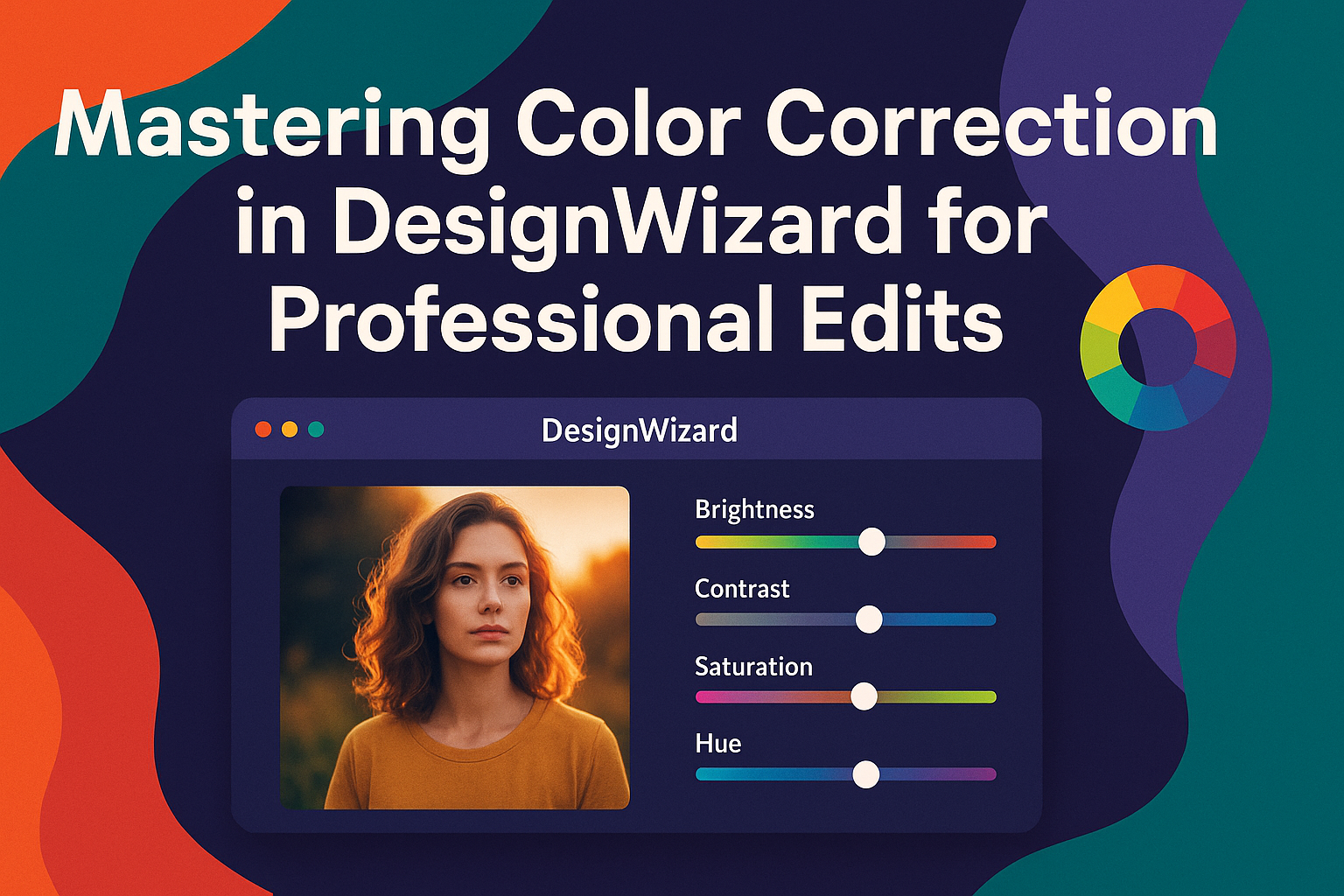
DesignWizard offers a range of tools for color correction that enhance designs effortlessly. Users can easily navigate essential tools like the Color Picker, access a variety of adjustments and filters, and understand the importance of histograms in design work.
Using the Color Picker
The Color Picker in DesignWizard is a crucial tool for designers who want precise color matching in their projects. It allows users to select colors from an image or palette easily, ensuring consistency across different elements. This feature supports the use of hex values or the color spectrum, providing flexibility in color choices.
Designers can effortlessly match or tweak colors to achieve the desired aesthetic. The ability to save and reuse custom colors streamlines the process, enhancing workflow efficiency. By selecting colors with precision, designs become more cohesive and professional.
Adjustments and Filters
In DesignWizard, adjustments and filters play vital roles in refining images. Users can alter brightness, contrast, and saturation to create the perfect balance. These features allow for non-destructive editing, enabling changes without losing the original image quality.
Filters offer creative effects that can transform the look and feel of a project. From subtle adjustments to bold transformations, they provide a wide range of options. Combining multiple filters is easy, and users can experiment to achieve unique styles, enhancing overall design appeal.
The Role of Histograms
Histograms in DesignWizard help users to understand the color distribution within an image. This tool provides a visual representation of pixel brightness across different tones, aiding in precise color adjustments.
Designers can use histograms to identify if an image’s exposure needs correction. By adjusting highlights, shadows, and midtones, they can refine the color dynamics. This results in a balanced image that maintains the intended mood and detail.
Understanding histograms aids in achieving optimal color correction. It ensures that images are not washed out or too dark, maintaining a professional quality. By utilizing this tool, designers gain greater control over their work, leading to more effective and appealing results.
Step-by-Step Color Correction Techniques
To achieve professional edits in DesignWizard, mastering specific color correction techniques is key. Crucial steps include correcting exposure and brightness, balancing colors, and using advanced options like curves and levels. These techniques will enhance your images with precision and clarity.
Correcting Exposure and Brightness
Exposure and brightness adjustments are fundamental to achieving a well-balanced image. The goal is to ensure that no part of the image is too dark or too light.
In DesignWizard, begin by examining the histogram. This helps identify underexposed or overexposed areas. Adjust the brightness sliders to bring details back into the shadows and highlights. It’s also important to pay attention to mid-tones for a natural look. If an image feels too flat, enhancing contrast can add depth and dimension.
For those unsure about exact numbers, try auto-correction tools to get a good starting point. Then, fine-tune manually for a more personalized touch.
Balancing Colors
Color balance helps an image appear natural and true to life. This involves adjusting the levels of red, green, and blue in the image.
In the software, start by identifying any dominant color casts, which can occur due to lighting conditions. Use temperature sliders to warm up or cool down the image. Alternatively, the tint sliders can correct subtle green or magenta casts.
Another effective method involves neutralizing any unwanted tints by using the eyedropper tool. Clicking on a known gray area should balance the colors across the image. For finer control, the RGB curves can be adjusted, allowing specific colors to be targeted without affecting others.
Advanced Techniques: Curves and Levels
For precise control over color correction, curves and levels are indispensable. Curves allow users to adjust the brightness and contrast across different parts of the image.
In the curves tool, make adjustments by placing anchor points along the curve line, pulling them to brighten or darken specific ranges like shadows, midtones, or highlights. This enables seamless tonal changes without affecting the entire image uniformly.
Levels adjustments focus on setting the black, white, and mid-point values. Moving sliders from the histogram’s ends will give a more dynamic range to the image. This technique is especially useful for images lacking definition between dark and light areas.
Harmonizing Colors for Cohesive Designs
Achieving a cohesive design with harmonized colors involves choosing the right color schemes and maintaining consistency across all design elements. This ensures a unified look that enhances the viewer’s experience.
Color Schemes and Palettes
Color schemes and palettes are essential tools for creating a cohesive design. Choosing the right combination of colors can evoke specific emotions and set the tone for any project. Using complementary colors, like blue and orange, can enhance contrast without losing harmony. Analogous colors, which sit next to each other on the color wheel, offer a more subtle and serene look, such as combining shades of teal, green, and yellow-green to create an earthy atmosphere.
Monochromatic schemes, built around a single hue in varying shades, provide seamless transitions and can evoke elegance and simplicity. Such choices ensure that each element naturally blends and contributes to the overall design theme, creating unity and balance. In design, using these techniques helps convey the intended message without overwhelming the audience and maintains a professional appeal.
Color Consistency Across Multiple Elements
Consistency in color use across different elements is key to maintaining a cohesive visual narrative. Designers should ensure that their selected color palette is applied uniformly throughout all components of a project. For instance, repeating the same shades and tints in graphics, text, and backgrounds strengthens the visual connection between each part.
To achieve color consistency, designers can use tools like color swatches and digital libraries to keep track of specific hues. This practice helps in avoiding mismatched tones that can disrupt the visual flow. Consistent colors build trust with the audience, as they come to recognize and associate the design’s identity with specific shades. Such thoughtful application enhances the viewer’s comfort and engagement with the design.
Workflow Tips and Best Practices
Achieving professional edits in DesignWizard involves employing smart strategies for color correction. This includes non-destructive editing techniques, making good use of layers and masks, and understanding the best methods for saving and exporting your images.
Non-Destructive Editing
Non-destructive editing allows users to make changes without altering the original image. It’s a safety net for those wanting the freedom to experiment. Techniques like using adjustment layers can help achieve this. Adjustment layers allow edits that don’t permanently change the image.
Applying changes through adjustment layers helps to control individual modifications easily. If a particular adjustment doesn’t work, simply delete or modify that layer. The original image remains untouched, which is a big advantage when you want to try different approaches or when clients request changes. This flexibility saves time and reduces errors.
Efficient Use of Layers and Masks
Layers and masks are essential in creating structured and flexible edits. Layers let users work on individual components of an image separately. This separation means different elements can be adjusted without affecting others. Masks further refine this process by controlling where effects are applied.
Masks you create can hide or reveal parts of a layer, offering precise control over areas impacted by changes. Editing with masks enables detailed corrections. For example, adjusting the color of a specific section without altering the entire image. By using these tools effectively, users can maintain high control and adaptability over their work in DesignWizard.
Saving and Exporting Corrected Images
When it comes to saving and exporting images, it’s vital to preserve color accuracy and quality. DesignWizard provides various options for exporting, such as PNG, JPEG, or TIFF formats. Always ensure that the color profile matches the intended output. This ensures that your colors remain consistent when viewed or printed elsewhere.
Consider saving your work as a project file first, keeping all layers and adjustments intact. This allows for future edits if needed. For sharing or final use, export the file to the desired format. Keeping these best practices in mind ensures that the quality of your work in DesignWizard remains top-notch from editing to final output.
Creative Uses of Color Correction in DesignWizard
Color correction in DesignWizard can significantly impact the visual appeal and storytelling of a project. By enhancing visual narratives, creating specific moods, and ensuring brand consistency, color correction transforms ordinary designs into compelling visual experiences.
Enhancing Visual Narratives
Color correction can bring a story to life by highlighting important elements in a design. For instance, using vibrant colors can draw attention to specific areas, guiding the viewer’s eye through the visual journey.
Designers can use tools to adjust the saturation and contrast, making images more striking. Adjusting colors can emphasize key moments in a sequence, making them more memorable.
Balancing the color temperature, such as warm or cool tones, also impacts how a scene is perceived, adding depth and emotion.
Creating Mood and Tone
Colors have a powerful effect on mood and tone. Adjusting hues in DesignWizard allows designers to evoke feelings such as warmth, excitement, or calmness. A cool, blue tone might create a peaceful atmosphere, while warmer hues could suggest energy and passion.
By tweaking brightness and contrast, designers can influence viewers’ emotional responses, setting the scene’s mood. This emotional connection ensures that the audience feels what the creator intends through color cues alone.
Playing with shadows and highlights can add drama or serenity to an image, depending on the desired mood.
Stylizing Images for Brand Consistency
Ensuring brand consistency is crucial, and color correction plays a vital role here. DesignWizard aids in matching a brand’s specific color palette across different images and graphics. This consistency helps in building a recognizable brand identity.
Color correction ensures that all marketing materials reflect the same tone, whether on a website, social media, or in print. Adjustments in hue, saturation, and brightness help align images to brand standards.
Creating presets or templates in DesignWizard allows teams to maintain uniformity in brand visuals, fostering familiarity and trust.
Troubleshooting Common Color Issues
Addressing color problems in DesignWizard can greatly enhance the quality of your edits. Tackle these issues to ensure your images look natural and professional.
Fixing Color Casts
Color casts occur when unwanted tints overlay your image, making it look unnatural. This can be caused by lighting conditions or incorrect white balance. In DesignWizard, users can adjust the white balance to fix these issues. Always begin by identifying the dominant color causing the cast.
Use the color balance tool to modify the reds, yellows, or blues. For example, if a photo has a yellow cast, increase the blue slider to neutralize it. This step ensures whites and grays appear color-neutral. Save these adjustments to see the image’s true colors once more.
Dealing with Over-Saturation
Over-saturation occurs when colors are too intense, making the image look unrealistic. In DesignWizard, users can easily tackle this by adjusting saturation levels. Open the saturation tool and reduce the intensity. This helps bring out natural hues and tones.
Be cautious not to overdo it. Too much desaturation can make the photo look dull. Instead, aim for a balanced look where colors appear vivid but still true to life.
Recovering Detail from Shadows and Highlights
Sometimes images lose details in dark shadows or bright highlights. This happens due to incorrect exposure settings. DesignWizard provides tools to help recover these details. Start by using the shadow and highlight adjustments.
Increase the shadow slider to reveal hidden details in darker regions. For highlights, decrease their intensity to restore details in bright areas. The goal is to achieve a balanced exposure, so textures and colors in both light and dark parts of the image stand out naturally. This creates a harmonious and detailed result.