Adobe XD is a powerful tool for designing user interfaces, and mastering its features can lead to more efficient and engaging designs. One of the key features is the ability to create reusable UI components, which significantly enhances productivity and consistency in design projects. By learning how to use Adobe XD’s components efficiently, designers can save time and maintain a uniform look across their projects.
Adobe XD components allow designers to build elements that can be reused across different artboards. This not only speeds up the design process but also ensures that changes to a component are reflected everywhere it is used. Creating reusable components is an essential skill for anyone looking to improve their workflow.
For those looking to dive deeper, understanding how to make, name, and manage components can make all the difference. Designing with reusable elements offers a structured approach, ensuring that every element is perfectly aligned with the project’s needs. Explore techniques such as creating symbols in Adobe XD to take advantage of this feature. This journey into the world of components promises to transform a designer’s approach and elevate the quality of any project.
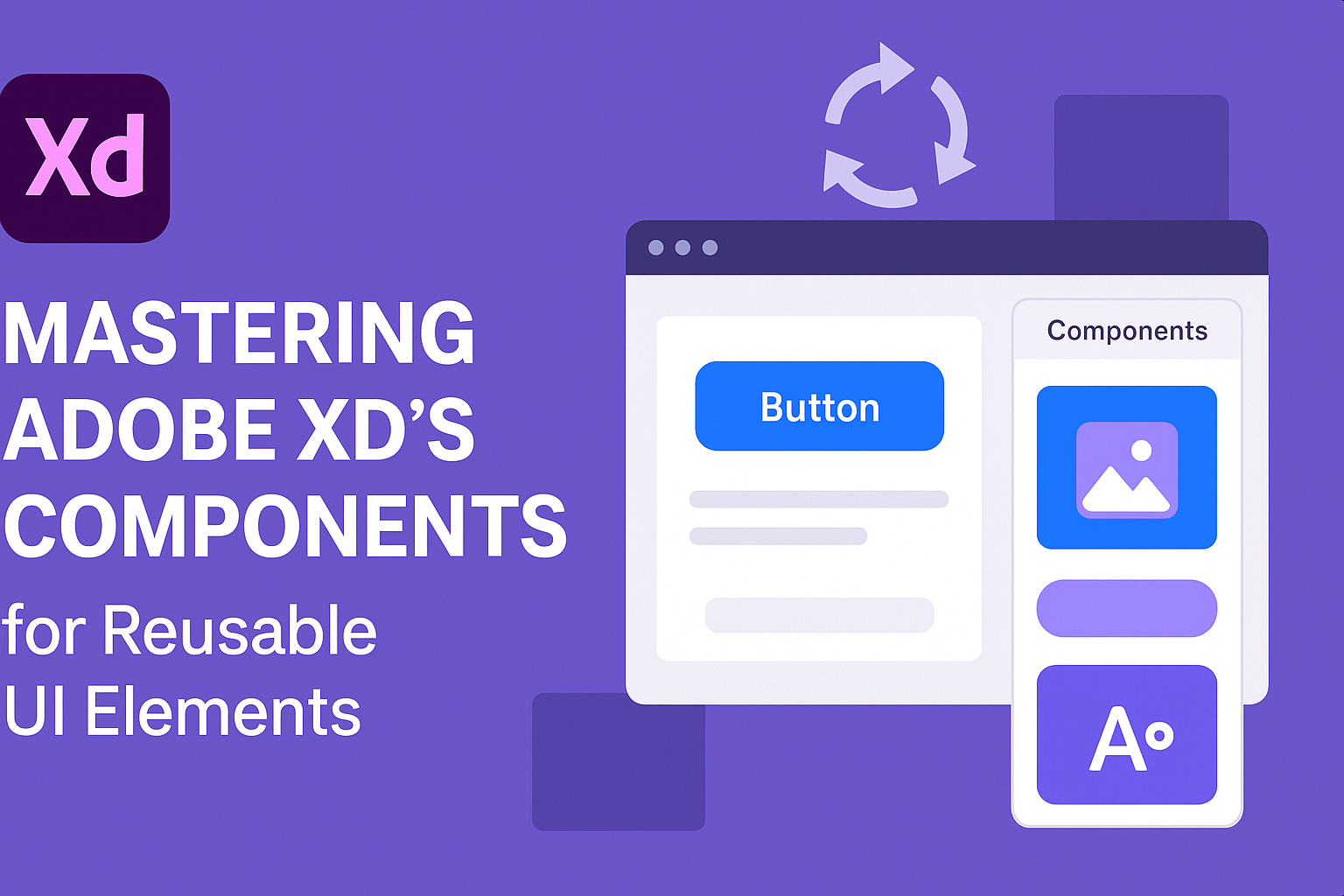
Understanding Components in Adobe XD
Adobe XD uses components to create reusable design elements, streamlining the design process. These components help maintain consistency and efficiency in UI projects.
The Basics of Components
In Adobe XD, a component is a set of design elements grouped together as a single reusable unit. This feature is designed to save time and ensure uniformity across design projects. To create a component, designers can select their elements and use the “Make Component” option. Once created, the original becomes a Master Component, indicated by a green icon. If you need to know more about how to create them, Adobe offers detailed instructions for working with components in XD.
States of Components
Components in Adobe XD can have multiple states. These states are variations within the same component, such as hover or active states. This feature allows for dynamic UI designs. Users can easily switch between different states to see how components behave in real situations. For example, a button can have a default state and a hover state, providing a clear view of user interactions. This versatility enhances the design process, making it more intuitive and efficient.
Component Instances and Overrides
Component instances are copies of the Master Component. They can be used throughout the design without affecting the original. One powerful aspect is the ability to override specific elements in each instance while keeping the core structure intact. For example, changing text or colors in one instance won’t alter the main component. This flexibility is essential for designers who need varying content within the same layout. Overrides ensure that changes made to specific instances are isolated from the rest, allowing for both consistency and customization. Learn more about using overrides in XD.
Creating Your First Component
Creating components in Adobe XD is a great way to make your design process more efficient. This involves designing the component elements, converting assets into components, and following best practices for reliable results.
Designing the Component Elements
When starting to design component elements, think about the basic parts you’ll need. These could be buttons, icons, or any UI elements that will be reused. Keep the design simple and consistent, ensuring that the elements align with the project’s overall theme.
Consider using grids and guides for precise alignment. This ensures every part of your component fits perfectly within your design. Use color and typography thoughtfully to maintain visual harmony.
Involve feedback early on during the design phase. It can help catch potential issues before they become time-consuming problems later.
Converting Assets into Components
Once your asset is ready, you can transform it into a component with a simple process. In Adobe XD, you can right-click the designed element and select “Make Component” or press Ctrl/Cmd + K.
This action adds your component to the Assets panel, making it easy to use across different artboards. Components keep your design consistent and allow global adjustments. This means changes to the main component will reflect across all instances.
When working with reusable UI components, remember to name them clearly. A clear name helps you identify components quickly, especially in complex projects.
Best Practices for Component Creation
Adopting best practices ensures the successful implementation and management of components. First, always name your components logically and descriptively to avoid confusion later. For instance, use names like “Primary Button” or “Secondary Icon.”
Regularly update components whenever there are design changes. This ensures all instances stay consistent throughout the project.
Take advantage of Adobe XD’s feature to override content in specific instances. This gives flexibility while maintaining a consistent structure. Remember to align to guides and grids for predictability in layouts. Following these steps ensures efficiency and consistency.
Organizing Components for Efficiency
Adobe XD allows designers to create efficient and reusable UI elements. To maximize their benefits, organizing components effectively is essential. This involves setting up a component library, using clear naming conventions, and categorizing components logically.
Setting Up a Component Library
Creating a component library in Adobe XD helps designers manage their UI elements more efficiently. By centralizing components in one place, it becomes easier to maintain consistency across different projects. This not only saves time but ensures that any updates made to a component are automatically reflected wherever it is used.
Components should include both basic UI elements like buttons and more complex designs such as full-screen layouts. Having a well-organized library also enables teams to work collaboratively, as everyone has access to the same components.
Using Naming Conventions
Clear and consistent naming conventions are crucial for managing components efficiently. By using descriptive names, designers can quickly identify the purpose and function of each component. For example, naming a button as “Primary Button” or a text field as “Search Input” clarifies their use.
Adobe XD also allows for organizing names by using prefixes. This can help group related components together. For instance, using “Nav-” for navigation elements or “Form-” for form components makes it straightforward to locate and use them. Consistent naming reduces errors and speeds up the design process.
Categorizing Components
Organizing components into categories makes it easier to find and reuse them. Categories can be based on functionality, such as buttons, forms, or navigation, or by project-specific requirements. This structured approach allows designers to quickly locate components, improving workflow efficiency.
Within each category, designers can further organize components by variations, like states for buttons or different text sizes. Using Adobe XD’s components efficiently requires a thoughtful approach to categorization, ensuring that all design assets are easy to manage and implement.
Advanced Component Features
Adobe XD offers advanced features for components that enhance design flexibility. These features include nested components, responsive resize, and dynamic animations. By understanding and using these tools, designers can create more interactive and adaptable UI elements.
Working with Nested Components
Nested components in Adobe XD allow for creating complex designs by placing one component inside another. This feature lets designers build structured layouts with multiple layers. For instance, a button with an icon and text can be created as a parent component. Inside, smaller elements like the icon and text can be components themselves.
When changes occur in a nested component, they reflect across all instances, saving time and keeping consistency. Designers can swap out nested components, providing versatility. This makes it easier to update parts of a design without changing the whole structure. Using nested components is efficient for managing changes across a large project.
Responsive Resize and Constraints
Responsive Resize and Constraints help adapt components to different screen sizes. With Responsive Resize, Adobe XD automatically adjusts objects when resizing artboards. This feature maintains the layout proportions, ensuring that the design looks balanced on any device.
Constraints let designers pin parts of a component to certain spots on the artboard. For example, a button pinned to the bottom maintains its position even if the artboard’s height changes. These tools are vital for creating a responsive design system. By using them, designers ensure consistency and flexibility across various screen resolutions. This adaptability is crucial for modern web and app design.
Animations and Interactions
Animations and Interactions in Adobe XD add dynamics to static designs. They make interfaces engaging and intuitive. With Auto-Animate, designers can create smooth transitions between different states of a component. For example, a button can change color or grow in size when hovered over.
Triggers and actions in XD define how users interact with components. A click can trigger a pop-up or navigate to a different screen. These features allow for realistic prototyping. By using animations and interactions, designers can test user experiences before final development, making the design process efficient and creative.
Collaboration and Sharing Components
Adobe XD enables designers to collaborate effectively by sharing components and updating them across projects. This ensures consistency in design and streamlines teamwork, making the design process smoother and more coordinated.
Shared Libraries in Adobe XD
Shared libraries allow teams to use the same set of design assets across different projects. Designers can save components, colors, and styles in a cloud-based library, making them available for everyone on the team. This feature helps maintain brand consistency and reduces the risk of outdated elements.
When a component is updated in the shared library, changes are automatically available to all users. This means everyone works with the latest design elements, ensuring uniformity and efficiency. Shared libraries are particularly useful for large teams or organizations with multiple ongoing projects.
Managing Component Updates
Managing updates to components is crucial for keeping designs consistent. Adobe XD allows users to make changes to a master component, which then reflects across all instances of that component. This central management system saves time and effort, as designers do not need to update each instance manually.
Notifications alert users when a component in their design has been updated. They can then decide to accept the changes or continue with the current version. This flexibility allows for quick adaptation to new styles or design elements, while still giving designers control over their work.
Collaborative Editing with Components
Adobe XD supports real-time collaboration, allowing multiple designers to work on the same project simultaneously. This feature is beneficial for teams working remotely or in different locations. Designers can see changes as they happen and provide instant feedback.
Collaborative editing reduces the need for back-and-forth file sharing, which can lead to version confusion. Adobe XD provides a document history to track changes and resolve any conflicts that might arise during editing. This feature ensures smooth teamwork and keeps everyone on the same page.
Integrating Components with Plugins and Extensions
Adobe XD offers powerful tools to enhance design systems by integrating components with plugins and extensions. By leveraging these tools, designers can streamline workflows, boost creativity, and ensure design consistency.
Utilizing Plugins for Component Enhancement
Plugins play a key role in enhancing components within Adobe XD. Tools like Zeplin 3.0 allow developers to view UI components directly within their codebase, fostering reusability and ensuring that designs align seamlessly with developer needs. The Toolabs DSM plugin also provides a way to link design tokens to components, making it easier to maintain consistency across projects.
Designers can install plugins from the XD Plugin Manager, creating custom workflows to fit specific project requirements. Installing the right plugin can transform the design process, allowing designers to work more efficiently and creatively by automating repetitive tasks or quickly generating complex design elements.
Automating Tasks with Extensions
Extensions in Adobe XD enable automation of repetitive tasks, freeing up time for designers to focus on creativity. This involves using specific plugins or scripts that can automate adjustments across numerous components, ensuring that any change in the main component updates all linked instances instantly.
Designers benefit from this automation by maintaining consistency and making global changes without the need for manual updates. This saves significant time, especially in large projects where the component library can be vast. With the right extensions, teams can stay agile and focus on innovation rather than execution.
Maintaining and Evolving Your Component System
A well-maintained and evolving component system in Adobe XD ensures consistency and adaptability. Regular audits and incorporating user feedback are crucial for keeping your design robust and relevant.
Component Audit and Cleanup
To keep the component system efficient, regular audits are essential. Designers should periodically review each component to ensure it is still relevant and effective. Components that are outdated or no longer used should be retired or refreshed. This process helps maintain clarity and organization within the design system.
Organizing components in logical groups can streamline the audit process. Tagging and categorizing elements based on their functions or uses make it easier to spot redundancies or inconsistencies. Employ tools available in Adobe XD, such as naming conventions, to better manage and track component usage.
Regularly updating documentation also helps keep everyone on the same page. Clear guidelines and records of changes made to components can improve team communication and help others understand the purpose and reasoning behind each adjustment.
Evolving Components with User Feedback
User feedback is invaluable in evolving a component system. By listening to user experiences, designers can identify areas that need improvement or expansion. Feedback provides insights into how real-world use may differ from initial assumptions, guiding the evolution of components.
Conducting surveys or user testing sessions can gather valuable data. When users struggle with a specific UI element, it might indicate a need for redesign or further adjustment. It’s important to prioritize this feedback in the design process, ensuring that components meet user needs.
By iterating based on feedback, the component library continues to grow in a way that aligns with user expectations. This cycle of feedback and iteration makes the system more intuitive and user-friendly over time, enhancing the overall experience of the application.
Tips and Tricks for Mastering Components
When dealing with components in Adobe XD, efficiency and smooth problem-solving are key. Applying the right shortcuts can enhance productivity, while understanding common issues can prevent setbacks.
Shortcuts and Efficiency Hacks
Using keyboard shortcuts in Adobe XD can save time. For example, pressing Cmd/Ctrl + K creates a component from the selected design element. This is a quick way to build a library of components.
Another helpful trick involves layer management. Naming and organizing layers ensures easy identification and editing. The Assets panel is also beneficial for keeping track of components. Designers often use it to drag and drop components easily, streamlining the workflow.
Creating multiple states within a component boosts flexibility. This allows different styles and interactions without creating new components. By maintaining a structured system of components, designers can efficiently replicate styles across projects.
Troubleshooting Common Component Issues
Sometimes components behave unexpectedly. One common issue is when changes in one instance are not reflected in others. Ensuring that components are linked and saved properly can resolve this.
Text overrides often lead to mismatches. Adjusting text within a component without altering the original involves using the Override Panel. This assists in keeping the desired uniformity.
Another issue is with the Repeat Grid feature. If adjustments affect unwanted areas, checking boundaries and resizing carefully can prevent these problems. Some designers overlook alignment and spacing settings, which can impact component design. Regularly checking these settings helps maintain a polished look.
Monitoring changes and using components appropriately can greatly improve the design process in Adobe XD.