Transforming regular text into visually captivating designs can be a game-changer for those using Adobe InDesign. One powerful feature is the Type on a Path tool, which allows designers to align their text along any path or shape they choose. This tool unlocks the potential for creative typography, making text more engaging and dynamic.
By understanding how to use this tool, users can create unique designs that draw in readers and deliver messages in visually compelling ways. For instance, placing text on curves or waves can highlight key information and make it stand out in a design. This feature not only enhances aesthetic appeal but also offers flexibility in styling text.
Using the Type on a Path tool is quite straightforward. Following simple steps, users can select a path and apply text that maintains its orientation, creating a seamless connection with the design. Experimenting with this feature can lead to creating standout designs that captivate audiences.
Getting Started with Adobe InDesign
Adobe InDesign is a powerful tool for creating professional layouts and designs. It’s important to understand its interface and how to set up a new document to maximize creativity and productivity.
Overview of InDesign Interface
Adobe InDesign offers an intuitive interface designed to make design work efficient and enjoyable. When first opening the software, users are greeted with a workspace that includes the main document area, toolbars, and panels.
The Toolbar on the left contains tools for creating and editing objects. On the right, users will find panels such as Layers, Swatches, and Text Options. These panels can be customized to suit specific workflow needs.
Above, the Control Panel provides quick access to common settings, changing contextually based on the selected tool or object. Users can also open multiple windows and arrange them to view several documents simultaneously. This setup is key for designers working on complex projects.
Setting Up a New Document
Creating a new document starts with selecting File > New > Document. This opens a dialog where users can choose page size, orientation, and the number of pages.
Users can set margins, bleed, and gutter values to ensure print-ready documents. Presetting these dimensions helps maintain consistency throughout the entire project.
InDesign allows for choosing measurement units, like inches or pixels, based on project requirements. Adjusting the intent for web or print can be crucial, as options and color settings differ. Expert users might save these settings as presets, speeding up future work and harmonizing document setup across multiple projects.
Basics of Typography in InDesign
Using Adobe InDesign’s typography tools effectively can greatly enhance the design of any document. Understanding fonts, typefaces, and working with text frames are essential skills for creating professional layouts.
Understanding Fonts and Typefaces
InDesign offers a variety of fonts and typefaces, each providing unique characteristics. Fonts are specific styles within a typeface, which refers to the overall design of lettering. For example, Helvetica is a typeface, while Helvetica Bold is a font. When choosing a typeface, consider the document’s purpose and audience, whether it’s formal or casual. InDesign includes robust font management features, allowing users to quickly browse and activate fonts directly from Adobe Fonts.
The software also supports OpenType, TrueType, and PostScript formats, giving designers flexibility in their choices. OpenType fonts are particularly versatile, offering advanced features like ligatures and alternate characters. Experimenting with different fonts and typefaces can lead to creative outcomes but should be done carefully to maintain readability and cohesion in the design.
Working with Text Frames
Text frames in InDesign are the primary way to add and manipulate text in a layout. They are flexible containers that can be resized, moved, and linked across pages. To create a text frame, users can simply use the Type Tool and click or click-and-drag in the workspace. Text frames can be connected to allow text to flow seamlessly from one frame to another, useful for multi-page documents.
Adjusting the text frame’s properties, such as margins and column settings, can help in organizing text efficiently. Designers can apply styles, such as paragraph and character styles, to maintain consistency throughout the document. Utilizing grids and guides ensures alignment and enhances the overall layout, making the design clean and professional.
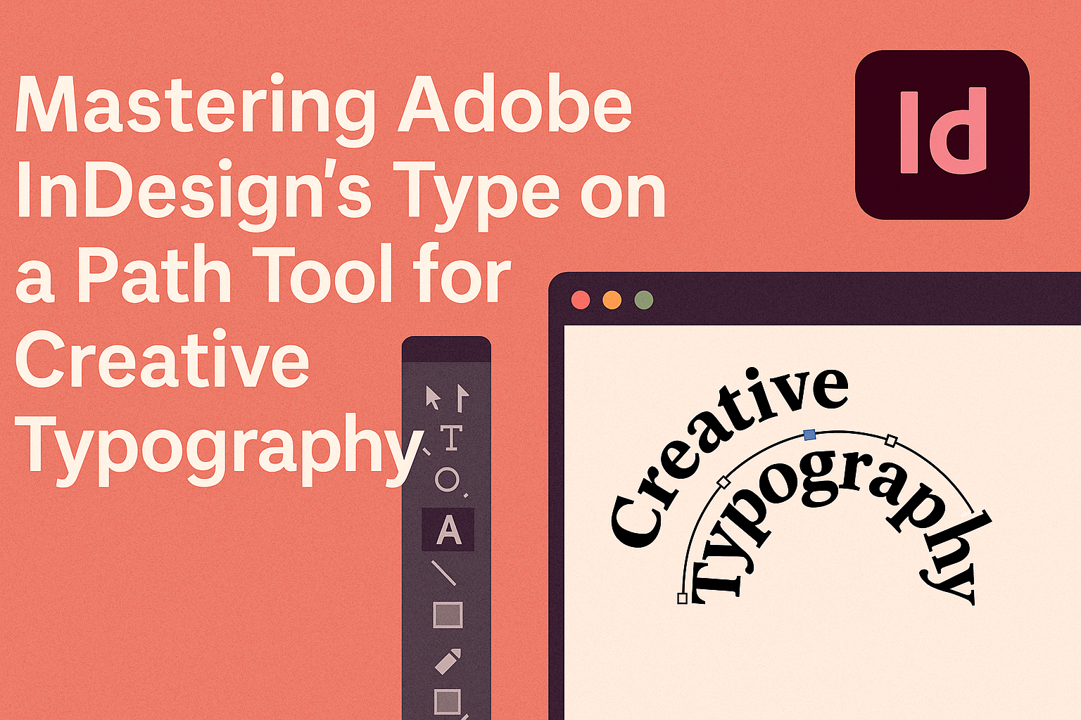
Exploring the Type on a Path Tool
Using the Type on a Path Tool in Adobe InDesign, designers can craft unique text layouts that follow custom paths. This section highlights selecting the tool, creating text paths, and the nuances of editing these paths for better design outcomes.
Selecting the Type on a Path Tool
To start working with this feature, users need to select the Type on a Path Tool. This is done by navigating to the Type Tool in the toolbox and then choosing Type on a Path Tool from the list. The icon looks like an underlined “T” sitting on a curved line.
Selecting this tool allows users to apply text to any open or closed path drawn with the Pen Tool or Shape Tool. For beginners, the easy accessibility of the tool helps in quickly applying complex text effects without needing advanced knowledge. It turns simple designs into visually appealing ones by merging text and shapes seamlessly.
Creating Text Paths
Creating text paths involves drawing a path first. Users can use the Pen Tool to draw custom paths or the Ellipse Tool if they want to create circular text. Once the path is in place, they can click the path with the Type on a Path Tool to begin typing on it.
This action converts the simple path into a canvas for unique typography. Having the freedom to choose any shape ensures creative flexibility. Whether the goal is to wrap text around a logo or form evocative text arcs, InDesign provides the precision and ease needed to achieve these designs.
Editing Text Paths
Editing text paths is essential to refine the typography. After placing text, users can adjust its position along the path. By using the Selection Tool, they can drag the start and end points, controlling where the text begins and ends on the path.
For text that doesn’t quite fit, spacing can be adjusted through options found under Type > Type on a Path > Options. Here, different effects are available, such as Rainbow or Skew, to tweak the text style further. Understanding these settings empowers designers to maintain a clean layout while experimenting with varied text effects.
Mastering Text Formatting
In Adobe InDesign, mastering text formatting means honing skills around adjusting character options and using paragraph styles. These techniques help create visually appealing and readable text layouts.
Adjusting Character Options
Character options in InDesign let users modify individual letter properties for customized designs. They can adjust the font size, style, and kerning to suit project needs. Line spacing can also be altered, helping ensure that text doesn’t appear cramped. These adjustments are crucial for those aiming to make text both readable and visually interesting.
For creative projects, using special characters or adjusting the baseline shift might add a unique touch. Selecting from various font weights can also emphasize different sections of text. With tracking, users can adjust the space between letters, which can be vital for creating clean and professional designs. Experimentation with these settings allows for personalized typography.
Using Paragraph Styles
Paragraph styles save time by applying consistent text formatting across a document with just a few clicks. When styles are set up, all paragraphs with that style will automatically update if changes are made. This ensures uniformity throughout the project, crucial for large documents.
Create different styles for various parts of a project, like headings and body text. Styles can include alignment, line spacing, and indentation settings. Using paragraph styles also helps maintain a clean workflow, as one can quickly switch between styles without manually adjusting each paragraph.
Advanced users might take advantage of nested styles to apply character styles within a paragraph automatically. This can be useful for complex layouts where different sections of a paragraph need distinct formatting.
Creative Typography Techniques
Creative typography in Adobe InDesign can elevate any design project. From applying unique effects to experimenting with type warp, these techniques provide endless opportunities for customization and expression.
Applying Effects to Type on a Path
Using the Type on a Path tool in InDesign, designers can add creative flair to text. By selecting Type > Type on a Path > Options, they can choose from various effects like Rainbow or Skew. Each effect changes the text’s appearance along the path and can align characters creatively.
Experimenting with effects allows the designer to make headlines stand out or create dynamic visual elements in layouts. Adjusting the Align to Path options can further customize how the text hugs the curve of the path. For those looking to enhance engagement, applying these effects adds notable impact to typography.
Experimenting with Type Warp
In addition to path effects, Type Warp is another powerful tool for creative typography. Designers can play with distortion to achieve intriguing perspectives and shapes. This involves using transformation options to twist, bend, or stretch text creatively.
Experimenting with different warp styles can produce playful and unexpected results. For visually complex designs, changing anchor points or the degree of warp allows for intricate and whimsical creations. Engaging with different warp settings in InDesign is a sure way to add sophistication and originality.
Advanced Type on a Path
Creating advanced designs using Adobe InDesign’s Type on a Path tool involves flowing text along intricate shapes and integrating typography seamlessly into layouts. Understanding these techniques can elevate design projects, making them more engaging and visually appealing.
Flowing Text Along Complex Paths
Using InDesign’s Type on a Path tool to flow text along complex paths allows for creative design possibilities. Designers can make text follow intricate shapes, such as spirals or waves, which can add a dynamic feel to a project. This feature is particularly useful in creating unique graphics, like logos or artistic posters.
To achieve this, designers can use the Pen tool to draw custom paths. Once the path is created, selecting the Type on a Path tool allows text to be aligned along these shapes. Adjustments like kerning and spacing can refine the text placement and enhance readability.
Using Type on a Path in Layouts
Incorporating the Type on a Path tool in layouts can transform ordinary designs into eye-catching visuals. This technique is especially useful in magazine layouts, banners, and advertisements where text needs to stand out. By placing text on curves or around objects, designers can draw attention to specific elements of the layout.
The tool allows text to wrap smoothly around images or other design elements, creating harmony and balance. Designers should consider the flow and readability of the text, ensuring it complements the overall design. Adjusting text size, style, and color can enhance the effectiveness of this tool in a layout.
Tips and Tricks
Using Adobe InDesign’s Type on a Path Tool can transform how you work with text, making designs more dynamic and visually interesting. Key elements include learning shortcuts and solving common problems to boost productivity.
Shortcuts for Efficiency
For those using InDesign regularly, mastering shortcuts can save a lot of time. A quick way to access the Type on a Path Tool is by pressing Shift + T. This allows users to switch tools without manually searching through the menu each time.
Another useful tip is to use keyboard shortcuts to adjust text alignment on the path quickly. Holding down the Shift key while dragging text helps maintain straight text, preventing unwelcome slants.
To adjust the starting point of your text on the path, click and drag the small line at the beginning. This allows for precise control without needing multiple tool changes or guesses.
Troubleshooting Common Issues
When working with this tool, some users face issues with text not fitting correctly. One common fix is to check the text size and ensure it’s not too large for the path. Adjusting the baseline shift can also help align text properly.
Sometimes the text might flip to the wrong side of the path. This can be corrected by going to Type > Type on a Path Options and adjusting the align settings. Select Flip to move the text to the desired side of the path.
For unexpected text gaps, ensure there’s no hidden character space by selecting Type > Show Hidden Characters. This reveals any unwanted spaces or breaks that might disrupt the flow of text.