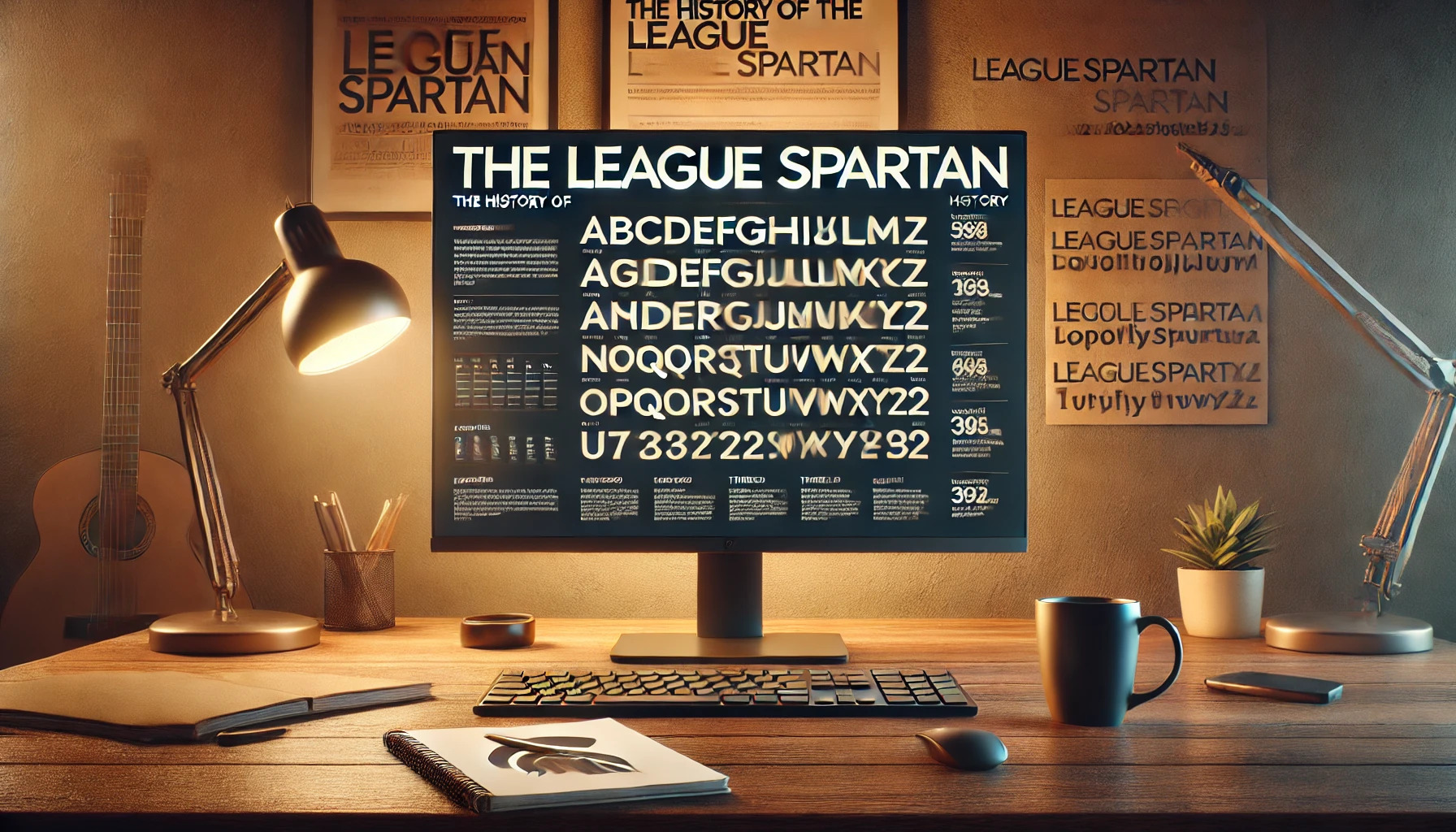
League Spartan is a typeface with an interesting backstory that appeals to design enthusiasts. Originally stemming from Matt Bailey’s Spartan, it was developed by The League of Moveable Type. This modern interpretation draws from early 20th-century American geometric sans serifs, providing a distinct yet versatile look.
In the world of typography, League Spartan stands out as a readable and soft alternative to the classic Futura. This makes it a favorite for many who seek both style and functionality. The font’s design captures the charm of its nostalgic roots while adapting to contemporary needs.
With its open-source license, League Spartan is continually evolving. The font features over 300 glyphs and plans for more styles and weights in the future. This growth ensures it remains a valuable resource for designers looking for a blend of history and adaptability. For more details, explore the League of Moveable Type’s website where they discuss its unique features and development.
Origins and Development
League Spartan is a modern take on classic geometric sans-serifs. This typeface combines design elements from the early 20th century with contemporary flair.
Initial Concept and Design
League Spartan was crafted by The League of Moveable Type, a group devoted to open-source typography. This font takes inspiration from Matt Bailey’s Spartan, which itself was influenced by American geometric sans serifs from the early 1900s. The design reflects a bold, clean style, suitable for various uses.
The depth in design stems from its roots in historical typefaces like Futura, but it adds unique touches that give it a fresh aesthetic. Its simplicity and strong geometric form make it versatile for digital and print media. League Spartan’s creation emphasizes readability and stylistic precision.
League Spartan Release
Introduced by The League of Moveable Type, League Spartan became available as an open-source font in 2011. This release focused on making high-quality type accessible to everyone. As it debuted, it featured a single robust weight to establish its visual impact.
The launch aimed to expand its influence in the design world, offering designers a license-free choice. Designers welcomed this addition for its versatility and modern appeal. The availability of League Spartan on platforms like Google Fonts further widened its reach, making it a favorite among many.
Design Characteristics
League Spartan is known for its clean and modern style, following in the tradition of early 20th-century sans-serif fonts. It features bold geometric shapes and a minimalist design that makes it suitable for a range of applications.
Typography and Geometry
League Spartan is celebrated for its geometric design. It features clean lines and simple shapes, reminiscent of early 20th-century typefaces like Futura. This geometry gives the font a modern and structured look, which is why it is popular for contemporary design projects. The balance between curves and straight lines creates a visually appealing font, ensuring readability and aesthetic appeal.
The typeface exhibits a strong visual presence due to its weight and thickness. This bold appearance makes it effective for headlines and titles, where making an impact is crucial. The letters are equally spaced, contributing to a uniform and tidy composition.
Distinctive Features
League Spartan has several features that set it apart from other fonts. Its boldness and modernity make it perfect for digital applications. The font maintains a sense of simplicity while still being visually striking. The thick strokes make it stand out, while the rounded forms bring softness to its overall structure.
A key characteristic is its versatility, as it pairs well with other fonts. For example, it can be combined with Libre Baskerville to create an eye-catching contrast between modern and classic designs. This adaptability makes League Spartan a favorite among designers who need a reliable font that complements various styles and themes.
Usage and Applications
League Spartan is a versatile font that adapts well to various uses. It is particularly popular in branding, identity, and both print and digital media. Its clean, bold look makes it stand out and work effectively in diverse projects.
Branding and Identity
League Spartan is favored in branding for its modern, clean design. Companies often use it to create strong, memorable logos. The boldness of the typeface helps businesses convey confidence and professionalism.
Its adaptability allows it to align with various brand messages. From tech startups to creative agencies, many industries select League Spartan to express a sleek and contemporary image. The font enhances brand recognition by maintaining clarity and readability across different sizes and formats.
Print and Digital Media
League Spartan shines in both print and digital media. Its bold and geometric style makes it suitable for print materials like brochures, posters, and magazines. The font’s clarity ensures that text remains legible, even from a distance.
In digital applications, League Spartan works well for websites and apps. The font’s design aligns with modern UI/UX trends, providing a pleasant reading experience across devices. Its versatility extends to various digital content, from social media posts to online ads, making it a reliable choice for designers and marketers alike.
Technical Information
League Spartan is a versatile font with several file formats, making it widely compatible with various software and platforms. It is also distributed under a license that permits both personal and commercial use, which contributes to its popularity among designers.
File Formats and Compatibility
League Spartan is available in multiple file formats, ensuring its use across different applications. The common formats include OTF (OpenType), TTF (TrueType), and WOFF (Web Open Font Format). These formats provide compatibility with web projects and desktop publishing software.
This flexibility allows designers to implement League Spartan seamlessly in print and digital media. The font’s design makes it an excellent choice for headlines and body text. As a geometric sans-serif typeface, it works well across various design styles, making it a favorite in both modern and classic projects.
License and Distribution
League Spartan is distributed under the Open Font License, allowing for free use in personal and commercial projects. This open license encourages widespread adoption without legal concerns for designers and developers.
The font can be downloaded from several platforms, including Google Fonts and Font Squirrel, providing easy access for users. This accessibility and the generous licensing terms make League Spartan an attractive option for many creative professionals. Its open nature also invites customization, encouraging personalization while ensuring compliance with its licensing agreement.
User Reception and Critiques
League Spartan has gathered a range of opinions from different user groups. Some appreciate its clean and modern appearance, making it popular for various design projects. Users often highlight its boldness and simplicity, which contribute to easy readability.
On platforms like Reddit, discussions reveal a mix of admiration and critique. While some find it iconic and noteworthy, others mention that it is mostly recognizable among typography enthusiasts. Overall, it is considered a reliable choice for both digital and print media.
A common theme among users is the font’s versatility. It’s often compared to Futura, with a slightly softer feel. This makes it a great alternative for those looking for a friendly and approachable sans-serif font. Designers frequently mention its flexibility in different sizes and contexts, from headlines to body text.
Some users feel that League Spartan lacks uniqueness because it derives heavily from earlier fonts like Futura. Yet, despite these critiques, it is generally praised for its utility and openness, especially being a creation from The League of Moveable Type. Many value its open-source availability, allowing more people to access and use it freely.
Users also discuss similar options, such as Twentieth Century and Century Gothic, especially for those seeking slight variations or alternatives. Its reputation continues to grow, as it remains a popular choice in the design community.
Influence and Legacy
League Spartan has left its mark on modern design, inspiring many designers with its geometric sans-serif style. Its impact can be seen in the evolution of typeface design and its use in popular media.
Impact on Typeface Design
League Spartan has influenced many modern typefaces with its clean lines and bold appearance. Designers often choose this font to convey a contemporary yet timeless feel. Its geometric form is reminiscent of early 20th-century sans serifs like Futura. This style makes it appealing for logos and branding, reflecting a polished and professional image. The font’s open-source nature has also encouraged a community of designers to innovate and build upon its design, fostering creativity in the world of typography.
Notable Uses in Popular Culture
The bold and modern look of League Spartan has made it a popular choice in various designs. It’s frequently used in digital media, including websites and apps. Designers appreciate its readability and versatility, using it for posters and advertising campaigns. The font’s unique style is well-suited for conveying powerful messages, making it a favorite in settings where clear and impactful communication is essential. Its influence extends into areas such as film posters and book covers, contributing to its enduring legacy in popular culture.