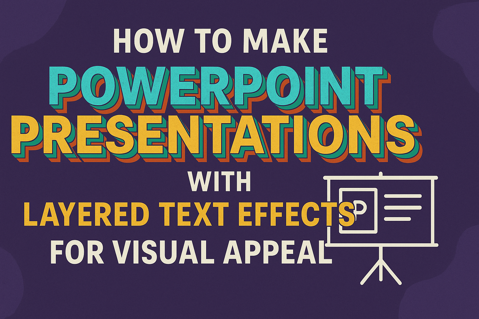
Creating visually appealing PowerPoint presentations can be a game-changer for effective communication. Layered text effects add depth and interest to slides, making information more engaging and easier to digest.
With the right techniques, anyone can transform bland presentations into captivating visual stories that hold the audience’s attention.
Understanding how to layer text effectively allows for better organization of content. By experimenting with text boxes, fonts, and animations, one can create a more dynamic experience for viewers.
This approach not only enhances visual appeal but also helps to emphasize key points in the presentation.
In this article, readers will discover practical steps and tips for implementing layered text effects in PowerPoint. From inserting text boxes to applying animations, these techniques will elevate any presentation into an exciting visual journey.
With these insights, anyone can learn to make their slides stand out.
Understanding Text Effects in PowerPoint
Text effects add depth and creativity to PowerPoint presentations. Using layered text can make slides more engaging and visually appealing, enhancing the communication of ideas. Below are key aspects of text layers and the various types of text effects available.
Text Layers Basics
In PowerPoint, using text layers means placing text boxes on top of each other or arranging them with images and shapes. This technique creates a sense of depth and interest.
To create a new text layer, a user can go to the Insert tab and select Text Box. Drawing the text box on a slide will add a new layer.
Arranging these layers can be done through right-clicking for options. Users can also access the Selection Pane to manage the layering. This pane shows all text boxes, making it easier to select and adjust their order.
Types of Text Effects
PowerPoint offers several types of text effects to enhance presentations. Some popular effects include shadows, reflections, and 3D formats.
Shadows can add depth by making text look like it is hovering. Reflections provide a polished look, while 3D formats help text appear more dimensional.
To apply effects, select the text and go to the Format tab. Users can choose from a variety of pre-set styles or customize their own.
Each effect serves a different purpose, so experimenting with them can lead to a more effective presentation.
Getting Started with PowerPoint
Beginning with PowerPoint is easy and enjoyable. Understanding how to open a new presentation, navigate the interface, and select a theme will set the stage for creating visually appealing slides.
Opening a New Presentation
To start a new PowerPoint presentation, the user first opens the program. The welcome screen appears, offering options to start fresh or use a template.
Clicking on “Blank Presentation” creates a new slide where they can begin adding content. Users can also open recent files from this screen.
For those using PowerPoint 365, there is an option to start from a cloud-based template. This is helpful for collaborative projects, allowing others to view and edit the presentation simultaneously.
Navigating the Interface
Once the new presentation opens, they will see a user-friendly interface. The ribbon at the top contains tabs like Home, Insert, Design, and Transitions, each providing different tools.
On the left, a slide thumbnail pane shows all slides in the presentation. Users can easily click on any slide to edit it.
Additionally, the main workspace displays the selected slide, allowing real-time editing and design.
The status bar at the bottom shows important information, like the slide number.
Splitting up the text into shorter paragraphs will make it easier to read and follow. This will also help avoid overwhelming the reader with too much information at once.
Selecting a Theme
Choosing a theme is important for visual appeal. Users can select one from the “Design” tab in the ribbon.
Each theme offers a coordinated set of colors, fonts, and effects to unify the presentation’s look. To preview a theme, one can hover over it to see how it changes the current slide.
Once a theme is chosen, it applies to all slides, saving time and ensuring consistency.
Customizing themes is also possible, allowing users to adjust colors and fonts for a personalized touch. This step makes presentations not only beautiful but uniquely theirs.
Design Principles for Text Layering
Creating visually appealing presentations relies heavily on effective text layering. Key considerations include achieving contrast, selecting appropriate fonts, and applying color theory wisely. Each of these factors plays a crucial role in ensuring the audience remains engaged and understands the message.
Contrast and Readability
Contrast is essential in text layering. High contrast between text and background enhances readability. For example, using white text on a dark background or dark text on a light background works well.
Tips for Achieving Contrast:
- Use Different Weights: Combine bold and regular font weights to emphasize key points.
- Experiment with Shadows: Adding shadows can help text stand out from busy backgrounds.
It’s important to remember that too much contrast can also be an issue. Strive for balance to avoid overwhelming the viewer.
Font Selection
Choosing the right fonts significantly impacts presentation quality. It’s advised to stick with 2-3 fonts to maintain consistency.
A good practice is to pair a sans-serif font for headings with a serif font for body text.
Font Pairing Examples:
- Headings: Arial Bold
- Body: Times New Roman
- Accent: Comic Sans for fun elements
Ensure the fonts are legible from a distance. Avoid overly stylized fonts that might distract from the message.
Color Theory in Text Layering
Color choices greatly influence overall design. Understanding basic color theory can help enhance a layered text effect. Complementary colors often create a striking appearance.
Color Tips:
- Use a Color Wheel: Choose colors opposite each other for contrast.
- Limit the Palette: Use no more than three main colors to avoid visual clutter.
Consider the emotions colors evoke. Blue can instill trust, while red can create urgency. Using color effectively adds depth and engagement to presentations.
Creating Layered Text Effects
Layered text effects can make a PowerPoint presentation visually striking. By using text boxes, employing layering techniques, and adding custom animations, anyone can enhance their slides effectively.
Adding Text Boxes
To start, the creator needs to add text boxes to the slide. They should click on the “Insert” tab in the toolbar and select “Text Box.”
A simple click and drag on the slide will create a text box where the desired text can be entered.
It’s important to select suitable fonts and colors that align with the presentation’s theme. Bold or italic styles can add emphasis.
Creating multiple text boxes allows for a more dynamic look. The text can be positioned precisely where it’s needed, contributing to the layered effect.
Layering Techniques
Layering text involves stacking multiple text boxes on top of each other. The creator can adjust the transparency of some text boxes to allow background elements to peek through. This adds depth to the composition.
The order of the layers matters significantly. To change the layer position, right-click on a text box and use the options “Bring Forward” or “Send Backward.”
Mixing different font sizes and styles in each layer enriches the visual experience and makes the text more engaging to the audience.
Applying Custom Animations
Custom animations give life to layered text. Under the “Animations” tab, a user can choose various effects like “Fade,” “Fly In,” or “Zoom.”
By selecting each text box and applying different animations, the presentation becomes dynamic.
Timing is crucial for animations. Using the “Animation Pane,” adjustments can be made to the delay and duration of each effect.
This helps create a flow that guides the audience’s attention. Additionally, combining animations creates a captivating sequence that keeps viewers engaged throughout the presentation.
Visual Enhancement with Images and Shapes
Incorporating images and shapes into presentations can greatly boost their visual appeal. These elements can grab attention and help convey messages more clearly. Here are two effective ways to enhance slides using images and shapes.
Using Images as Backgrounds
Images can serve as powerful backgrounds in PowerPoint slides. When used correctly, they can set the tone of the presentation.
It’s essential to choose images that are relevant to the content to create harmony.
To ensure text visibility, use images with enough contrast. Consider adding a semi-transparent layer over the image. This technique allows text to stand out while the image remains a focal point.
Common sizes for images work well. A full slide image fills the background nicely.
Remember that clear and high-resolution images help maintain a professional look.
Integrating Shapes with Text
Shapes are not just decorative; they can enhance communication. Using shapes to surround text adds visual interest.
Rectangles, circles, and arrows can help draw the eye to key points.
Choosing the right shape is key. For instance, a rounded rectangle can soften the look of a slide, while sharp angles convey a more modern feel.
To make important text pop, consider using contrasting colors. Bold colors against softer backgrounds provide great visibility.
Additionally, adding shadows or reflections can give depth to shapes, making the presentation more engaging.
Advanced Text Effects
Advanced text effects can enhance the visual appeal of PowerPoint presentations. These effects allow the presenter to engage the audience and emphasize key points effectively.
3D Effects and Shadowing
Using 3D effects can give text a modern and dynamic appearance.
To apply these effects, select the text box and navigate to the Format tab. Here, options are available to add depth and dimension.
Shadowing can also add depth; it makes text stand out.
Choose a shadow style that suits the presentation’s theme. Light direction is important.
Adjust the angle to see how it changes the text’s visibility. Combining 3D effects with shadows provides a layered look that can draw attention.
Animating Text for Emphasis
Animating text is a great way to highlight important points during a presentation.
PowerPoint allows various animation options, such as fade, zoom, or fly in. Selecting the text box and going to the Animations tab will show these options.
It’s best to keep animations simple to maintain professionalism. Overuse can distract the audience from the content.
Timing settings also matter. Using a delay can create suspense before revealing key information, adding impact without overwhelming viewers.
Tips for Maintaining Consistency
Maintaining consistency in a PowerPoint presentation is key to making it visually appealing. By focusing on aligning text layers and reusing styles across slides, presenters can create a more polished look that enhances audience engagement.
Aligning Text Layers
Text layers should be carefully aligned to improve readability and aesthetic appeal. When positioning text, it’s important to establish a clear hierarchy. This means using different font sizes and weights to indicate which text is most important.
To achieve proper alignment:
- Use grids or guides in PowerPoint to help position text layers evenly.
- Ensure that text boxes are lined up with one another for a neat appearance.
- Pay attention to spacing between lines and paragraphs to create a uniform look.
Using the same alignment method across all slides reinforces consistency. It also helps the audience follow the presentation more easily.
Reusing Styles Across Slides
Reusing styles across slides is a simple way to keep a cohesive design.
Select a few fonts, colors, and sizes to use throughout the presentation. This not only saves time but also creates a uniform experience for viewers.
Here are some tips for effective style reuse:
- Create a master slide with your chosen styles, so they are ready for use on all slides.
- Stick to a limited color palette that complements the theme.
- Ensure that bullet points and lists are formatted the same way across slides.
By sticking to these styles, presenters can enhance the professionalism of their presentation. This approach allows the audience to focus on the content rather than being distracted by design variations.
Best Practices for Presentation Design
Effective presentation design helps convey messages clearly and keeps the audience engaged. Two essential aspects of this are organization and the use of transitions. Attention to these details enhances comprehension and visual appeal.
Keeping Slides Organized
An organized slide presentation is crucial for audience understanding.
Each slide should focus on one main idea. This helps avoid clutter and keeps the viewer’s attention.
Using bullet points to convey information can simplify complex topics.
For instance, if explaining a process, break it into clear steps:
- Step 1: Introduction of the concept
- Step 2: Explanation of key elements
- Step 3: Conclusion and implications
Also, maintaining a consistent color scheme and font choice throughout the slides is important.
This includes using simple, readable fonts like Arial or Calibri, especially for larger audiences.
Consistency creates a professional look and aids in audience retention.
Effective Use of Transitions
Transitions add movement and can enhance presentation flow when used wisely. However, they should not distract from the content.
Subtle transitions, such as “Fade” or “Push,” are usually more effective than flashy animations.
Each slide transition should relate to the content.
For example, a slide featuring a timeline could use a “Wipe” transition, emphasizing the progression of time.
It’s also wise to limit the number of different transitions in a presentation.
Using just one or two types keeps the flow smooth. A consistent transition style makes the presentation cohesive and organized, allowing the audience to focus on the message.
Enhancing Accessibility
Making presentations accessible ensures that everyone can enjoy and understand the content.
Key aspects include using readable font sizes, selecting color-blind friendly palettes, and employing clear language.
Readable Font Sizes
Choosing the right font size is essential for readability.
A good rule of thumb is to use 18-point font or larger for body text. This size helps individuals with visual impairments or older adults read the information easily.
Using larger fonts also allows for easier viewing from a distance, an important factor in presentations.
Sans-serif fonts, like Arial or Calibri, work best since they are simpler and clearer.
Keep text blocks brief and organized. Shorter sentences and bullet points can improve clarity. Making these adjustments can significantly enhance overall accessibility.
Color Blind Friendly Palettes
Color selection impacts how information is received.
Use high contrast colors that are distinguishable to everyone. Avoid combinations like red and green, which can be challenging for color-blind individuals to differentiate.
Instead, consider palettes that include blues and yellows, which are generally easier to see.
Tools like color contrast checkers can help identify safe color choices.
While choosing colors, be mindful of background and text contrast. Dark text on a light background tends to be easiest to read.
This focus on color ensures your presentation remains visually appealing and inclusive.
Clear Language Usage
Presenters should use straightforward language to communicate effectively.
Avoid jargon or complex terms that may confuse some audience members. Instead, opt for simple words that convey the intended message clearly.
Short sentences help in breaking down information, making it easier to digest.
Using bullet points can further assist in organizing thoughts and allowing the audience to follow along easily.
When presenting, speakers should also consider how they explain concepts.
Providing examples and analogies can enhance understanding.
Clarity in language is a key factor in making presentations accessible and engaging for everyone.