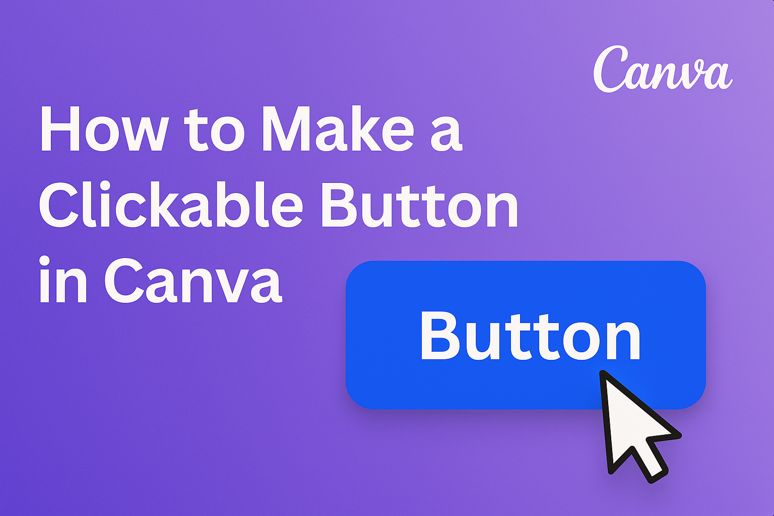
Creating engaging designs in Canva is easy, especially when it comes to adding interactive elements like buttons. To make a clickable button in Canva, users simply need to create a rectangle and add text. This feature can enhance presentations, marketing materials, and social media posts.
With a few simple steps, anyone can transform their static designs into dynamic content that encourages action. Whether it’s directing customers to a website or promoting a special offer, clickable buttons can significantly increase user engagement.
Getting Started with Canva
Canva is a user-friendly design tool that allows individuals to create eye-catching graphics easily.
Understanding how to navigate its interface and choose the right template is essential for a smooth start.
Navigating the Canva Interface
When you first open Canva, the interface may seem busy, but it’s simple to use.
On the left side, users will find the main menu with options like Templates, Elements, and Uploads.
At the top, there’s a toolbar with editing features. Users can adjust text, colors, and layout here.
Familiarity with these tools enables quick design adjustments.
For any help, Canva offers a search bar where users can type queries. Finding specific design elements becomes easy without endless scrolling.
Selecting the Right Template
Choosing the right template is crucial to saving time. Canva provides a wide range of designs for various purposes. Users can find templates for social media posts, presentations, and more.
To select a template, navigate to the Templates section on the left sidebar. Users can use filters based on categories or styles.
Choosing a template that aligns with the intended message can enhance the overall design. Once a template is selected, users can customize it to match their unique needs, ensuring a polished final product.
Creating the Button
Creating a clickable button in Canva involves several steps that include choosing the right shape, adding text, and customizing the design.
Each part is essential to ensure the button looks appealing and serves its purpose effectively.
Choosing a Shape for Your Button
The first step is to select a shape that best represents the button. Canva provides various shapes like rectangles, circles, and rounded rectangles.
- Shapes: Rectangles are common for buttons. They allow for clear text placement. Circles can add a unique touch but may limit text space.
- Adding a Shape: To add a shape, click on the “Elements” tab in the left sidebar. Search for your preferred shape and drag it into your design.
After placing the shape, adjust its size to fit the text and design needs. A well-chosen shape enhances visibility and draws attention to the button.
Adding Text to Your Button
Next, it’s time to add text that communicates the button’s purpose. The text should be clear and action-oriented.
- Text Options: Use phrases like “Learn More,” “Buy Now,” or “Sign Up.” These encourage users to click.
- Text Placement: Click the “Text” tab to add a text box. Position it centrally over the shape for balance.
Make sure the text is legible by choosing a font style and size that contrasts well with the button shape. A good contrast makes the button easier to notice.
Customizing the Button Design
Customization is key to making the button align with your brand. This includes colors, borders, and shadows.
- Color Choices: Pick colors that suit your brand. Using bright colors can help the button stand out.
- Borders and Shadows: Add a border for definition and a subtle shadow for depth.
Canva allows you to preview changes in real time, so adjust elements to see what looks best. A well-designed button is not only attractive but also effective in engaging users.
Making Your Button Clickable
Creating a clickable button in Canva is simple and effective. It allows users to interact with designs by linking to web pages or specific actions. Here are key ways to achieve this.
Linking to a Web Page
To link a button to a web page in Canva, start by selecting the button shape or text. Then, look for the “Link” icon in the top toolbar, which resembles a chain.
Clicking this icon will open a window where you can enter the desired URL.
It’s important to ensure that the link is accurate. A broken link can frustrate users and diminish engagement.
Make sure to test the link by clicking it before finalizing the design.
If the link doesn’t open a new tab, it may be set as an internal link within a presentation or document.
Using Hyperlinks Effectively
Using hyperlinks effectively involves more than just adding a link.
It’s essential to ensure that the button clearly represents its purpose. For example, a button labeled “Visit Our Site” should link to the homepage, while “Sign Up Now” should lead to the registration page.
Consider the button’s placement in the design as well.
A well-placed button can draw attention and encourage clicks. Using contrasting colors can also help make the button stand out.
Lastly, consider the audience’s needs.
Providing clear calls to action will guide users and improve their experience.