Creating charts is an excellent way to visualize data and make it more engaging.
In just a few simple steps, anyone can make a chart in Canva using data from Google Sheets. This process not only saves time but also enhances the overall presentation of information.
Many people use Canva for its user-friendly design tools, but combining it with Google Sheets allows for even more powerful data visualization.
With a few clicks, users can import their data directly into Canva and turn it into stunning charts that stand out.
No matter the project, whether it’s for a presentation or social media, knowing how to make a chart in Canva can be a game changer. This post will guide readers through the steps needed to create beautiful charts effortlessly.
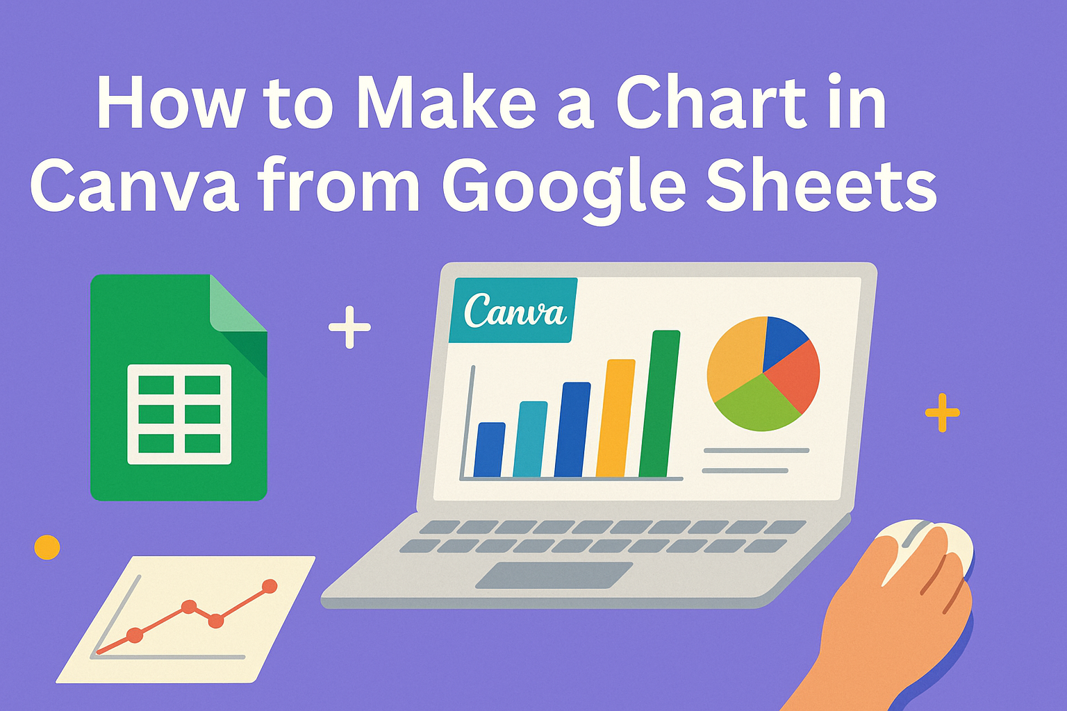
Getting Started with Canva and Google Sheets
To create stunning charts using data from Google Sheets, one must start by understanding both tools.
Canva offers a user-friendly platform for design, while Google Sheets provides a solid way to organize data.
Overview of Canva
Canva is a versatile graphic design tool that helps users create a variety of visual content. It features an easy drag-and-drop interface.
Users can choose from countless templates or design from scratch.
The “Charts” feature allows for the integration of data directly into designs. Users can select different types of charts like bar, line, and pie charts depending on their needs. This makes it simple to visualize data in a visually appealing way.
Canva also supports easy customization of designs. Users can change colors, fonts, and sizes to fit their unique style or brand.
Anyone can create professional-looking designs without extensive graphic design skills.
Preparing Your Data in Google Sheets
Before importing data into Canva, it is crucial to properly organize it in Google Sheets.
Begin by creating a new spreadsheet or open an existing one.
Data should be structured in rows and columns. Each column typically contains a unique variable, while each row represents a different data point. For example, a table might have columns for “Sales”, “Month”, and “Region”.
Once the data is well organized, users can select the range they wish to visualize. They should also ensure there are no empty cells in the selected range to avoid import issues.
Finally, data can be downloaded in CSV format if needed. This file type is compatible with Canva for smoother integration.
Creating Your Chart in Canva
Creating a chart in Canva involves selecting the right type of chart, designing it to fit the audience, and importing data from Google Sheets. These steps are essential for ensuring the chart effectively communicates the intended information.
Choosing the Right Chart Type
First, it’s important to select the appropriate chart type for the data being presented. Options include pie charts, bar charts, line charts, and more.
- Pie Charts: Great for showing parts of a whole.
- Bar Charts: Useful for comparing values across categories.
- Line Charts: Ideal for displaying trends over time.
Choosing the right chart type helps in conveying the message clearly. Users should consider the data they have and the story they wish to tell with their chart. Each type serves a specific purpose, so the choice can impact the understanding of the data.
Designing Your Chart
Once the chart type is selected, designing it is the next step. Canva offers various customization options to make charts visually appealing.
Users can change colors, fonts, and sizes to fit their design style.
- Color Palette: Choose colors that align with your brand or theme.
- Fonts: Use clear, readable fonts for any text in the chart.
- Labels: Ensure all elements are labeled correctly for easy interpretation.
A well-designed chart will catch the viewer’s eye. It enhances comprehension and engagement, making the data more digestible.
Importing Data from Google Sheets
To make a chart using data from Google Sheets, one must first open Canva and start a new design. Next, navigate to the Charts section.
- Select “Upload”: Users can connect to Google Sheets easily.
- Sign In: Logging into a Google account may be necessary.
- Choose Data: Select the specific Google Sheets document and the relevant data range.
This process ensures that the chart reflects the most current data available.
Customizing and Finalizing Your Chart
Customizing a chart makes it more informative and visually appealing. By focusing on titles, colors, and final details, anyone can enhance their charts in Canva.
Adding Titles and Labels
Creating clear titles and labels is essential for understanding the data.
Start by adding a main title that summarizes what the chart shows. It should be concise yet descriptive.
To add labels, click on each chart element. This includes axes and data points. Be sure to use simple language, so viewers easily grasp the information.
Adding tooltips can further clarify points. For example, when hovering over a data point, a tooltip can show specific values or notes. This makes the chart interactive and informative.
Adjusting Colors and Fonts
Colors and fonts play a significant role in chart readability.
Choose colors that contrast well, making the data easy to see. For instance, using bright colors for the bars in a bar chart can effectively point out differences.
Font choice is just as important. Stick to clean, easy-to-read fonts for titles and labels. Canva offers many options to ensure they fit the chart’s theme and style.
Always preview the chart after making color and font adjustments. Ensure that everything remains legible both on screens and in printed formats.
Final Touches and Review
Before finishing, reviewing the chart is a must.
Check for any spelling errors in titles and labels. Mistakes can distract viewers from the data’s message.
Next, ensure that all elements are properly aligned.
This creates a cleaner look, making the chart more professional.
Finally, consider sharing the chart with a colleague for feedback.
Fresh eyes might spot issues that were missed.
A quick review helps guarantee that the chart conveys the intended message clearly and effectively.