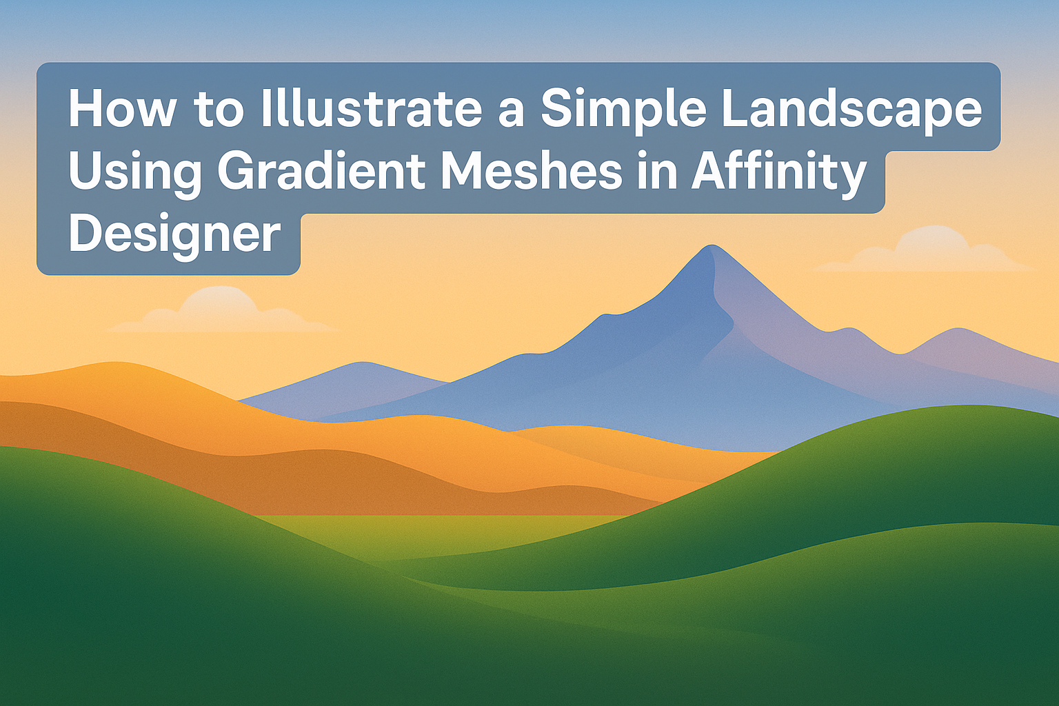
Creating beautiful landscape illustrations can be enjoyable and rewarding. Using gradient meshes in Affinity Designer allows artists to achieve smooth transitions of color and light that bring their scenes to life.
This technique can elevate a simple design into something eye-catching and professional.
As artists explore the basics of gradient meshes, they’ll find that mastering this tool opens up many possibilities for their work.
With just a few steps, they can transform ordinary shapes into stunning visuals that capture the essence of a landscape. This post will guide them through the process, making it accessible and fun for everyone.
Whether someone is a beginner or has some experience, this tutorial will provide valuable insights. By the end, readers will feel confident in their ability to illustrate a captivating landscape with gradient meshes. Let’s dive into the colorful world of Affinity Designer!
Getting Started with Affinity Designer
Affinity Designer is a powerful tool for creating beautiful illustrations. Understanding the basics will help in using features like gradient meshes effectively in landscape design.
Overview of Gradient Meshes Feature
Gradient meshes allow for smooth color transitions and depth in illustrations. They create a grid of points on a shape, helping to control color at various areas for a more realistic effect.
When using gradient meshes, artists can manipulate colors easily.
Adjusting the points can change colors within a shape without affecting the entire object. This feature is essential for creating detailed landscapes and adding dimension to artwork.
Setting Up Your Document
Before starting, it is important to set up the document correctly.
Open Affinity Designer and select “New Document” from the File menu. Choose dimensions that suit the project, like 1920 x 1080 pixels for a web-friendly landscape.
It’s wise to set the color mode to RGB for digital art. This setting provides vibrant colors, which enhance gradient effects.
Don’t forget to save the document in the Affinity format so adjustments can be made easily later.
Understanding the Workspace and Tools
The workspace in Affinity Designer is user-friendly, organized into panels and tools.
On the left, the toolbar provides access to essential tools like the Pen Tool and the Gradient Tool.
The Color panel shows color options and adjustments, crucial for customizing gradients.
Familiarity with the Layers panel is also helpful, as it allows for easier management of different elements in the illustration.
By understanding these components, artists can navigate the software more efficiently, making their landscape illustrations more engaging and polished.
Creating the Basic Landscape
In this section, the focus is on building a strong foundation for the landscape. Key steps include sketching the outline and adding basic color blocks to enhance the image’s overall appeal.
Sketching the Landscape Outline
To begin, he should select a large canvas in Affinity Designer. A sketch helps map out the main features like mountains, hills, or trees.
Using the Pencil Tool, he can create rough shapes to define these elements.
Focusing on proportions is crucial. For example, he might want larger hills in the background and smaller ones in the foreground. This technique creates depth.
Once satisfied with the outline, he can adjust the stroke style and color. Using a light color for the outline helps in identifying the shape without overpowering the final colors.
Finally, keeping the lines soft allows for easy modification during later stages.
Adding Basic Color Blocks
After sketching, it’s time to add basic color blocks. He can do this by using the Rectangle Tool and applying flat colors to different areas.
For instance, he might choose green for hills and blue for the sky. This approach helps visualize the overall layout.
Utilizing the Fill Tool will make applying colors to selected areas straightforward.
Next, it’s important to think about shading and light. He can add darker shades in the shadowed areas and lighter colors on raised features. This technique starts creating a more realistic landscape.
Finally, he should focus on blending colors smoothly later for depth. Maintaining simple shapes keeps the design organized at this stage.
Mastering Gradient Meshes
Gradient meshes provide a powerful way to create stunning landscapes with depth and realism. Understanding how to apply meshes, adjust colors, and refine details can elevate one’s artwork in Affinity Designer.
Applying Gradient Meshes to the Landscape
To start, the artist should create a basic shape representing the ground or sky of the landscape. Once the shape is drawn, select it and navigate to the gradient mesh option in the menu. This tool works by creating a grid over the shape.
The artist should focus on placing mesh points where changes in color or light occur. For example, points can be placed along hills, waterlines, or clouds. This technique allows for smoothly blending colors, essential for creating depth and dimension in the landscape.
Using the mesh tool might seem challenging at first, but with practice, it becomes intuitive. It helps produce a more realistic appearance, making landscapes more appealing.
Adjusting Color and Intensity
After applying the gradient mesh, adjusting the color is crucial for achieving a realistic look. The artist should select individual mesh points and apply color based on the natural landscape they aim to depict.
For instance, a sunny day might call for bright blues in the sky and soft greens in the grass. In contrast, a sunset requires warmer tones like oranges and purples.
It is also vital to consider light intensity. Colors can be made brighter or darker to reflect shadows and highlights.
Using the color picker tool, artists can easily mix and match colors until they find the perfect combination for their landscape.
Refining Details for Realism
Once the colors are set, refining the details is the next step to enhance realism. This involves zooming in and examining areas that may need adjustments.
Artists can add texture by using smaller mesh points for features like tree bark or grassy fields. Incorporating subtle variations in color at these points adds depth and interest.
Additionally, adding elements like birds, clouds, or mountains can further complement the landscape. These details should relate to the overall color scheme and lighting to maintain cohesion in the piece.
Finalizing Your Illustration
After creating the landscape with gradient meshes, it’s time to add the finishing touches and export the artwork. This step enhances the visual appeal and ensures the illustration meets the intended quality for sharing or printing.
Adding Finishing Touches
To polish the illustration, start by adjusting the colors. He can use the Color Picker to fine-tune hues or add highlights and shadows to give depth.
Adding texture can make the artwork feel more vibrant. She might consider incorporating subtle textures by using brushes or patterns that blend naturally with the design.
Finally, reviewing the composition is essential. They should check the balance of elements and make small tweaks to improve the overall look. A few adjustments can elevate the piece significantly.
Exporting Your Artwork
Once satisfied with the design, it’s time to export the illustration.
He should choose the appropriate file format based on where it will be used.
For digital use, saving as PNG or JPEG is common. If he plans to print the artwork, opting for PDF or TIFF will provide better quality.
Before exporting, adjusting the resolution is important.
For web use, a resolution of 72dpi is usually sufficient, while print should be at least 300dpi for clarity.
Finally, naming the file thoughtfully will help in organizing projects. This makes it easier for him to locate and share the artwork later.