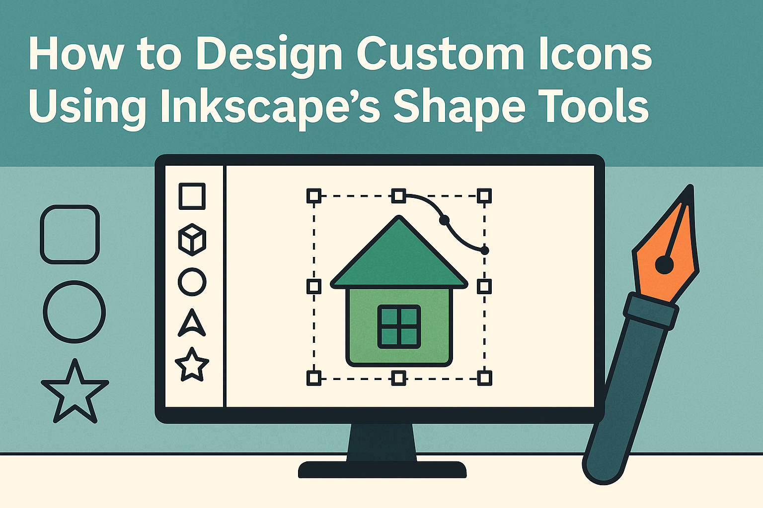
Designing custom icons can add a personal touch to any project, and with Inkscape’s shape tools, it’s easier than ever. Inkscape, an open-source vector graphics editor, offers powerful features for creating and editing shapes. Among these tools, the Shape Builder Tool stands out as an essential tool for transforming overlapping shapes into unique designs.
This ability to manipulate shapes opens up endless possibilities for designers. By using Inkscape’s intuitive interface, users can create complex icons from basic geometric forms. Whether it’s for web design, app development, or personal projects, custom icons can elevate a design’s visual appeal.
For those new to Inkscape, there are helpful resources available to get started. Watching tutorials, like this one on YouTube, can provide step-by-step guidance. With practice, anyone can master the art of icon design using Inkscape’s versatile features.
Getting Started with Inkscape
Starting with Inkscape is an exciting journey into the world of vector graphics. This section will guide you through the process of downloading the software, exploring its interface, and grasping the essential concepts of vector graphics.
Downloading and Installing Inkscape
To begin, ensure your system meets the requirements for Inkscape. It is compatible with Windows, macOS, and Linux. Visit the Inkscape download page to get the latest version. Choose the appropriate installer for your operating system.
Windows users can opt for an EXE or MSI installer. macOS users should download the DMG file. Linux users can install the software using package managers like APT or YUM, or download an AppImage or tarball.
Once downloaded, run the installer. Follow the on-screen prompts to complete the installation. For macOS, drag the Inkscape icon to your Applications folder. Linux users might need to adjust permissions or use terminal commands.
After installation, launch Inkscape to ensure it opens correctly. Take a moment to confirm that your installation was successful and that the software runs smoothly on your system.
Familiarizing with the Inkscape Interface
When you first open Inkscape, the interface may seem full of options. The main workspace is the white canvas area. This is where you will create your designs. Surrounding the canvas are various toolbars and panels.
The toolbox is located on the left. It contains tools for creating and editing objects, like shapes, lines, and text. The commands bar at the top provides quick access to common functions such as saving, opening files, and undoing actions.
On the right, the dialogs panel offers options for layers, object properties, and more. Keyboard shortcuts can also enhance navigation. Spend a few moments exploring these tools and panels, as they are essential for efficient design work.
Understanding the Basics of Vector Graphics
Vector graphics are crucial for creating scalable images. Unlike raster images made of pixels, vector graphics use mathematical formulas to represent shapes and colors. This means they can be resized without losing quality.
In Inkscape, objects are created using nodes and paths. Nodes are points that define the edges of shapes. Paths are the lines that connect these nodes. Users can manipulate nodes to modify shapes precisely.
Vector files are saved in formats like SVG, which preserves their scalability. Understanding these differences is important for effective use of Inkscape’s tools. Recognizing vector strengths will help create crisp, clear designs that can be used across various media.
Exploring Inkscape’s Shape Tools
Inkscape offers a range of shape tools to help users create custom designs. From basic rectangles and squares to complex spirals and freehand shapes, each tool caters to different design needs. These tools are user-friendly, making it easier for both beginners and experienced artists to bring their creations to life.
Using Rectangles and Squares
Inkscape provides a straightforward method to create rectangles and squares. By selecting the rectangle tool, users can click and drag on the canvas to draw a rectangular shape. Holding the Ctrl key while dragging allows them to create a perfect square.
In the tool settings, there’s an option to round the corners by adjusting the corner radius. This feature is useful for creating buttons or icons that need smooth edges.
The fill and stroke options offer further customization, enabling users to change the color and outline style. With these options, creating appealing and functional shapes becomes a simple task.
Creating Circles, Ellipses, and Arcs
With Inkscape’s ellipse tool, drawing circles, ellipses, and arcs is intuitive. Users can start by selecting the tool and clicking to form the desired shape. By holding the Ctrl key, they can create perfect circles.
For more complex designs, the tool allows shaping arcs by moving handlers. This is particularly handy for creating pie charts or similar visual elements.
Color options in the fill and stroke settings help in modifying the design to fit specific requirements. This flexibility ensures that users can create precisely what they envision without difficulty.
Working with Stars and Polygons
Inkscape’s star tool makes creating stars and polygons a breeze. Users can choose the number of points for stars or sides for polygons, making each shape unique. Adjustments such as spoke ratio and rounded corners add more customization options.
Users can easily manipulate these shapes by dragging nodes or using the tool settings. This allows them to design intricate patterns without hassle.
The ability to combine shapes with other tools enhances creativity. For instance, using the shape builder tool, users can merge or subtract parts to form complex icons.
Drawing Spirals and Freehand Shapes
Spirals and freehand shapes add an artistic touch to any design. With the spiral tool, users can set the number of turns and divergence, creating anything from simple to highly complex spirals.
The freehand tool offers freedom, letting users graffiti-style draw directly onto the canvas. It captures slight movements, making it ideal for unique, hand-drawn elements.
Combining these with fill and stroke adjustments enables artists to develop a personalized style. The tools’ versatility helps users experiment and bring their abstract concepts to life with ease.
Designing Your First Icon
Creating your first icon in Inkscape can be an exciting project. You’ll start by preparing your canvas, picking a style and color palette, and then skillfully combining shapes to form your design.
Setting Up Your Canvas
Before jumping into the creative process, it’s essential to configure your canvas properly. Open a new document in Inkscape. Change the canvas size to your desired dimensions; a common size is 24×24 pixels for icons. This can be set by navigating to File -> Document Properties.
Next, adjust the units to pixels for precision. Enable a rectangular grid to help align your shapes accurately, improving consistency. To do this, go to the “Grid” tab and select “New.”
Utilizing guides can further assist in positioning elements evenly. Guides can be added by dragging from the rulers onto the canvas. Once your canvas is set, you’re ready to create your icon with a reliable framework, ensuring your design starts on the right foot.
Choosing a Style and Color Palette
Picking a style and color palette is crucial. Decide if your icon will be flat, three-dimensional, or minimalistic. Each style affects how users perceive and interact with the icon.
Creating a color palette ahead of time can streamline your workflow. Inkscape offers a variety of tools for color selection, including a color wheel and swatches. This helps ensure your colors remain consistent throughout the design.
Using color effectively enhances visual appeal and communicates the icon’s purpose. Keep in mind the context where the icon will be used, and choose colors that align with brand guidelines if applicable. Planning colors and style thoughtfully will greatly impact the success of your design.
Combining Basic Shapes into Complex Icons
Once the canvas is ready and the style set, it’s time to translate basic shapes into a detailed icon. Start with Inkscape’s shape tools to draw rectangles, circles, and polygons. These are the building blocks of your icon.
Transform and arrange these shapes by resizing, rotating, and stacking them to form intricate designs. For example, combining circles and rectangles can create a simple camera icon.
Path operations, such as union and difference, can merge shapes or remove overlapping areas, refining the icon further. Using these techniques allows for more creative freedom and precision, resulting in a polished icon suitable for various applications.
Adding Detail and Complexity
To create icons that truly stand out, it’s important to pay attention to the finer details. This involves manipulating paths and nodes, applying gradients and textures, and using layering and grouping to achieve greater depth and visual interest.
Manipulating Paths and Nodes
Adjusting paths and nodes in Inkscape allows for precise control over icon shapes. By using the Node tool, designers can move, add, or delete nodes to refine the icon’s contours. They can also convert straight lines into curves or vice versa.
Snapping nodes to a grid helps maintain alignment while the Path menu offers tools like Union or Difference to combine or subtract shapes, letting artists craft intricate designs with ease.
Another technique involves using the Bezier tool. This tool provides flexibility in creating complex shapes by drawing freeform lines that can be manipulated with handles. Understanding these functions gives a designer the power to transform basic shapes into captivating icons.
Applying Gradients and Textures
Adding gradients can give icons a vibrant look by blending colors smoothly. The Gradient tool in Inkscape offers linear and radial options. Designers can adjust the gradient handles on the canvas, modifying color stops to achieve the desired effect. For precision, editing directly in the Fill and Stroke panel is also useful.
Textures add depth and realism. Users can apply bitmap images over vector shapes using the Pattern fill option. Another way is to manually combine smaller shapes to mimic textures like fabric or woodgrain. This requires thoughtful arrangement and color selection to ensure the texture is visible and not too overwhelming.
Using Layering and Grouping Effectively
Layering is key to organizing the elements of an icon design. Arranging objects on different layers helps manage overlaps and gives control over individual parts without disturbing others. The Layer panel allows for naming, locking, or hiding layers, making complex compositions easier to handle.
Grouping elements that form a single part of the icon aids in editing. By selecting elements and using the Group function, adjustments can be made to the whole unit at once. This is particularly useful when resizing or repositioning complex elements, ensuring they remain consistent and proportional within the design.
Tips for Crafting Professional Icons
Creating professional icons requires thoughtful attention to detail, consistency across icon sets, balance in design, and optimization for various resolutions. With these elements in place, icons will not only look visually appealing but also serve their intended purpose effectively.
Maintaining Consistency in Icon Sets
Consistency in icon sets helps establish a cohesive visual language. It is important for designers to define a style guide before starting, highlighting key elements such as color schemes, stroke weight, and corner radius. Using a grid can provide a framework for maintaining uniformity.
Designers should stick to basic geometric shapes whenever possible. This approach ensures that all icons share similar characteristics and feel part of the same family. When an icon set looks cohesive, it enhances usability.
Another helpful practice involves using symbols or components in design software. This allows for easy updates across the entire set if changes are needed. Consistency not only improves aesthetics but also enhances the user experience by providing predictable interactions.
Aligning and Distributing Icons for Balance
Balance is crucial when designing icons. Ensuring that each icon is symmetrically aligned impacts how it feels visually. Using the align and distribute tools within design software helps achieve even spacing and positioning.
Imbalance occurs if elements are clustered at one end, making the icon look unprofessional. Designers should imagine a central axis within the icon canvas and aim for symmetrical distribution on either side.
Visual weight—a concept where some parts of the icon may look heavier due to dark colors or thicker lines—must be managed. Lighter colors or thinner lines in other parts can offset this. Through careful alignment and distribution, icons remain balanced and pleasing to the eye.
Optimizing Icons for Different Resolutions
Icons need to be versatile across many platforms and devices. Thus, creating them in vector format allows resizing without losing quality. Icons can be exported in scalable formats like SVG.
Pay attention to simplification. At smaller resolutions, tiny details can get lost or look cluttered. Designers should minimize intricacies for smaller versions of icons.
Another aspect to consider is the safe space. Ensuring there is enough buffer around icons prevents them from getting cropped or squeezed, especially on smaller screens. Thoughtful optimization helps in maintaining clarity and effectiveness across varying resolutions and devices.
Finalizing and Exporting Your Icons
Finalizing your icons involves a few key steps to ensure they look great and function well. After refining the design, export them in various formats for different uses. Finally, integrate these icons into your projects for a seamless workflow.
Checking for Design Flaws
Before exporting, it’s crucial to check your icons for any design flaws. Look for inconsistencies in size, color, and style. Ensure that lines are crisp and corners are smooth.
Use tools like the zoom function to catch small errors. Comparing your icons against a grid can help maintain alignment. A grid helps in achieving visual balance.
Seeking feedback from peers or using review tools can provide valuable insights. This step helps catch errors you might have missed.
Exporting Icons as SVG, PNG, and Other Formats
Exporting your icons in the right formats ensures their usability across platforms. SVG is great for web use due to its scalability without losing quality.
To export, select “File” then “Export” and choose the desired format. Inkscape supports a variety of formats, including PNG and PDF. PNG is excellent for raster images while PDFs are useful for print.
Consider the compatibility and intended use when choosing formats. Properly named and organized files make future use easier.
Integrating Icons with Software and Web Projects
Once your icons are exported, integrate them into your software and web projects. Ensure the icons match the design guidelines of your projects for a cohesive look.
In web projects, use CSS or HTML to position and style the icons accurately. When using software, refer to its documentation for icon integration.
Icon libraries can help manage and update icons across projects. Staying consistent with icon placement and style helps maintain a professional appearance.