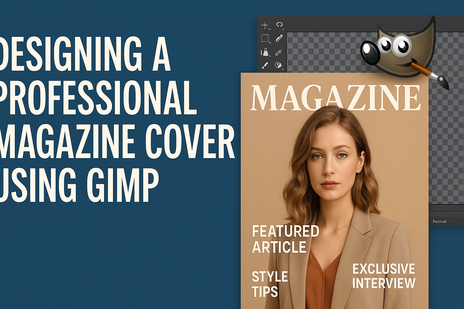
Creating a professional magazine cover is an art that blends creativity with practical design skills. For those looking to develop these skills, GIMP offers an accessible and powerful option. GIMP allows users to design stunning magazine covers by editing photos, adding borders, and incorporating text elements effectively.
With GIMP, designers can transform a basic image into a captivating cover that draws readers in. By exploring features like the shape tools and text options, users can enhance their design capabilities. Learning to design a magazine cover in GIMP can elevate one’s graphic design projects.
Whether you’re an experienced designer or a beginner, GIMP’s tools make it easy to create appealing magazine covers. The software’s capabilities extend beyond photo editing, making it a versatile choice for various design projects. Unlocking GIMP’s features could be the key to crafting your next professional cover.
Understanding GIMP Basics
GIMP is a versatile program for photo editing and graphic design. This section covers what GIMP is, how to use its interface, and the main tools available for creating professional projects.
Introduction to GIMP
GIMP, or GNU Image Manipulation Program, is a free and open-source image editor. It’s popular for its extensive features that cater to various graphic design and editing tasks. Users ranging from beginners to advanced can leverage its capabilities for tasks like photo retouching, image composition, and even simple paint design.
Being cross-platform, GIMP works on Windows, macOS, and Linux. It allows for third-party plug-ins, contributing to its flexibility and power. Even though GIMP offers professional-level features, it remains accessible to newcomers due to its user-friendly setup.
Navigating the GIMP Interface
Navigating GIMP’s interface might seem daunting at first, but it becomes intuitive more quickly. The main window includes a variety of panels, such as the toolbox, image window, and layers panel. The toolbox on the left contains essential tools like selection, paint, and transform tools.
The right side usually houses the layers panel, which is crucial for managing different layers in complex images. Users can customize the interface by docking panels where they prefer them, creating a workspace that suits their workflow.
GIMP also offers a customizable menu bar that lets users access filters, scripts, and preferences. By familiarizing themselves with these elements, users can boost their productivity significantly.
Key Features and Tools
GIMP is packed with features to aid in graphic design. It has powerful tools like the path tool for creating bezier curves and straight lines. There’s also a text tool for adding and styling text, which is essential for designing posters or covers.
The GEGL filters provide live previews, making it easier to see changes in real-time. Additionally, GIMP offers paint tools such as brushes and pencils and supports pressure-sensitive tablets for drawing.
Other advanced tools include the clone tool for retouching and the transform tool for scaling or rotating images. Each tool can be customized further, offering enhanced control over the creative process.
Setting Up Your Project
When designing a magazine cover in GIMP, it’s important to start with the right project setup. This involves creating a new document, setting the correct resolution and size, and effectively using layers. Each part plays a crucial role in achieving a professional look.
Creating a New Document
When opening GIMP, the first step is to create a new document. To do this, go to the File menu and select “New.” A dialog box will appear where you can set the dimensions of the canvas.
For a standard magazine cover, a common size is 8.5 x 11 inches. Keeping these dimensions in mind helps in creating a realistic and appropriate cover design.
Additionally, make sure to choose a color mode suited for print, such as CMYK. While GIMP primarily works with RGB, ensuring you’re using a print-friendly color space can be important if you’re planning on physical prints. Consider leaving some margin for bleed if the design will be printed to the edge.
Resolution and Size
An essential aspect of magazine cover design is the resolution. Set the resolution to at least 300 DPI (dots per inch) for clear and sharp print quality. This level of detail is crucial for printed images to avoid pixelation or blurriness.
Adjust the image size to match your project needs. Using the Image Dimensions section, ensure that the pixel dimensions are proportionate to the project’s physical size in inches. For example, an 8.5 x 11-inch magazine cover at 300 DPI would need 2550 x 3300 pixels.
Tip: Double-check that you’ve set both the physical dimensions and resolution correctly before proceeding with the design. This will save time and ensure that the final product looks professional.
Working with Layers
Layers are a powerful tool within GIMP for organizing different elements of the cover. Each element, like text, images, or graphics, should be on its own layer. This makes it easier to move and edit each component independently.
To add a layer, navigate to the Layer menu and select “New Layer.” Naming each layer helps keep the project organized. For example, you might label layers as “Background,” “Title Text,” and “Main Image.”
Use the Layers panel to adjust the order of layers. Elements higher in the list will appear above those lower down. This feature lets you control the visual hierarchy of the design, allowing important features to stand out. Adjusting layer opacity can also create effects like transparency or blending, adding depth to the design.
Design Elements of a Magazine Cover
Designing a magazine cover involves a few key elements that work together to catch the eye and convey the magazine’s message. These elements include the use of color, the choice of typography, and the composition of images.
Color Theory
Color plays a crucial role in attracting readers’ attention. It sets the mood and emotion of the magazine. Warm colors like red and orange can evoke feelings of excitement and energy. Cool colors like blue and green can feel calm and sophisticated.
Using contrasting colors can help important details stand out. For instance, pairing a vibrant color with a neutral background can maintain balance while ensuring the cover looks appealing.
Complementary colors, which are opposite on the color wheel, can also create eye-catching visuals when used correctly. Consistent use of a specific color palette can make a magazine recognizable to its audience.
Typography Selection
Typography is vital for readability and style. Choosing the right fonts is important to convey the magazine’s theme and tone. Serif fonts can offer a classic look, while sans-serif fonts provide a more modern feel.
Size and placement of text matter too. The masthead usually features the magazine’s name prominently at the top. Headlines should be bold and distinct to grab attention. Subheadings should complement the main headline without overshadowing it.
Using different weights and styles, like bold or italic, can help emphasize important points or attract attention to specific areas of the cover.
Image Composition
The composition of images on a magazine cover significantly impacts its effectiveness. A strong focal point, like a person’s face or a striking object, can draw the viewer in.
Balance is essential in placing images; too much clutter can overwhelm, while too little can make the cover look empty. Proper alignment ensures harmony between various elements like text and images.
Using the rule of thirds can help in positioning key elements off-center, creating more dynamic and interesting layouts. Consistency in style, such as using similar color tones or filters, can unify the cover’s design.
Creating the Background
To create an eye-catching magazine cover, the background needs careful attention. Choosing the right colors and textures can set the mood and theme. Adding images and effects further enhances the design.
Choosing Colors and Textures
Colors play a major role in setting the tone. Bright colors can make a design feel energetic, while muted tones might create a more elegant look. When selecting colors in GIMP, consider using the color wheel to find complementary shades. This technique helps maintain harmony in the design.
Textures can add depth to the background. GIMP offers various texture brushes. Experimenting with these can help find the perfect match. For instance, a grainy texture can give a vintage feel, whereas a smooth one suits a modern theme.
Always test different color and texture combinations. Viewing the design on various screens ensures it appears as intended everywhere.
Adding Images and Effects
Images can add visual interest to a magazine cover. In GIMP, layers allow users to add images easily. They can be resized and positioned to fit the design perfectly. When choosing images, ensure they have high resolution to avoid pixelation.
Effects like shadows or glows can make images pop. GIMP provides tools to adjust these effects precisely. For instance, adding a shadow beneath text can create depth, making it more readable. Light effects can highlight key areas and draw the viewer’s attention.
Using effects wisely keeps the design from becoming cluttered. Testing different effects and finding the right balance can dramatically enhance the cover’s appeal.
Incorporating Text and Headlines
Designing a professional magazine cover with GIMP involves choosing the right fonts and arranging text effectively. Main titles grab attention, while subtitles provide context. Proper styling and text positioning make the overall design engaging and coherent.
Adding Main Titles
Main titles play a crucial role in capturing readers’ attention. They should be bold and large to stand out prominently on the cover. The font style should align with the magazine’s theme and target audience. For a modern look, sans-serif fonts are popular, while serif fonts give a classic appeal.
Choosing the right color is also key. The title color should contrast with the background for readability. Using GIMP, designers can experiment with shadows or outlines to make the title pop. Layer effects in GIMP can further enhance visibility.
Positioning is important. Placing the title at the top or center gives prominence. Using GIMP’s alignment tools helps in achieving precise placement, ensuring the title is easily readable at a glance.
Overlaying Subtitles
Subtitles provide additional information and support the main title. They should be smaller but still noticeable. The font style should complement the main title without overshadowing it. Text that is clear and succinct is usually more effective.
Using different font weights or italics can help differentiate the subtitle from the main title. GIMP allows for various text effects that can add emphasis without being overwhelming. Designers might use subtle color variations to maintain harmony.
Subtitles are often positioned near the main title. This ensures readers can connect the headline and supporting details quickly. With GIMP, it’s easy to adjust the spacing and alignment to achieve a cohesive look that guides the reader’s eye naturally.
Styling and Positioning Text
Styling text involves choosing the right size, color, and effects. Consistency in text style across the cover helps maintain a professional appearance. Using diverse styles sparingly ensures that the text remains engaging and visually appealing.
GIMP has various text styling options, like adding drop shadows or gradients. These effects can add depth, making text stand out without clashing with other design elements. It’s advisable to test different styles to see what works best.
Positioning is critical for balance. Text can be aligned along key images to create a unified look. GIMP offers guides and grids to help position text accurately. Careful consideration of text placement can greatly enhance the cover’s readability and charm, drawing in potential readers.
Using Professional Techniques
Designing a magazine cover with GIMP requires mastering several advanced techniques to achieve a professional look. From using layers creatively to handling brushes and patterns, these methods take your design skills to the next level.
Advanced Layer Effects
Layers are the backbone of digital design in GIMP. By using effects like shadows and highlights, designers can create depth and focus. Layers allow the application of different blending modes which can alter how images blend together.
Creating a dynamic cover requires experimenting with opacity levels. This helps in achieving the perfect balance between elements. For instance, setting a background image to a lower opacity can make text stand out more vividly.
Using layer masks provides additional control. By masking parts of a layer, designers can ensure only specific elements show through, contributing to a cleaner and more appealing design.
Custom Brushes and Patterns
Custom brushes and patterns can greatly enhance the uniqueness of a magazine cover. GIMP allows users to create and import their own brushes, making it possible to add intricate designs or textures that can’t be achieved with default brushes.
Patterns give texture to different sections. Applying a subtle pattern to a background can add interest without overpowering the main design elements. This keeps the cover engaging and professional.
The Pattern tool offers variety and customization. By altering pattern scales and orientations, each design gets a personalized touch, setting the cover apart from standard templates.
Masking and Blending
Mastering masking and blending in GIMP is crucial for seamless transitions and highlights. Masks allow parts of images to be hidden or shown without altering the original image, making edits non-destructive.
Blending options combine different elements fluidly. Whether merging a title into an image or combining graphic elements, blending modes like Multiply or Overlay help achieve the perfect effect.
Proper usage of masks ensures that the edges of images blend naturally into the background, avoiding harsh lines and creating a unified look across the cover.
Removing Backgrounds with Precision
Precise background removal is vital for a clean, professional appearance. GIMP provides several tools for this, including the Paths tool and the Fuzzy Select tool. These tools help isolate the subject effectively.
The Paths tool is great for controlled precision. It allows designers to outline a subject and convert this path into a selection. This method provides smooth and accurate cuts, especially useful for complex shapes.
Removing backgrounds can also be done with layer masks, which enable further fine-tuning. This is essential for removing unwanted elements cleanly, ensuring a polished final design.
Final Touches
When the main design elements are in place, it’s time to focus on refining the magazine cover. This involves enhancing its visual appeal, fine-tuning details, and ensuring it’s ready for print. Attention to these steps ensures the cover will captivate viewers and print without issues.
Enhancing Visual Appeal
A crucial step is to make sure the cover stands out. Using contrast can achieve this; for example, dark text on a light background, or vice versa. Color balance is another vital aspect. It’s important to ensure colors complement each other instead of clashing.
Typography should not be overlooked. Using fonts that match the theme and maintaining readability is key. Adding subtle shadow effects can also make text pop. Borders or simple graphic elements like lines can guide the reader’s eye naturally over the cover. Simple yet effective embellishments help make the cover visually appealing without overwhelming the main message.
Detail Refinement
Refining details ensures that all elements are polished. Aligning text and images symmetrically or asymmetrically needs careful thought. It’s important for maintaining professionalism. Checking for spelling errors or alignment issues is a must. Small mistakes can distract the audience.
Resolution quality should be high. This ensures that all images and text are sharp and clear. Any low-resolution images will look pixelated when printed. Filters or effects can add depth but should be used sparingly to avoid a cluttered look. Cropping images for symmetry and balance adds to a clean layout.
Preparing for Print
Before sending the cover for printing, setting the correct file format is necessary. Exporting in PDF format is often recommended for high quality. It’s important to double-check the dimensions match the magazine’s size specifications.
Bleed areas should be included. This prevents any unwanted white border from appearing during printing. Color mode needs to be in CMYK since it’s better suited for physical print as compared to RGB which is for digital screens. It’s beneficial to confer with the print shop to ensure all settings are correct and meet their requirements.