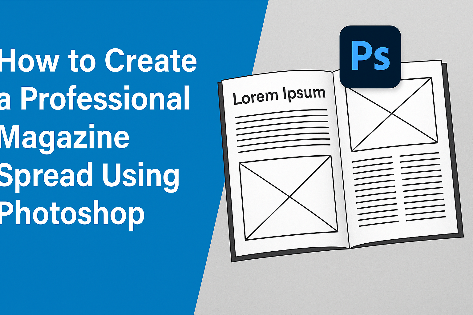
Creating a professional magazine spread in Photoshop can seem daunting at first, but it’s easier than you might think. Photoshop offers a robust set of tools that can help anyone, from beginners to experienced designers, craft eye-catching layouts. With just a few steps, you can transform your ideas into a polished spread that stands out.
For those interested in learning, there’s a handy 10-step guide to designing a double-page spread, perfect for magazines or online publications. These step-by-step instructions demonstrate how to utilize Photoshop’s features, such as layers and text placements, to enhance your design.
Visual elements and typography are key components of a successful magazine layout. By focusing on these aspects and incorporating tips from experienced designers, your spreads will not only look professional but also engage readers effectively. Check out some top tips for designing high-impact magazines to get more inspired.
Getting Started with Photoshop
To create a professional magazine spread in Photoshop, it’s essential to get comfortable with the basics. This includes knowing your way around the workspace, setting up the initial document correctly, and familiarizing yourself with the essential tools and panels.
Understanding the Workspace
Photoshop’s workspace can feel overwhelming at first glance. It offers various panels and toolbars that serve different purposes. On the left, you’ll find the Tools panel, which includes options for selection, cropping, and painting.
Above, the options bar adjusts for each tool. On the right, you’ll see various panels like Layers, Color, and Properties. These can be rearranged to fit personal workflow preferences. Understanding this layout helps streamline the design process.
Switching between different workspaces, such as Essentials or Photography, can also enhance efficiency for specific tasks. They tailor the available tools and panels to better suit the task at hand, making the work environment more intuitive.
Setting Up Your Document
When starting a new project, selecting the right document settings is crucial. Begin by navigating to File > New to create a new document. Here, you can set the dimensions and resolution. For a magazine spread, it’s standard to choose an A3 size with a resolution of 300 pixels per inch.
This ensures high print quality. Other settings like color mode should be CMYK for print projects. Take note of the Bleed settings, which are essential for avoiding white edges after printing. Consult the specifications from your printer to make sure everything is set correctly.
Familiarizing with Tools and Panels
Familiarity with tools and panels can significantly boost productivity. The Move, Brush, and Type tools are frequently used in magazine layout design. Learning their keyboard shortcuts can save a lot of time. For example, pressing ‘V’ activates the Move tool.
The Layers panel, vital for organizing project elements, allows users to create, reorder, and manage different components. Using layer Styles and Masks effectively can add depth and flexibility to designs.
Mastering these tools and panels will make creating complex designs more manageable and intuitive. This solid understanding will serve as a strong foundation for professional-quality spreads.
Design Foundations
Creating a magazine spread involves understanding layout, grid systems, and color schemes. These elements ensure the content is both attractive and easy to navigate.
Layout Principles
The layout is crucial for visual appeal and readability. Starting with a clear hierarchy can help guide the reader’s eye through the page. Headings, subheadings, and body text should be distinct. Aligning elements like text and images creates a visual flow.
Balance is also important. This involves distributing visual weight evenly across the spread. Symmetrical balance provides a formal look, while asymmetrical balance can make the design dynamic. Whitespace, or empty space, should not be overlooked. It allows the reader’s eye to rest, making the content more approachable.
Working with a Grid System
In Photoshop, using guides or setting up a custom grid can be helpful. This ensures consistency across different pages.
Grids allow designers to align elements precisely. Commonly used grids include three-column or four-column layouts. The choice depends on the content volume and type. Aligning images and text consistently with the grid lines keeps the design tidy.
The grid also aids in creating sections that highlight important content. This division can help break complex information into digestible bits, making your magazine more reader-friendly.
Choosing a Color Scheme
Color schemes define the mood and appeal of the magazine. Photoshop offers tools to experiment with different palettes. Choosing complementary colors ensures harmony, while contrasting colors can be used for emphasis.
Consider the magazine’s theme and target audience when selecting colors. For a vibrant look, bold colors might be appropriate. Pastel colors can offer a softer, more elegant design. Consistency in color usage is key.
Colors affect how content is perceived. Background and foreground colors should contrast enough for readability. This helps draw attention to the main elements and enhances the overall aesthetic of the spread.
Incorporating Text Elements
Creating a professional magazine spread involves thoughtful consideration of text elements. It is crucial to choose appropriate fonts, meticulously place and align the text, and effectively style headlines and captions.
Selecting Fonts
Choosing fonts is a key part of magazine design. Fonts set the tone and enhance readability. Serif fonts often lend a classic look, while sans-serif fonts are more modern and clean. For a cohesive design, designers should limit their choices to two or three complementary font families. This ensures visual harmony while maintaining readability.
Additionally, fonts must be legible in both print and digital formats. It’s wise to test how fonts appear at various sizes, checking that the text remains clear and easy to read. Designers should consider fonts like Garamond or Helvetica, which are popular for their balance of style and readability.
Text Placement and Alignment
Positioning and aligning text are crucial for an effective layout. Aligning text to grids can help maintain uniformity and balance across the spread. Designers often use a grid system to structure their layout, ensuring consistent margins and spacing.
Text should be placed where it supports images and graphics without overwhelming them. White space is important for clarity and should not be overlooked. It provides a visual break and makes the text more approachable. Left alignment is most common, but center or justified alignment can also be used strategically to highlight key information.
Styling Headlines and Captions
Headlines need to grab attention. Bigger fonts, contrasting colors, or bold styling can make them stand out. They should complement the main font style but be distinct enough to provide visual interest.
Captions are smaller but equally important. They provide context and should be easy to read. Using italics or a lighter font weight can set them apart from the main body text without detracting from the overall design. Designers can enhance the flow by ensuring captions align with the corresponding images or sections. By styling headlines and captions thoughtfully, they enhance the narrative and create a more engaging spread.
Working with Images
When creating a professional magazine spread, handling images effectively is crucial. This involves properly placing and resizing images, utilizing manipulation techniques, and understanding layering and composition to achieve a cohesive design.
Placing and Resizing Images
Placing images correctly ensures they enhance the layout. Begin by opening your Photoshop document. Use the File -> Place Embedded option to insert an image. Position it where it supports your composition. Adjust the size to fit without distorting by holding the Shift key while dragging the corners.
Ensure images are high-resolution for print quality. Ideally, this means a resolution of 300 pixels per inch. Check by right-clicking on the image and selecting Image Size. If resizing, prioritize maintaining aspect ratio to avoid stretching. Proper placement and size can make images pop and keep the layout balanced.
Image Manipulation Techniques
Image manipulation helps in refining and enhancing the visual appeal. One common technique is adjusting brightness and contrast through the Image -> Adjustments menu. This can make images stand out more vibrantly.
For more detailed touch-ups, experiment with the Clone Stamp tool to remove unwanted elements or use the Healing Brush for smoothing imperfections. Applying filters from the Filter -> Filter Gallery can add unique textures or artistic effects, enhancing the overall design aesthetic.
These techniques ensure each image contributes effectively to the magazine’s visual narrative. This step is about refining details for a polished and professional look.
Layering and Composition
Effective layering can bring depth and hierarchy to your spread. In Photoshop, every image automatically gets its own layer. Use the Layers panel to organize and position these layers. Place more significant elements like main photos at the bottom layers, while text and other small graphics can sit on top.
Prioritize composition principles such as the rule of thirds. This creates visually pleasing layouts by aligning images along imaginary grid lines. Group related layers using Ctrl+G for easier modification and maintaining a tidy workspace.
Creatively using layers helps in crafting a complex but harmonious design. These steps ensure images are integrated seamlessly into the magazine’s overall look.
Graphic Elements and Icons
When designing a magazine spread in Photoshop, integrating graphic elements and icons can enhance the visual appeal and improve readability. Custom shapes, icons, and vector graphics can add personality and clarity to the layout.
Creating Custom Shapes
Creating custom shapes in Photoshop can bring a unique touch to a magazine spread. By using the Pen Tool, designers can craft specific shapes that fit the theme of the magazine. It’s often helpful to start with basic shapes and modify them to fit the design’s needs. This might include changing the shapes’ opacity or color to match the magazine’s overall aesthetic.
Aligning shapes with other elements on the page helps maintain a clean and professional appearance. Designers can also use custom shapes to help guide the reader’s eye through the spread. Creative use of custom shapes can add depth and interest, ensuring the layout is both functional and beautiful.
Incorporating Icons
Icons are small but mighty elements that can guide readers through a magazine spread with ease. They serve as visual cues that help break up text and highlight important sections. Icons like arrows or stars can draw attention to specific areas, making the spread more engaging. It is important to choose icons that match the magazine’s style and tone.
Icons can also aid in improving navigation within multi-page spreads. For instance, using repeated icons on each page can help create consistency. Incorporating well-chosen icons will not only enhance the aesthetic appeal but also make the content more accessible and easy to understand.
Using Vector Graphics
Vector graphics are created using mathematical equations, so they can be resized without losing clarity, making them perfect for magazine spreads that may change size from digital to print. Photoshop allows for the easy integration of vector graphics from other design programs.
One practical application is in adding logos or decorative elements that need to maintain crisp lines. Vectors are versatile and can be used for anything from illustrations to text. By incorporating vector graphics, designers ensure that the spread looks sharp and professional on all platforms. This adaptability is crucial for maintaining a polished look in any magazine.
Applying Final Touches
In this part of the process, designers refine their work to ensure a polished look. They adjust visual elements for clarity, enhance imagery with filters, and confirm everything is correct to create a cohesive and professional magazine spread.
Adjusting Contrast and Brightness
Adjusting contrast and brightness is crucial for making images stand out. This process involves tweaking the light and dark areas to enhance the details. Using Photoshop, designers can easily manipulate these settings.
Increase contrast for sharper details. Use the Brightness/Contrast adjustment layer for non-destructive editing. This allows any changes to be easily undone.
Brightness adjustment affects the exposure level of the entire image. Be cautious not to wash out colors or lose details in bright areas. Test settings to find the right balance that complements the overall design.
Applying Filters and Effects
Filters and effects add style and mood to a magazine spread. They can transform an ordinary image into something eye-catching and unique. In Photoshop, designers have a variety of options.
Common filters include Sharpen, Blur, and Noise Reduction. Sharpening makes edges crisp, adding clarity. Blurring can create depth by focusing attention on the main subject.
Effects like Drop Shadow or Bevel and Emboss add dimension to text or images. Experiment with different options to enhance the visual appeal while maintaining a professional look. Always use a light touch so the spread doesn’t look over-edited.
Proofreading and Finalizing Design
Proofreading is a critical step to ensure all text is error-free. Spelling and grammar mistakes can distract from the design’s impact. Go through each line carefully.
In addition to text, check the layout and design elements. Ensure proper alignment, consistent spacing, and that fonts are uniform throughout. This is the time to catch any glaring errors or mismatches.
Once proofreading and design checks are complete, review the spread as a whole. Ensure every component works together harmoniously. A quick preview helps check how the spread will look both digitally and in print.
Exporting Your Magazine Spread
After finishing the design, it’s time to export the magazine spread. This step is crucial to ensure that the final output looks polished and professional.
First, save your document in Photoshop format (.PSD) to preserve layers and make future edits easier. This format keeps all design elements intact.
Next, export your work as a PDF. This is the preferred format for print, as it maintains high-resolution quality. To do this, go to File > Export > Export As and choose PDF from the options.
Make sure to check the settings for high quality. Set the resolution to 300 pixels per inch (PPI) for a crisp print. Double-check margins and bleed settings, especially if the design goes to the edge of the page.
It’s also helpful to preview the final file. Use Adobe Acrobat or a similar tool to make sure that everything is aligned and looks good. Test colors and fonts to ensure they display correctly in the PDF.
If you plan to share the spread online, consider exporting as a JPEG or PNG for better web compatibility. This makes it easier for quick sharing with clients or on social media.
Remember that accurate file names make organization simpler. Name your files descriptively so you can quickly find them later. For example, use magazine_spread_final.pdf instead of generic names like document1.pdf.
These small details can make a significant difference in the final presentation.
Tips for Professional Results
When creating a magazine spread in Photoshop, achieving a polished look requires attention to detail. Key elements include ensuring design consistency, managing layers wisely, and staying updated with the latest design trends.
Maintaining Consistency Across Spreads
Consistency is key to creating a cohesive magazine feel. Use a uniform grid system for alignment, ensuring text and images stay aligned. This keeps the layout looking neat. Utilize the same font family and color palette throughout. This helps in building brand identity and makes the pages flow well.
Repetition of certain design elements, such as headers or background patterns, reinforces the theme. To avoid monotony, introduce subtle variations that maintain the overall style. Consistency aids in enhancing readability and gives a professional touch.
Managing Your Layers Effectively
Effectively managing layers in Photoshop can make a world of difference. Start by naming each layer clearly. This practice helps in identifying different elements quickly. Group related layers, like text and images for a section, to keep the layer panel organized.
Arrange the hierarchy of layers, ensuring that important elements are not obscured. Use layer masks rather than erasers for non-destructive editing. This allows edits without losing original data. Smart layers can be used for inserting reusable components across multiple spreads, aiding efficiency.
Keeping Up with Industry Trends
Staying current with industry trends can keep a magazine design fresh and appealing. Follow design blogs and publications that highlight emerging styles. Experiment with new design tools and techniques that can enhance the visual appeal.
Incorporating modern elements such as minimalist designs or bold typography can set the spread apart. Attend workshops or webinars to learn from experts and incorporate innovative ideas. Keeping a finger on the pulse of the industry not only makes statements but also keeps the audience engaged.