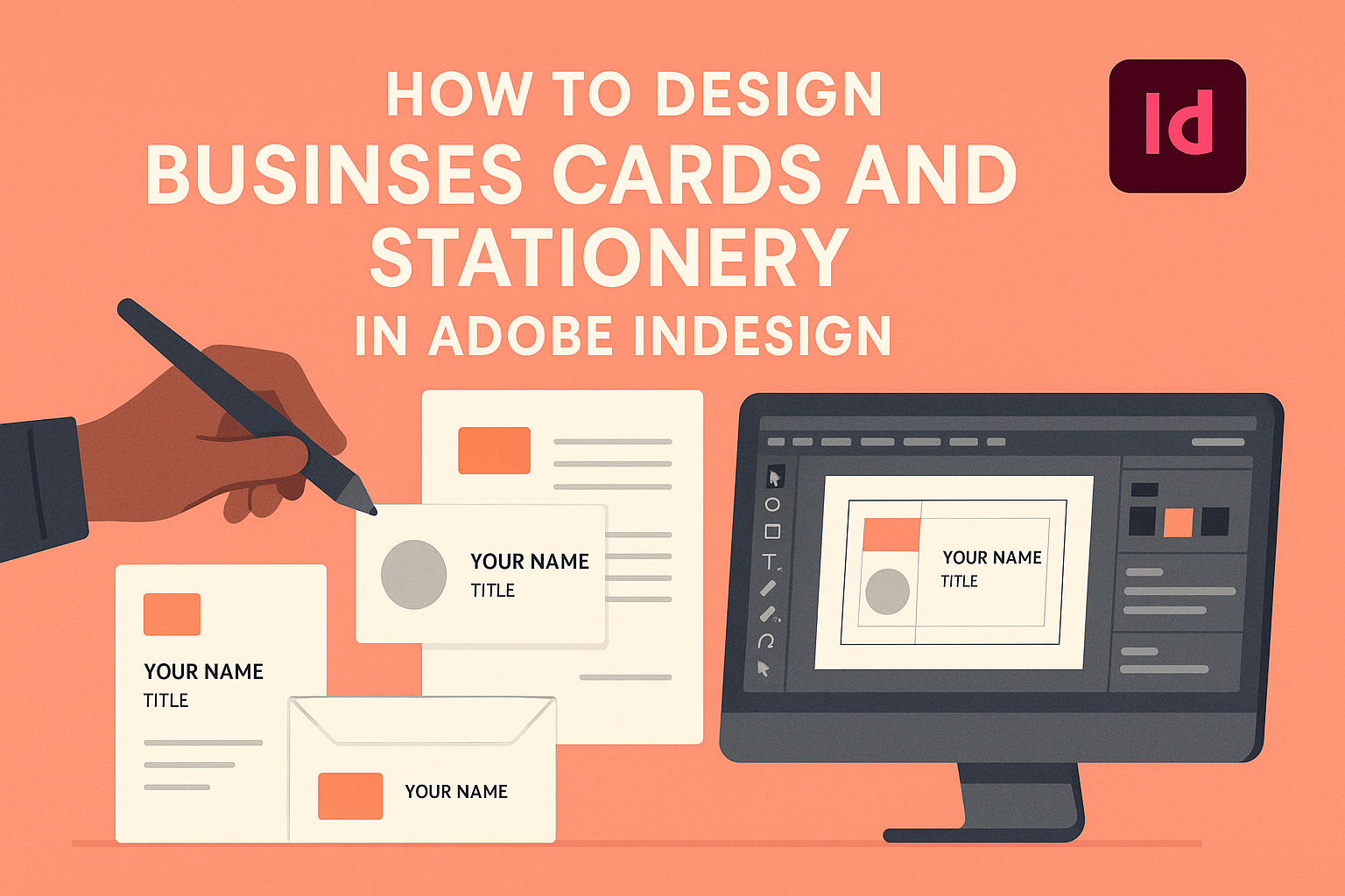
Designing business cards and stationery is an exciting journey that lets creativity shine. Adobe InDesign is a powerful tool that helps create professional and custom designs easily. Whether it’s crafting a modern business card or an entire stationery suite, users can bring their vision to life with precision.
Using Adobe InDesign allows for easy customization of elements like logos, text, and colors. With InDesign, designers can effortlessly put together polished projects that stand out. Plus, generating a print-ready PDF ensures that the final product maintains its quality when printed.
By tapping into InDesign’s features, anyone can design eye-catching business cards and stationery that leave a lasting impression. Ready-to-use tools and templates make the process smooth, whether for personal use or business branding. With creativity and the right software, designing can be both fun and productive.
Understanding the Basics of Adobe InDesign
Adobe InDesign is a powerful tool for creating professional layouts for print and digital media. Grasping the essentials like the workspace, document setup, and layer management is crucial for seamless design.
Workspace Overview
The Adobe InDesign workspace is tailored for flexibility and efficiency. Panels are on the right and allow access to essential tools like the Properties Panel and Color Swatches.
The Tools Panel is on the left, providing easy access to selection, text, and drawing tools. The Control Panel at the top changes based on the selected tool, offering quick adjustments.
Users can customize the workspace by rearranging panels or creating new workspace layouts to suit specific projects. Familiarity with these elements boosts productivity and enhances design capabilities.
Setting Up a New Document
Starting with the right document settings saves time and ensures the design fits the intended purpose. InDesign offers options to set page size, orientation, and margins.
For instance, to design a business card, one might set the page size to 3.5 x 2 inches, a standard size in the U.S. Adobe Inc. provides a detailed guide for these settings.
Bleed and slug settings are crucial for print jobs, providing space for trim and printing marks. Accurate setup ensures the final product looks professional.
Working with Layers
Layers in InDesign help organize different elements and control their visibility and stacking order. Designers can separate text, images, and backgrounds into distinct layers.
Having a clear naming system for each layer can reduce confusion, especially in complex projects. Locking or hiding layers provides control and prevents accidental edits.
Using adjustment layers, like color overlays, applies effects non-destructively. Understanding layer management enhances the designer’s control over complex projects and allows easy editing and revisions.
Design Elements for Business Cards
Creating a business card involves making choices about color, branding, and typography. Each element plays a crucial role in ensuring the card leaves a strong impression.
Choosing the Right Color Palette
When designing a business card, selecting the right color palette sets the tone for your brand. Colors can evoke emotions and communicate messages quickly. Sticking to two or three colors ensures the design remains clean and uncluttered. Often, businesses use the colors from their logos as a base.
Complementary colors add contrast without clashing, which helps highlight important text like a name or title. Designers can use a color wheel to pick harmonious colors that enhance the card’s appeal. For digital assurance, it’s essential to use CMYK color mode to match print standards.
Incorporating Your Branding
Incorporating branding is critical for consistency and recognition. The card should prominently feature the company logo in a spot that’s visible yet balanced with other elements. Logos serve as a visual anchor, giving the card its unique identity.
Integrating taglines or slogans can also reinforce brand messaging. Ensuring that the card’s style matches other branded materials creates a unified look. This might include using the same layout or visual motifs found in letterhead or envelopes. Every branding element should work in harmony to maintain professionalism.
Selecting Fonts and Typography
Choosing the right fonts and typography requires balancing readability with visual interest. It’s best to limit fonts to two: one for the name and another for contact information or additional text. Sans-serif fonts are often preferred for their clean and modern appearance.
Font size is crucial for legibility; typically, names are slightly larger to stand out. Designers need to consider line spacing and alignment to ensure the text doesn’t appear crowded. Keeping font style in line with the brand’s voice and identity ensures that the business card reflects the company effectively. Following these guidelines guarantees that the card is both functional and attractive.
Creating a Business Card Layout
Designing a business card layout in Adobe InDesign involves setting up margins and bleed, arranging text and graphics, and using grids for alignment. Each step ensures the card is both visually appealing and functional.
Setting Margins and Bleed
Setting correct margins and bleed is crucial for printing. Margins define safe zones for text and images, preventing them from being cut off. It’s important to keep all critical elements like text, logos, and photos within these margins. Bleed extends colors and images beyond the card’s edges, ensuring there are no white lines after cutting.
In InDesign, start by selecting “New Document” and inputting standard business card dimensions, often 3.5×2 inches. Set a bleed of at least 0.125 inches. Use “File > Document Settings” to adjust these values. Make sure to preview your design with bleed settings on, using “View > Screen Mode > Preview”. This step helps visualize how the business card will look once printed.
Arranging Text and Graphics
Fonts and images are central to the card’s appearance. Choose readable fonts that reflect the brand’s identity and ensure they are legible at a small size. Common text includes names, titles, contact details, and possibly social media links.
Graphics, like logos, should be high-resolution and placed prominently. To insert a logo, use the “File > Place” option and navigate to the desired file. Holding the “Shift” key while resizing helps maintain proportion. Consider using contrast, such as light text on a dark background, for better visibility. Keep the design uncluttered, focusing on the essential information.
Using Grids and Alignment Tools
Grids and alignment tools help maintain order and consistency in design. Use a grid to arrange elements symmetrically, providing balance and uniformity. In InDesign, activate the grid by going to “View > Grids & Guides > Show Grid”.
Alignment tools, found under the “Window > Object & Layout > Align”, enable precise placement of text and graphics. They help align objects centrally or to the edge, which can enhance the card’s visual impact. Always check object spacing, using equal distances between elements, to promote a clean and organized layout. This approach results in a professional-looking business card.
Designing Matching Stationery
Creating cohesive stationery helps establish a strong brand identity. By aligning the design of letterheads, envelopes, compliment slips, and note cards, the overall appearance and professionalism of a brand are enhanced.
Letterheads and Envelopes
Letterheads and envelopes often serve as the first impression of a business. Using Adobe InDesign, designers can craft polished and professional letterheads and envelopes.
Start by choosing a consistent color palette and font style that matches the company logo. Include essential details like the company name, address, phone number, and email. It’s important to maintain ample white space to ensure readability.
Envelopes should complement the letterhead. The design should harmonize with that of the letterhead by using similar colors and typography. Adding the company logo to the envelope as a prominent feature helps with brand recognition.
Compliment Slips and Note Cards
Compliment slips and note cards are often used for informal communication. They provide an opportunity to add a personal touch to professional correspondence.
When designing compliment slips in InDesign, ensure they reflect the company’s branding style with subtle design elements. Include the company logo and contact information, and leave room for written notes.
Note cards should also coordinate with the rest of the stationery suite. Use consistent fonts and colors that align with the company’s brand identity. Simple designs often work best, allowing the message to stand out. Including a watermark or a light pattern can add an elegant touch without overpowering the content.
Preparing for Print
Preparing a business card or stationery design for print involves knowing the right specifications, exporting the design correctly, and checking for errors. These steps ensure your design looks professional and prints as expected.
Understanding Print Specifications
Print specifications are crucial for achieving the best results. It is important to use the correct color mode, which is CMYK (cyan, magenta, yellow, and black) for printing. This ensures colors appear vibrant and accurate.
You should also set the correct resolution, typically 300 DPI (dots per inch) for print quality. This resolution keeps images sharp and text clear. Additionally, setting bleed and margins correctly prevents any important parts of your design from being cut off during printing. Bleed usually extends 0.125 inches beyond your design.
Choosing appropriate paper size and type also plays a role. Whether designing a business card or stationery, make sure you select a size that fits your needs.
Exporting Your Design
Exporting your design correctly from Adobe InDesign ensures it will print well. The recommended format for print is PDF, as it maintains the quality and layout of your design. When exporting, select the ‘High Quality Print’ option to keep the design sharp.
Make sure to include bleed settings in the PDF export options. Adding printer’s marks like crop marks can also be helpful, guiding the printer on where to trim.
It is important to embed fonts in the PDF during the export process. This prevents any changes to the text when the document is opened on another computer. Adobe InDesign offers export settings to streamline this process so checking these settings before exporting is beneficial.
Proofreading and Pre-Flight Checks
Before sending your design to print, thorough proofreading is essential. Check for typos, incorrect contact information, or misplaced elements. Errors found after printing can be costly to fix.
Performing a pre-flight check in InDesign can help identify potential issues in your file. This includes missing fonts, incorrect colors, and image resolution problems. Addressing these before printing saves time and resources.
You can create a pre-flight profile to automate some of these checks. This helps maintain consistency and quality in all your print projects. Regularly using these tools enhances your workflow efficiency and print quality.
Advanced Design Techniques
When designing business cards and stationery in Adobe InDesign, using advanced graphics can make a design stand out with unique effects and interactive elements. Creating interactive PDFs can also provide engaging, digital versions for clients or presentations.
Using Advanced Graphics and Effects
InDesign offers a variety of tools to create visually appealing designs. Designers can use gradient fills and transparency effects to add depth and interest. These features allow for smooth transitions between colors or blending images seamlessly into the background.
Another useful technique is adding drop shadows and inner glows. These effects can give elements a 3D appearance, making text or images pop. Utilizing InDesign’s layering capabilities enables designers to stack multiple graphics and see how they interact with each other.
Custom shapes can also elevate a design. Using the pen tool, designers can create unique paths that outline graphics or text. This tool allows for precision, resulting in stand-out designs. Incorporating these advanced effects ensures a professional and polished final product.
Creating Interactive PDFs
Interactive PDFs are a fantastic way to present designs digitally. InDesign enables the addition of buttons, audio, and video elements. This functionality transforms a simple PDF into a dynamic user experience.
Including hyperlinks is another technique that enhances an interactive PDF. These links can direct viewers to websites or different pages within the document. Form fields are also feasible, allowing for data entry and ensuring functionality beyond static print designs.
InDesign supports features like page transitions, which provide a smooth flow when moving between pages. Offering a multimedia-rich design captures attention, making interactive PDFs a powerful tool for sharing designs virtually.
Sourcing Printing and Materials
When designing business cards and stationery, choosing the right paper and selecting a reliable printer are crucial. The right materials ensure a professional look and feel, while a dependable printer guarantees high-quality results.
Choosing Paper Quality and Weight
The choice of paper can greatly affect the appearance of business cards and stationery. Different paper qualities and weights cater to various needs and preferences. For business cards, a heavier cardstock is typically preferred because it feels durable and gives a sense of professionalism. It’s common to use 300-350 gsm (grams per square meter) paper for these cards.
Stationery like letterheads and envelopes often uses lighter paper, around 80-100 gsm. Coated paper gives a shiny finish, while uncoated paper offers a matte texture. For a more eco-friendly option, recycled paper can be a great choice. Glossy finishes enhance vibrant colors, while matte finishes have a more subdued, classic look. Selecting the right paper type helps in creating the desired effect and impression.
Finding a Reliable Printer
Selecting the right printer is essential for achieving the desired quality in printed materials. It’s important to research different printing services to find one that matches the needed specifications and budget. Ask for samples to gauge their work quality and ensure it meets expectations.
Consider whether the printer offers services for adjusting design elements, such as color matching or adjusting image resolution. It’s also beneficial to check online reviews and seek recommendations from colleagues or friends.
A good printer should provide clear communication about timelines and costs. Reliable printers can offer advice on design tweaks, paper selection, and finishing touches to enhance the printed materials. Comparing several options ensures that the final product is satisfactory and professional.