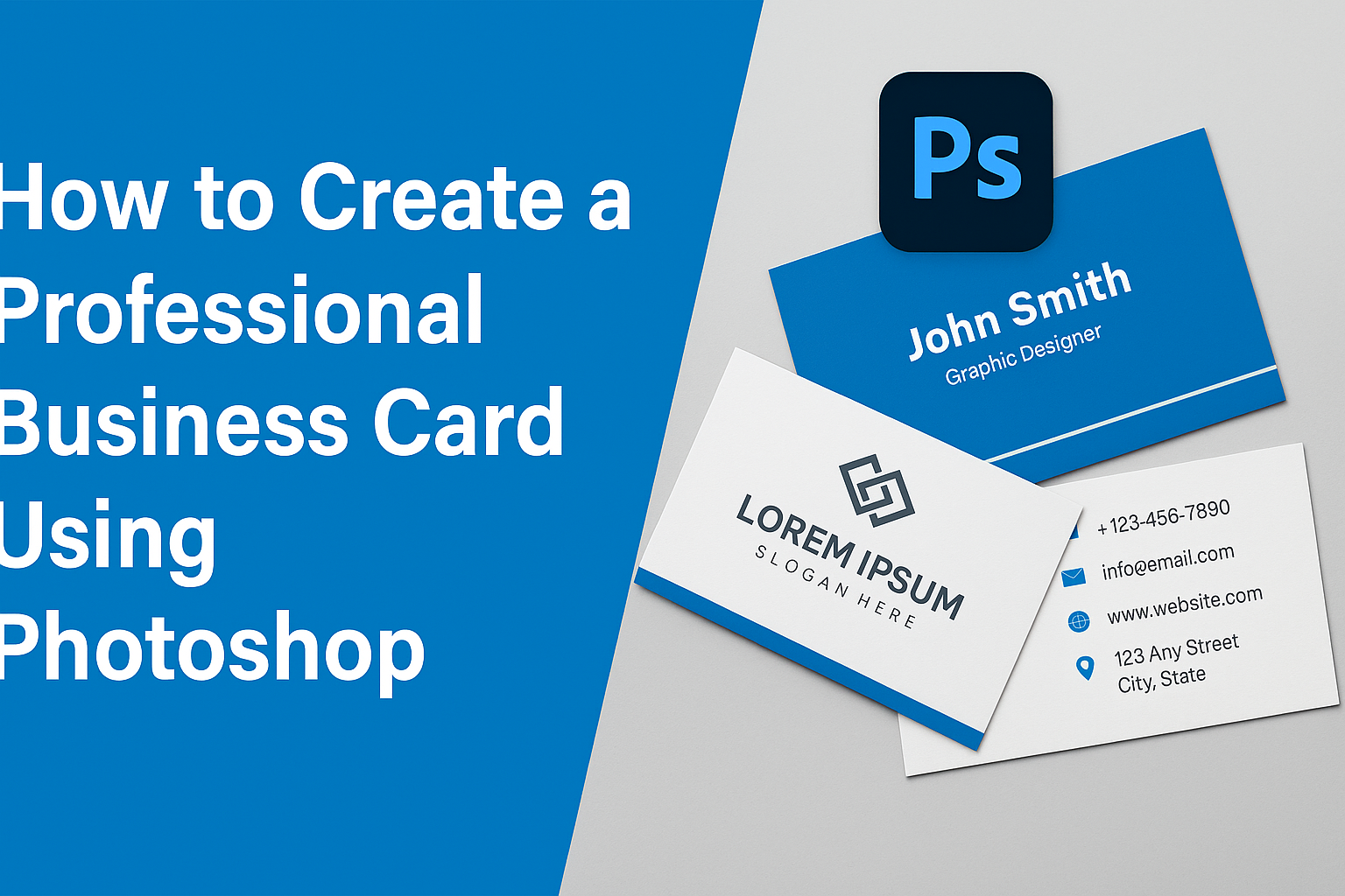
Creating a professional business card in Photoshop can be a rewarding skill, blending creativity with practicality. Designing a card that stands out involves understanding key elements like layout, color schemes, and fonts. Mastering these basics will help you craft a card that makes a lasting impression.
Photoshop offers the tools to create unique and personalized business cards tailored to individual style and business needs. From setting the correct dimensions to adding eye-catching designs, the process is both fun and fulfilling. These steps can transform a simple card into a powerful networking tool.
For those interested in graphic design or wanting to promote their brand effectively, designing a business card in Photoshop is an essential skill. By following simple guidelines, anyone can produce professional-quality cards that communicate their brand’s identity.
Understanding Business Card Basics
Business cards are a crucial tool for networking and professionalism. They not only provide contact information but also represent an individual’s brand. A well-designed card can leave a lasting impression and make networking much more effective.
The Purpose of Business Cards
Business cards serve several key purposes. They are a quick and effective way to share personal or business contact information. These small cards include a person’s name, job title, company, phone number, email address, and other contact details.
They also help make a memorable first impression. Exchanging these cards with someone can be the start of a new business relationship. When designed thoughtfully, a business card is an extension of your brand and reinforces your professional image.
Overall, they are not only practical but also a lasting representation of a brand or business values. It’s important that the card reflects the style and personality of the holder. This contributes to powerful branding.
Standard Business Card Dimensions
The standard size for a business card is 3.5 inches by 2 inches. This dimension is widely accepted because it fits easily in wallets and cardholders. These measurements ensure compatibility with most printers and card-cutting machines.
Sometimes, unique shapes and sizes are used to stand out. However, it’s important to stick closer to the standard size to maintain practicality. Going too far from the expected size can be inconvenient for the recipient.
The recommended resolution for printing is 300 pixels per inch (ppi). This ensures the card looks crisp and professional when printed. High resolution is crucial for maintaining clarity and quality.
Effective Design Principles
Design principles play a significant role in creating a professional business card. Clarity is essential: make sure the text is legible, and choose fonts that are easy to read. Avoid overcrowding the card with too much information.
Focus on color schemes that align with the brand image. Use contrasting colors so that text and logos are clearly visible. Elements like logos should be distinct and not overpower the card’s content.
Consider the card’s finish, like matte or glossy, which can affect its appearance and feel. Utilizing effective design principles can make a card not only informative but also appealing to its audience.
Setting Up Your Photoshop Project
Setting up your project in Photoshop correctly is crucial for creating a professional business card. This includes setting the right document size, resolution, color models, and efficiently organizing layers. Careful setup ensures your design process is smooth and the final product looks great when printed.
Creating a New Document
To start, open Photoshop and create a new document. Click File > New. In the dialog box, set the dimensions to 3.5 inches by 2 inches, which is a standard business card size. Leave a bleed area of around 0.125 inches on each side to prevent important elements from being trimmed during printing.
Under the Advanced Options, choose the orientation as Landscape or Portrait based on your design choice. Setting the background color to white helps when you begin designing.
Understanding Resolution and Color Models
Correct resolution and color mode are vital. Set the resolution to 300 DPI (dots per inch) to ensure high-quality print. Lower resolutions might result in pixelated prints. For color, choose CMYK. This color model is used for printing and will ensure your colors come out accurately. RGB is more for digital displays.
Keep in mind that using the CMYK color model may slightly change how colors appear compared to what you see on your screen. It’s a good idea to print a test card to see the colors in real life.
Organizing Layers for Efficiency
Organizing layers can simplify the design process. Group similar elements together. For instance, all text layers could be in one folder while images are in another. This keeps your workspace tidy and makes it easier to find specific elements.
Name each layer clearly, like “Logo” or “Contact Info,” so you recognize them quickly. Use layer styles for effects or adjustments without altering the original layer. This makes it simple to tweak parts of your design later on.
Efficient layer management reduces design time and helps in making quick changes if needed.
Designing Your Business Card
Creating a business card involves balancing style and information. It includes choosing the right colors, incorporating brand elements, selecting typography, adding visuals, and arranging everything on the layout. Each of these components serves a unique role in making the card both appealing and functional.
Choosing a Color Scheme
Picking a color scheme is vital in setting the tone of the business card. Colors convey emotions and can highlight what the business stands for. For a professional look, consider colors that align with the company’s logo or branding.
Neutral colors like black, white, and gray often give a clean and sophisticated feel.
Bright colors catch attention and can be used sparingly for highlights. Use tools like color wheels to find complementary colors that enhance each other. It’s important to ensure the text is readable against the background colors. Testing different combinations can help find the best match that represents the brand and maintains clarity.
Incorporating Your Brand Elements
To make a business card memorable, incorporate brand elements like logos and taglines. The logo should be prominent, as it represents the business identity. Placing it in the top corner or center can draw immediate attention.
Taglines, if used, should be brief and catchy, summarizing the essence of the business.
The company’s contact information, such as phone number and email, should be clear and easy to find. Integrating these brand elements helps to create a cohesive look and strengthens brand recognition. Consistent use of such elements across different platforms ensures that customers associate these visuals with the business instantly.
Selecting Fonts and Typography
Fonts and typography play a crucial role in how information is perceived. It’s essential to select fonts that are clear and professional. Sans-serif fonts like Arial or Helvetica are often used because they are simple and easy to read.
For a more elegant touch, a serif font can be employed for the business name or headings.
Using contrasting fonts for headings and body text can make the card more visually appealing. While creativity is welcome, it’s critical to limit the use to two or three fonts to maintain a clean and organized appearance. Pay attention to font size as well; content should be legible without overwhelming the design.
Adding Images and Graphics
Images and graphics can enhance the visual appeal of a business card. A professional headshot adds a personal touch and can help clients put a name to a face. If relevant, consider including images that reflect the business theme or products.
Abstract graphics or patterns can add style without being too distracting.
It’s important to ensure that images or graphics are high quality to avoid pixelation. Too many graphics can clutter and detract from the main message, so use them sparingly. Select visuals that complement the color scheme and overall design, making the card visually coherent and attractive.
Arranging Components on the Layout
Arranging the components effectively is key to a well-designed business card. Start by sketching a rough layout that includes placement for the logo, text, and images. The most essential information, like name and contact details, should be prominently placed for easy viewing.
Use alignment and spacing to create a balanced look.
Employ grids to help organize elements symmetrically. Negative space, or areas without text or images, is important for letting the design breathe. Balance is the overall goal, ensuring no area of the card feels cluttered. Business cards that are well-arranged look professional and help convey information without overwhelming the recipient.
Adding Essential Information
Creating a professional business card involves including essential details that make it easy for others to contact you. It’s crucial to choose what information to include, ensuring the card is informative without being cluttered.
Contact Information
Including accurate contact information is vital. A business card should list a valid phone number and email address. These details allow someone to reach out conveniently. It’s a good idea to double-check the accuracy of these specifics.
An optional addition is a postal address. This is useful for businesses with a physical location. Be sure that all contact information is current to avoid any confusion. Keeping it simple yet thorough helps in making the right impression.
Job Title and Company Name
Clearly stating the job title and company name helps in understanding the cardholder’s role. This information immediately tells the recipient who they are dealing with. Use a legible font that stands out from the rest of the text.
Consider using bold or italics for emphasis. It should be placed in an easy-to-spot location on the card. Ensuring that job titles and company names are up-to-date and correctly spelled is equally important.
Social Media Profiles
Adding social media profiles can be beneficial for networking. Consider including only professional accounts such as LinkedIn. It’s an effective way to showcase your professional presence.
Make sure the links are accurate. Using social media icons can help save space and make the card look tidy. Only include profiles that are frequently updated and relevant to your professional image.
QR Codes and Call-to-Action
QR codes offer a convenient way to share information digitally. A QR code can link to a portfolio, website, or social media page. This keeps the card looking clean while providing more details.
Including a call-to-action can encourage recipients to reach out. Simple and direct phrases like “Contact me today!” can engage the reader. Balancing text and QR codes ensures clarity and professionalism.
Fine-Tuning Your Design
In this phase, focus on making sure your business card is both visually appealing and easy to read. It’s important to pay attention to alignment, balance, and the careful use of filters and effects. Ensuring that all text is clear will help you create a professional and effective business card.
Using Alignment and Balance
Alignment and balance are crucial in making your business card look organized. When elements are aligned properly, the card feels cohesive and professional. Use guides in Photoshop to line up text boxes, logos, and other elements evenly on the card. Balance refers to distributing elements evenly so no part seems too cluttered while another remains empty.
Use symmetry to make the design pleasing to the eye. Equal spacing between elements also helps achieve balance. Adjust objects as needed to ensure text and images don’t overwhelm the card. A well-aligned card not only looks clean but also directs the viewer’s attention to the key information.
Applying Filters and Effects Sparingly
Filters and effects can add depth and interest to a design. However, using them too much might distract from the main message. In Photoshop, subtlety is key when adding shadows, glows, or strokes. For instance, a shadow can make text pop against the background, but it should be faint to avoid competing with the content.
Glows around text can add emphasis, but should match the color scheme of the card. Consistency is important, so any filters or effects used should align with the overall design style. Keep in mind that the goal is to enhance the design, not to overpower it.
Ensuring Readability
Readability is vital so that your contact information is clear at first glance. Choose fonts that are easy to read and keep font sizes consistent. Avoid overly decorative fonts that can confuse or tire the eyes. Contrasting colors between text and background help improve visibility.
It’s important to check the card at a small scale to ensure the text remains readable. The spacing between letters and lines, known as kerning and leading, should be adjusted to ensure clarity. Test prints can help you see how the design looks in real life.
Preparing for Print
Getting a business card ready for print involves careful attention to detail. This process includes setting up bleed, trim, and safety lines, selecting the right file format, and completing a final prepress checklist to ensure everything is perfect for printing.
Bleed, Trim, and Safety Lines
Bleed, trim, and safety lines are crucial for any print project. The bleed is extra space around the card’s edges, usually around 0.125 inches. This ensures that no unprinted edges appear after cutting.
The trim line marks where the card will be cut, so it should align with the final size of the card. The safety line is set about 0.125 inches inside the trim line. It keeps important text and images safe from being cut off. Keeping these lines well defined is essential for a professional look.
Choosing the Right File Format
Choosing the correct file format guarantees that the design looks good when printed. Formats like PDF, TIFF, or JPG are commonly used.
A PDF is great because it keeps high quality. It also keeps layer information if needed. TIFF files are used for large, high-resolution images and preserve details well. JPGs are good for simple color images and are good for sharing proofs.
The resolution should be at least 300 dpi for quality prints. Also, use CMYK color mode for accurate colors on paper.
Final Prepress Checklist
A final prepress checklist helps catch any last-minute issues. First, double-check spelling, font sizes, and alignment. Look at the design layout to ensure everything fits within the safety lines.
Make sure all images are embedded and links are working. Verify that the color mode is set to CMYK and the resolution is correct. Review all layers and flatten them if needed. Save and backup the final version as a PDF or TIFF.
Doing these checks helps catch mistakes before printing, ensuring a perfect business card.
Exporting and Printing
Once the business card design is complete, the final steps are to export the file correctly and choose the right printing service. Ensuring that these steps are done properly will result in high-quality printed business cards.
Exporting Your Business Card
When the design is ready, exporting it correctly is crucial for maintaining quality. Begin by saving the Photoshop file as a high-resolution PDF. This format is commonly accepted by most printing services. Check that all layers are merged and that the resolution is set to 300 DPI (dots per inch) for clear printing.
Next, ensure that color settings are adjusted. Convert the color mode from RGB to CMYK, as it’s the ideal format for printing. Remember to include bleed and crop marks. These settings allow for any small inconsistencies during cutting. Finally, double-check the dimensions to ensure they match the standard 3.5 inches by 2 inches or the custom size you chose.
Finding a Quality Printing Service
Choosing the right printing service affects the final look of the business card. It’s a good idea to research local and online printing options to compare prices and quality. Look for services that offer reviews or samples of their work. Think about the type of finish, like matte or glossy, you want for the cards.
Reputable printing services often provide options for cardstock thickness, which can enhance the card’s durability and feel. Don’t hesitate to ask about customization options, such as embossing or foil stamping. These details can add a professional touch to your cards.
Reviewing a Printed Proof
Before printing a full batch of business cards, reviewing a printed proof is essential. A proof is a sample that shows exactly how the final product will look. Carefully examine the proof to ensure that colors are accurate and that text is clear. Look for any typos or layout mistakes.
Check that the design elements, like logos and borders, appear as intended and aren’t too close to the card’s edges. Ensure that all contact information is correct and easy to read. If any adjustments are needed, it’s better to catch them now rather than after mass printing. Once everything looks perfect, give the go-ahead for printing the full order.