Creating a mobile app with a user-friendly navigation menu is essential for keeping users engaged and satisfied.
A well-designed navigation menu ensures that users can easily access the features they need, making their experience smooth and enjoyable.
Gravit Designer is a powerful tool that simplifies this process, allowing designers to create intuitive navigation menus with ease.
Designers can explore various styles and patterns that cater to different user preferences. From bottom navigation bars to hamburger menus, the right choice can significantly impact user interaction.
By leveraging Gravit Designer’s features, creators can build navigation menus that not only look good but also enhance the overall usability of their apps.
In this article, readers will discover practical tips and techniques to design an effective mobile app navigation menu. They will learn how to make thoughtful choices that align with user needs and preferences, ensuring that their mobile app stands out in a crowded market.
Understanding Gravit Designer Basics
Gravit Designer is a versatile design tool perfect for creating user-friendly mobile app navigation. By mastering its basics, designers can efficiently create stunning interfaces.
Exploring the Interface
The Gravit Designer interface is user-friendly and intuitive.
Upon opening the program, users will see a clean workspace with toolbars on the left and top.
Key features include:
- Toolbar: Contains essential tools like the selection, shape, and text tools.
- Layers Panel: Displays all the elements in the project for easy organization.
- Properties Panel: Allows adjustments to colors, sizes, and styles.
Familiarizing oneself with these parts is crucial.
Exploring the interface ensures that users can quickly access the tools they need to design their app navigation.
Setting Up Your Canvas
Setting up the canvas is an important first step.
Users can choose from various preset sizes or create a custom size suitable for their app.
To set up the canvas:
- Open Gravit Designer and select “New Document.”
- Choose a preset size, like iPhone or Android dimensions, or input custom dimensions.
- Adjust DPI (dots per inch) settings for resolution quality.
This process helps in keeping the design focused and aligned with mobile standards.
A well-prepared canvas also aids in visualizing how the navigation menu will look on different devices.
Utilizing Vector Tools for UI Design
Vector tools in Gravit Designer are essential for creating scalable app designs. These tools allow for crisp, clean lines and shapes.
Important vector tools include:
- Pen Tool: For drawing custom paths and shapes.
- Shape Tool: Provides access to basic geometric shapes like rectangles, circles, and polygons.
- Text Tool: Enables easy addition and styling of text.
Utilizing these tools helps in crafting unique navigation elements.
It is critical that the design remains visually appealing and user-friendly, ensuring a great experience for app users.
Designing the Navigation Menu
Creating an effective navigation menu is crucial for a user-friendly mobile app. A well-structured menu guides users smoothly through the app, making their experience enjoyable. Key elements and appealing styles also play important roles in a successful design.
Defining the Structure
Defining the structure of the navigation menu is the first step. This involves organizing content into logical categories. Users should easily understand where to find different sections of the app.
Consider these structures:
- Hierarchical: This allows for subcategories under main categories.
- Flat: This keeps everything at the same level for simplicity.
Creating a clear hierarchy helps users navigate quickly.
Testing the structure with real users can provide insights into how well it works in practice.
Incorporating Key Elements
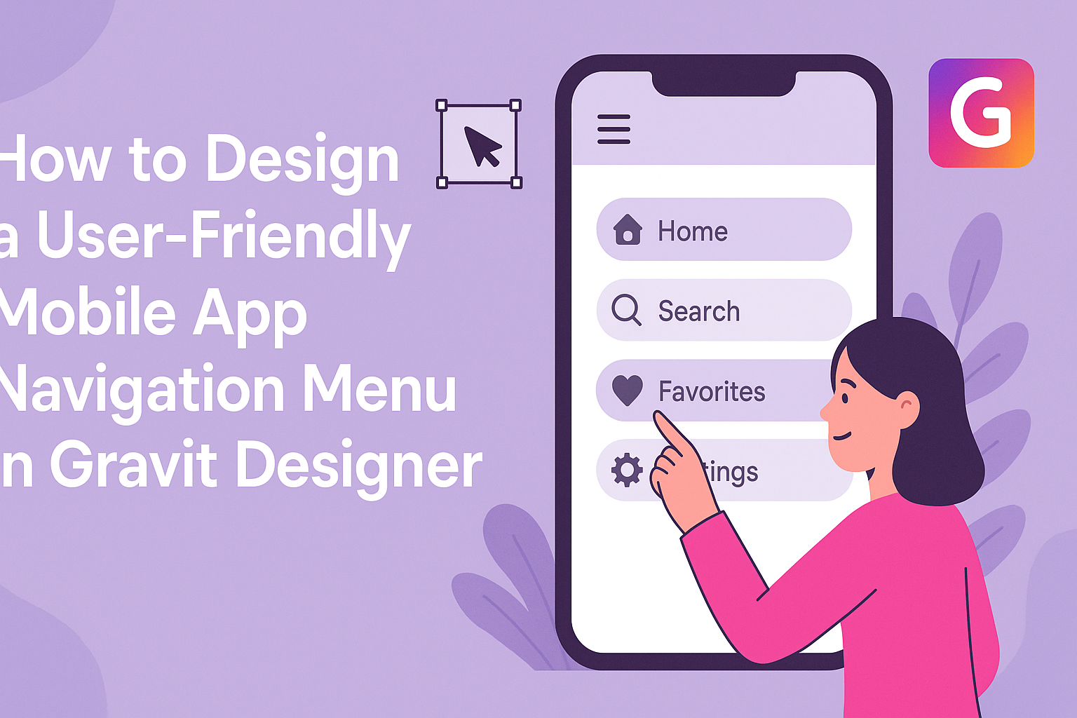
Incorporating key elements in the navigation menu enhances usability. Every navigation menu should include important items such as a home button, back navigation, and clear labels.
Key elements to consider:
- Icons: Adding recognizable icons improves recognition.
- Search Bar: This helps users find specific items instantly.
Using familiar patterns, such as hamburger menus or tab bars, helps users feel comfortable with the navigation.
Additionally, ensuring that buttons are adequately spaced prevents accidental clicks, making the experience smoother.
Styling with Color and Fonts
Styling the navigation menu with color and fonts can significantly affect user experience. Color choices should align with the app’s overall design while ensuring readability.
Tips for styling:
- Contrast: Use contrasting colors for text and background for easy reading.
- Font selection: Choose legible fonts that reflect the app’s personality.
Keeping the style consistent throughout the app strengthens the brand’s identity.
Using a limited color palette can also create a clean appearance, making the navigation feel cohesive.
User Experience Best Practices
Creating a user-friendly mobile app navigation menu is essential for enhancing user experience. Focusing on the structure and the way users interact with the app will lead to a smoother journey and more satisfied users.
Simplifying the User Journey
A clear and simple navigation menu helps users find what they need quickly. To achieve this, designers should prioritize essential features and content. This means eliminating unnecessary items that could clutter the menu.
Using labels that are easy to understand will guide users. Clear words indicate what users can expect when they select an option. Instead of using technical jargon, it’s best to stick with everyday language.
Additionally, grouping related content together can assist in creating a logical flow. For example, placing similar items within the same section allows users to navigate intuitively.
A well-structured menu will significantly reduce the time users spend searching for information.
Ensuring Intuitive Usability
Intuitive usability is about making the app feel familiar and easy to use. Designers should aim for a consistent layout across different screens.
This means using similar icons, colors, and styles to create a cohesive look.
Interactive elements, such as buttons and icons, need to be recognizable. Users should instantly understand what action they can take.
It helps to use well-known symbols like a magnifying glass for search or a home icon for navigation.
Testing with real users is a valuable step.
Gathering feedback through usability tests can highlight any confusing elements. Regular updates based on this feedback can lead to continuous improvements, ensuring a user-friendly experience.
Testing and Refinement
Testing and refinement are crucial steps in designing a user-friendly mobile app navigation menu. These stages ensure that the design meets user needs and provides a smooth experience.
Conducting User Tests
User testing involves observing real users as they interact with the navigation menu. It is important to select a diverse group of participants who represent the target audience.
During these tests, she can ask participants to complete specific tasks, such as finding a feature or accessing different sections of the app.
Observing how easily they succeed or struggle provides valuable insights.
Feedback can be gathered through direct observation and surveys after testing.
Key questions can include:
- Did you find what you were looking for?
- How easy was it to navigate?
This information helps identify areas for improvement.
Iterating Based on Feedback
After collecting user feedback, it is time to analyze the results.
This step involves looking closely at common pain points users experienced.
Key adjustments may include refining the menu layout, simplifying labels, or enhancing visibility.
Making these changes can significantly improve navigation.
Once updates are made, another round of user testing is essential to see how the modifications perform.
This iterative process continues until the navigation system meets the users’ expectations.
Involving users at every stage fosters a sense of ownership in the final product.
It ensures that the navigation menu is intuitive and aligns with users’ needs.