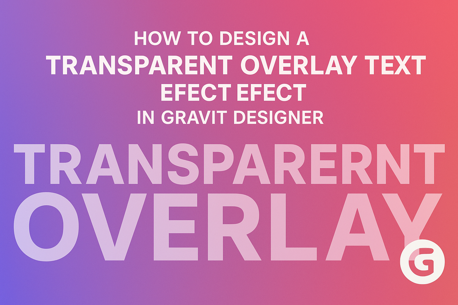
Designing a transparent overlay text effect can elevate any graphic project. This simple technique adds depth and style, making text pop against backgrounds while keeping a clean look.
Whether for a website, social media post, or digital art, achieving this effect in Gravit Designer is both fun and easy.
Many designers often struggle to find the right balance between visibility and aesthetics in their text. By using transparent overlays, they can enhance readability while allowing beautiful images to shine through.
This method not only grabs attention but also conveys a modern feel to any design.
In this article, readers will discover step-by-step instructions on creating this effect in Gravit Designer. With just a few tools and techniques, anyone can achieve professional-quality results without needing advanced skills.
Getting Started with Gravit Designer
Getting started with Gravit Designer is straightforward and intuitive.
This section covers the main parts of the interface and how to set up your canvas for a seamless design experience.
Understanding the Interface
Gravit Designer has a clean and organized interface that makes it easy to find tools and features. The main elements include the toolbar on the left, the canvas in the center, and various panels on the right.
The toolbar holds tools for shapes, text, and more. The properties panel on the right changes based on the selected element. This panel offers options to adjust colors, sizes, and effects.
At the bottom, there is a status bar that shows useful information like zoom level.
Familiarizing oneself with these elements helps in efficiently navigating and using Gravit Designer for any project.
Setting Up Your Canvas
Setting up the canvas is essential for effective design work. When a new document is created, users can choose from sizes like A4, Letter, or custom dimensions.
To create a new canvas, go to File > New and select the preferred size. The canvas background can also be set to transparent, which is helpful for overlay effects.
Users can zoom in and out using the zoom tool or the slider in the status bar.
It’s advisable to set the canvas dimensions according to the intended use of the design, such as web graphics or print materials, to ensure the final output meets specific needs.
Creating the Text Overlay Effect
Designing a transparent text overlay can add depth and creativity to any project. This section will guide the reader through adding text to a design and applying a transparent effect.
Adding Text to Your Design
To begin, the designer should create a new text layer. This can be done by selecting the Text Tool from the toolbar. Clicking on the canvas allows the designer to type the desired text.
Next, choosing the right font is important. The font style should match the overall theme of the design. For instance, a bold font can make the text stand out.
Once the text is typed out, the designer can position it where it fits best in the layout. Using alignment tools can help center the text effectively.
Adjusting the font size may also be necessary to ensure the text is easily readable within the design.
Applying the Transparent Effect
To create a transparent overlay, the designer needs to adjust the text layer’s opacity. In Gravit Designer, this can be done in the properties panel. Lowering the opacity to around 50% often works well for a soft effect.
Next, adding a background layer can enhance the overall look. A solid color or an image can serve as the background.
It’s essential to pick a background that contrasts with the text to maintain readability.
Lastly, experimenting with blending modes can yield impressive results. Different modes like Multiply or Overlay can change how the text interacts with the background.
This experimentation allows the designer to discover unique combinations that enhance the project.
Enhancing Your Design
To achieve a stunning transparent overlay text effect, adjusting opacity and using layers creatively plays a crucial role. Attention to these elements can elevate the overall look and feel of the design, making it more engaging.
Adjusting Opacity and Blending Modes
Adjusting opacity allows the text to interact beautifully with the background. This creates a seamless look and ensures that text visibility remains effective.
Typically, a lower opacity between 50% to 80% works well, depending on the background image.
Blending modes also contribute to this effect. Using modes like “Multiply” or “Screen” can enhance how the text appears against various backgrounds.
Each mode changes the way colors mix, adding depth and interest to the design.
Experimenting with these settings is key. Designers should try different combinations to see what resonates best with their creative vision.
Utilizing Layers for Advanced Control
Using layers effectively allows for greater control over each element in the design.
By placing the text on a separate layer, adjustments can be made without affecting the background.
Additionally, grouping related layers helps in organizing the workspace.
This way, moving or resizing elements becomes easy.
Designers can also apply effects to individual layers. This includes adding shadows or glows to bring more focus to the transparent text.
Each layer can possess unique styles, which enhances the overall complexity and appeal of the design.
Proper layer management makes it simpler to tweak and refine the design as needed.