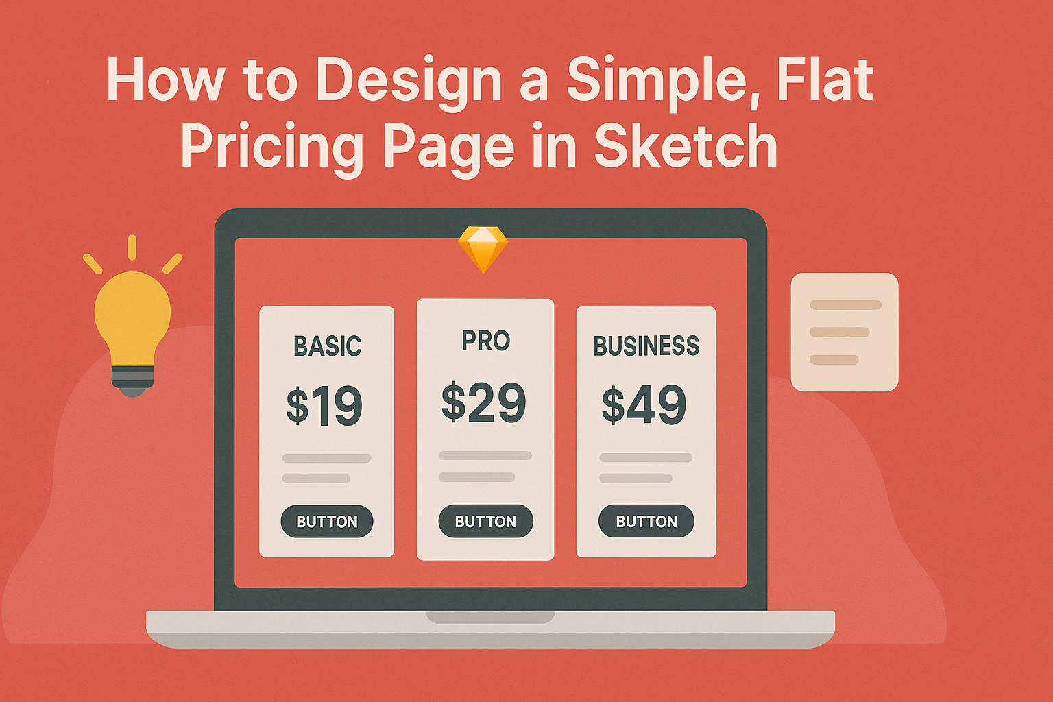
Designing a simple, flat pricing page can be an important task for any business or project.
A well-structured pricing page effectively communicates what customers can expect and helps them make informed decisions.
In this guide, readers will discover practical steps to create an attractive pricing page using Sketch, whether they are beginners or experienced designers.
Understanding the key elements that make a pricing page successful is crucial. This article covers everything from layout choices to typography, ensuring that the design is user-friendly and visually appealing.
By focusing on clarity and simplicity, it can help increase conversions and improve user experience.
With the right approach, anyone can design a pricing page that stands out. This post will highlight best practices and important tips that can make the design process smoother and more efficient.
Readers will find useful insights that can enhance their projects and engage their audience better.
Getting Started with Sketch
Sketch is a powerful tool for creating designs, including pricing pages. Understanding how to set up a document, navigate the interface, and use essential tools will help any designer get started on their projects.
Setting Up Your Document
To begin, open Sketch and create a new document.
It’s helpful to choose a suitable artboard size. For a simple pricing page, a width of 1440 pixels is common.
Next, define the document settings. Set the grid to help align elements neatly.
Using a grid can improve the overall design consistency.
It’s also wise to establish a color palette early on. This ensures that all design elements are cohesive. Sketch allows users to save colors for easy access.
Understanding the Interface
Sketch’s interface is user-friendly, making it accessible for beginners. The main parts are the toolbar, inspector, and the canvas area.
The toolbar contains tools for selecting, drawing, and modifying shapes. Designers can quickly choose what they need from this section.
The inspector provides options to make changes based on the selected element. This includes colors, border weights, and shadows.
Lastly, the canvas is where all the design work takes place. It’s where elements are layered and organized to create the layout.
Essential Tools for Design
Sketch offers a variety of essential tools for any design project.
The Shape tools allow users to create rectangles, circles, and more. These are fundamental for basic layouts.
Text tools enable the addition of titles and descriptions. Designers can customize fonts, sizes, and colors to fit the brand style.
Additionally, the Color Picker allows users to choose colors easily. They can select colors from existing designs, helping maintain brand consistency.
Using these tools effectively will empower designers to create professional-looking pricing pages. Each tool plays a crucial role in achieving a polished final product.
Designing Your Pricing Page
Creating an effective pricing page requires careful planning and design. Key elements include establishing a layout grid, selecting the right typography and color scheme, and incorporating price tables for clarity. Each component plays a vital role in enhancing user experience.
Creating a Layout Grid
A layout grid helps in organizing elements on a pricing page. Using a grid system ensures that everything aligns neatly. It provides a visual structure that guides users’ eyes across the information.
A basic grid might have a 12-column structure. This allows for flexibility when arranging content. Placing key features and pricing side by side can make comparisons easier for users.
In Sketch, he can utilize layout guides to create a grid. This tool helps to maintain balanced spacing, making the page look professional and cohesive.
Typography and Color Scheme
Choosing the right typography and color scheme sets the tone of the pricing page.
Clear, legible fonts improve readability. Sans-serif fonts often work well for online content due to their simplicity.
For color, he should consider a palette that reflects the brand. Using contrasting colors for pricing tables can draw attention to important information. For instance, a bright color can highlight featured pricing plans.
Limit the number of font styles and colors used. This keeps the design clean and focused. Consistency across fonts and colors creates a harmonious atmosphere.
Adding Price Tables
Price tables are essential for displaying different plans clearly.
Each table should list features, pricing, and call-to-action buttons such as “Sign Up” or “Get Started.”
Using a simple table format helps users compare options easily. It’s helpful to highlight the most popular plan. This guides the user toward making a decision.
Each table cell can include brief descriptions of features. Keeping this information concise aids in quick understanding. Avoid clutter to ensure the tables remain user-friendly and effective.
Enhancing Usability
To create a simple pricing page that users find easy to navigate, it is crucial to focus on key elements like visual hierarchy and user-friendly call-to-action buttons. These components significantly improve user experience and guide potential customers toward making decisions.
Visual Hierarchy Principles
Visual hierarchy plays a vital role in how information is presented on a pricing page. It directs the user’s attention to the most important elements.
-
Size and Scale: Larger text grabs more attention. Pricing tiers can benefit from larger font sizes to distinguish them easily.
-
Color Contrast: Using contrasting colors makes information stand out. The price should be bold and in a color that contrasts well with the background.
-
Whitespace: Ample spacing around elements helps avoid clutter. This allows users to focus on essential details without feeling overwhelmed.
By applying these principles, designers can create a clear flow of information that leads users through options effortlessly.
User-Friendly Call-To-Action Buttons
Call-to-action (CTA) buttons guide users toward the next steps. They should be designed for maximum engagement.
-
Clear and Concise Text: Use simple language like “Get Started” or “Buy Now.” This lets users know exactly what they’re doing when they click.
-
Prominent Placement: Position buttons where users naturally look. Place them in areas like the center or at the end of pricing options to catch attention.
-
Color and Size: Ensure buttons are noticeable, using a color that contrasts with the page. A larger button can draw the eye and encourage users to click.
By focusing on these aspects, a pricing page can significantly enhance usability and make the purchasing process smoother for users.
Finalizing and Exporting
At this stage, it’s crucial to ensure the pricing page design is polished and ready for web use. Key aspects to focus on include reviewing the layout for any final tweaks and exporting the necessary assets correctly.
Reviewing Your Design
Before exporting, the designer should conduct a thorough review of the layout. This involves checking for alignment issues and ensuring consistent spacing between elements.
Using the Preview feature in Sketch can help visualize how the design looks in real time.
It’s important to assess typography choices, color contrasts, and readability. They should verify that all text is legible and free from typos.
After the initial review, the designer may wish to share the design with team members or stakeholders. Gather feedback and make any necessary adjustments. Collaboration can bring fresh perspectives and identify overlooked details.
Exporting Assets for Web
Once the design is finalized, exporting assets is the next step.
The designer must select the layers or groups they wish to export. The export settings should be configured for web use, which typically involves choosing the correct file format.
Common formats include PNG for images with transparency, JPEG for photos, and SVG for vector graphics. It’s wise to consider the balance between image quality and file size.
Setting the resolution to 1x or 2x helps in maintaining quality across different devices.
After configuring settings, the designer can simply hit the export button and save the files in an organized manner. Keeping a logical folder structure will make it easier for developers to access assets later.