Creating an appealing e-commerce product page is crucial for attracting customers and increasing sales.
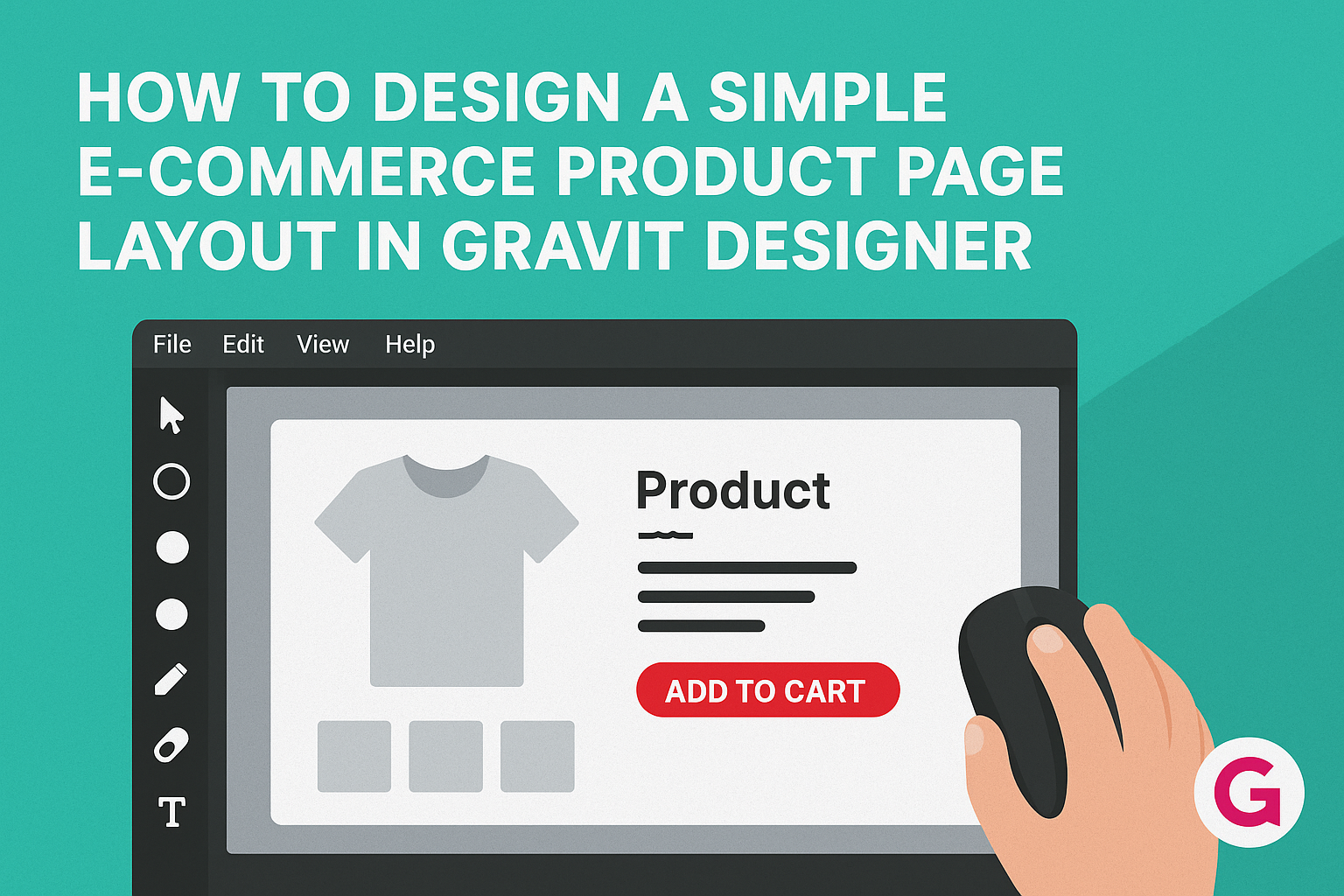
A simple layout in Gravit Designer can effectively showcase products while providing essential information without overwhelming visitors.
This guide will take readers step-by-step through designing a user-friendly product page that converts.
Utilizing Gravit Designer, anyone can design a clean and efficient product page. They will learn how to organize product images, descriptions, and purchasing options for the best user experience. This approach ensures that customers find what they need quickly and easily.
The right design can make all the difference in online shopping. With a focus on simplicity and clarity, this tutorial will help readers create product pages that not only look great but also drive sales effectively.
Getting Started with Gravit Designer
Beginning with Gravit Designer is easy and fun.
This section covers understanding the workspace and setting up a new project effectively.
Understanding the Workspace
When a user opens Gravit Designer, the workspace welcomes them with a clean, well-organized layout. The main components include the canvas, tool panel, and layers panel.
The canvas is where designs come to life. He or she can draw shapes, add text, and create images directly on this surface.
The tool panel provides all the tools for designing. These tools include shapes, text, and vector editors, each represented by easy-to-understand icons.
The layers panel helps manage different elements in a design. It shows a list of all layers, allowing users to group, hide, or lock them for neat organization.
Setting Up Your Project
To start a new project, an individual selects “New Document” from the file menu. This opens a dialog box with options to choose from.
Here, the user can set the size of the canvas. Common sizes for e-commerce product pages include dimensions like 1200×800 pixels.
After defining the document size, they can also select the units used, such as pixels or inches. It’s best to choose what feels comfortable and familiar.
Finally, users set a background color if needed. A white or light background often works well for e-commerce sites, making products stand out more.
Designing the Product Page Layout
A well-structured product page layout is essential for effective e-commerce design. It helps customers easily navigate and understand product details. The layout should focus on key elements like headers, images, pricing, and calls to action.
Creating the Header
The header sets the tone for the entire product page. It should include the brand logo and a clear navigation menu. This helps customers find other products or sections of the website quickly.
Including a search bar in the header is also beneficial. It allows users to search for products without scrolling through multiple pages. A simple yet effective header can improve user experience and keep visitors engaged.
Adding Product Images and Descriptions
High-quality product images are critical. They should showcase the product from various angles. Clear images help potential buyers visualize and understand the product better.
In addition to images, detailed descriptions are important. These should highlight key features and benefits. Use bullet points for clarity, focusing on size, color, and material. A good description answers questions before they arise.
Incorporating a Pricing Section
The pricing section should be straightforward and clearly visible. Display the price prominently near the product image and description. If the product is on sale, use a striking design to indicate this.
Consider adding comparison prices. This can highlight savings and encourage purchases. Additionally, users appreciate knowing shipping costs upfront, so including that information can build trust.
Designing the Call to Action Area
The call to action (CTA) is vital for conversions. It should be clear and inviting, prompting customers to take action, like “Add to Cart” or “Buy Now”. Use contrasting colors to make the CTA stand out on the page.
Position the CTA button directly under the pricing and description. This ensures that customers see it after gaining essential product information. A well-designed CTA can significantly increase conversion rates.
Tips for a User-Friendly Layout
Creating a user-friendly layout is essential for encouraging visitors to explore and purchase. Focus on making navigation simple, ensuring the site looks good on all devices, and choosing the right colors and fonts to enhance readability.
Navigation and Flow
Easy navigation helps users find what they need quickly. A clear menu at the top of the page allows visitors to browse categories effortlessly. Consider using breadcrumbs, which show the path taken, so users can return to previous pages without frustration.
Group similar products together and make sure each item has a significant image and description. A prominent search bar is crucial for those who know what they want. Also, ensure that buttons like “Add to Cart” are easy to locate, enhancing the shopping experience.
Mobile Responsiveness
With many shoppers using mobile devices, a responsive layout is critical. The design should adjust seamlessly to different screen sizes, ensuring all features remain accessible.
Images and buttons must resize correctly, preventing issues like overlapping text or buttons that are too small to click. Test the page on various devices to confirm all elements work well.
Using a mobile-first approach can help prioritize essential content for smaller screens. This keeps the layout clean and focused on key features, allowing for an enjoyable shopping experience.
Using Color and Fonts Effectively
Color choices can greatly impact user experience. Use a consistent color scheme that aligns with the brand while maintaining visual appeal. Colors should not distract from the products but instead draw attention to key actions, like purchase buttons.
Font selection is equally important. Choose clear, legible fonts for product descriptions and headers. Keep the font sizes appropriate for different sections to ensure readability. Avoid using too many font types, as this can make the layout feel chaotic.
By carefully selecting colors and fonts, the product page can become inviting and easy to read, enhancing usability and engagement.
Finalizing and Exporting Your Design
Before exporting, it’s essential to ensure that the design is polished and functions well across different devices. Attention to detail during the review process can make a significant difference in user experience.
Reviewing and Testing
In this stage, focusing on usability is crucial. The designer should check the layout for consistency in fonts, colors, and spacing. It’s also a good idea to seek feedback from others.
Key aspects to review include:
- Links: Ensure all buttons and links direct to the correct pages.
- Image Quality: Verify that product images are high resolution and load quickly.
- Mobile Responsiveness: Test how the design looks on various screen sizes.
Testing interactively helps identify any possible issues. Using tools like user testing platforms can provide great insights from real users. This step ensures the design meets user needs.
Exporting Options
Once the design is confirmed, it’s time to export.
Gravit Designer offers various formats for export.
Common export formats include:
- PNG: Great for images with transparent backgrounds.
- JPEG: Ideal for photos with rich color details.
- SVG: Perfect for scalable vector graphics.
Before exporting, check the resolution settings.
For web use, aim for 72 DPI. For print, use at least 300 DPI.
After selecting the desired format, click on the export option and save it to your device.
Ensuring everything is correct before this final step is vital.