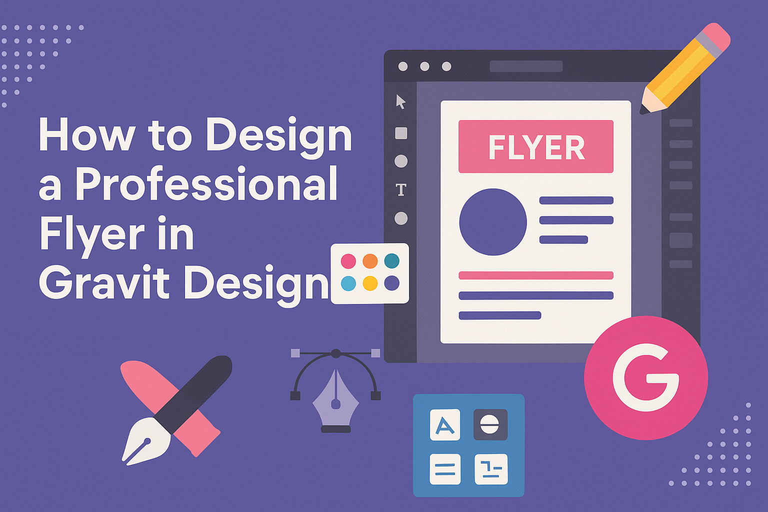
Designing a professional flyer can make a big difference in how a message is received.
Using Gravit Designer, anyone can create eye-catching flyers that stand out while effectively communicating information.
Whether for an event, business promotion, or community outreach, a well-designed flyer captures attention and encourages engagement.
Gravit Designer offers a range of tools that simplify the design process. With its user-friendly interface, designers can efficiently choose colors, fonts, and images to match their brand or theme.
This makes it accessible for beginners and experienced designers alike.
By following a few simple steps, anyone can learn how to create a striking flyer that meets their needs. From selecting the right template to fine-tuning elements, this guide will help unlock the potential of Gravit Designer for all flyer designs.
Getting Started with Gravit Designer
Gravit Designer is an intuitive vector design tool that anyone can use to create stunning graphics. Understanding its interface, setting up the canvas, and navigating the tools are key steps to start designing effectively.
Understanding the Interface
The interface of Gravit Designer is clean and user-friendly. The main parts of the interface include the canvas area, where designs come to life, and the side panels that provide access to tools and settings.
On the left is the tools panel, offering options like the selection tool, shape tool, and text tool. The right side contains the properties panel, which allows users to adjust properties of selected objects, including colors, sizes, and effects.
Familiarizing oneself with these areas helps streamline the design process.
Setting Up Your Canvas
Starting with the right canvas size is crucial for creating an effective flyer. Users can choose dimensions based on the flyer format, like A4 or letter size.
To set up the canvas, go to File > New. Here, enter the desired width and height.
It’s also helpful to choose a resolution of 300 DPI for print quality. Users can set a background color or leave it transparent for layered designs.
A properly set canvas ensures that the designs fit well and look professional.
Navigating the Tools Panel
The tools panel is essential for accessing the various features of Gravit Designer. It allows users to quickly select tools necessary for their project.
Key tools include the shape tool for creating geometric shapes, the pen tool for custom paths, and the text tool for adding written content. Each tool can be selected easily with a single click.
Users should explore the options by hovering over each icon for quick tips. Understanding what each tool does is vital for creating a polished flyer and helps users work more efficiently in their designs.
Flyer Design Basics
Designing a professional flyer involves careful consideration of various elements. Key aspects include choosing an effective color scheme, working with typography, adding images and graphics, and organizing the layout and composition. Each of these components plays a significant role in creating an eye-catching flyer that communicates the intended message clearly.
Choosing a Color Scheme
The right color scheme can make a flyer stand out. When selecting colors, it’s essential to consider the brand or event’s personality.
- Use a color wheel to find complementary colors that work well together.
- Aim for a maximum of three main colors to avoid overwhelming the reader.
Using bold colors for important details enhances visibility. Gravit Designer allows users to adjust color opacities, creating depth and visual interest.
Remember that colors evoke emotions, so choose shades that align with the flyer’s purpose.
Working with Typography
Typography sets the tone for a flyer. It’s crucial to choose fonts that are easy to read and align with the message.
- Limit the use of fonts to two or three styles for consistency.
- Use a bold font for headlines and a simpler font for body text.
Pay attention to font size and weight; larger text grabs attention while smaller text provides details. Ensure there’s enough contrast between text and background colors for clarity.
Gravit Designer offers various font options and allows users to customize spacing, enhancing readability.
Adding Images and Graphics
Images and graphics can effectively convey a message quickly. Including high-quality visuals attracts readers’ attention.
- Select images that complement the text and theme of the flyer.
- Consider using icons or illustrations to break up text and add interest.
Remember to use images that are relevant and appropriate for the target audience.
With Gravit Designer, users can easily integrate images, edit them, and ensure they fit well within the overall design. Graphics should enhance the message without overshadowing important text.
Organizing Layout and Composition
A well-organized layout guides the reader’s eye through the flyer. It’s important to establish a visual hierarchy to show the importance of information.
- Use grids to align elements neatly for a polished look.
- Leave plenty of white space for balance, making the flyer easier to read.
Place the most critical information at the top or center where the eye naturally goes first.
Gravit Designer offers tools to help with alignment and spacing, ensuring all elements of the flyer are visually appealing. An effective layout helps convey the message clearly and encourages action from the audience.
Finalizing Your Design
As the design process comes to a close, it’s time to refine the flyer. Attention to detail is crucial at this stage. It involves applying effects, ensuring consistent design elements, and preparing for export. Each step enhances the overall quality of the flyer.
Applying Effects and Adjustments
Adding effects can elevate the flyer’s appearance significantly. Gravit Designer offers several effects, such as shadows, glows, and blurs. These can help certain elements stand out.
- Shadows: Create depth by applying shadows to text or images. Be careful with the opacity and blur to maintain readability.
- Glows: Use glowing effects for highlights. This draws attention but ensure it doesn’t overpower the main content.
- Blurs: Apply blurs for backgrounds to focus attention on the foreground elements.
Adjust colors and brightness as needed. Subtle adjustments can make a big difference.
Design Consistency and Alignment
Consistency in design creates a professional look. Every aspect of the flyer should match in style and alignment.
- Fonts: Stick to two or three fonts throughout the design. This maintains clarity and visual harmony.
- Colors: Use a limited color palette. Choose colors that complement each other for a unified feel.
- Elements: Align text and images properly. Use Gravit’s alignment tools to center objects and create balanced spacing.
Regularly zoom out to view the flyer as a whole. This hints at any inconsistencies and helps maintain alignment across all elements.
Exporting the Final Flyer
After everything is set, it’s time to export the flyer.
- File Formats: Choose the right format for your needs. PDF is great for printing, while PNG or JPEG works well for digital use.
- Resolution: Ensure the resolution is high enough for print.
A minimum of 300 DPI is recommended for quality prints. - Check Before Export: Always preview the design. Look for any last-minute adjustments needed.
Once satisfied, hit the export button, and your professional flyer is ready to share!